I like to paint crosses because they bring a simple sense of peace to a room without needing much else.
My collection has grown over time as I experiment with different woods and paint finishes.
These ideas focus on styles that hold up well and do not go out of style.
Some use watercolors while others rely on acrylics or even wood burning for texture.
I hope you find one that matches what you are looking for in your own decor.
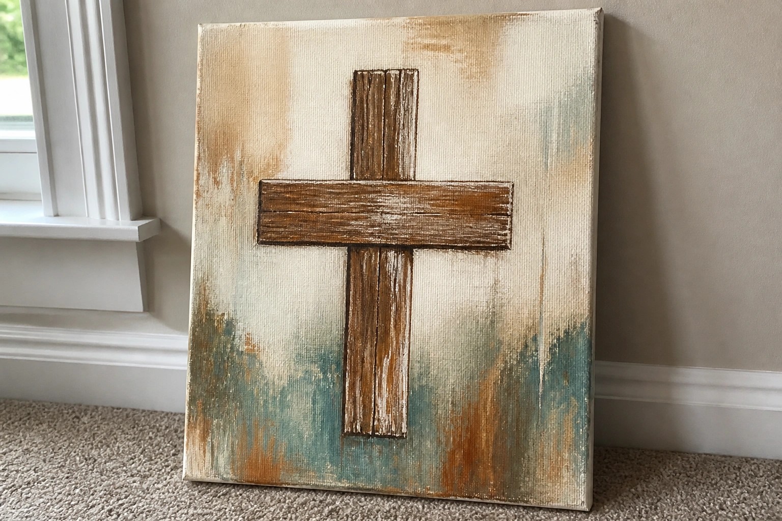
Distressed Cross on a Blended Neutral Background

A basic cross rendered with rough brushstrokes and a few paint drips forms the main subject against a background of soft beige, teal, and brown washes. This approach keeps the focus on the shape itself while the layered background adds quiet contrast without competing for attention. The idea fits neatly into decorative faith-based art where a single strong element carries the piece.
The composition does a lot of the work here because the centered placement and limited color range make the cross straightforward to sketch and fill in. You can change the wash colors to suit different walls or simplify the drips if you want a cleaner finish. For wall art, something like this adapts easily to different canvas sizes while still reading clearly from across the room.
Sunset Cross Silhouette on a Hill
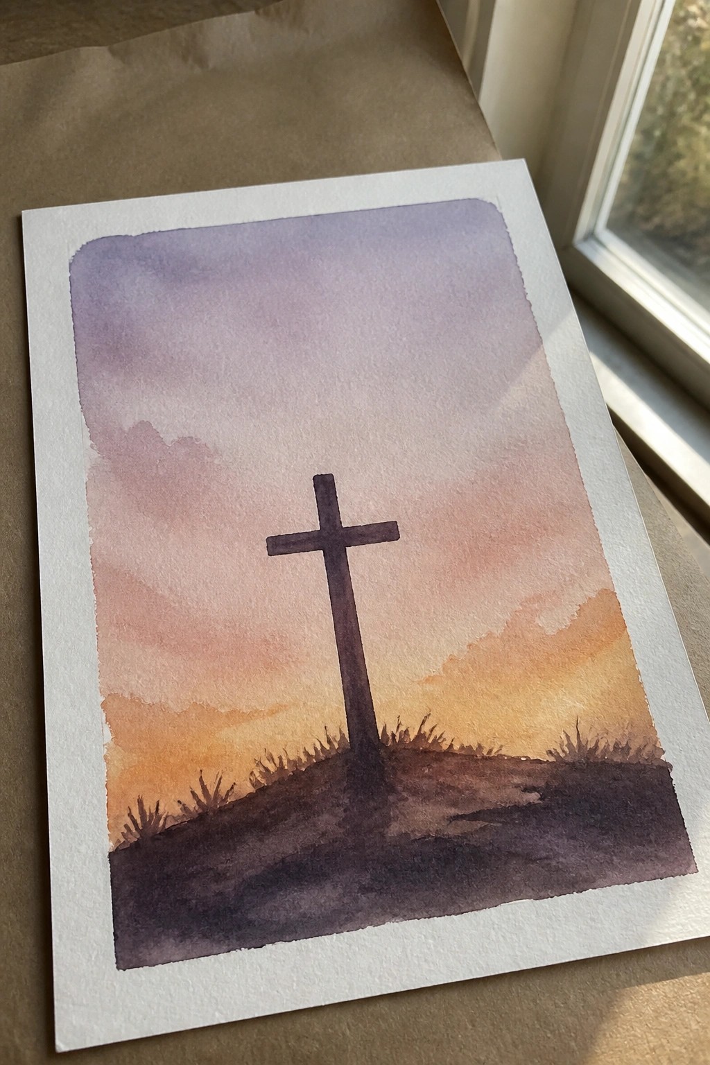
A cross placed as a dark silhouette on a low hill works well as a landscape-style painting idea when paired with a smooth sky gradient. The composition relies on a simple vertical shape against horizontal bands of color that move from purple down to orange. A darker foreground with minimal grass marks keeps the eye on the cross without adding extra layers.
What makes this idea useful is how the silhouette reduces the need for precise outlines or shading. The sky gradient adapts easily to whatever paints are on hand, and the hill line can shift higher or lower to fit different canvas sizes. For wall decor this layout stays readable even at smaller scales, and the same approach works if you want to swap the cross for another basic symbol.
Floral Cross Built from Layered Blooms
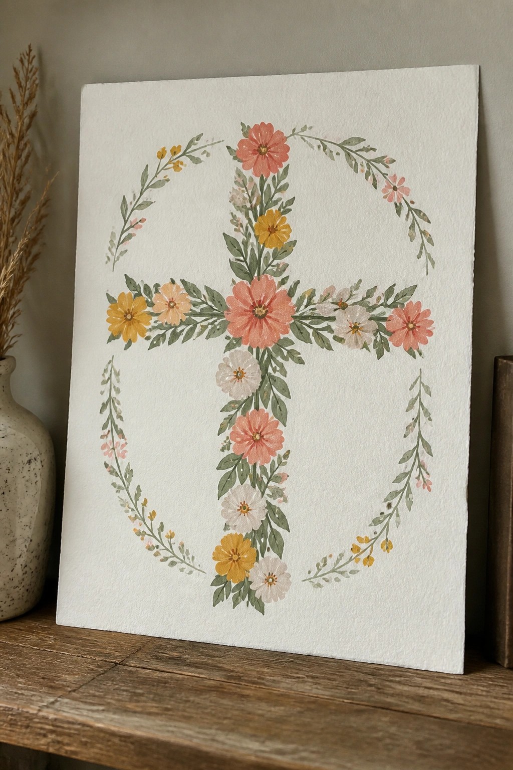
A cross formed by grouping pink, coral, and yellow flowers with green leaves creates the main shape, while smaller vines with matching blooms curve around the sides to add balance. The flowers vary in size and placement so the cross remains readable from a distance, and the open center keeps the design from feeling crowded. This category of decorative floral painting works because the blooms follow the lines of the cross rather than filling a rectangle or circle.
What makes this idea useful is the way the partial vines frame the cross without needing a full wreath, so the piece stays focused on the central shape. The color mix of warm pinks and yellows against white can be swapped for cooler tones or limited to two colors if you want a simpler version for a smaller canvas. For wall art, this layout adapts easily to different sizes and still reads clearly when printed or hung in a group of other faith-based pieces.
Folk Patterned Cross with Central Heart Motif
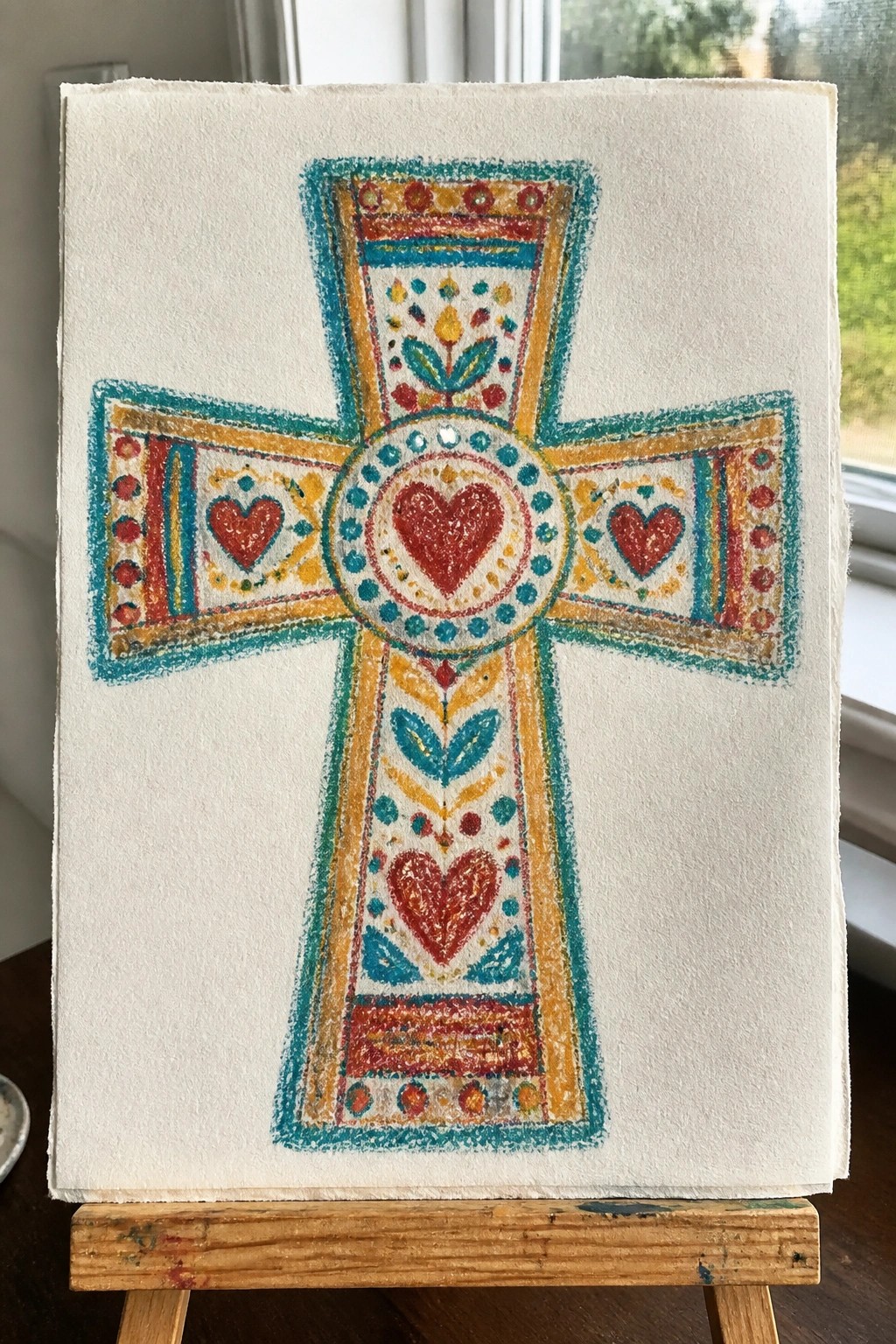
A decorative cross works well when filled with repeating hearts, leaves, and bordered sections that follow the shape of the arms. The idea uses a central circle to anchor the design, then extends the same motifs outward so the patterns stay balanced across the whole piece. This fits the decorative art category because the focus stays on even spacing and clear color blocks rather than shading or realism.
What makes this idea useful is how the existing structure of the cross gives you ready-made sections to fill, so you do not need to invent the layout. The mix of cool teal outlines with warmer reds and yellows lets you swap colors without losing contrast, and the design scales easily for smaller cards or larger canvases. For practice, this kind of subject helps build control with repeated shapes while still producing a finished piece ready for display.
Minimalist Black Cross on Neutral Washed Background
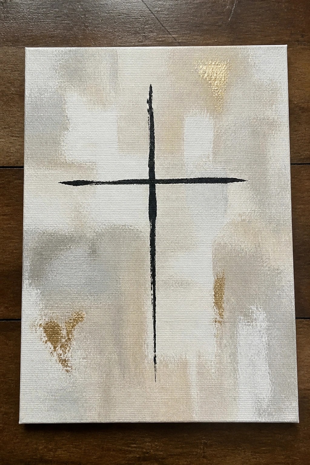
A single bold cross painted in black sits centered on a canvas covered with loose, blended washes of beige, gray, and off-white. Subtle gold accents appear in a few spots across the background, adding slight variation without pulling attention from the cross itself. This style works as abstract decorative art that keeps the composition simple while using soft layering to create a quiet backdrop.
The composition does a lot of the work here because the cross shape stays easy to paint even if your brush control is still developing. You can swap the background tones to match different wall colors or adjust the thickness of the arms for a heavier or lighter look. For wall art this approach stands out on Pinterest because it reads as intentional rather than overly busy, and the same layout scales well to both small practice canvases and larger pieces.
Watercolor Cross with Scripture and Leaf Accents
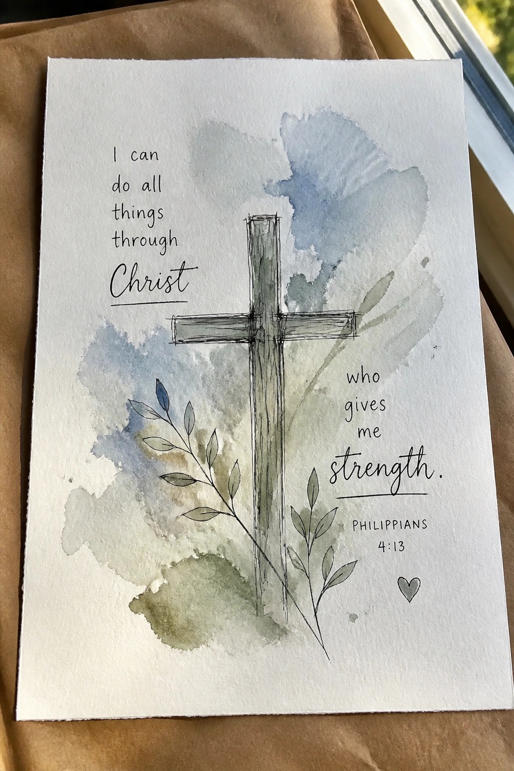
A cross forms the central element in this painting idea, drawn with simple line work and set against a loose watercolor wash in muted blues and greens. Text from Philippians 4:13 sits on either side of the cross, while thin branches with small leaves add a light botanical touch at the base. The composition works because the soft background lets the cross and lettering stay prominent without competing for attention, fitting into the decorative art category for faith-based pieces.
The composition does a lot of the work here by balancing text on both sides of the cross so the layout stays readable at any size. This idea adapts easily if you swap the verse, shift the color wash to match a room, or drop some of the leaves for a cleaner version. It stands out on Pinterest because the mix of illustration and scripture gives it a clear purpose for wall decor without requiring tight details or advanced skills.
Folk Pattern Crosses in Bold Colors
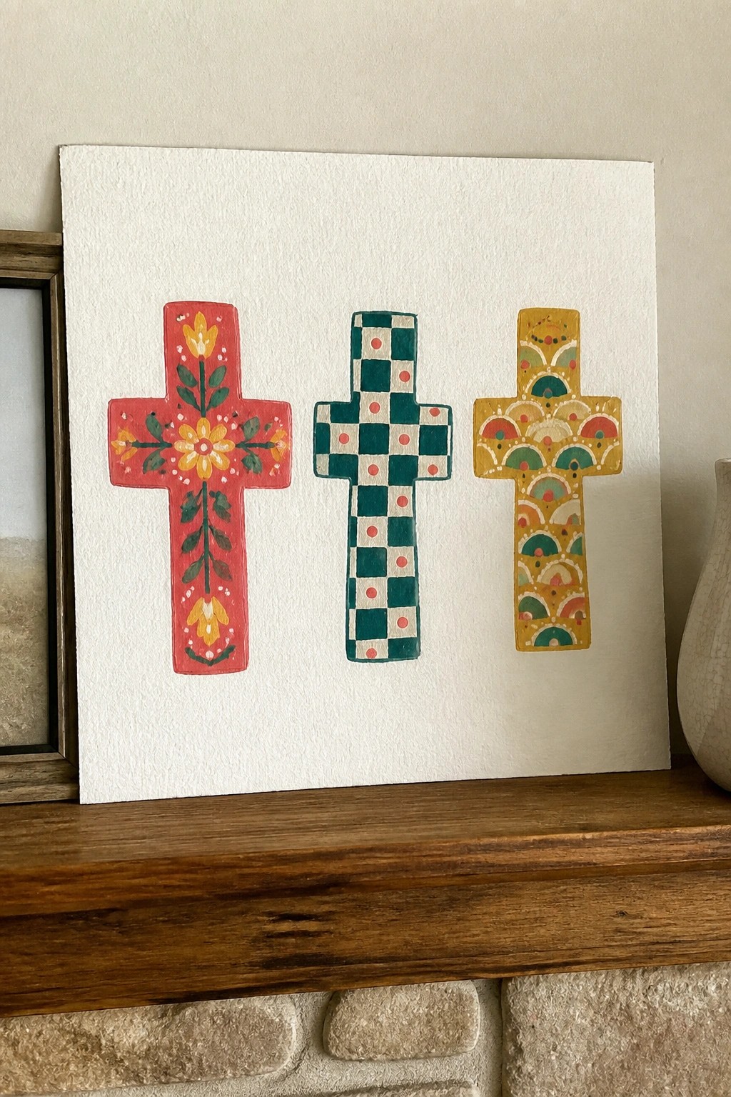
Painting multiple crosses side by side, each filled with its own repeating motif, creates a clean set of decorative pieces for faith-based walls. One uses simple flowers and leaves on red, another repeats a checkerboard with dots in teal, and the third layers arches and small circles in yellow. The matching cross shape keeps the group unified while the contrasting patterns and colors add variety.
The repeated shape makes this easy to adapt by swapping in new motifs or shifting the color palette to match a room. It works especially well as a single canvas for wall art or as three smaller pieces for gifts. The flat patterns require no shading, so the idea stays approachable even when trying different designs.
Cross Silhouette on a Hill at Sunset
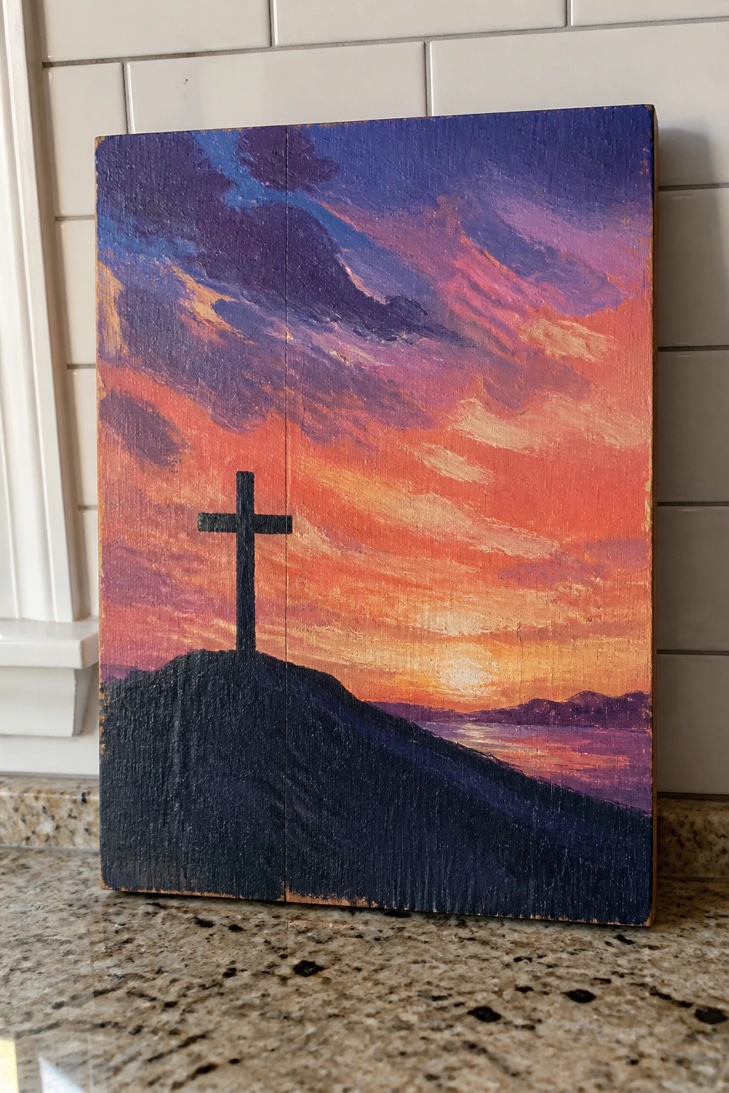
A cross silhouette on a dark hill forms the main subject in this landscape idea, set against a layered sunset sky with blended oranges, pinks, and purples. The composition works by using the high contrast between the solid black cross and the bright sky to keep the focus clear, while the water and distant hills add simple depth. This fits into faith-based decor as a straightforward landscape that relies on color blocks and basic shapes rather than fine detail.
What makes this idea useful is how the silhouette handles most of the visual work, so you only need to focus on smooth sky gradients. The color palette can be swapped for cooler tones or a sunrise without changing the layout, and the wood panel format already gives it a finished look for hanging. This would be easy to turn into a smaller canvas version or adjust the hill shape to fit a different frame size. For practice, the limited details make it a good option to test blending without getting stuck on precision.
Floral Cross with Trailing Leaves and Blooms
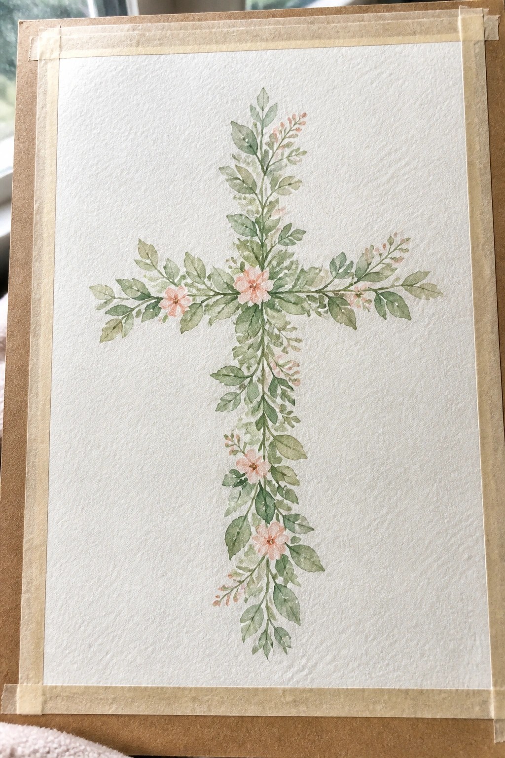
A floral cross painting builds the shape entirely from leaves and small pink flowers rather than a solid outline. The design places the larger blooms near the center where the arms meet, then lets the greenery extend outward and trail downward to keep the vertical line clear. This approach creates a natural flow while still making the cross shape the main focus.
The composition does a lot of the work here by letting the foliage define the arms instead of relying on precise lines. You can adapt it easily by changing the pink tones to other shades or reducing the number of flowers if you want a simpler version. For wall art, the white background keeps the piece light and simple to frame in most spaces. This style also works well for practice because you can build from the center outward and adjust the balance as you go.
Lace Imprint Cross on Teal Background
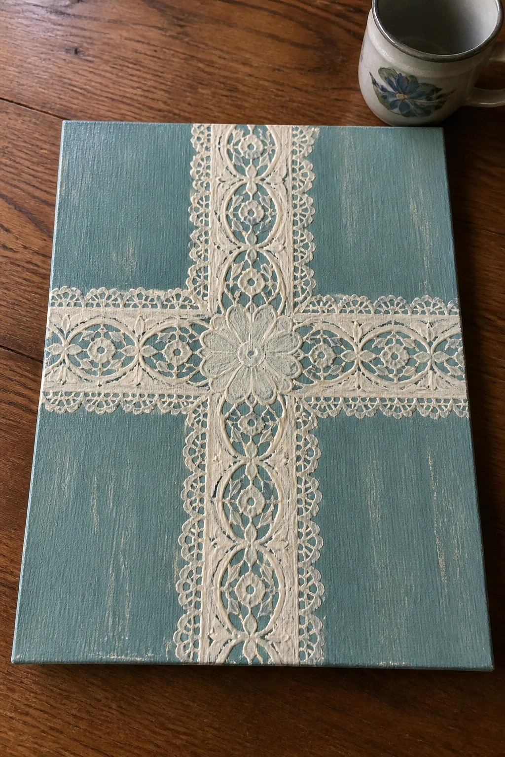
A cross formed by pressing lace into paint creates raised, patterned lines without freehand work. The vertical and horizontal strips meet at a central floral section, while the teal base provides enough contrast to keep the white design clear. This method turns an ordinary canvas into decorative wall art by letting the lace supply the detail.
What makes this idea useful is how the lace handles most of the pattern, leaving you to choose only the background color and strip placement. You could swap the teal for navy or soft gray, or trim the lace to fit a smaller canvas for a set of pieces. For wall decor, this approach works well because the finished look stays neat even on a basic square size.
Hilltop Cross with Figures at Sunset
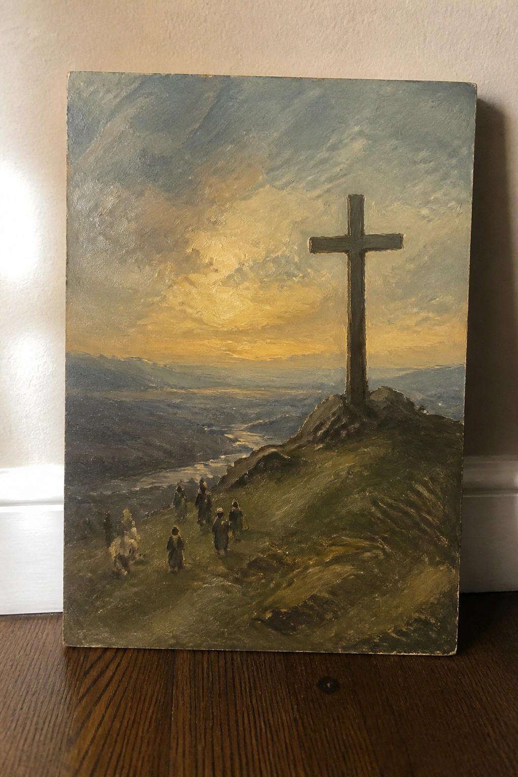
A tall cross positioned on a rocky rise forms the central element in this landscape painting idea. A line of robed figures walks along a path toward it, with layered mountains, a valley, and a winding river filling the background. The glowing yellow-orange sky contrasts against cooler greens and blues, letting the cross stand out while the gradual shift in tones creates depth.
What makes this idea useful is how the strong vertical shape of the cross organizes the layout and keeps the eye moving upward. You can reduce the figures to simple silhouettes or shift the sky toward softer pinks if you want a different mood. For wall art the idea adapts easily to medium or large canvases since the distant landscape works with broader brushwork rather than tiny details.
Books Stacked into a Cross Shape

A cross built from painted books creates a clean, graphic option for faith-based wall art. The books are layered in horizontal and vertical stacks that form the arms and stem of the cross, with varied spine colors and a single yellow bookmark adding a small focal point. The solid teal background keeps the shape easy to read and lets the book details stand out without extra elements.
The rectangular book shapes make the layout simple to sketch first, then fill in with color blocks and a few brush lines for pages. You can swap the book colors to match a room or add titles that mean something personal. This approach works well for a medium-size canvas and translates quickly into a printable or smaller study version.
Hanging Cross with Bow and Personalized Word
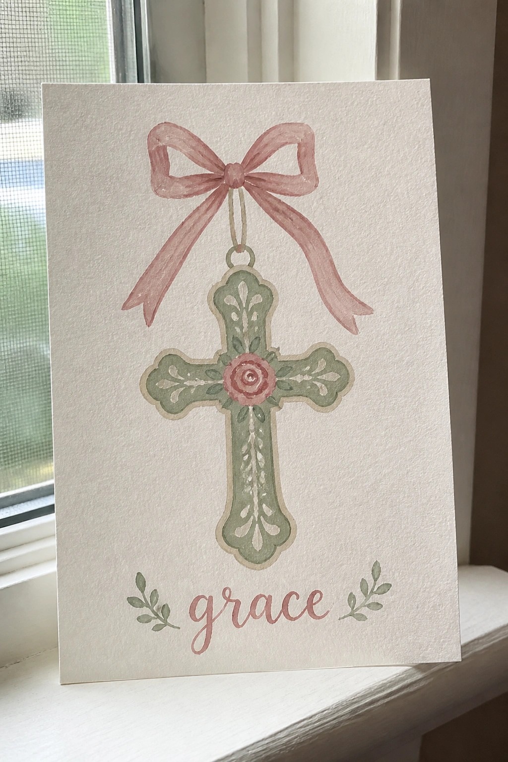
A decorative cross serves as the central subject here, painted in soft green with a pink rose at the center and paired with a large bow hanging from the top. This approach falls under decorative faith-based art, where the bow and the word below create a balanced vertical layout that keeps the eye moving from the ribbon down through the cross. The clean white space around the elements makes the shapes stand out without extra background work.
What makes this idea useful is the straightforward hanging setup that lets you practice painting a bow and cross together in one piece. The color choices stay simple enough to swap for different seasons or match existing decor, and the word at the bottom can be changed to another short phrase or name. This layout works well for cards or small wall pieces because it needs little extra detail to feel complete.
Cross in a Layered Landscape
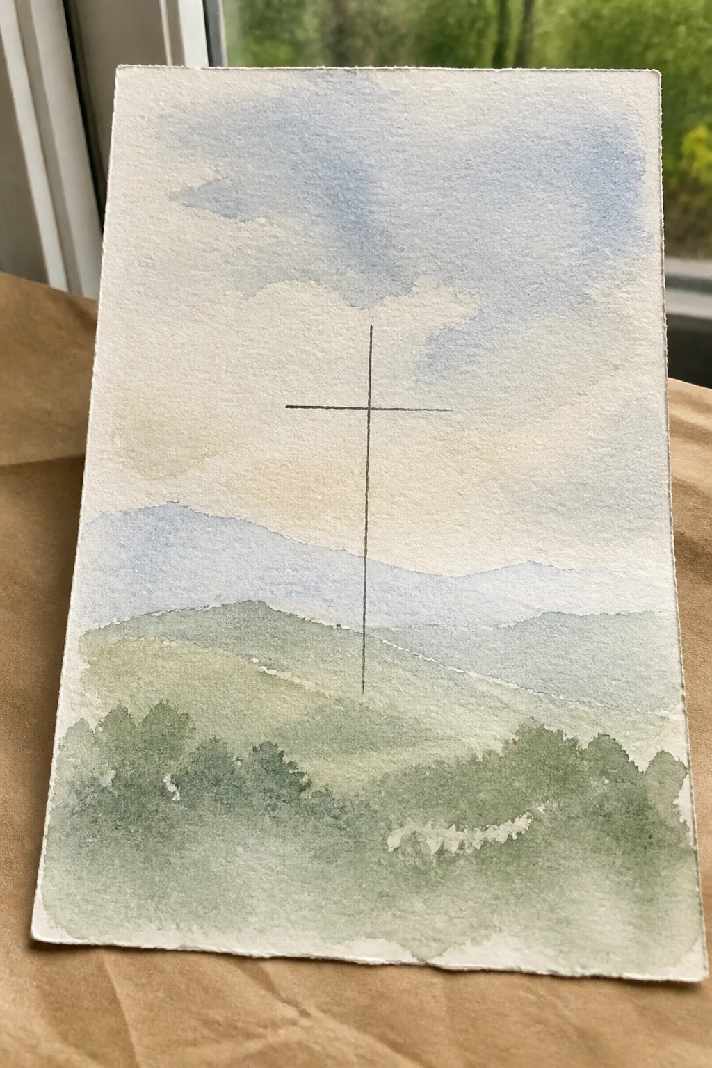
A landscape cross painting uses soft horizontal bands of hills and sky to frame a single centered cross. The idea keeps the cross as the main focal point by placing it against gentle color layers that recede into the distance. This approach fits the landscape category and works because the simple vertical shape stands out without competing elements.
The composition does a lot of the work here by balancing the cross against the softer background. You can shift the hill tones to blues or earth colors to match different rooms or shrink the sky area for a more compact version. This style makes a smart choice for wall decor since it stays readable even at smaller sizes and adapts easily to different paper formats.
Blush Cross with Heart and Radiating Rays
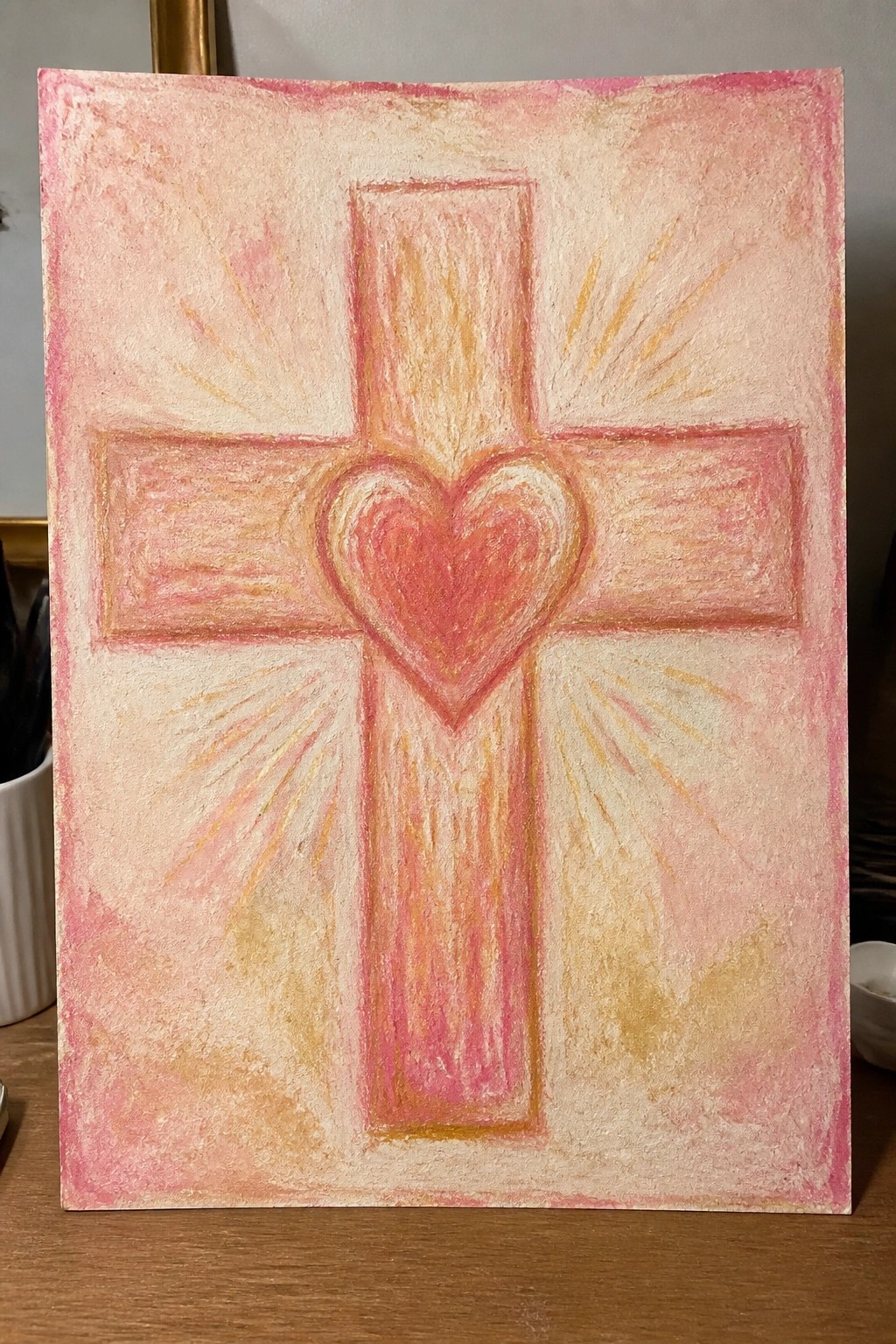
A cross painting that centers a heart at the intersection turns the standard symbol into a compact focal point. The straight arms of the cross stay balanced while short brushstrokes fan outward to suggest light without adding extra objects. Soft pink and peach layers over an off-white ground keep the whole piece light and readable from a distance.
The simple cross shape and central heart make the layout easy to transfer to different canvas sizes. You can swap the pink palette for deeper tones or keep the background pale so the design works on its own as wall art. The radiating strokes add interest without requiring fine detail, so the same idea can be painted quickly for practice or repeated on smaller panels for gifts.
Geometric Cross Made from Colored Square Blocks
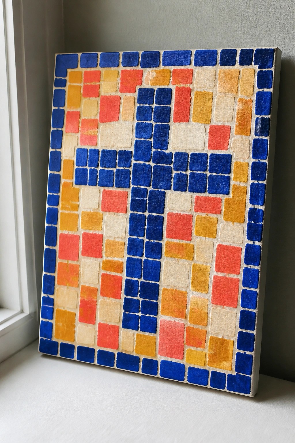
A grid layout of small painted squares in blue, orange, red, and yellow builds a clear cross shape on a light canvas. The idea relies on flat color blocks arranged in rows and columns so the cross emerges from the pattern rather than from any curved lines or shading. Strong warm-cool contrast between the orange-red tones and the blues makes the shape readable even when viewed from across a room.
The square grid removes the need for freehand drawing, so you can mark it out with a ruler and tape before filling each block. Swap in different color families or reduce the number of shades if you want a faster version for a smaller canvas. This approach works especially well for modern faith-based wall pieces because the clean geometry keeps the cross visible without extra detail.
Negative Space Cross in a Blue Watercolor Wash

A cross left unpainted creates the main shape while blue watercolor washes fill the space around it to form soft, cloud-like edges. Small white stars scattered across the blue areas add contrast and keep the layout from feeling empty. This idea fits the category of simple decorative faith art that uses negative space and loose washes instead of detailed rendering.
The composition does a lot of the work here because the centered cross and surrounding washes create balance with minimal effort. You can adapt the idea by changing the blue tones to other colors or adjusting the paper size to match different frame dimensions. For wall decor, the clean layout makes it easy to repeat in different color schemes without starting from scratch each time.
Rustic Cross Painted Across Wood Planks
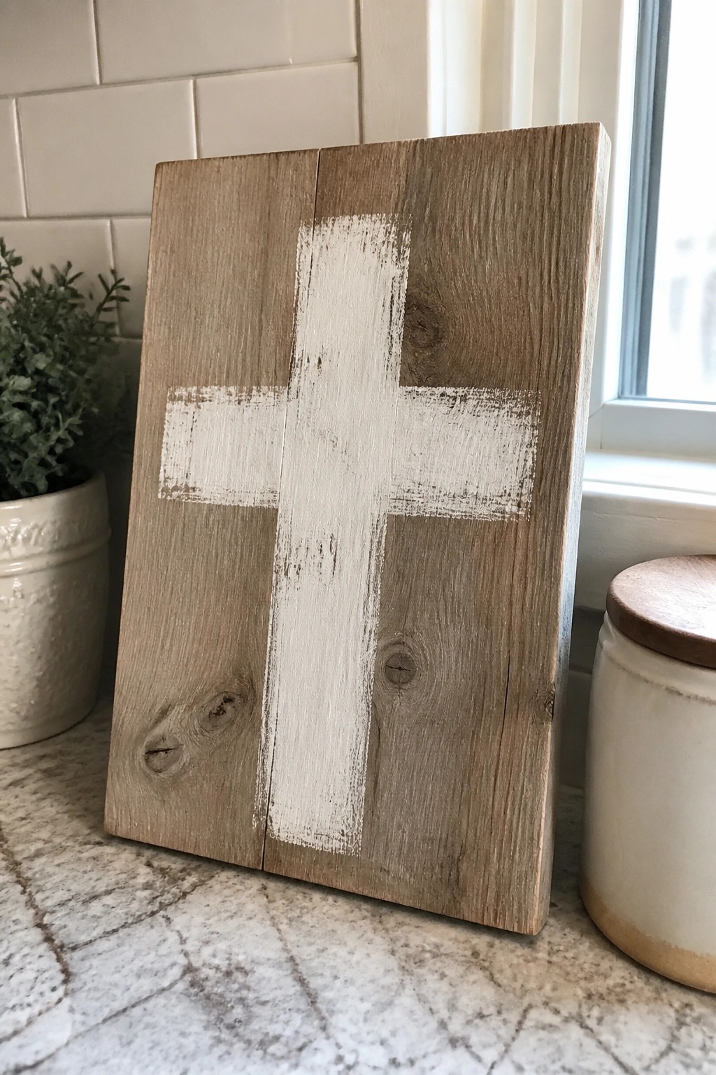
A cross formed with wide white brush strokes on joined wood planks gives a clean faith-based piece that relies on the wood itself for most of the surface. The uneven paint coverage lets the natural grain show through, which keeps the design simple while still filling the space. This style fits decorative art because the composition stays balanced without extra elements or shading.
What makes this idea useful is that the wood does most of the work, so you only need one color and basic strokes. You can swap in different board widths or stain tones to match existing decor, and the same layout works on smaller boards for shelves or tabletops. The shape stays readable even if the brush lines are slightly off-center, which makes it easy to adapt for quick weekend projects or gifts.
Vertical Gradient of Painted Crosses

A single vertical line of crosses painted down the center of a canvas makes a clean decorative piece. The colors move in a steady fade from warm coral through peach and beige into cool greens and deep teal, with a few crosses given simple dot or line details. This approach keeps the shapes basic while the color shift and centered placement do the visual work.
What makes this idea useful is how the straight layout removes the need for complex spacing decisions. You can shorten the sequence to five or six crosses or change the palette to match existing decor without altering the core format. For wall pieces this stays easy to adapt for different room sizes and works as a quick project that still reads as intentional rather than basic.
Coastal Rock with Cross Silhouette

A landscape painting idea that centers on a large rock formation rising from the shore with a clean cross shape cut through it. The ocean and waves fill the middle ground while the sky stays light and open above. The idea works because the rock acts as a strong vertical anchor that contrasts with the horizontal lines of the water and sand.
The composition does a lot of the work here by using the rock to frame the cross without extra elements. You could swap the blue tones for warmer sunset colors or crop the scene tighter to focus just on the rock and waterline. For wall decor this approach keeps the cross visible from a distance while the simple beach setting makes it easy to paint on different paper sizes.
Navy Cross with Layered Florals
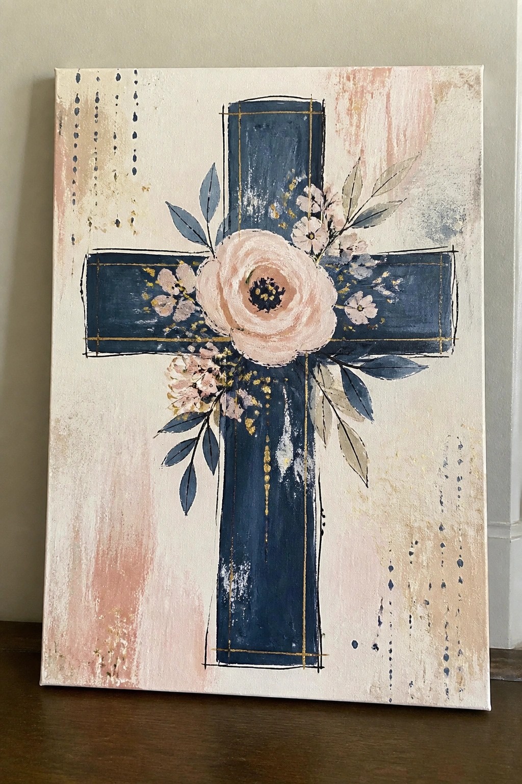
A cross painted in deep navy with thin gold lines serves as the main structure while a large central bloom and smaller surrounding flowers soften the edges. The idea combines a bold geometric shape with floral details to create a decorative piece that fits faith-based wall art. The light background with subtle texture keeps the focus on the cross without competing elements.
The composition does a lot of the work here because the cross gives clear lines to follow and the flowers add interest without needing perfect symmetry. You can adapt the idea by changing the navy to black or a deep green and swapping the pink tones for whatever colors match your room. For wall decor this works especially well on a medium canvas since the simple background makes it easy to hang in different spaces. The same layout could be simplified by using fewer flowers or turning the gold lines into dashed accents instead.
Frequently Asked Questions
What supplies do I need to recreate these cross painting ideas at home?
Start with a sturdy canvas or wooden cross base, acrylic paints in neutral tones like soft grays, creams, and golds for a timeless look, and basic brushes of various sizes. Add optional items such as stencils for scripture verses, fine liners for details, and a sealant spray to protect the finished piece. Many of the ideas use simple layering techniques, so gather a palette knife for texture if you want to add depth without advanced skills.
How can I choose which of the 21 ideas fits my existing home style?
Consider the room’s color scheme and mood first. For modern spaces, lean toward minimalist cross outlines with clean lines and metallic accents. Traditional rooms pair well with ornate details or vintage-inspired washes. Match the scale too by picking smaller canvases for shelves and larger ones for walls above furniture. This ensures the faith-based element blends naturally rather than clashes.
What tips help beginners paint these crosses without frustration?
Begin with a light pencil sketch of the cross shape on your surface before applying paint. Work in thin layers and let each one dry to avoid smudges. Focus on one idea at a time, such as a simple silhouette with a subtle background, rather than complex compositions. Practice on paper first if needed, and remember that imperfections can add character to handmade faith decor.
How do I make sure these painted crosses stay meaningful for years?
Select designs that incorporate personal elements like a favorite Bible verse or subtle symbols tied to your faith journey. Use durable, high-quality paints and sealants to prevent fading. Rotate displays seasonally or clean them gently with a soft cloth to maintain their appearance. Timeless choices avoid fleeting trends and emphasize enduring themes like hope or grace.
Where are the best places to display these finished cross paintings?
Hang them in entryways for a welcoming faith reminder, above beds for daily inspiration, or in living areas as focal points. Group smaller pieces on gallery walls for visual interest, or place them on mantels with candles. Ensure good lighting to highlight details, and keep them away from direct sunlight to preserve colors over time.