
I’ve been wanting to refresh my living room walls without adding too much clutter.
Minimal cross canvas art seems like a good fit for that clean look I like.
I tried a few simple designs myself and they turned out better than I expected.
These ideas are ones that have worked well in my own space.
They help keep the room feeling open and modern.
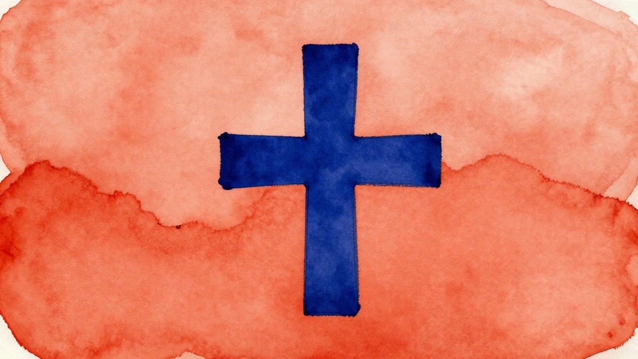
Bold Cross on Layered Wash
A single thick blue cross painted over a loose orange-red wash creates a clean modern cross idea. The background includes a softer cross shape that sits behind the main one, adding subtle depth through simple layering. This approach keeps the focus on shape and color contrast rather than detail or texture.
What makes this idea useful is how the limited palette lets you swap the blue or background color to match any room without changing the layout. You could paint the same design on a larger canvas or try a different wash color for seasonal pieces. The strong central shape also makes it easy to adapt for quick practice or a straightforward wall accent.
Minimalist Cross Silhouette on Gradient Background
A bold black cross fills most of the canvas and sits centered over a soft teal to warm orange gradient that runs top to bottom. A simple dark band at the base suggests ground without any extra detail. The idea uses strong contrast and large flat shapes rather than layers or texture.
The composition does a lot of the work here by letting the cross dominate through size and value. You can change the gradient colors to fit a room or swap the sky for a single wash if you want fewer steps. This approach stays useful for quick canvas pieces because the silhouette keeps the focus on shape instead of brushwork or fine details.
Distressed Metallic Cross on Neutral Ground
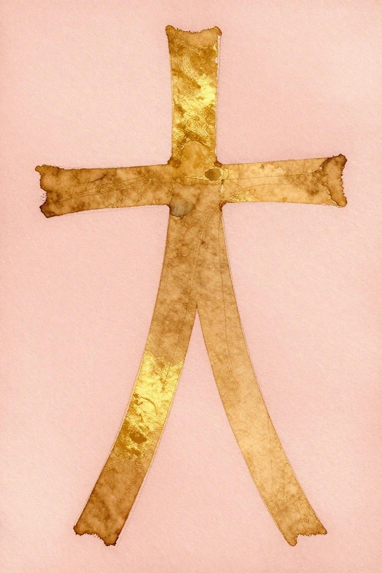
A minimal cross painted in metallic gold with a distressed, uneven texture creates a striking focal point through simple geometry and subtle surface variation. The irregular edges and faint cracks in the gold keep the shape from feeling too rigid while the plain background lets the form stand out clearly. This approach falls into decorative art, where the contrast between the luminous metal and soft ground gives the piece a clean, modern presence.
What makes this idea useful is how the single metallic element and straightforward layout translate easily to different canvas sizes. You can change the background to white, gray, or warm beige to fit various rooms, or try copper or silver leaf for a different tone. For wall art, the design works well because it stays bold without needing extra details, and beginners can achieve the distressed look with basic masking tape and dry brushing.
Repeating Cross Grid Over Soft Watercolor Washes
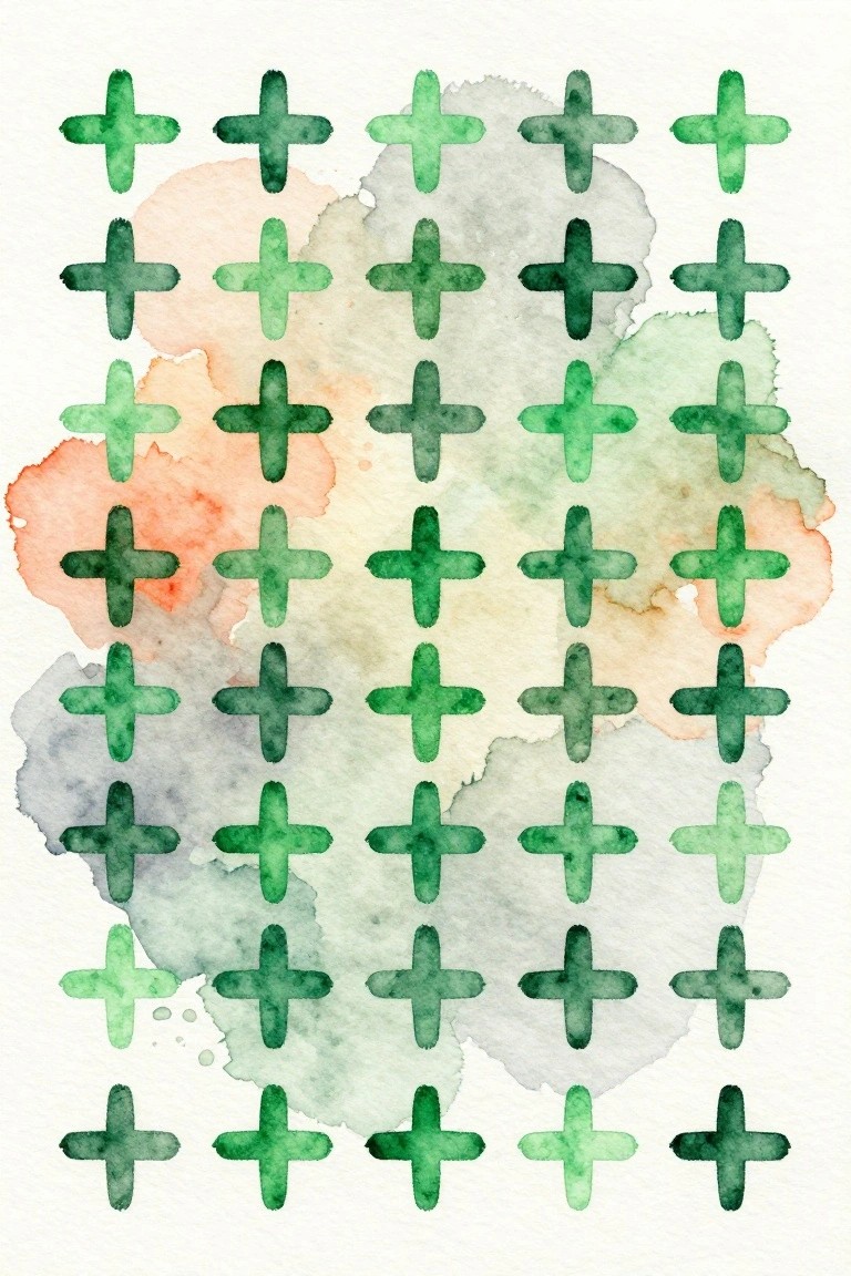
A grid layout of crosses painted in different green tones forms a simple repeating pattern that works as decorative art. The crosses vary slightly in shade and saturation while sitting over loose, blended background washes that add subtle color without adding detail. This keeps the idea in the abstract geometric category and lets the regular spacing do most of the visual work.
The even grid structure makes it easy to adapt the size or number of crosses to fit a canvas of any dimension. You can change the green palette to match a room or swap in another color family while keeping the same layout. The background washes give texture without requiring precise control, so the piece stays minimal yet interesting. For practice this works well because the shapes are basic and the focus stays on color blending and spacing rather than complex drawing.
Minimal White Cross on Blue Watercolor Wash

A centered white cross stands out against a loose blend of blue watercolor washes that range from pale aqua to deep navy. The background uses soft edges and uneven pigment to create movement without adding extra shapes or details. This approach lands in the decorative category and keeps the focus entirely on the clean cross shape.
What makes this idea useful is the way the background handles most of the visual interest so the cross itself stays simple to paint. You can adjust the blue tones to fit any space or swap in a different base color while keeping the same layout. For canvas work, the high contrast makes the piece read clearly from a distance without needing extra layers or fine lines.
Beveled Gradient Cross
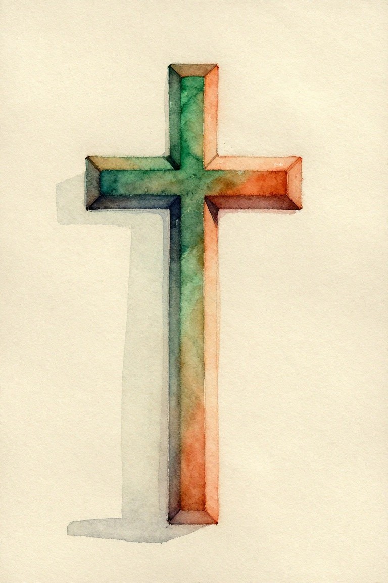
A dimensional cross works well here because the color shifts gradually from cool green tones into warm orange across the surface. The beveled edges create a raised effect that adds depth while the overall shape stays simple and balanced. This style fits cleanly into decorative cross art that keeps the focus on line and color rather than detail.
What makes this idea useful is how easily the gradient can be changed to match different room colors or seasons. The clean shape scales up for canvas without extra elements getting in the way, and the soft shadow underneath helps it sit nicely on a plain wall. For practice, this kind of piece lets you work on smooth color blending and edge control at the same time.
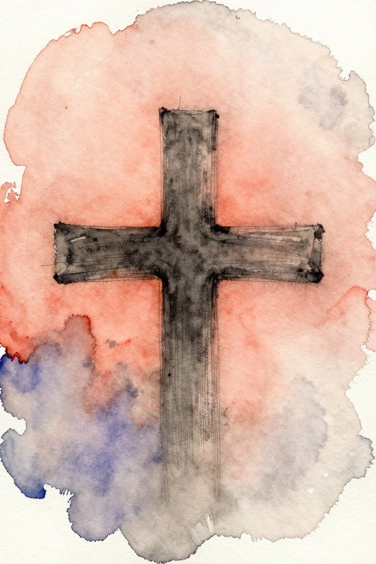
Minimal Cross on a Soft Blended Wash
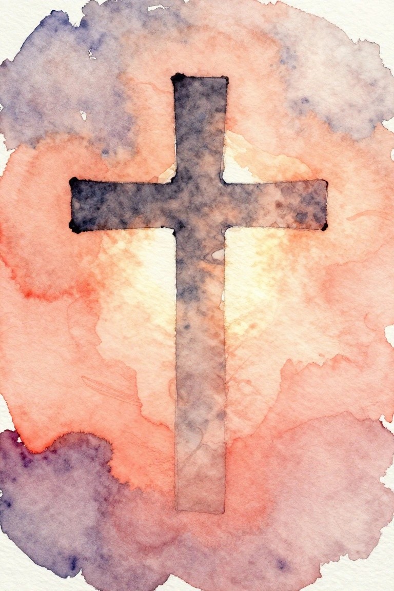
A dark, solid cross sits centered over loose watercolor washes that fade from warm coral and peach into cooler purple tones. The background stays abstract and circular with soft edges, letting the cross remain the only hard shape in the piece. This keeps the idea firmly in the minimalist decorative category while using color contrast to make the cross pop.
The composition does a lot of the work here because the irregular wash edges naturally frame the cross without needing extra lines or details. You could easily recreate the same layout on a square canvas by starting with a light pencil cross, then brushing diluted colors around it and letting them blend on their own. For wall art this works well in modern spaces since the limited palette stays calm but the dark cross still gives it weight. Scaling the cross thicker or thinner changes the whole feel without adding more elements.
Red Cross with Dark Outline on Blue Wash
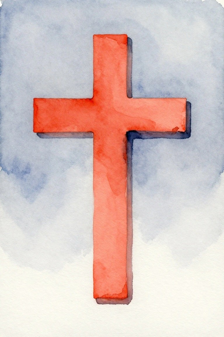
A bold red cross with a thin dark outline forms the entire focus of this painting idea. The style is minimalist decorative art that relies on strong shape contrast and a soft blue background to keep things clean. The slight shadow effect around the edges adds just enough depth without cluttering the simple layout.
What makes this idea useful is how the limited colors and centered placement make it quick to paint on any size canvas. The color palette makes this easy to adapt by switching the red to black or navy while keeping the same background tone. For wall art, something like this works especially well in modern rooms where one strong shape is enough. You could also try it on a smaller scale or change the outline color to test different looks.
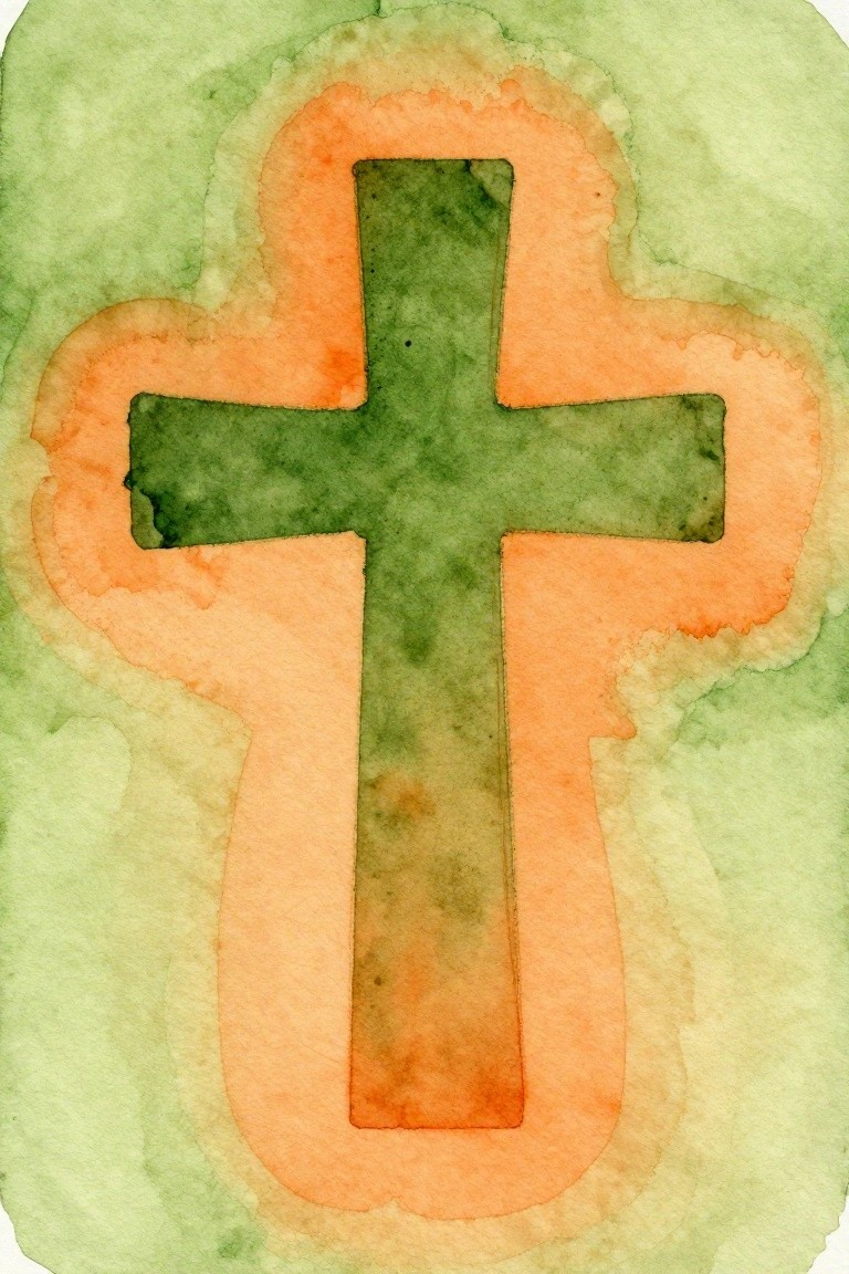
Minimal Cross with Halo on Green Wash
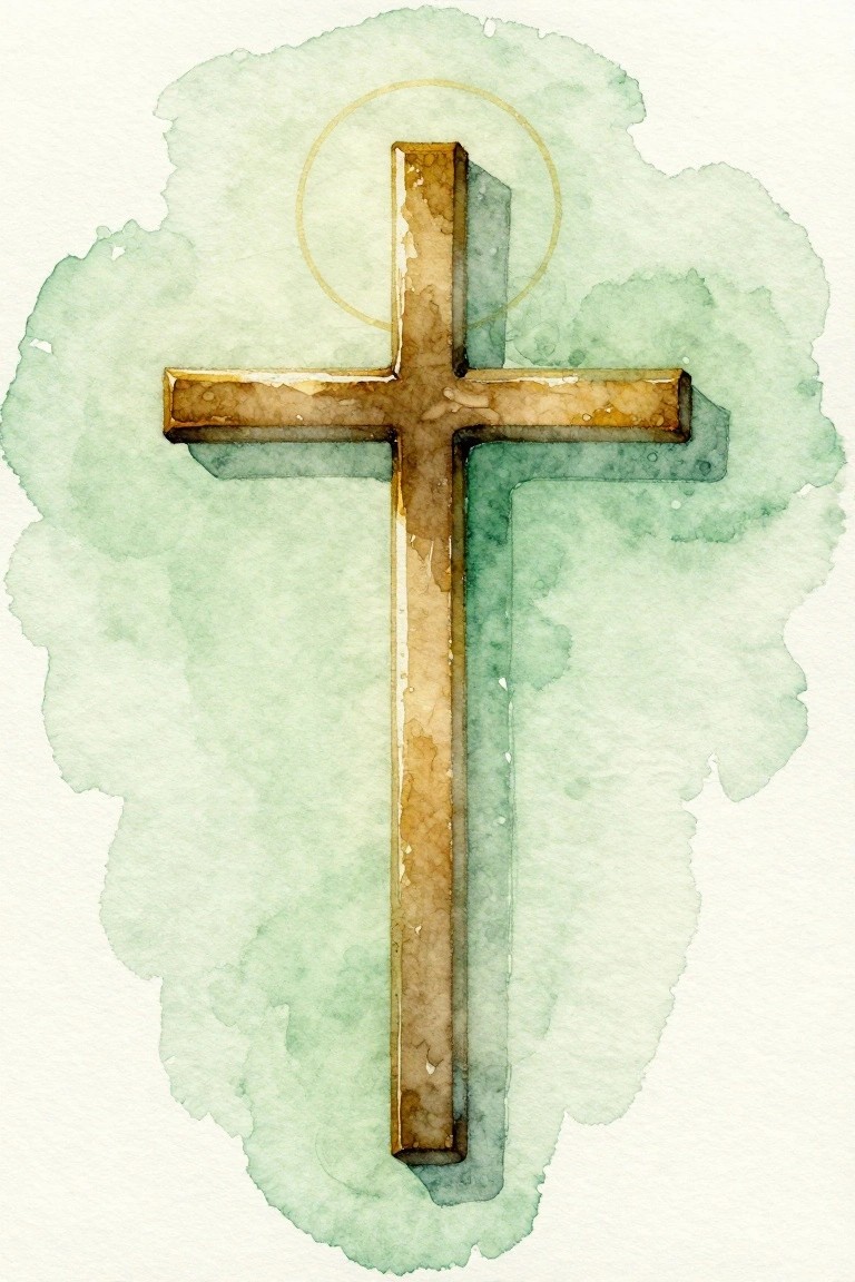
A cross painted in warm brown tones with visible texture forms the central focus against a soft green watercolor background. A thin gold ring placed behind the top of the cross creates a quiet accent that draws the eye without adding extra elements. The straightforward vertical layout and muted palette keep the design minimal while still giving the cross clear presence on the canvas.
What makes this idea useful is how the loose background wash does most of the work, so the cross itself can stay simple in shape and detail. You could easily change the green to a pale gray or soft beige to fit different rooms, or adjust the brown to a cooler tone if you prefer less warmth. For a clean modern wall, this version scales well on a medium canvas and leaves space around the edges so it does not feel crowded.
Gradient Cross Grid on Soft Wash
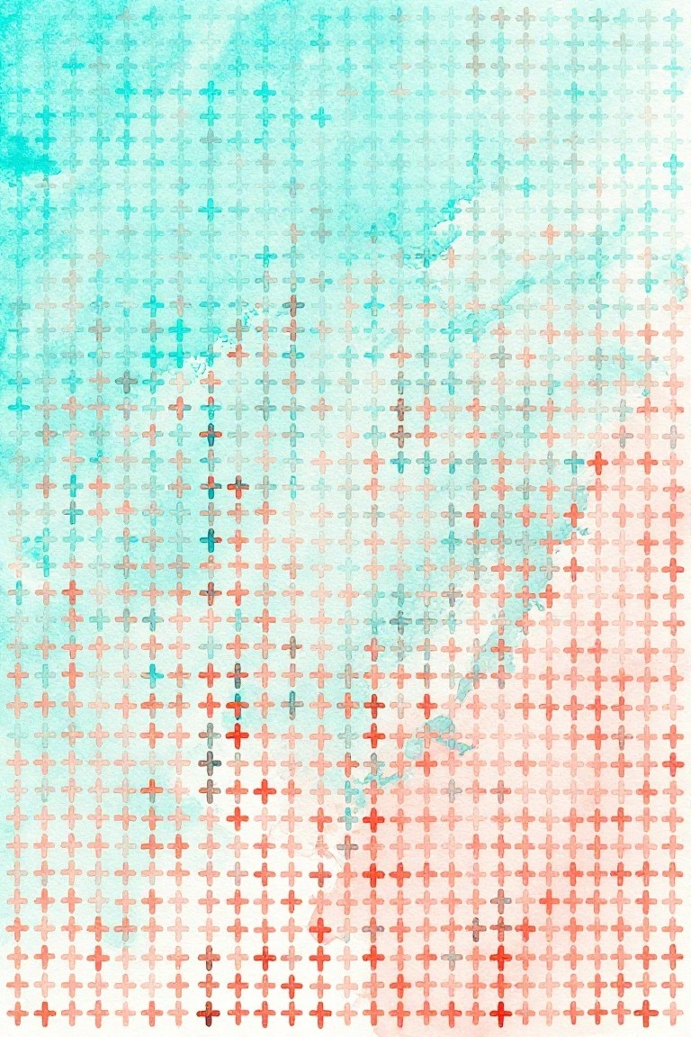
A grid of small crosses painted across the canvas creates a clean repeating pattern that shifts gradually from teal tones at the top to coral and red at the bottom. The crosses stay uniform in size while the background wash blends lightly behind them to keep the focus on the color progression. This fits into the decorative abstract category and works because the even spacing and gentle fade give the whole piece a balanced, modern structure without extra elements.
What makes this idea useful is how the repeat pattern lets you adjust the grid size or spacing to fit different canvas dimensions. You can keep the same cross shape but change the starting and ending colors to match a specific room palette. For wall art, something like this works especially well when you want subtle texture from the wash without adding shapes or layers. The simple layout also makes it straightforward to sketch the grid first and then fill it in section by section.
Minimal Cross with Watercolor Background
A centered cross painted in dark layered tones sits over a loose wash of warm peach and cool gray-blue. The cross itself carries visible brush texture while the background stays soft and blended, letting the shape hold the focus without extra detail. This approach works as a simple decorative piece that balances a strong symbol with an easy, open background.
The composition does most of the work by keeping the cross bold and the colors diffused. You can change the wash to cooler blues or warmer oranges depending on the room, and the same layout scales easily to a larger canvas or a smaller study. For practice, start with the background first so the cross sits cleanly on top without fighting the colors. This kind of piece shows up well on Pinterest when the contrast stays high and the edges stay soft.
Yellow Cross on a Blue Watercolor Wash
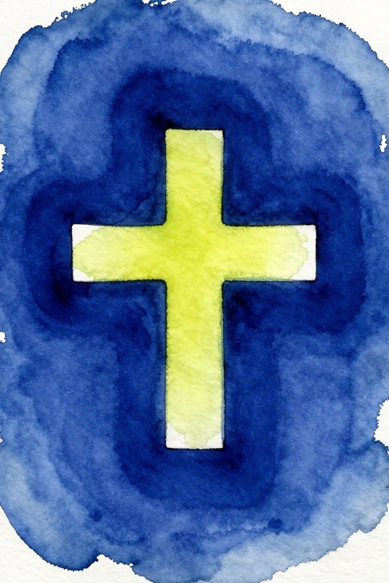
A centered yellow cross stands out against a deep blue watercolor background that spreads in a loose circular shape. The cross uses flat color with soft edges while the background relies on blended washes and visible texture to fill the space. This fits into minimal decorative art because it limits the palette to two colors and keeps the focus on a single geometric form.
The composition does a lot of the work here by placing the cross dead center so the blue wash can handle all the movement. You can adapt the idea by changing the blue to black or navy and trying the cross in another bright shade like orange or white. For wall art, something like this works well on a small canvas since it needs only basic shape placement and loose background strokes. The simple shapes help this feel more approachable for anyone wanting a quick modern piece without extra detail.
Scattered Watercolor Crosses in Primary Colors
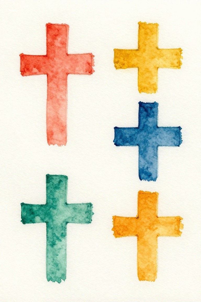
A collection of five crosses painted in solid watercolor hues gives a direct way to work with simple shapes and strong color on canvas. Each cross sits on its own with soft, slightly uneven edges from the wash, and the colors stay separate rather than blended. The loose placement across the surface keeps the layout balanced while letting the flat forms stand out clearly against the white ground.
What makes this idea useful is how quickly it translates to different canvas sizes or single crosses instead of a group. The limited palette makes color choices easy to repeat or swap for other rooms without overthinking the design. For wall pieces, the same layout works in smaller sets or with one color repeated across multiple canvases to match existing decor.
Centered Cross Over a Soft Teal Wash with Loose Base Strokes
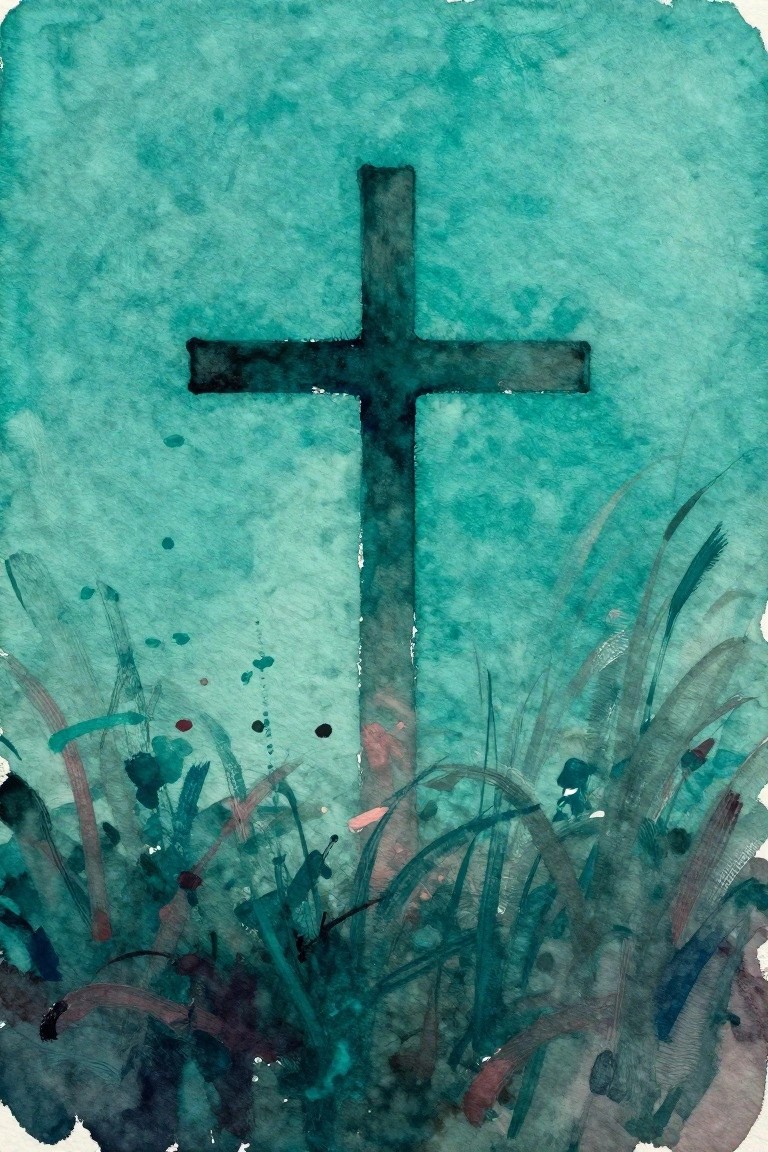
A single dark cross sits centered on a textured teal background that fades from light to deeper tones. Loose, varied brushstrokes along the bottom edge suggest grass or foliage without adding much detail. The idea works because the cross stays bold and simple while the background and base strokes give just enough variation to avoid a flat look.
The composition does a lot of the work here since the large open space keeps the focus on the cross shape. You can swap the teal for any solid or washed color and still get the same clean result. This layout also scales easily to different canvas sizes, making it a quick option when you want something minimal but not completely plain.
Earth Tone Watercolor Cross With Soft Background Washes
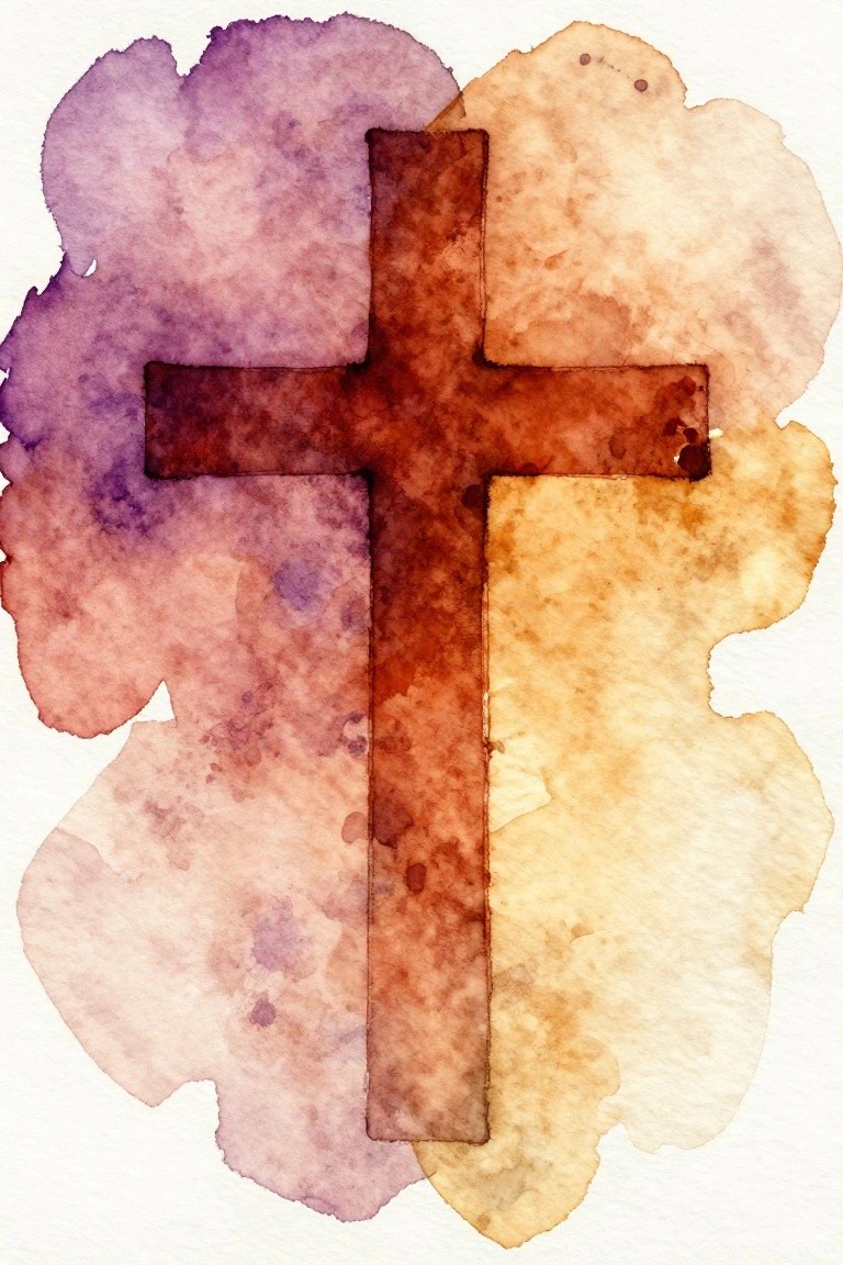
A centered cross in deep brown sits over loose watercolor washes that blend purple, rust, and pale yellow into irregular shapes. The painting idea uses a single bold shape against a minimal background so the cross stays the focus while the soft edges add some movement. This approach works well for decorative cross art because the colors stay muted and the layout stays simple.
The composition does a lot of the work here since the washes naturally frame the cross without extra elements. You can swap the purple for gray or the yellow for a soft green to match different rooms. For canvas, lay down the background first and let it dry completely before painting the cross so the edges stay sharp. This style also translates easily to smaller paper sizes if you want quick practice pieces.
Outlined Cross on Soft Green Background
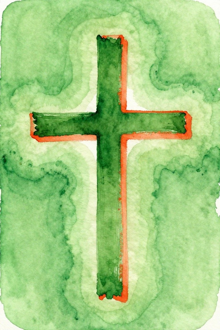
A deep green cross with a bright orange border stands out through simple contrast against a loose wash of lighter greens. The background uses soft, blended shapes rather than sharp details, which keeps the whole piece minimal and modern. This style fits decorative art because the limited palette and centered layout rely on clean shapes instead of complex rendering.
The composition does a lot of the work here by letting the bold outline carry the visual weight without extra elements. You could adapt the same idea by changing the border color to match a room’s accent tones or scaling it down for a series of small canvases. For wall art, something like this works especially well because the high contrast makes it readable from a distance even in a clean, uncluttered space.
Watercolor Asterisk Cross with Orange and Blue
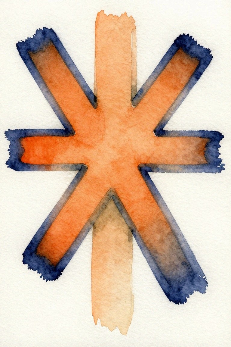
A multi-armed cross shape painted in loose watercolor strokes gives a clean geometric look that still feels handmade. Broad orange fills run through each arm while a darker blue border adds contrast and keeps the edges soft. This style works as abstract decorative art because the simple layout and limited palette let the form stand out on its own.
The composition does a lot of the work here since the repeating arms create balance without extra elements. You can swap the orange for any single color or keep the blue border while changing the background to match a room. For wall art, something like this fits minimalist spaces well and can be scaled up or down depending on canvas size. The same idea also adapts easily if you want to try it in acrylic or with a finer brush for sharper lines.
Minimal Watercolor Cross with Blended Tones
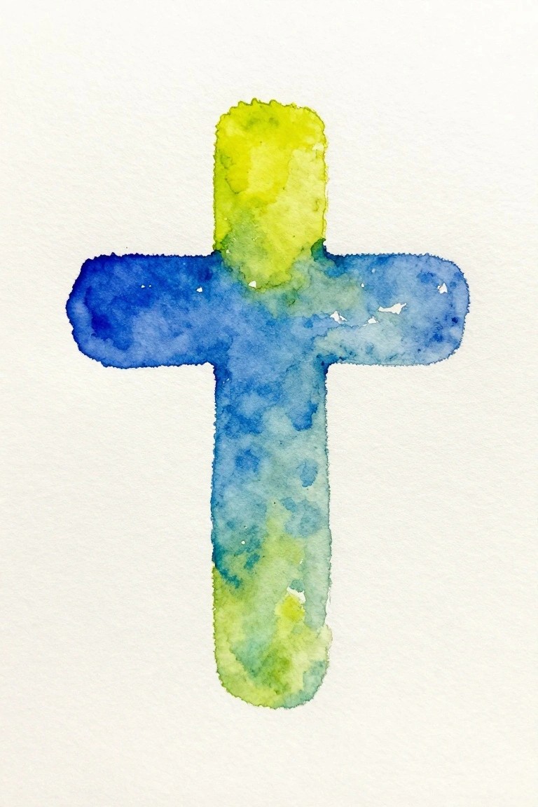
A cross painted with loose watercolor washes creates a clean modern piece through simple color transitions. The vertical bar starts with a bright yellow at the top and shifts into blue across the arms before moving into green toward the bottom. This approach keeps the focus on the shape while letting the paint do the work of adding variation.
What makes this idea useful is how the overlapping washes create depth without extra steps. You can swap in different color pairs to match a room or try the same layout on canvas instead of paper. The basic cross shape also works as a base for testing new paper types or adding a second thin layer in spots that need more contrast. For wall art, something like this stays easy to frame and keeps the look uncluttered.
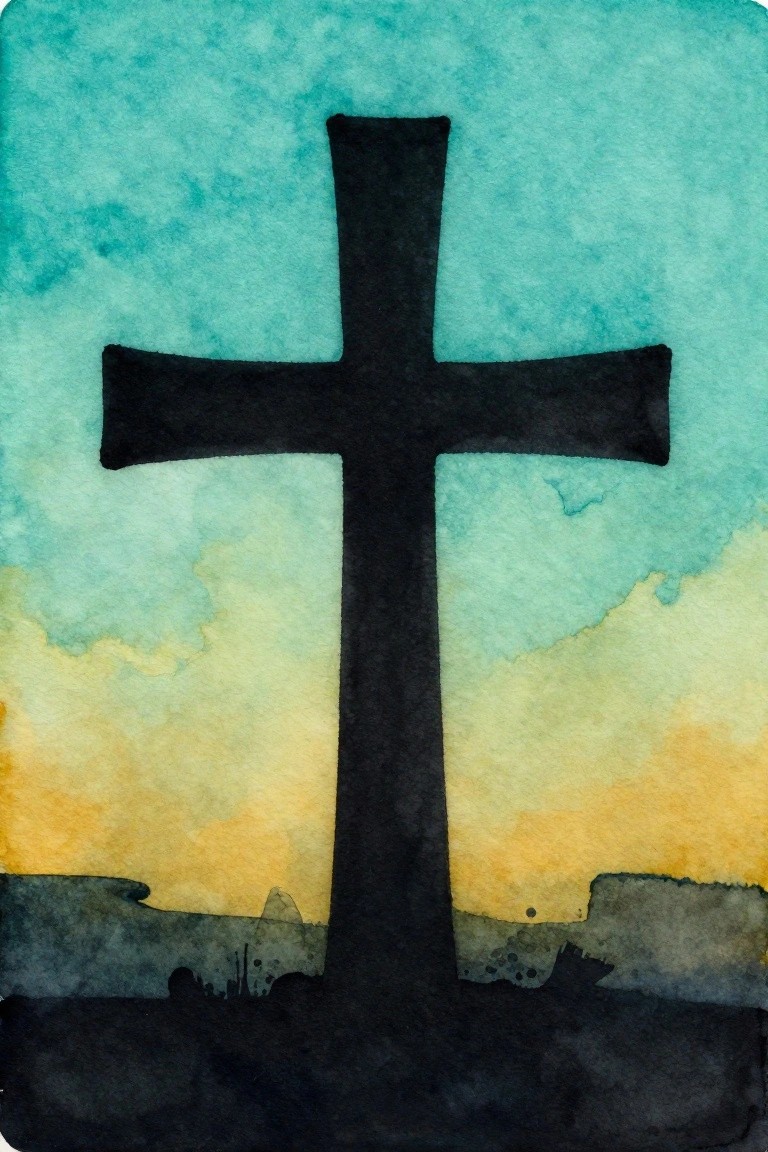
Lone Cross in a Gradient Landscape

A single cross placed centrally against a simple sky-to-ground gradient creates a strong minimalist composition that relies on shape and contrast rather than detail. The vertical line of the cross cuts through the horizontal layers of blue above and warm earth tones below, giving the piece clear structure and balance. This approach fits the landscape category but keeps everything reduced to basic blocks of color and texture.
The composition does a lot of the work here by using just one main element and a limited palette. You can adapt it easily by swapping the blue for another sky color or adjusting the ground to match your room’s tones. For wall art this works well because the clean layout translates directly to canvas without needing advanced techniques. The same idea could be simplified further by removing the ground texture if you want an even bolder look.
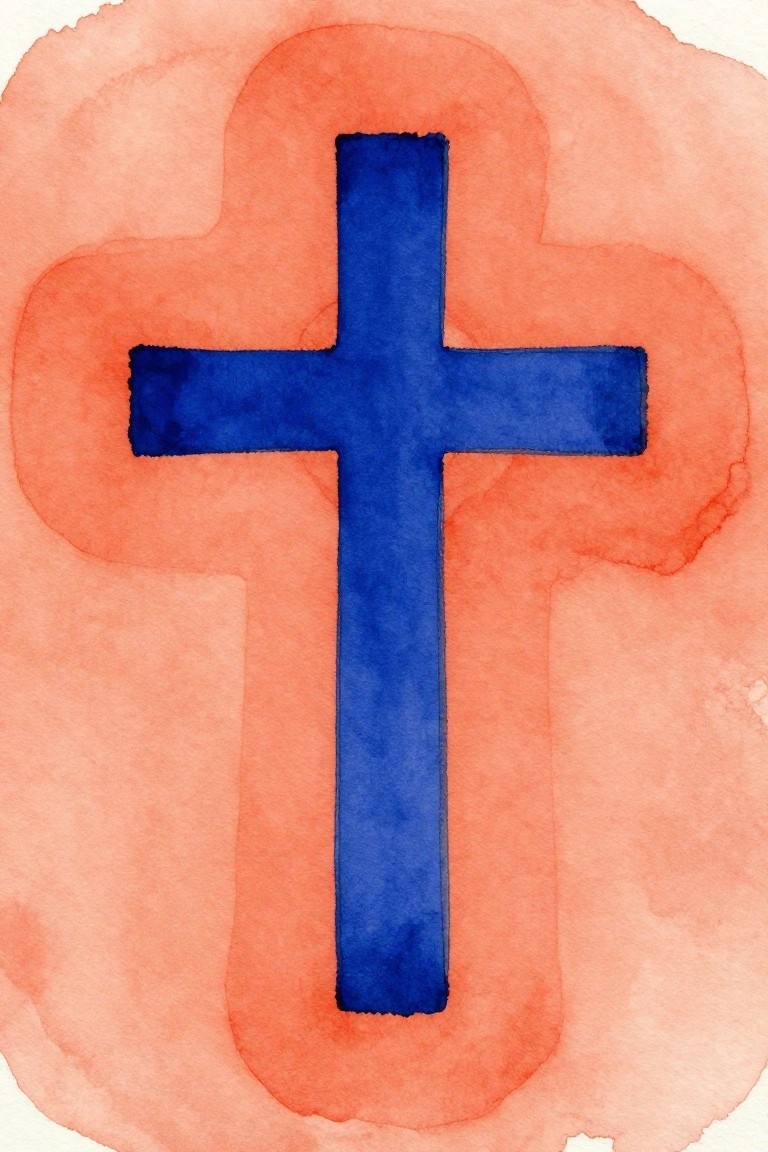
Pink Watercolor Wash Behind a Simple Black Cross
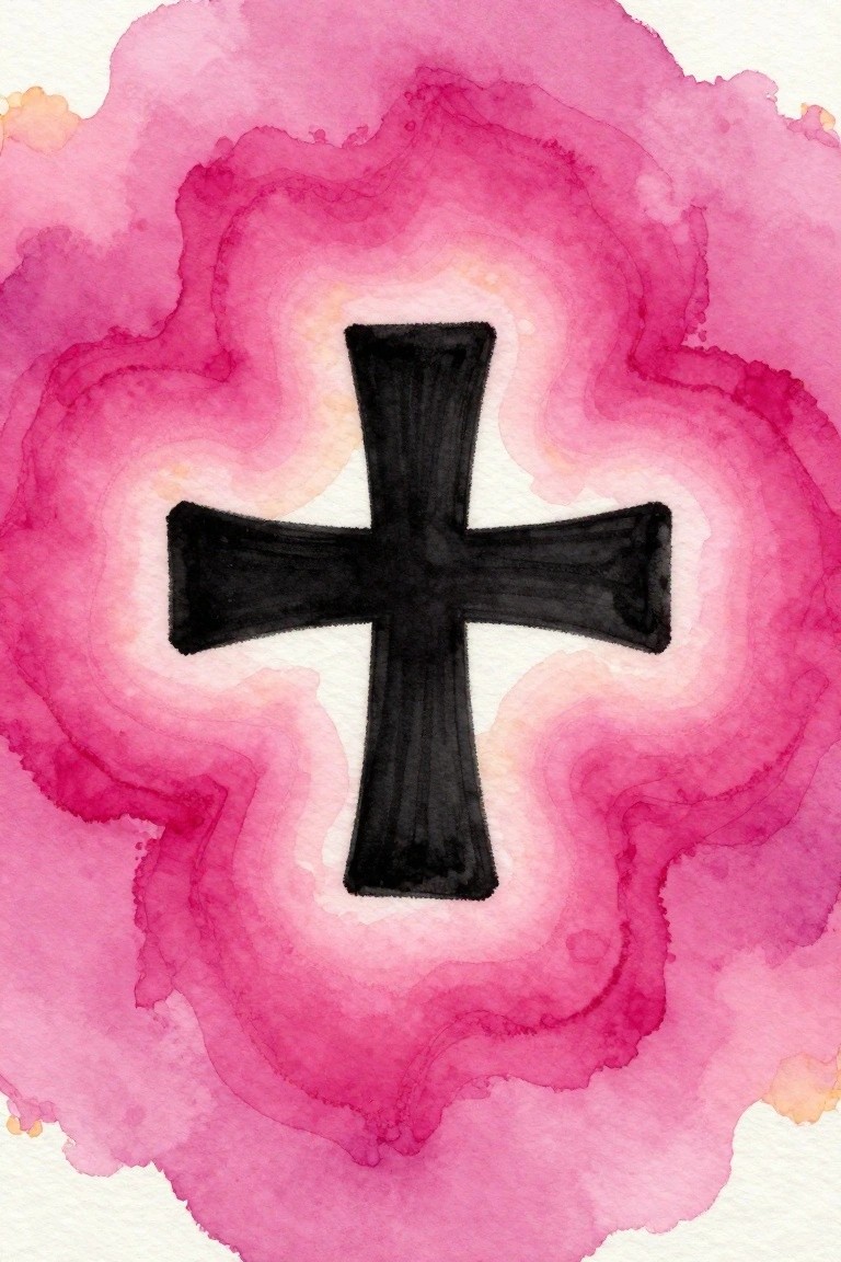
A bold black cross placed dead center over layered pink watercolor washes creates a clean focal point through strong contrast. The background uses soft, overlapping rings of magenta and lighter pink to frame the cross without competing with it. This setup keeps the idea minimal while letting the shape carry the composition in a decorative style.
The composition does a lot of the work here by using a large centered shape against a loose background so the cross stays readable at any size. You can swap the pink tones for other soft washes or adjust the cross thickness to match different canvas sizes. For wall art this kind of piece works well because the simple layout translates easily to prints or quick canvas versions without needing extra elements.
Watercolor Cross with Split Coral and Teal Background
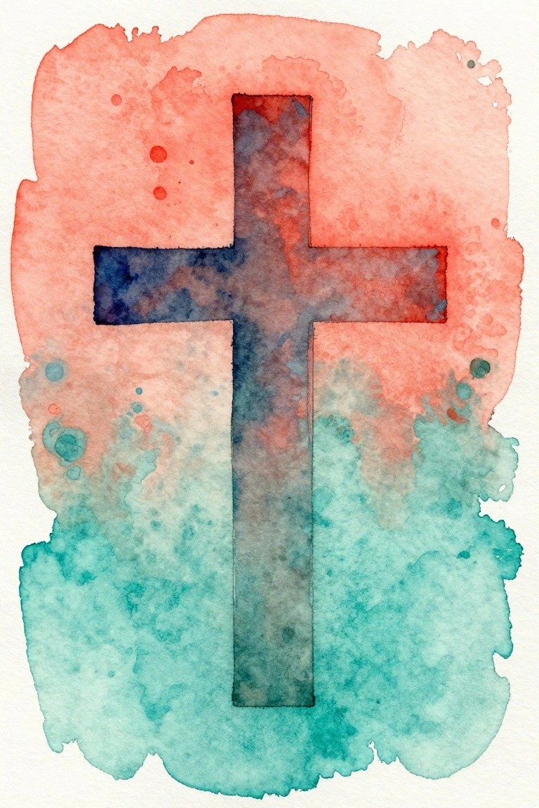
A single cross in dark blended tones sits centered over a background split between a warm coral wash above and a cool teal wash below. The idea relies on simple color blocking and soft edge bleeding to make the cross shape pop without any extra detail or outlines. It falls into the decorative art category where the focus stays on bold form and limited color contrast.
The composition does a lot of the work here because the cross lines create instant structure against the loose background. You can swap the coral and teal for any two colors that fit your space or try the same layout with acrylics if you want sharper edges. This style works especially well for quick canvas pieces since the main shape stays readable even with uneven washes.
Green Cross with Warm Border Layers
A minimal cross painted in deep green uses a soft orange border to create separation from the pale green background wash. The idea relies on overlapping color layers and loose edges rather than precise lines, which keeps the overall design clean and modern. This fits decorative art and works on canvas because the limited palette and simple shape avoid clutter while still giving the cross clear presence.
The composition does a lot of the work here since the strong central shape holds attention even with soft brushwork. You can adapt the colors by changing the border to a cool gray or the fill to navy blue to match different wall tones. For practice this subject is useful because it lets you focus on layering and edge control without needing many details, and the same layout scales easily to larger canvases for wall pieces.
Rainbow Arc with Gradient Lip Silhouettes
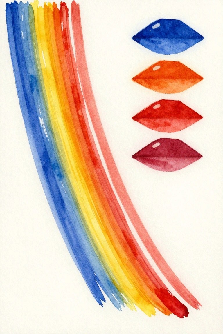
A minimal abstract idea that pairs a broad, curved rainbow stroke with a column of four simplified lip shapes in matching color order. The composition works because the vertical stack of forms creates balance against the sweeping arc, while the shared color progression ties both sides together without extra detail. It falls into decorative abstract art where flat shapes and spectrum washes keep the look clean and modern.
What makes this idea useful is how the lip shapes can be swapped for other simple outlines like leaves or ovals while keeping the same color flow. The rainbow stroke can be widened or shortened to fit different canvas sizes, and reducing the number of forms makes it even quicker to paint. For wall art, something like this stands out on Pinterest because the bold color blocks read clearly from a distance.
Bold Teal Cross on Solid Orange Background
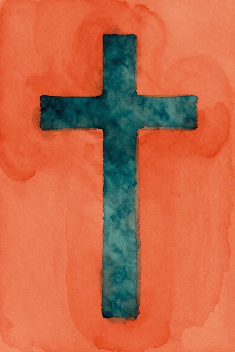
A single centered cross painted in textured teal creates the main focus against a flat warm orange wash. The idea uses strong color contrast and an uncluttered layout to keep the composition minimal and modern. It falls into decorative art that relies on simple shapes and bold blocks of color rather than fine detail.
What makes this idea useful is how the large shape and limited palette let you finish the piece quickly on any canvas size. Swap the teal for navy or black and adjust the background to a softer tone if you want it to match different spaces. The approach also works as an easy base for testing different wash techniques or trying the same cross in acrylic for a flatter finish.
Frequently Asked Questions
What materials work best for creating these minimal cross designs on canvas? Use stretched cotton or linen canvas in sizes like 12 by 16 inches or larger for a balanced modern scale. Acrylic paints in matte finishes, painter’s tape for crisp lines, and fine brushes or rollers help achieve clean edges on the crosses. Start with a neutral base coat such as white or soft gray, then add thin intersecting lines in black or muted tones to keep the look simple and uncluttered.
How do I select colors that maintain a clean modern aesthetic across the 24 ideas? Stick to a limited palette of two or three shades maximum, focusing on neutrals like beige, charcoal, and off white. Avoid bright hues unless used sparingly as accents on one or two pieces. Test colors on small canvas scraps first to ensure they blend seamlessly with your room’s existing furniture and walls.
Where should I place these cross canvas pieces for the greatest visual impact? Hang them at eye level in entryways, above sofas, or in home offices where they can serve as subtle focal points without overwhelming the space. Group three to five pieces in a loose grid formation on a single wall to create rhythm while preserving the minimalist feel. Leave ample white space around each canvas to enhance the clean lines.
Can these designs be scaled or customized for smaller rooms or apartments? Yes, reduce the canvas size to 8 by 10 inches or use stretched paper alternatives for tighter spaces. Simplify the cross patterns by using fewer intersecting lines or thinner strokes. This keeps the modern look intact while fitting the proportions of compact areas like bedrooms or hallways.
What steps help avoid common errors when executing these ideas? Measure and mark the center of the canvas before drawing crosses to ensure symmetry. Allow each paint layer to dry fully before adding the next to prevent smudging. View the finished piece from a distance during creation to confirm it reads as minimalist rather than busy.