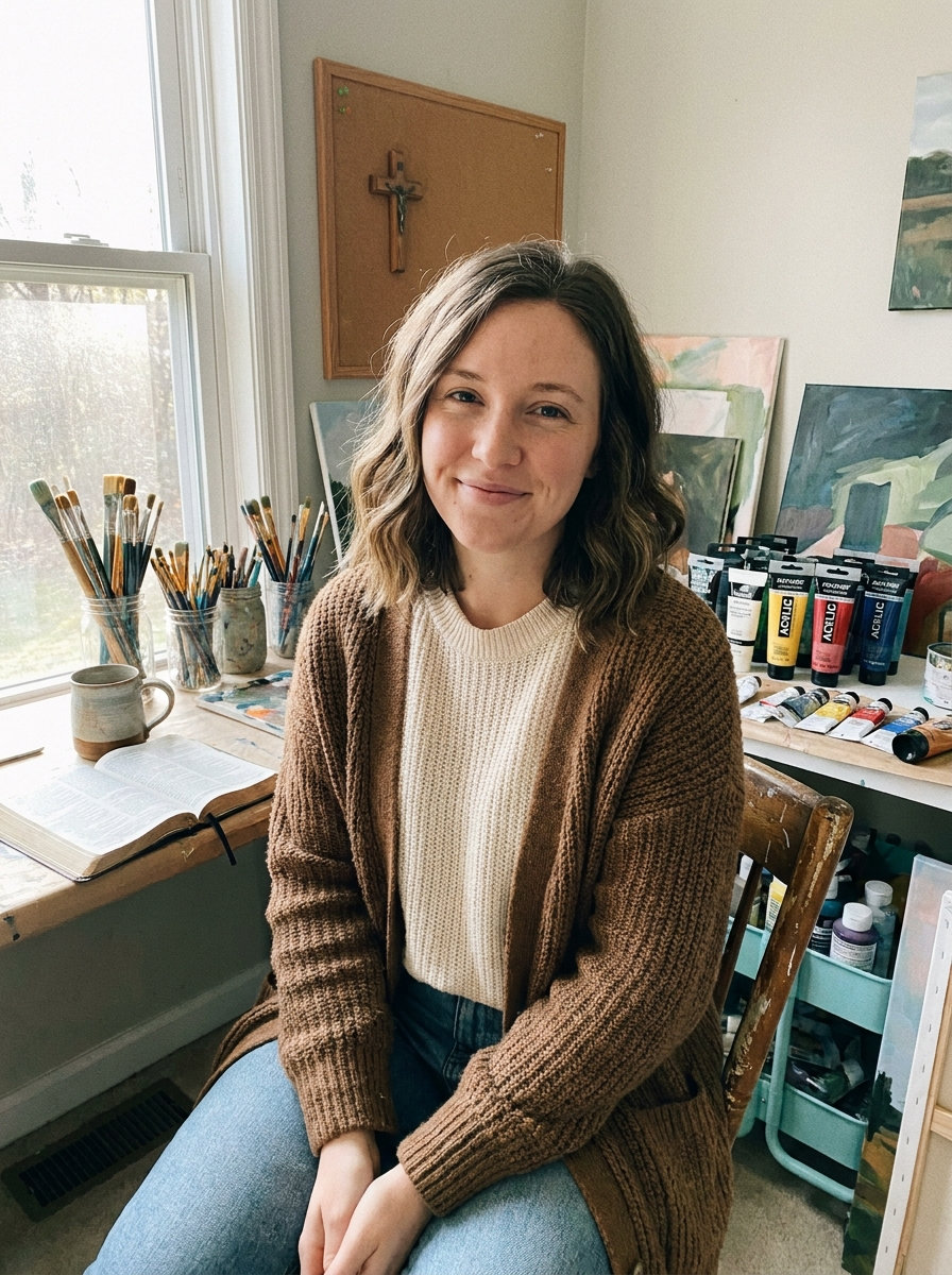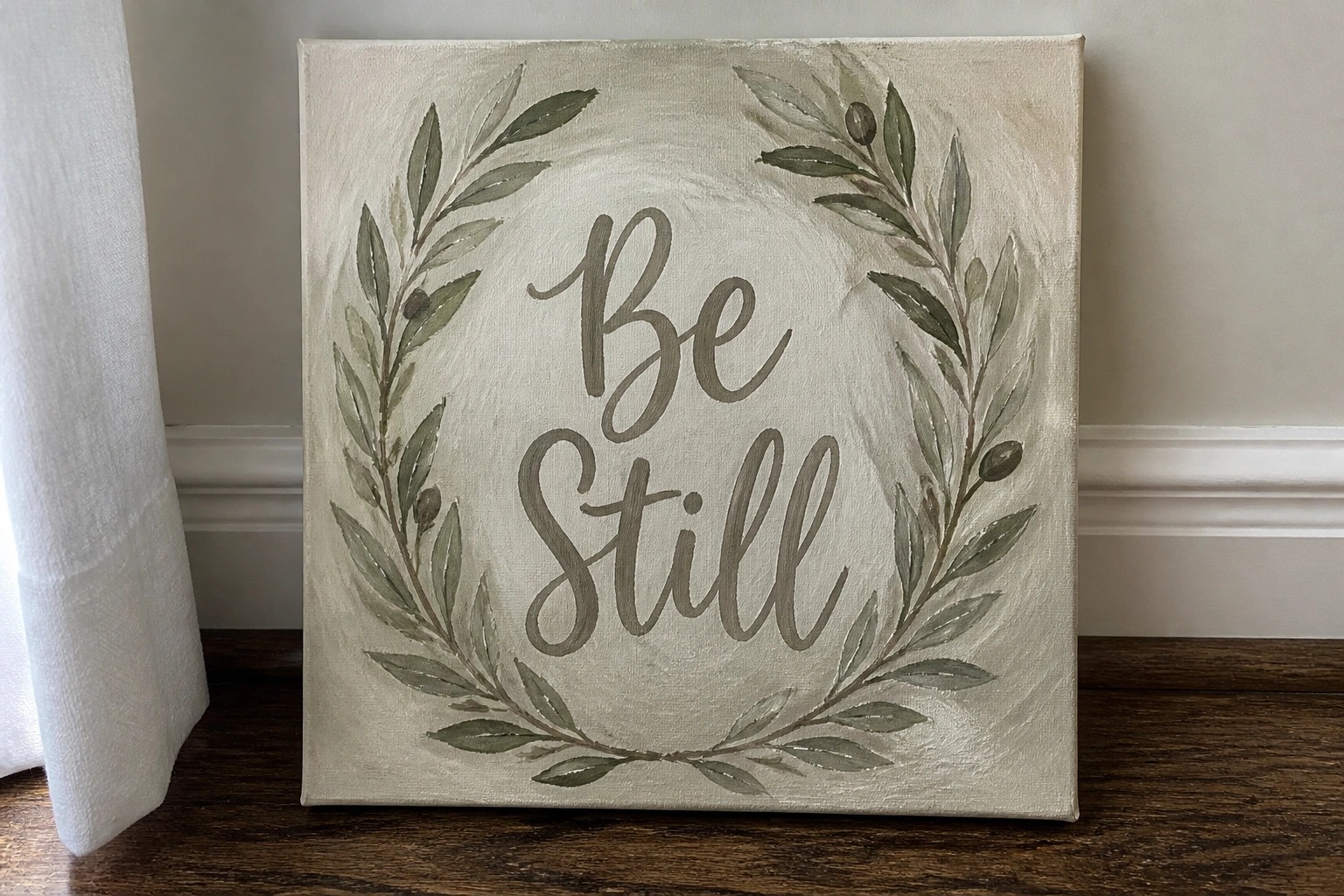
I have been painting scripture on canvas for a while now and I like how it adds a calm touch to a room.
Soft neutrals are my go to colors for these pieces since they blend easily with most rooms.
I have put together some ideas based on what I have painted myself over time.
These designs stay simple and focus on the words without too much extra detail.
Maybe one of them will inspire something you want to try.
Be Still Leaf Wreath Canvas
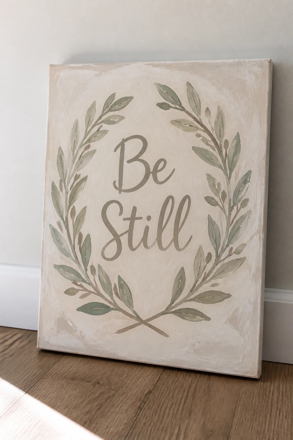
A simple canvas idea pairs the phrase “Be Still” with a loose wreath of painted leaves that frame the words in a circle. The leaves use soft green and brown tones with visible brush strokes, and the stems cross at the bottom to close the shape. The neutral background keeps the focus on the text and foliage without extra layers or details.
The composition does a lot of the work here by letting the wreath guide attention straight to the lettering. You can swap in different leaf shapes or adjust the green tones to match your wall colors, and the crossed stems at the bottom make the design feel complete without extra planning. For wall art, this style works well because it stays readable even when scaled down for smaller canvases or printed versions.
Psalm 23 with Eucalyptus Leaves in Neutral Watercolor
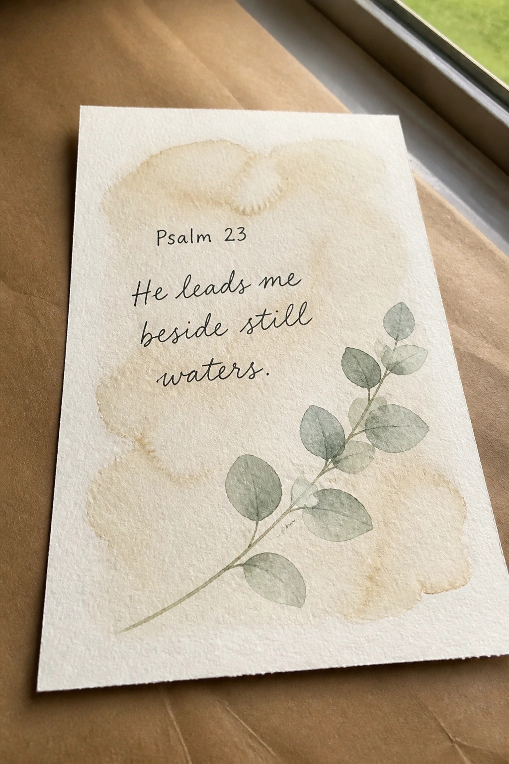
A scripture canvas idea that places the verse from Psalm 23 on the left side of the surface with a single eucalyptus branch painted in muted greens on the right. Soft beige watercolor washes create a gentle background layer without competing with the text or the leaves. The layout works because the text and botanical element are spaced apart, keeping the overall design balanced and easy to read.
What makes this idea useful is how the limited color range and simple leaf shapes let you focus on lettering practice while still producing a finished piece. You could swap the eucalyptus for another plant, change the verse length, or enlarge the canvas without needing new colors. For wall art this keeps the neutral aesthetic intact while giving the text room to stand out.
Faith Word Art with a Small Cross Accent
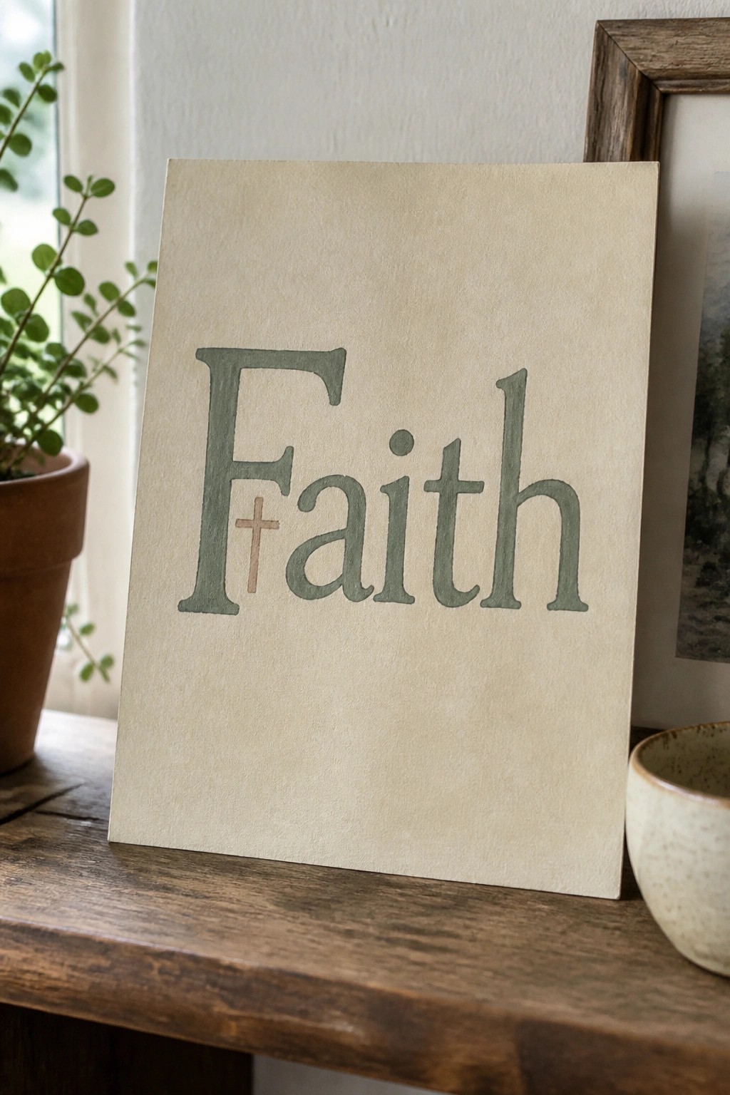
A single-word canvas with “Faith” painted in large, soft green lettering creates a clean scripture piece that fits a neutral palette. The capital F holds a small cross in a muted brown tone tucked near its base, which adds a simple visual break without splitting the word. This layout works because the text stays centered on a plain cream background and the colors stay close in tone.
What makes this idea useful is how the cross placement keeps the focus on the lettering while still adding meaning. You can easily change the green to match your wall or room accents, or try a different neutral shade for the background. For wall art, something like this works well because it reads clearly from a distance and does not require extra details. The same approach adapts quickly to other short words by keeping the cross small and using the same font weight.
Layered Mountain Ranges with Scripture Text

A landscape painting idea built from stacked horizontal bands of mountains in muted grays, dusty pinks, and soft creams. The simple circular sun sits high in a pale sky while a narrow strip of trees runs across the base, leaving plenty of negative space for the centered scripture quote. This approach keeps the focus on clean shapes and gentle color shifts rather than fine detail.
The composition does a lot of the work here because the overlapping layers create depth without needing complex brushwork. You can easily change the mountain colors to match a specific room or swap the verse for another short passage. For wall art, something like this scales well to larger canvases while staying simple enough to finish in a few sessions.
Blended Neutrals Behind a Single Scripted Word
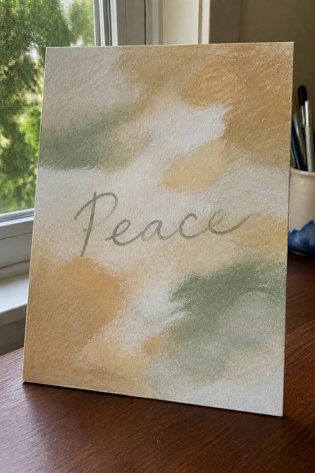
A simple painting idea that uses overlapping washes of beige, cream, and soft green to build a textured neutral background, then layers the word peace in muted green cursive across the center. The loose brushwork keeps the colors light and blended so the text remains the clear focal point without needing sharp edges or extra details. This approach works as decorative text art where the background supports rather than distracts.
The color palette makes this easy to adapt by swapping in different neutral tones or adjusting the word size to fit various canvas dimensions. You can keep the same wash technique but change the lettering style or add a second thin layer of color for more depth if needed. For wall pieces in a soft neutral aesthetic, the minimal layout helps the finished canvas pair with other decor without competing for attention.
Split Scripture Triptych with Neutral Abstract Circles
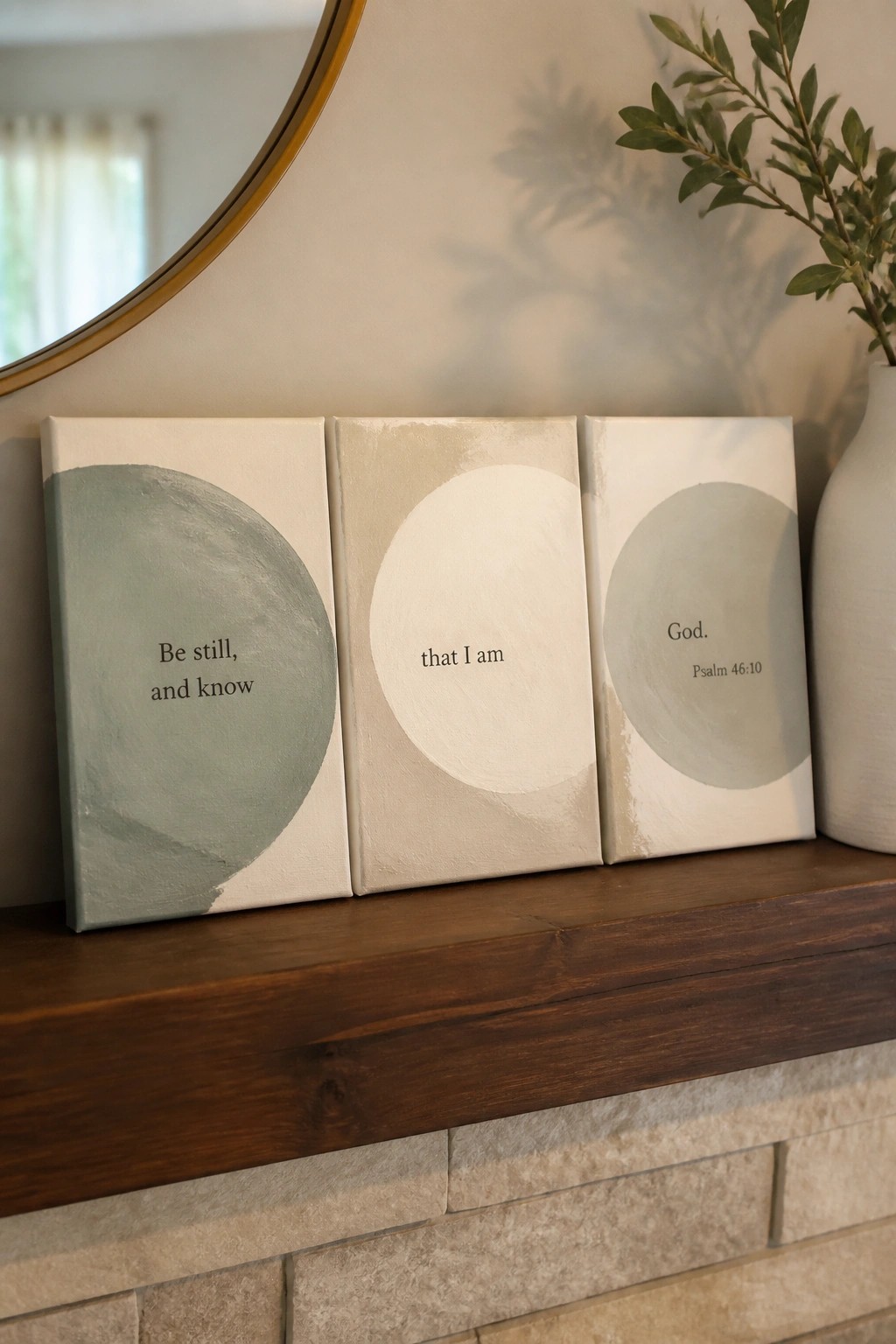
This painting idea divides Psalm 46:10 across three canvases, with each panel carrying one phrase of the verse alongside a large painted circle in muted sage or warm beige. The circles sit off-center and vary slightly in tone and placement so the set reads as connected when the panels hang together. The off-white backgrounds and simple text keep the focus on the words while the shapes provide quiet structure.
What makes this idea useful is how the circle shapes let you change scale or color without redesigning the whole piece. You could paint the panels one at a time and rearrange them later, or shrink the format to two canvases if space is limited. The layout stays easy to read on a wall and works for anyone who wants scripture art without adding extra detail or busy patterns.
Soft Green Wreath Around Scripture Text

A wreath built from watercolor leaves and small branches creates a circular frame that holds the words “Be Still and Know” in the center. This decorative art idea works by letting the foliage vary in size and tone so the eye moves naturally around the text without crowding it. The muted greens and browns keep the whole piece light and balanced on a plain background.
What makes this idea useful is how the wreath layout handles the spacing for you so the text stays readable. The color palette makes this easy to adapt by swapping in similar soft neutrals or changing the canvas size for different wall spots. For practice, this kind of subject lets you focus on loose leaf shapes instead of perfect detail, and you can simplify the branches if the full version feels too involved.
Centered Scripture with Corner Floral Accent
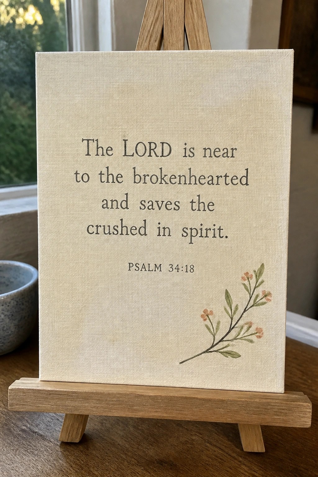
A scripture canvas idea like this places the full verse in the middle of a light neutral background with a single small branch illustration positioned in the lower corner. The layout works because the text takes up most of the space while the floral element stays small enough to act as quiet detail rather than a main feature. This style falls into decorative text art and pairs cleanly with soft neutral room aesthetics.
What makes this idea useful is how easily the same structure can be used with any short verse by simply changing the wording and keeping the branch size consistent. The wide empty space around the text makes it forgiving for hand lettering practice and lets you scale the canvas up or down without needing more elements. For wall pieces, the limited palette and single motif keep it from feeling busy next to other decor.
Layered Collage Canvas with Central Scripture Quote
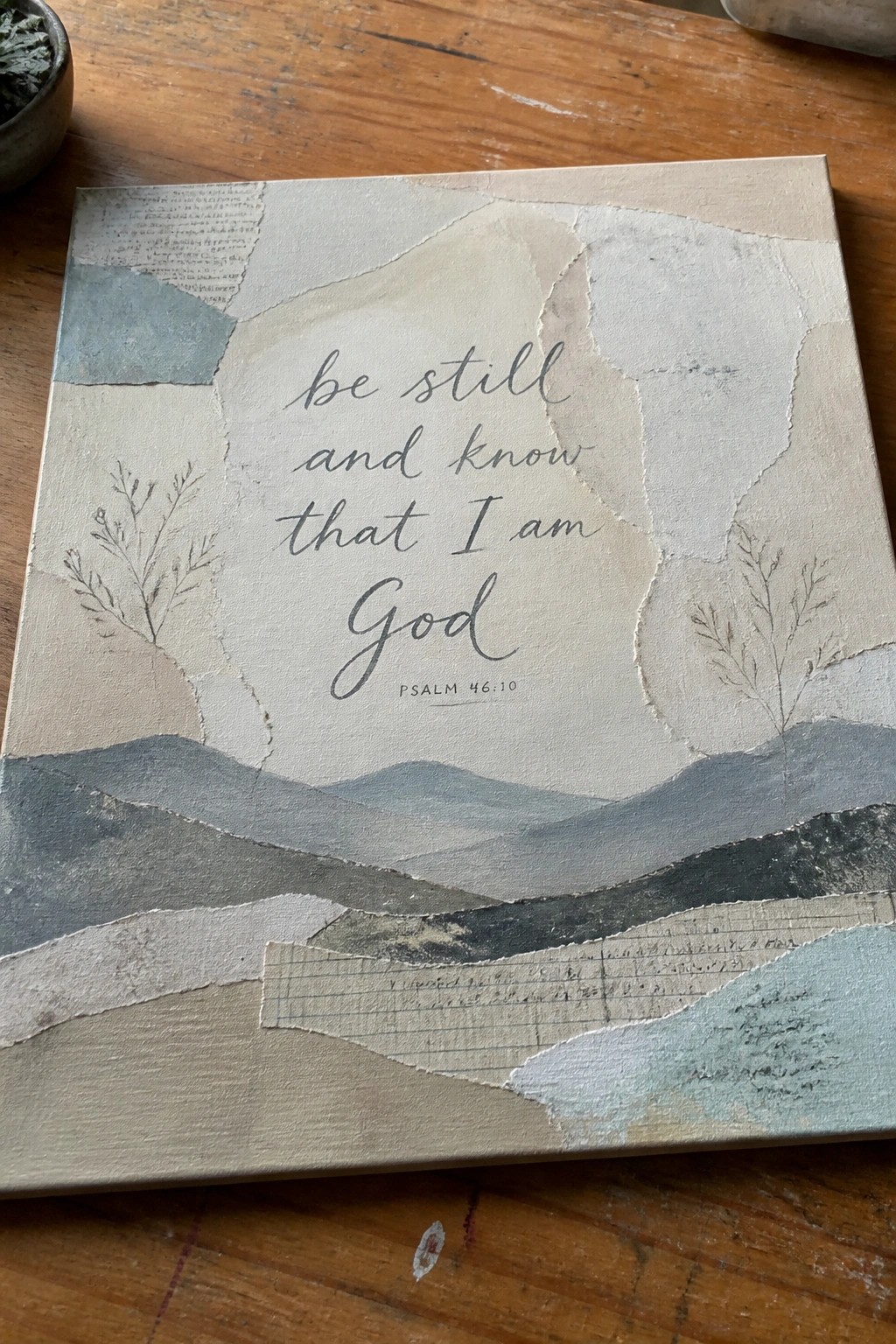
This painting idea uses torn paper layers in soft beige, gray, and muted blue tones to build a simple landscape of hills and plant silhouettes around a scripture quote. The text sits centered on the canvas with the layered pieces creating depth through overlapping edges and varied textures. It falls into the category of decorative scripture art that combines collage elements with typography on a neutral background.
What makes this idea useful is the way the torn paper shapes guide the eye toward the quote without needing precise drawing skills. The color palette makes this easy to adapt by swapping in papers that match your existing wall tones or room decor. For wall art, something like this works especially well because the composition stays balanced even if the paper placement shifts slightly. You could simplify it further by using fewer layers or scale it down for smaller canvases.
Neutral Coastal Path Landscape with Scripture
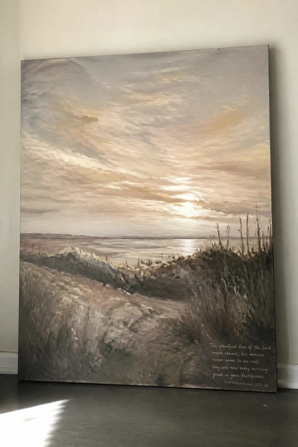
A landscape painting idea built around a winding path through low dunes that leads the eye out to a calm stretch of water under a softly blended sky. The muted palette of grays, taupes, and warm sky tones keeps the focus on the simple horizon line and the gentle slope of the path. Scripture text sits in the lower right, sized and positioned to sit within the scene instead of competing with it.
The composition does a lot of the work here because the path creates a clear focal line without needing extra detail. You can scale the same layout to a smaller canvas by reducing the number of foreground strokes or shift the sky tones cooler if you want a different neutral feel. This kind of piece works well as wall art because the text integrates naturally and the overall softness matches a calm room without demanding attention.
Cross on a Hill with Psalm Verse
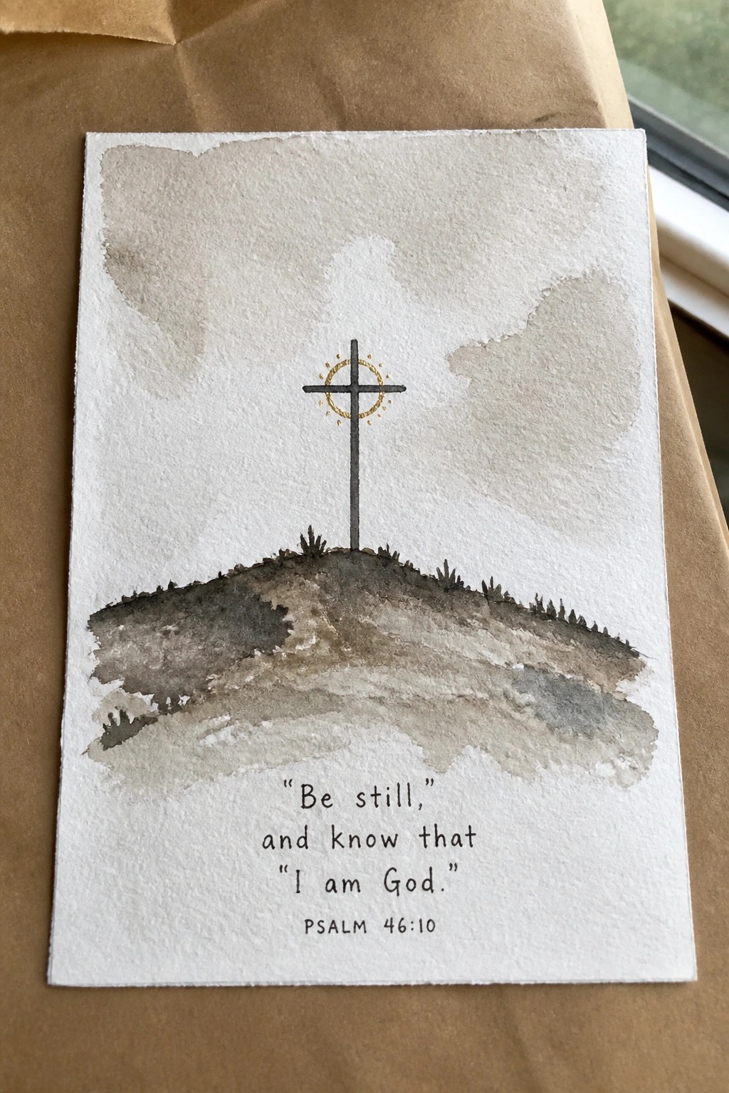
A landscape painting idea that centers a single cross above a low hill works well for scripture canvas art. The cross uses a thin vertical form with a small gold accent ring, while the hill is built from overlapping brown and gray washes that suggest simple layers of ground. A soft neutral sky area above leaves clear space for the verse text at the bottom in plain lettering.
The composition does a lot of the work here because the broad sky and hill washes are quick to block in and leave the cross as the main focal point. You can change the verse wording or shift the hill height to fit different canvas sizes without breaking the balance. For a soft neutral aesthetic the muted palette makes it easy to match existing wall tones or pair with other scripture pieces.
Grace Scripture with a Tied Bouquet
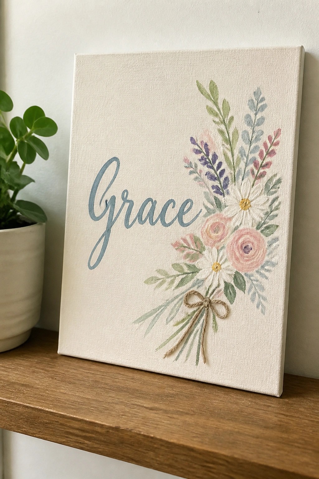
Pairing a single scripture word with a small mixed bouquet gives the canvas a clear focal point without filling every inch. The lettering sits on the left while the flowers and leaves angle down from the right, creating balance through uneven spacing rather than symmetry. A simple twine bow at the bottom finishes the arrangement and keeps the eye moving across the full piece.
What makes this idea useful is how the loose flower shapes leave room for variation in size and type. You could swap in different blooms or change the bow color to match a new room. The soft palette stays easy to adapt across multiple canvases if you want a matching set.
Scripture Text Over a Sunset Meadow Landscape
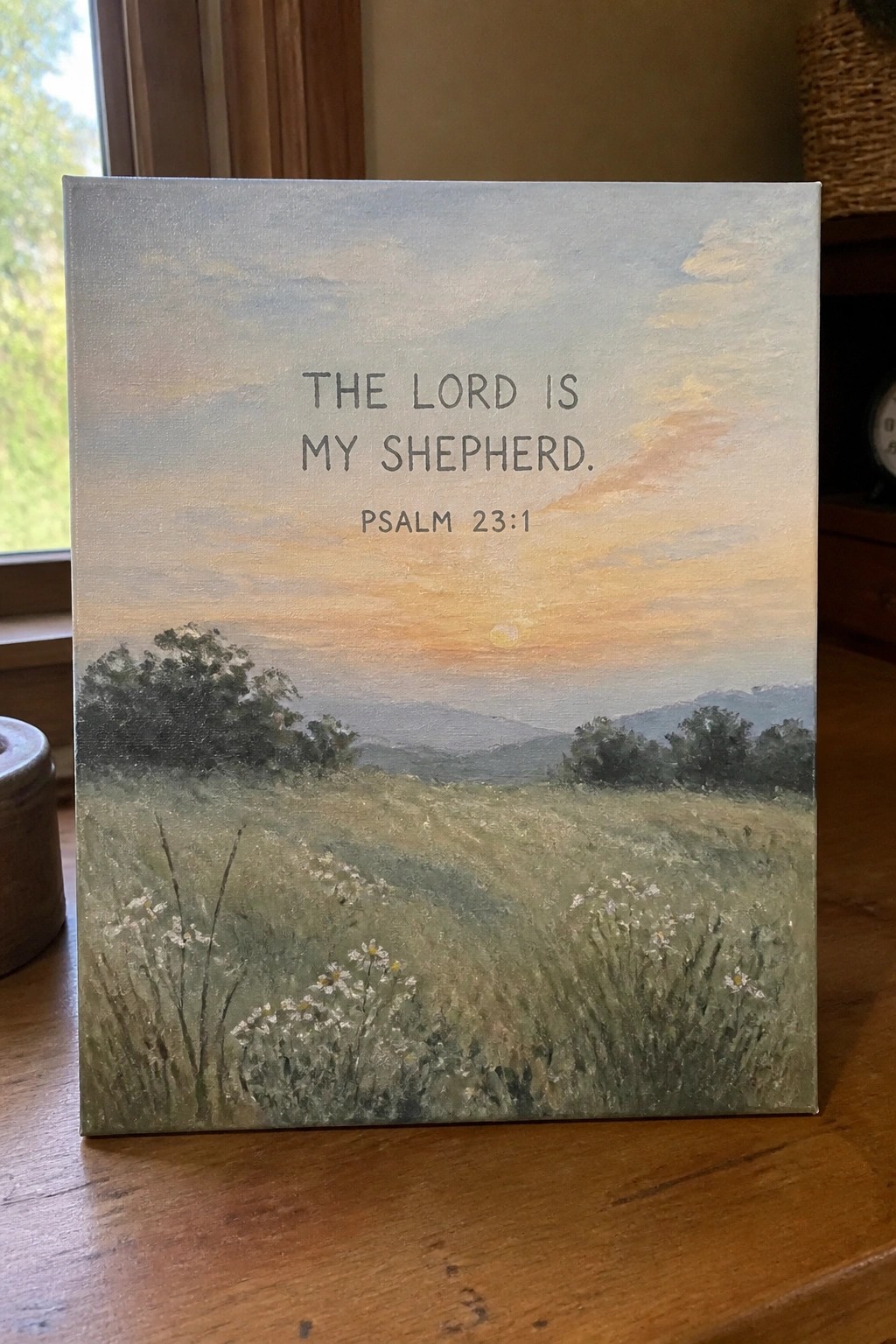
A scripture canvas works well when the landscape stays soft and low in detail so the text remains the main focus. This idea uses a simple horizon split with the sky taking up the upper half and the field filling the lower half, letting the warm gradient and muted greens support the centered verse without competing. The brushwork stays loose in the distance and slightly more defined in the foreground flowers, which helps the composition feel balanced on a rectangular canvas.
The composition does a lot of the work here because the open sky gives plenty of negative space for the lettering to sit clearly. You can easily change the flower shapes or shift the sky colors toward cooler tones if you want a different season while keeping the same layout and text placement. For wall art in a neutral room, this kind of piece fits because the palette stays calm and the text adds the main point of interest without needing extra elements.
Dove Holding an Olive Branch
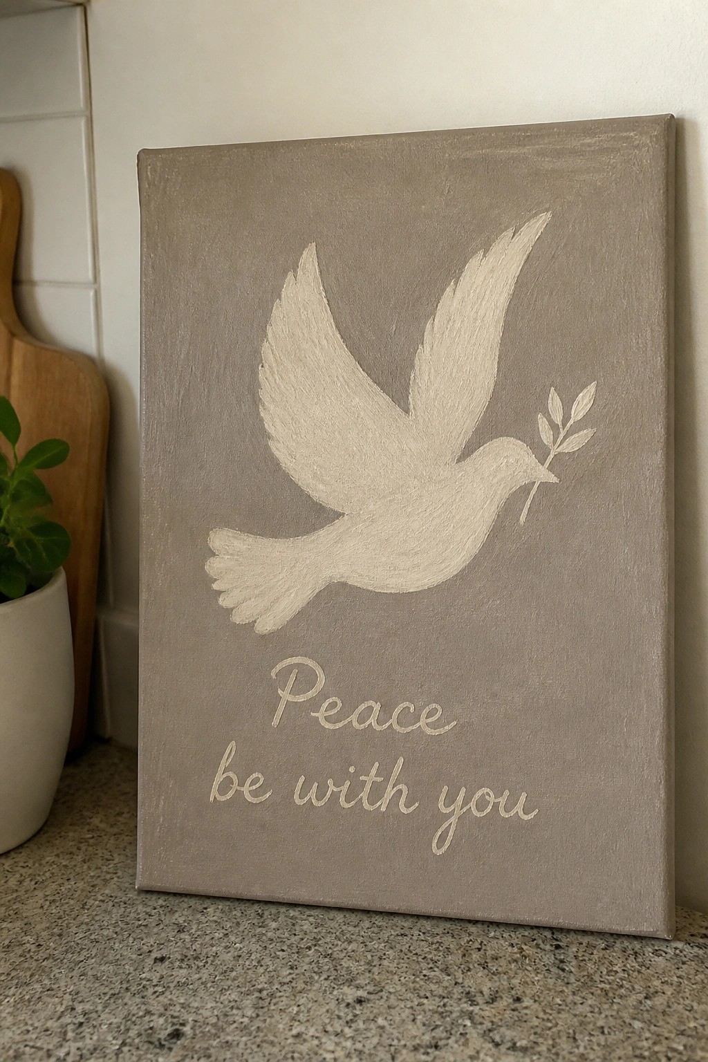
A dove carrying an olive branch placed above the phrase “Peace be with you” forms a straightforward decorative canvas idea. The bird is painted in a single light shade with basic wing and tail shapes, while the text sits centered underneath in a loose script. This approach keeps the piece in the animal and lettering category, using a muted background to let the main elements stand out without extra layers.
The composition does a lot of the work here because the centered layout and open space around the dove make it easy to resize for different canvas dimensions. You can swap the background tone or shorten the text to another short phrase while keeping the same bird shape. For neutral wall pieces, this style adapts quickly to other soft color pairings and works as a quick project that still reads clearly from a distance.
Stacked Stones Scripture Painting
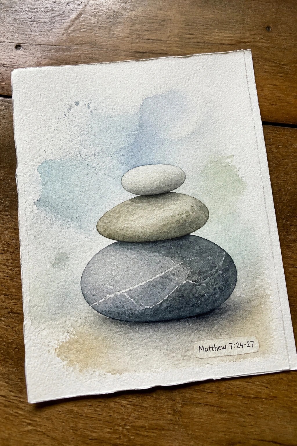
A still life of three balanced stones in soft grays and beiges creates a clean vertical focal point against a loose wash of muted blue and green. The idea centers on simple overlapping shapes with subtle texture shifts between each rock, keeping the composition minimal while the background stays light and unfussy. This approach fits decorative art that pairs easily with scripture references.
What makes this idea useful is how the stacking gives clear practice with light and shadow on rounded forms without requiring fine details. The neutral palette works on small or large canvases and can be adjusted by changing rock sizes or spacing to fit different wall spaces. For a quick variation, add or remove the small scripture tag and shift the background wash to match other pieces in a set.
Wheat Stalks Scripture Canvas

A simple botanical painting of upright wheat stalks in soft brown tones makes up the main subject, with a few small leaves scattered around them and a scripture quote placed in a reserved band at the bottom. This type of decorative scripture art uses minimal plant forms to frame text without overwhelming it. The staggered stalk heights and light negative space keep the layout balanced and easy to read from a distance.
What makes this idea useful is how the vertical arrangement fits standard canvas proportions and leaves room for the quote to stay prominent. The neutral palette can be adjusted by changing the wheat color or background shade to match other pieces in a room. You could simplify it further by using fewer stalks or personalize it by swapping the verse while keeping the same plant layout.
Neutral Blocks with Scripture Text

An abstract layout uses overlapping rectangles in soft earth tones to create a quiet backdrop for a centered scripture verse. The idea combines flat color fields with a few loose line elements on the sides to keep the focus on the words while adding subtle visual interest. This style fits the decorative art category and works through simple layering rather than detailed rendering.
The composition does a lot of the work here by letting large color areas carry the design so the text stays readable. This approach adapts easily to different canvas sizes or slight shifts in the neutral palette to match existing room colors. For wall pieces, the same block structure can hold other short verses without needing new sketches each time.
Leaf Wreath Frame Around Simple Typography
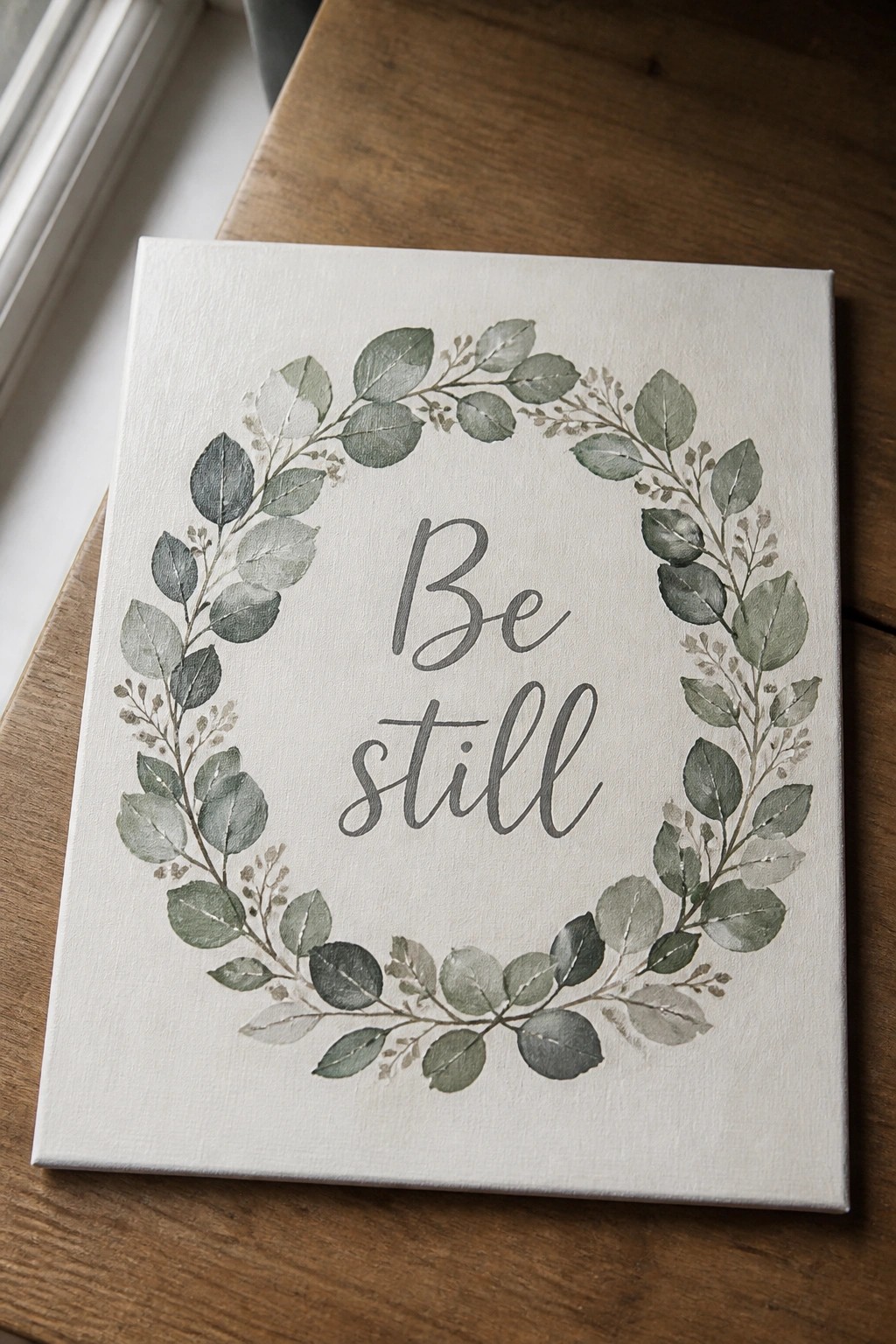
A wreath of layered green leaves and small branches forms a loose circle that frames the words “Be still” in the center. The leaves shift through different green tones with soft edges and some lighter highlights, keeping the overall layout balanced on a plain background. This decorative art idea pairs botanical shapes with centered text for a clean, readable result.
What makes this idea useful is how the circular layout does most of the visual work, so you only need to focus on even spacing around the text. You can swap in different leaf shapes or shift the greens to fit your wall colors, and the same structure works on smaller canvases or as a printable template. For practice, this kind of piece lets you test brush control on the leaves while keeping the text straightforward to paint or stencil.
Scripture Layered Over a Neutral Seascape
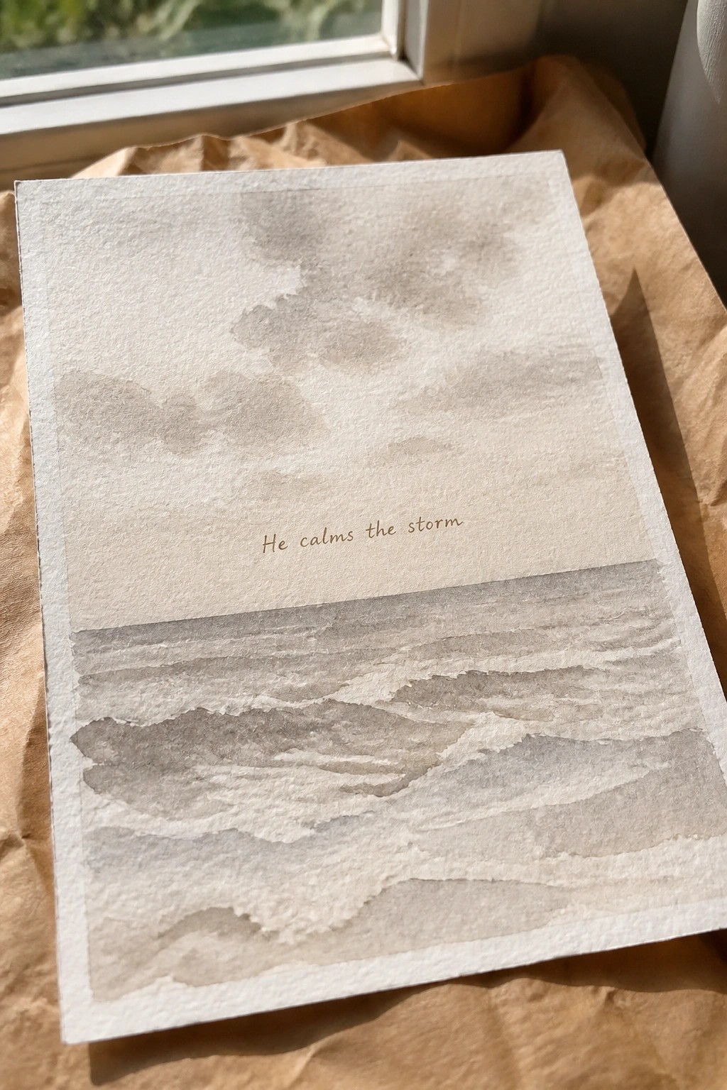
A seascape split into three horizontal bands makes a straightforward canvas idea for scripture text. Soft washes form the sky across the top third, the verse sits centered in the middle band, and the lower section builds up overlapping waves using the same muted gray-brown tones. The horizontal layout keeps the eye moving across the piece while the limited palette prevents the water from competing with the words.
The composition does a lot of the work here because the clear divisions leave an obvious spot for text without extra planning. You could simplify the waves to just a few loose strokes or enlarge the sky area if you want more breathing room around the scripture. This approach also translates well to different canvas sizes since the structure stays readable even when scaled down for a smaller wall or shelf piece.
Trio of Scripture Canvases with Hope Faith and Love

This painting idea uses three separate canvases to display the words hope, faith, and love in large script lettering, each paired with its matching Bible verse below. The backgrounds stay in soft neutral shades with one piece using a pale yellow wash and another a faint heart shape, while small leaf illustrations add light detail without crowding the text. The layout keeps the word dominant at the top, the verse smaller at the bottom, and the accent element tucked to one side so the pieces read clearly as a set.
What makes this idea useful is how the simple word-plus-verse format works on any size canvas and lets you swap verses without changing the overall structure. The neutral backgrounds make it easy to match existing decor or adjust the tint on one piece for variety while keeping the others plain. You could paint all three the same size for a balanced wall grouping or scale them down for a smaller space, and the minimal accents mean the focus stays on the lettering and text rather than extra elements.
Frequently Asked Questions
1. How do I choose scriptures that align with a soft neutral aesthetic? Focus on verses about peace, rest, and grace such as those from Psalms or Isaiah. Select short phrases that evoke calm and pair them with light beige, taupe, or off-white backgrounds. Test the text size and font on a digital mockup first to ensure the overall look stays gentle and uncluttered.
2. What materials work best for creating durable scripture canvas art at home? Use high-quality cotton canvas stretched over a wooden frame and archival-quality inks or acrylic paints in muted tones. Seal the finished piece with a matte varnish to protect against dust and fading. This approach keeps the art looking fresh for years while maintaining the soft neutral feel.
3. How can I arrange multiple scripture canvases in one room without overwhelming the space? Start with an odd number of pieces such as three or five and hang them at eye level with equal spacing between each. Choose varying sizes but keep the color palette consistent so the collection feels cohesive. Leave breathing room on the wall to preserve the peaceful, uncluttered aesthetic.
4. Where can I find affordable options if I prefer not to make the art myself? Search online marketplaces for neutral-toned prints that allow custom text additions. Many sellers offer canvas wraps in soft beige or gray shades at reasonable prices. Compare reviews for print quality and request samples if possible to confirm the colors match your existing decor.
5. How should I care for scripture canvas art to keep it looking its best over time? Dust the surface gently with a microfiber cloth every few weeks and avoid direct sunlight or high humidity areas. If the piece is in a kitchen or bathroom consider a protective glass cover. These simple steps help maintain the soft neutral tones and prevent any yellowing or damage.