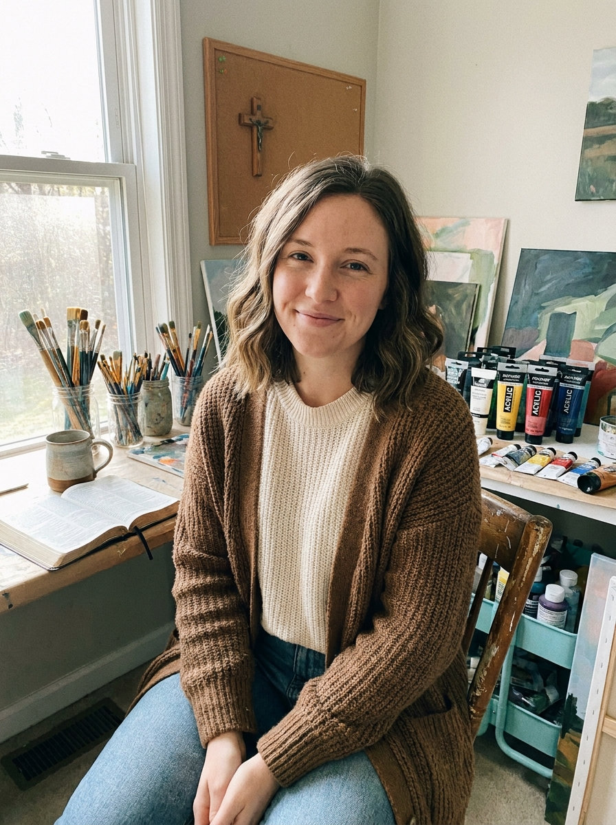
I put these tutorials together because I wanted simple ways to paint Christian themes without feeling lost with the brush.
Watercolor can take some practice and these ones break each project into clear steps that build as you go.
I have tried similar ideas in my own sketchbook and they helped me feel more sure of what I was doing.
Some focus on symbols like crosses or verses while others show gentle scenes that feel peaceful to work on.
You can pick what matches your style and go at your own pace.
Cross Silhouette in a Layered Sunset Landscape
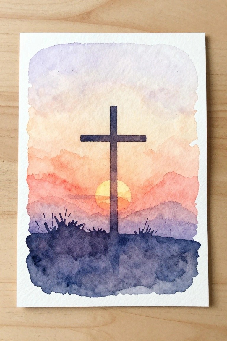
A centered cross serves as the main subject in this landscape idea, set against a gradient sky and overlapping hills with a low sun visible behind it. The composition relies on a vertical focal point balanced by horizontal bands of color that move from cooler tones at the top to warmer ones near the horizon. A dark foreground with simple grass marks anchors the scene and creates clear separation between the ground and sky.
What makes this idea useful is how the solid cross shape handles most of the structure, letting you practice sky washes and hill layering without complex details. The color transitions can be simplified to fewer bands or expanded with more hill rows depending on the paper size. This setup works especially well for wall pieces because the strong contrast between the dark cross and bright sky keeps the image readable even when printed small. For practice, you could swap the sunset for a sunrise palette or crop the foreground tighter to change the emphasis.
Open Book Lettering Still Life
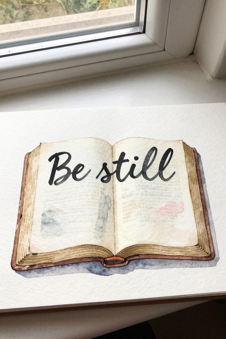
A still life centered on an open book lets you combine simple lettering with soft watercolor washes on the pages. The text sits large and centered to draw the eye, while the book’s edges and binding add structure without needing fine detail. Placing the book on a light surface near a window edge keeps the focus on the pages and gives the whole piece a clean, balanced layout that works well as wall art or a practice study.
What makes this idea useful is how easy it is to swap in any short phrase or verse while keeping the same book shape and muted page tones. You can adjust the size of the book or the amount of wash on the pages to match whatever paper you have on hand. For practice, this kind of subject builds comfort with both lettering and loose color without requiring complex backgrounds. It also pins well on Pinterest because the text is instantly readable and the layout stays simple.
Dove Holding an Olive Branch with Yellow Blooms
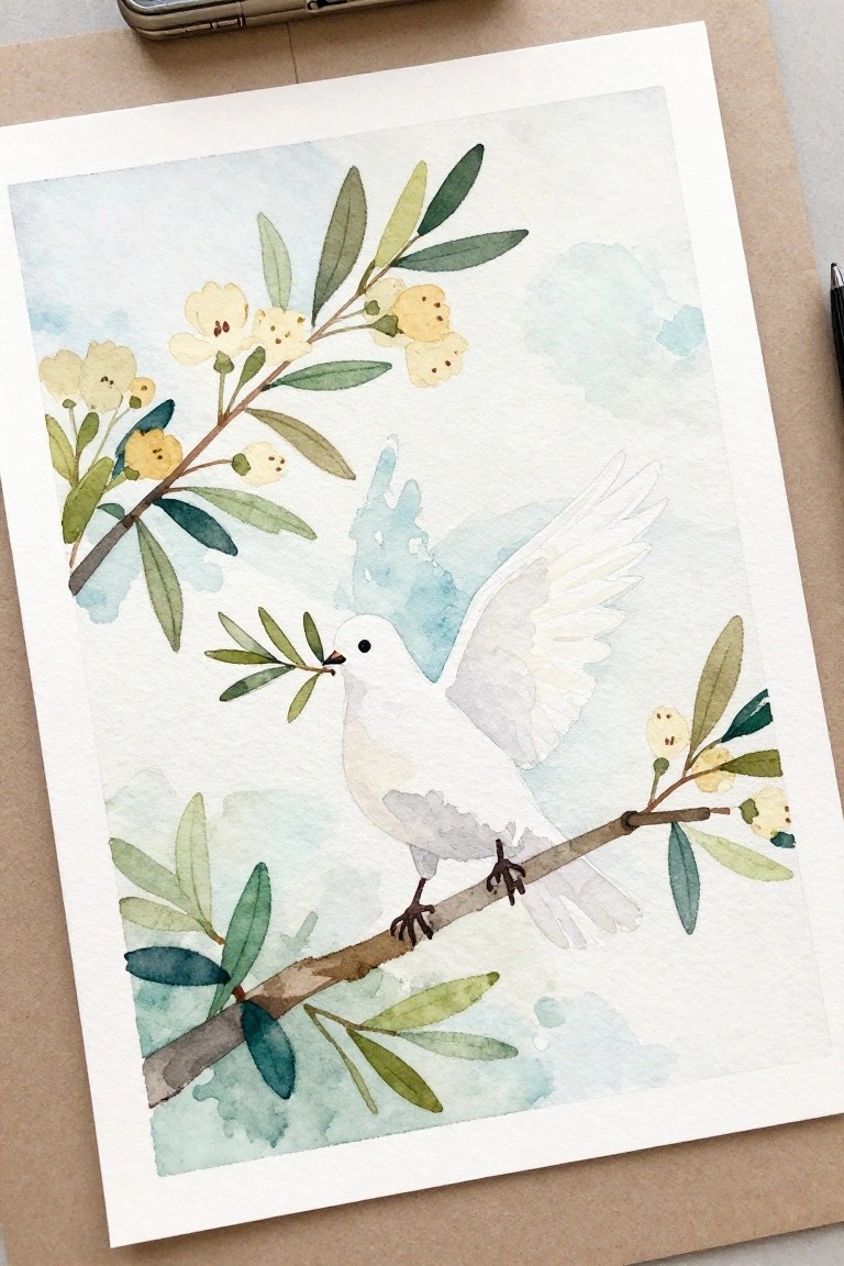
A painting centered on a white dove with a small branch in its beak combines a single bird shape with surrounding foliage for a straightforward nature subject. The branches extend from both sides to frame the bird while the pale flowers and leaves add variety without overwhelming the main form. Soft background washes in blue and green keep the composition light and let the bird stand out as the focal point.
What makes this idea useful is the clear separation between the bird and the plant elements, so you can paint the dove first and fill in the leaves and flowers afterward. The limited color range of greens, soft yellows, and blue-gray tones makes it simple to match with basic paints or swap in different flower colors. For practice, this layout works well because the bird shape stays simple and the branches give you an easy way to practice loose leaf strokes. You could shrink the whole scene for a card or enlarge the dove for a bigger piece without changing the basic arrangement.
Country Church Landscape with Winding Path
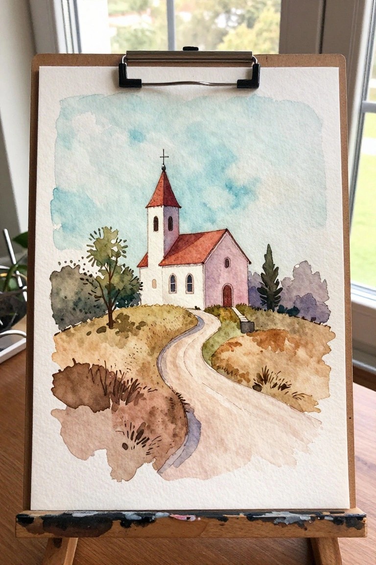
A rural church placed on gentle hills works well as a landscape subject because the winding path naturally leads the eye to the main building without extra focal points. The idea combines a simple architectural form with loose tree shapes and open ground, letting the composition stay balanced even when the details stay minimal. Earthy ground washes and a light sky keep the church as the clear center while the path adds movement across the page.
What makes this idea useful is how the path handles depth on its own, so you can focus on basic shape placement and color layering instead of complex perspective. The color palette adapts easily if you want to change the roof or ground tones for a different season. For wall art or small prints, the main shapes hold up well even when you simplify the trees or shrink the overall size.
Painting a Resting Lamb in Open Grass
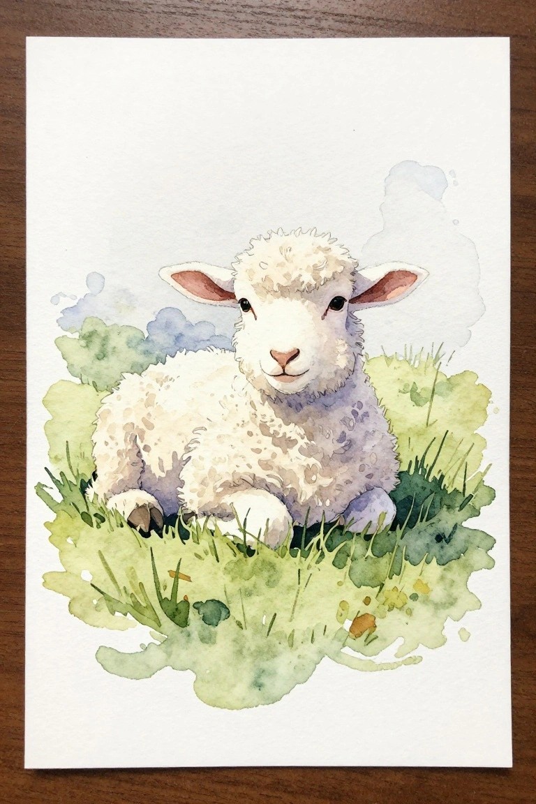
A centered lamb resting in grass forms the core idea here, using soft rounded shapes for the body and head to create a simple animal study. The composition works by keeping the lamb low in the frame so the loose green washes around it act as a natural border without crowding the subject. Blended background washes in light blue and green add depth while the limited color range on the lamb itself keeps the focus tight.
What makes this idea useful is how the basic oval forms let you practice animal proportions without needing fine detail work. The open layout scales easily to smaller paper sizes for cards or larger ones for prints, and you can swap the grass tones or background wash color to change the season. For practice, this kind of subject helps build confidence with layering soft edges before moving on to more complex scenes.
Floral Wreath with Central Cross
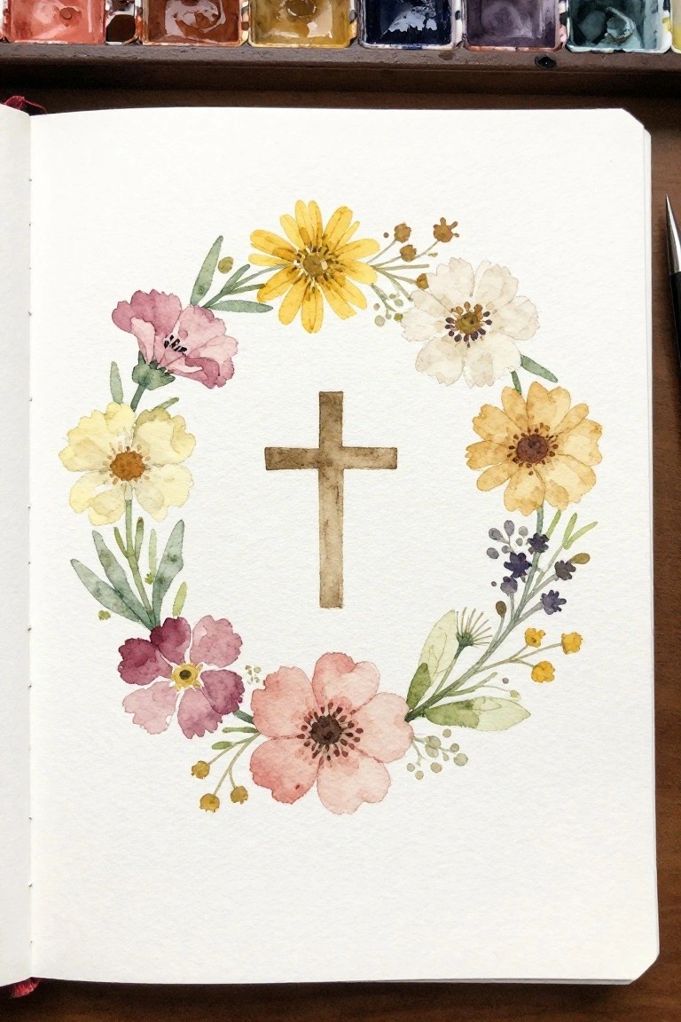
A circular arrangement of mixed flowers forms a wreath around a simple cross at the center. The flowers vary in size and color, with pinks, soft yellows, and whites placed to create even spacing and balance around the focal point. This approach works as a decorative floral piece where the wreath shape keeps the composition contained and the cross remains the clear center.
What makes this idea useful is the way the wreath layout lets you swap in different flower shapes or colors without changing the overall structure. The open middle space keeps the cross easy to paint first and leaves room for adjustments if the blooms need balancing. For practice, this kind of subject helps build control with circular arrangements while staying simple enough to finish in one session. The same setup adapts quickly to smaller cards or larger wall pieces by scaling the wreath size.
Calm River Landscape with Mirror Reflections
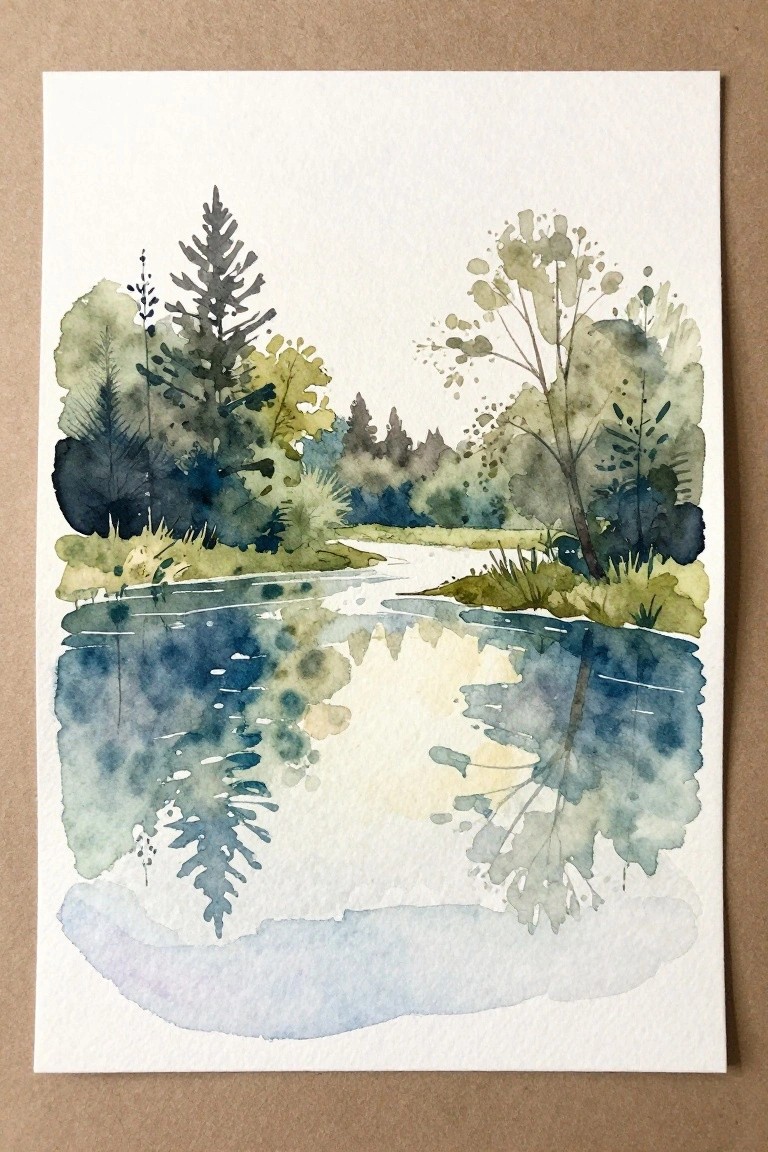
A reflective water scene with trees lining both banks gives you a straightforward landscape to explore symmetry and soft edges. The idea centers on using the water surface to repeat the shapes of the foliage above, which builds interest without needing many details. Loose layering of greens and blues keeps the focus on the overall balance rather than individual leaves or branches.
The composition does a lot of the work here by splitting the page into two similar halves that still feel connected. A painting like this works especially well for practice because the reflections let you repeat shapes with less precision. The simple shapes help this feel more approachable for trying wet-on-wet techniques or color blending. For wall art, something like this hangs well in smaller sizes where the soft transitions stand out.
Lion and Lamb Side by Side Watercolor

A lion and lamb placed next to each other on a shared green base forms a simple cute animal painting idea. The balanced side-by-side layout keeps both figures equal in focus while the limited color palette of soft browns and creams prevents the scene from feeling busy. This approach works because the shapes stay rounded and basic, and the small green ground anchors everything without adding extra layers.
What makes this idea useful is how easily the two-animal setup can be swapped for different pairs or scaled down by dropping the grass patch. The muted tones match most beginner watercolor sets and the compact arrangement fits well on standard paper sizes for quick sessions. For practice or small decor pieces, the same layout adapts by changing the animals or shifting the base color to match other themes.
Vertical Stack of Watercolor Fish Studies
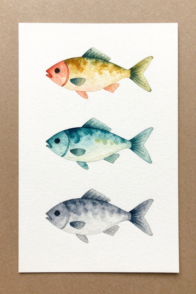
Painting the same fish shape three times in a row creates a clean series that lets you focus on color mixing and wash techniques without changing the subject. Each fish keeps a similar silhouette and fin placement while shifting through its own palette, from warm reds and yellows at the top to cool blues in the middle and muted grays at the bottom. The vertical layout with even spacing makes the whole piece feel balanced and easy to scan at a glance.
The composition does a lot of the work here because the repeated shape keeps things simple while the color changes add variety without extra elements. You can swap in any palette you already have on your palette or adjust the size to fit a journal page or small canvas. This kind of series also photographs well for sharing, since the white background and clear arrangement stand out in a feed without needing props.
Pastoral Sheep in Rolling Hills
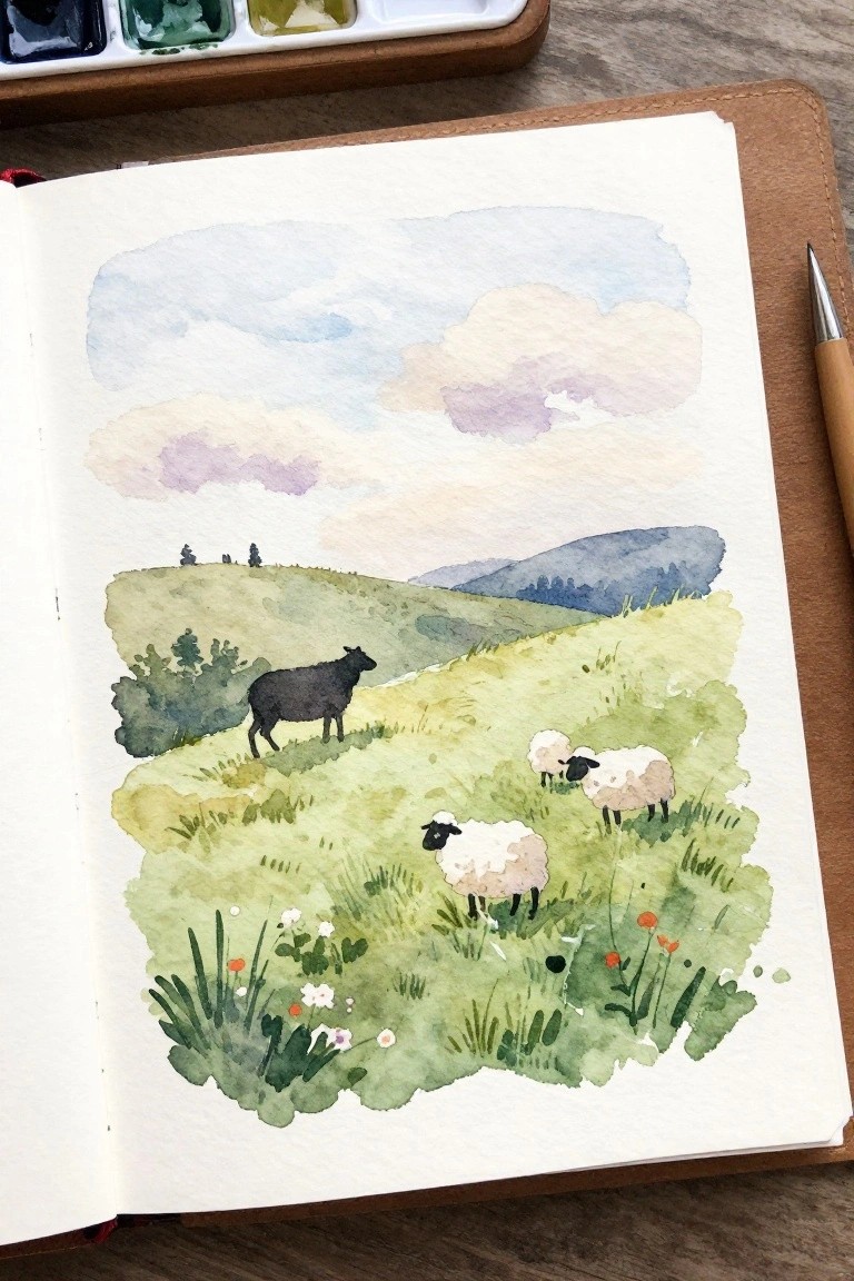
A simple pastoral landscape idea works well here by placing a few sheep across layered green hills with soft cloud shapes overhead. The composition uses a clear foreground of grass and small flowers to anchor the scene while the rolling hills and distant blue shapes create natural depth without needing complex details. This fits into the animal landscape category and keeps the focus on the animals through their placement and contrast against the lighter background washes.
What makes this idea useful is the straightforward layout that lets you practice basic washes and simple animal shapes before adding any extra elements. You can easily swap the color palette for different seasons or change the number of sheep to match the size of your paper. For practice, this kind of subject builds confidence with both landscape layers and small figures at the same time. It would also translate well to a quick greeting card or a small framed piece since the main shapes stay readable even when simplified.
Botanical Branch and Seed Study
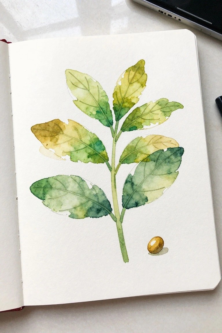
This painting idea focuses on a single vertical stem with layered leaves in shifting green and yellow tones, finished with a small seed placed separately at the base. The leaves vary in size and angle to create natural movement while the seed adds a simple focal point that keeps the eye from drifting off the page. It falls into the botanical still life category and succeeds because the color shifts and open spacing let the shapes stay readable without heavy outlining.
What makes this idea useful is how the loose color blending and limited elements turn it into quick practice for watercolor control. The composition does a lot of the work here by using one strong vertical line and a single accent object, so you can easily change the leaf colors or add a short verse underneath for Bible journaling pages. For wall art, something like this works especially well in a small frame or as a series with different seed shapes. The simple shapes help this feel more approachable if you want to test new paper or try painting from a real sprig instead of a photo.
Hillside Village with Central Tower
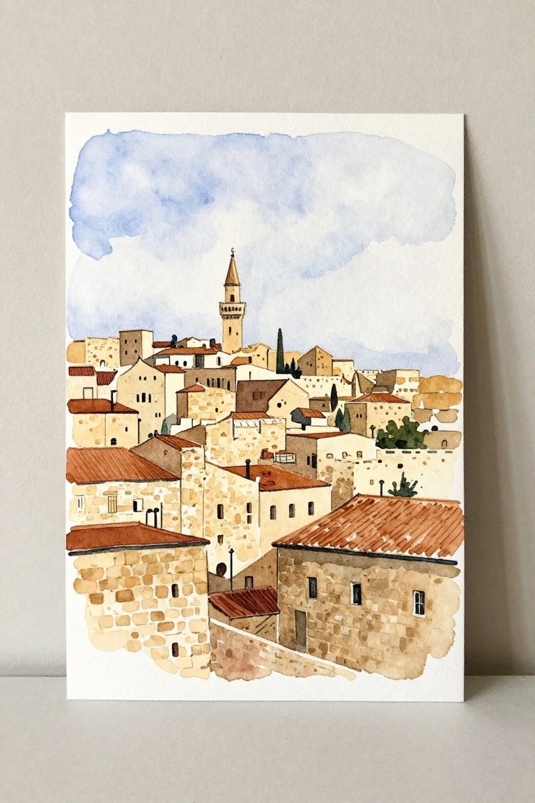
A clustered townscape built from stone blocks and overlapping terracotta roofs makes a strong landscape subject, especially when a single tall tower rises as the main focal point. The idea works because the buildings stack naturally into layers that create depth with minimal perspective work, while the limited palette of warm neutrals and soft blue keeps the whole scene readable. This approach suits anyone who wants to practice architectural shapes without getting lost in tiny windows or fine details.
What makes this idea useful is how the rectangular forms and angled roofs can be simplified or detailed depending on the time you have. The vertical tower gives an easy center that holds the composition together even if the surrounding shapes shift a little. For practice or wall pieces, the same layout adapts quickly to different paper sizes or slight changes in roof color. A version with fewer buildings still reads clearly, so it works for both quick studies and finished pieces that pin well on Pinterest.
Silhouette Figures Beneath a Star
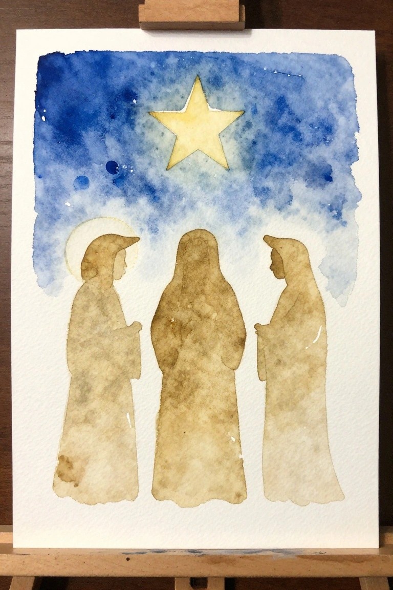
A silhouette approach to three robed figures standing under a single large star creates a clean Christmas scene that relies on shape and placement rather than detail. The blue background wash sets a simple sky while the figures stay defined by the unpainted paper and minimal line work. This type of painting fits seasonal religious art and uses broad areas of color with the star as the main focal point.
What makes this idea useful is how the large shapes and limited palette let you focus on even washes and basic figure outlines without extra layers. You could swap the star for different colors or adjust the spacing between the figures to fit taller or wider paper. For practice, this kind of subject works well because the composition stays balanced even if the brushwork stays loose.
Heart with Cross and Loose Floral Frame
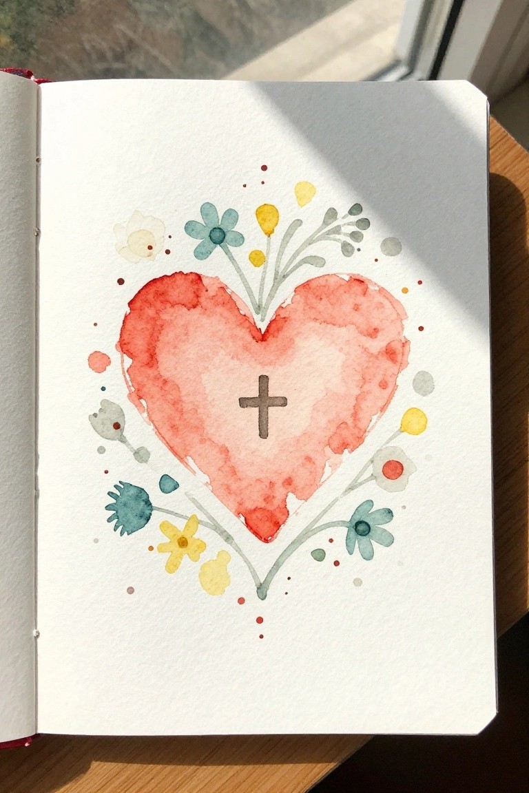
A heart shape painted in soft red and pink washes sits at the center with a small cross inside it. Simple flower shapes in yellow, teal, and muted green are placed around the edges with scattered dots to create a loose border. The composition works because the large heart anchors everything while the flowers stay light and uneven so they do not compete with the center.
What makes this idea useful is how the heart and cross can be painted first in one or two washes before adding the flowers later. The scattered placement means you can use fewer or more stems depending on the paper size or how much time you have. For wall art or cards this layout stays balanced even if the flower colors change, and the dots help fill gaps without needing extra detail.
Mountain Valley Landscape with Layered Hills

A landscape idea built around overlapping hills and distant mountains works well when the goal is to show depth through simple horizontal layers. The main shapes include open slopes in earth tones, clusters of dark trees, and a winding line that leads the eye through the valley. This approach fits the landscape category and relies on soft color shifts and grouped shapes rather than small details to keep the scene readable.
What makes this idea useful is how the overlapping forms handle most of the composition work, so you can focus on wash control and edge variation. The color palette mixes warm foreground tones with cooler background ones, which makes it easy to adapt for different seasons by changing the greens and browns. For practice, this kind of subject lets you test how much detail to add to tree groups without overworking the paper. A painting like this also scales well for cards or small prints since the layout stays balanced even at reduced size.
Beginner Book Stack Still Life
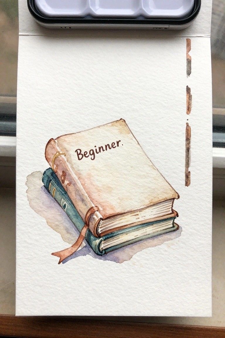
A stack of two books forms a clean still life subject that focuses on simple shapes and soft color layers. The top book rests at a slight angle with the word Beginner written across the cover, while the bottom book shows a teal spine and a ribbon bookmark hanging down. Neutral brown and beige washes define the pages and edges without heavy detail, and the off-white paper background keeps the focus tight on the books.
What makes this idea useful is how easily the cover text can be swapped for any short word or phrase. The vertical layout leaves space on the side for quick color swatches or extra elements if needed. For practice, this kind of subject builds control with large washes and light shading before moving to more detailed work. The color palette makes this easy to adapt by changing the book tones to match whatever supplies you already have on hand.
Anchor with Ribbon and Hope Text
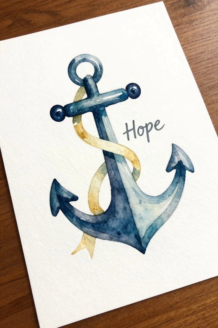
An anchor design gains visual interest when a ribbon wraps through the center and trails downward in soft loops. Placing the word “Hope” to the side balances the composition and turns the piece into a simple text-and-object layout. The blue tones on the anchor with a contrasting yellow ribbon keep the focus on shape and flow rather than fine detail.
What makes this idea useful is how the ribbon breaks up the solid anchor form without adding complex layers. You can easily change the ribbon color or shorten it for smaller cards and journal pages. The same layout works for practice pieces because the main shapes stay large and the text can be adjusted in size or style. For wall art, this kind of subject scales well to different paper sizes while keeping the same clean arrangement.
Watercolor Lamb Standing in Grass Beside a Scythe
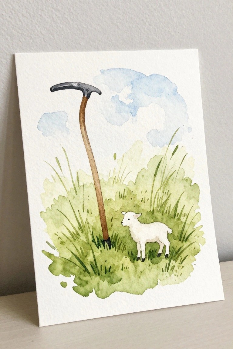
A single lamb placed next to a tall scythe creates a clear focal point in an open field setting. The idea combines an animal subject with simple landscape elements, using loose green washes for the grass and a soft blue sky to hold the composition together. Negative space around the main objects keeps the layout balanced without crowding.
The composition does a lot of the work here by anchoring the lamb low and letting the tool extend upward for height. You could adapt it by changing the grass color to match a different season or by reducing the number of grass strokes for faster practice sessions. This subject works well for testing wet-on-wet backgrounds while keeping the lamb itself more controlled. For wall pieces, the vertical tool helps the scene feel complete even on a small canvas.
Stained Glass Window with Cross Dove and Bread
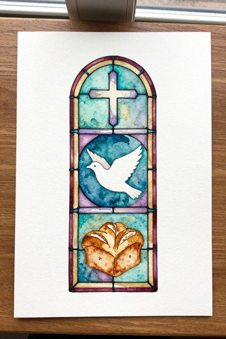
A vertical stained glass style composition works well as a decorative art idea because it stacks three distinct Christian symbols inside an arched frame. The top panel holds a simple cross, the middle uses a circular frame around a dove, and the bottom shows a loaf of bread, all separated by thin lead lines. This layout keeps the eye moving from top to bottom while the cool teal and purple washes give the whole piece a cohesive look without needing complex blending.
What makes this idea useful is the built-in structure of the window panes, which breaks the painting into smaller sections that are easier to handle one at a time. The color palette can be swapped for warmer tones or muted shades depending on the intended use, and the same layout works at postcard size or scaled up for a larger piece. For practice, this kind of subject lets you focus on flat color areas and clean outlines rather than detailed shading.
Tree of Life with Blended Blue and Gold Foliage

A single tree with an open canopy offers a clear subject when the leaves are formed through loose color washes rather than individual shapes. The idea centers on mixing cool blues with warmer yellows and greens in the foliage to build depth while keeping the trunk and roots in steady brown tones. This approach sits in the category of symbolic nature paintings that stay simple in structure but gain interest from the color layering.
The composition does a lot of the work here by centering the tree and leaving plenty of white space around the edges. You can change the balance of blue versus gold to shift the mood or scale the whole thing down for a greeting card. For practice, this kind of subject helps with wet-on-wet blending without requiring tight control, and the minimal ground line keeps the focus on the canopy. A painting like this would translate well to a Pinterest pin because the colors stand out even at small sizes.
Frequently Asked Questions
What basic supplies do I need to begin these watercolor tutorials? You can start with affordable essentials like 140 lb cold press watercolor paper, a set of primary watercolor paints, round brushes in sizes 2, 6, and 10, a palette for mixing, and two jars for clean and dirty water. Add a pencil and eraser for light sketches. These items support the step by step approach in the tutorials while keeping costs low as you build skills.
How do the tutorials help beginners gain confidence quickly? Each tutorial breaks the process into clear stages such as sketching, layering washes, and adding details so you complete small sections at a time. Starting with simpler designs lets you see immediate progress and celebrate small wins which steadily increases your comfort with the medium and Christian themes.
Can I add my own Bible verses or personal symbols to the paintings? Yes the tutorials offer flexible frameworks that welcome your input. After following the main steps you can incorporate favorite scriptures in elegant lettering or include meaningful icons like crosses or doves to make each piece a deeper expression of your faith.
What should I do if a painting does not match the example? View differences as opportunities for creative expression rather than errors. Review the tutorial steps again focusing on one area at a time such as color blending or edge control then try the same lesson with adjusted colors or simpler shapes to reinforce learning without frustration.
How can I display or share the finished artworks in daily life? Frame smaller pieces for home altars or prayer corners where they serve as quiet reminders of faith. You can also scan them for digital devotionals gift prints to friends or include them in personal journals to revisit the spiritual messages during quiet time.