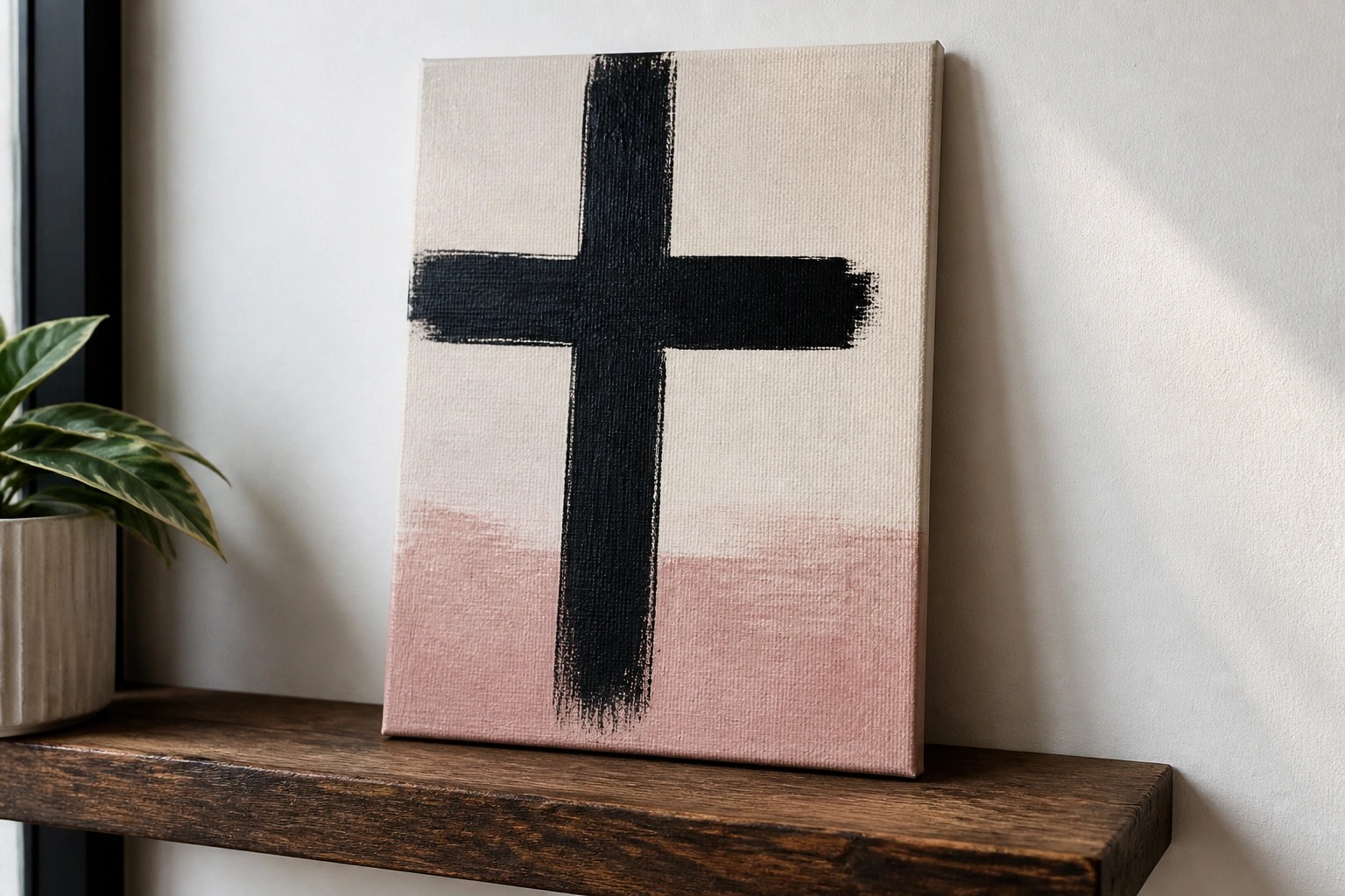
I have painted a few canvas pieces with bible verses for my walls.
They fit nicely with the rest of my furniture and colors.
Sometimes I change them out depending on the season or how I feel.
It is a simple way to keep faith in view during daily routines.
I put together some ideas that could work for a modern home like mine.
Minimalist Cross with Gradient Wash
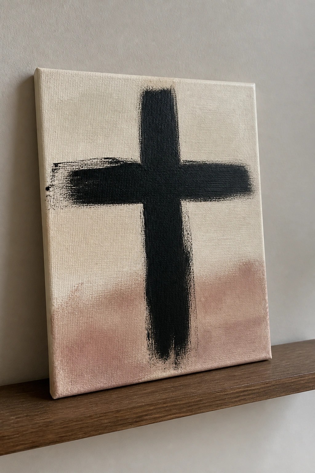
A bold black cross painted with thick, visible brushstrokes sits centered on a light canvas that shifts from off-white at the top to a soft dusty rose at the bottom. The idea relies on strong vertical and horizontal lines paired with a subtle color transition to keep the focus on the cross itself. This approach falls into abstract decorative art where the shape and texture do the heavy lifting instead of added details or shading.
The composition does a lot of the work here because the uneven brushwork adds interest without needing extra elements. You could swap the bottom tone for any neutral or muted shade to match existing wall colors, or adjust the stroke thickness to change the overall weight. This works especially well for modern faith-based decor since the limited palette keeps it from feeling busy. For a different take, try the same layout on a larger scale or with a slightly warmer background tone.
Earth Tone Cross Trio on Color Blocks
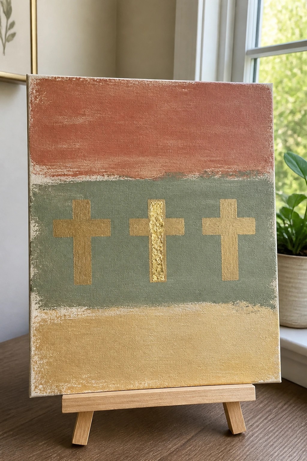
A straightforward canvas idea that uses three horizontal bands of warm terracotta, muted green, and golden yellow as the base, then places three simple cross shapes across the middle green section. The crosses are painted in gold, with one given a slightly raised texture for contrast while the others stay flat. This layout keeps the focus on the repeated cross shapes against the striped background without needing complex details or shading.
The composition does a lot of the work here because the even spacing and limited color palette make the crosses easy to replicate on any size canvas. You could swap the band colors to match a room or try different metallic shades for the crosses if you want a quick variation. For wall art, something like this works especially well when you want a clean Christian piece that still feels current rather than traditional. The simple shapes also make it a good option to try first if you are testing out larger canvases or metallic paints.
Oval-Framed Dove Carrying an Olive Branch

A dove with an olive branch works well as a simple animal subject when the bird is centered inside a single soft oval. The wings are built from a few angled strokes rather than fine detail, and the small branch adds just enough interest on one side to balance the composition. Keeping the palette to white, muted pink, and a hint of green makes the whole piece feel calm and easy to read from a distance.
What makes this idea useful is how the oval contains the design so you can change canvas sizes without redrawing the bird. You could swap the pink oval for a different neutral or skip the oval entirely and paint the dove directly on a plain background. The limited colors and basic shapes also let you shrink the same layout for greeting cards or practice boards while keeping the same proportions.
Be Still Scripture on a Textured Abstract Canvas
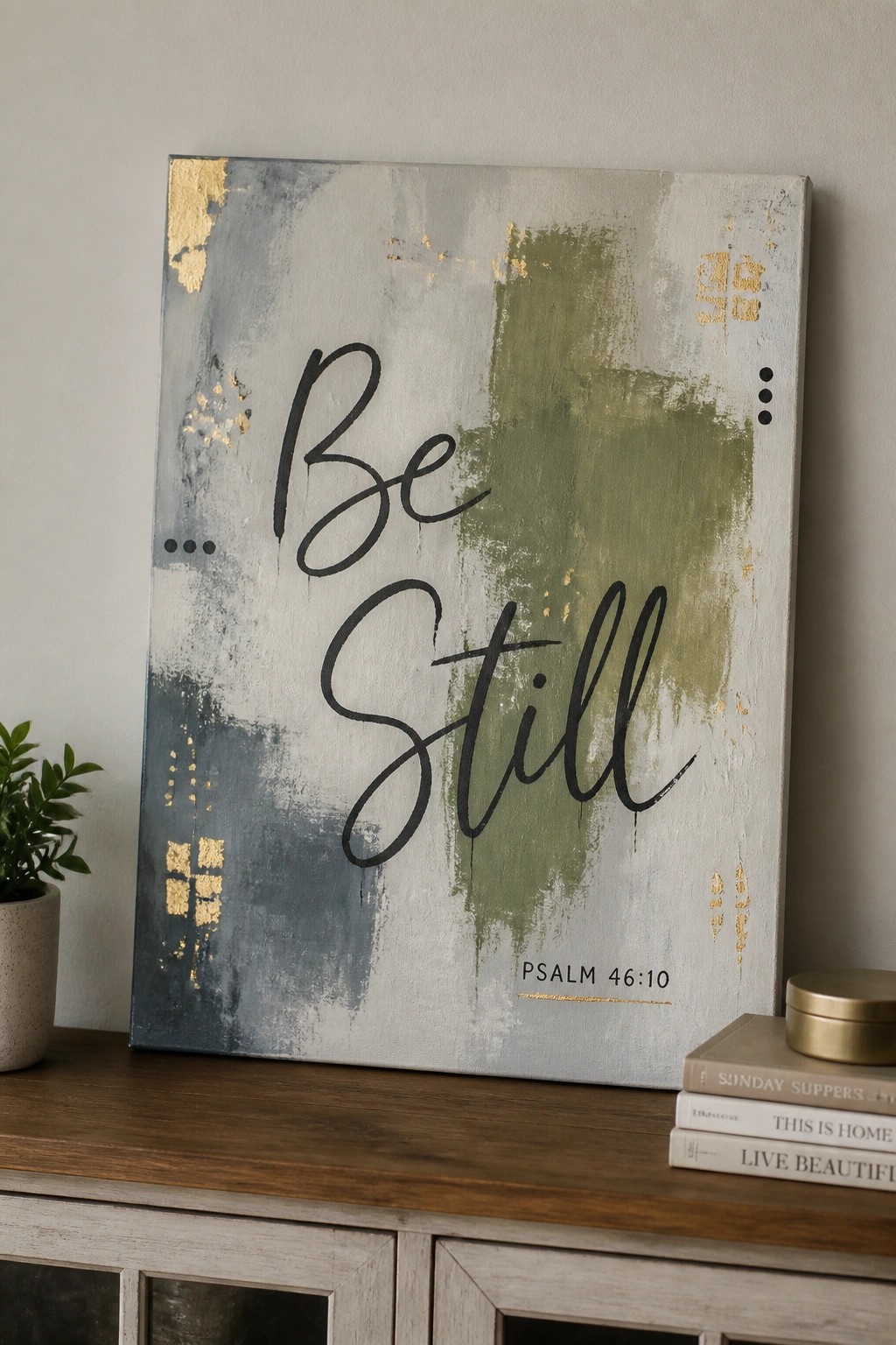
This painting idea uses oversized black script to display the words “Be Still” from Psalm 46:10 over a layered abstract background. The background combines broad brushstrokes in gray, sage green, and off-white with scattered gold foil patches that add subtle shine and texture. The approach works as decorative text art because the bold lettering stays front and center while the softer background provides contrast without distraction.
The composition does a lot of the work here since the text is large and centered, which makes the layout forgiving for different lettering styles. You could easily adapt the color scheme to blues or earth tones to match existing decor, or simplify the background to fewer layers if you want a quicker version. For wall art, this kind of piece stands out because the mix of abstract texture and clear message gives it a modern look that still reads from across the room.
Three Crosses on a Sunset Hill
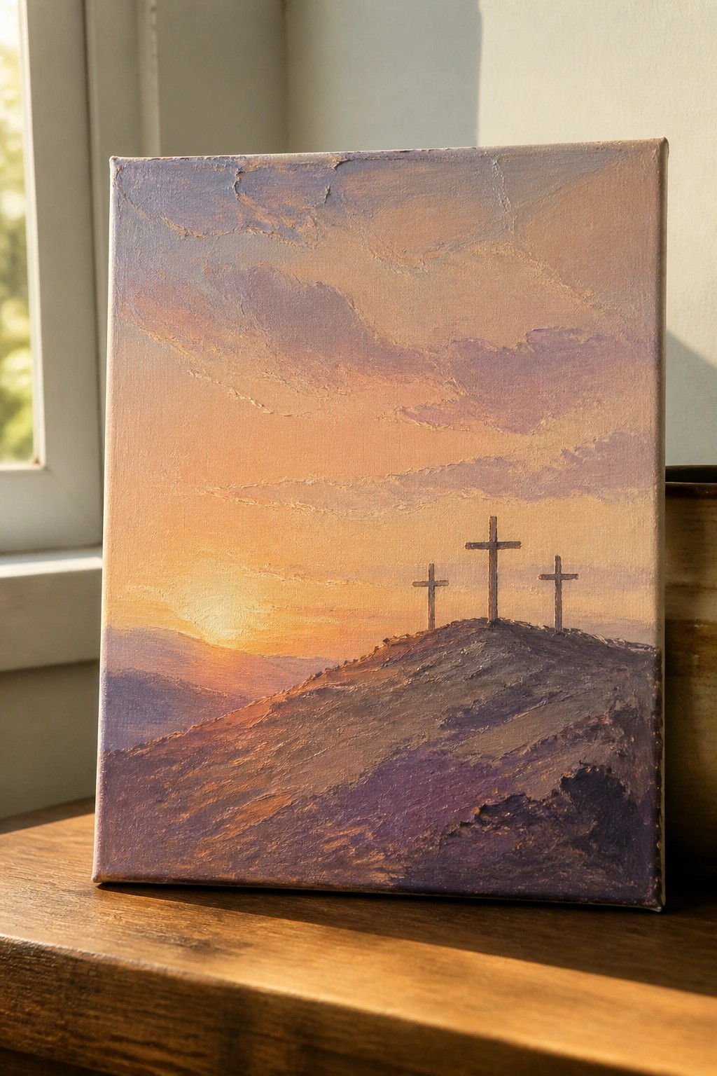
A landscape painting idea built around three crosses placed along a ridge at sunset works well because the horizon line and sky handle most of the visual weight. The warm orange and purple palette blends together through broad, visible brushstrokes that keep the focus on the overall scene rather than small details. The simple arrangement of the crosses against the glowing sky gives the composition a clear focal point without needing extra elements.
What makes this idea useful is that the main shapes stay easy to block in even if your brushwork stays loose. You can change the sky colors to cooler tones or softer pastels to match different room styles while keeping the same hill and cross layout. For wall art, the vertical canvas format and centered placement let the piece read clearly from a distance. This would be easy to scale down for a quick practice version before trying a larger size.
Praying Hands with Faith Lettering
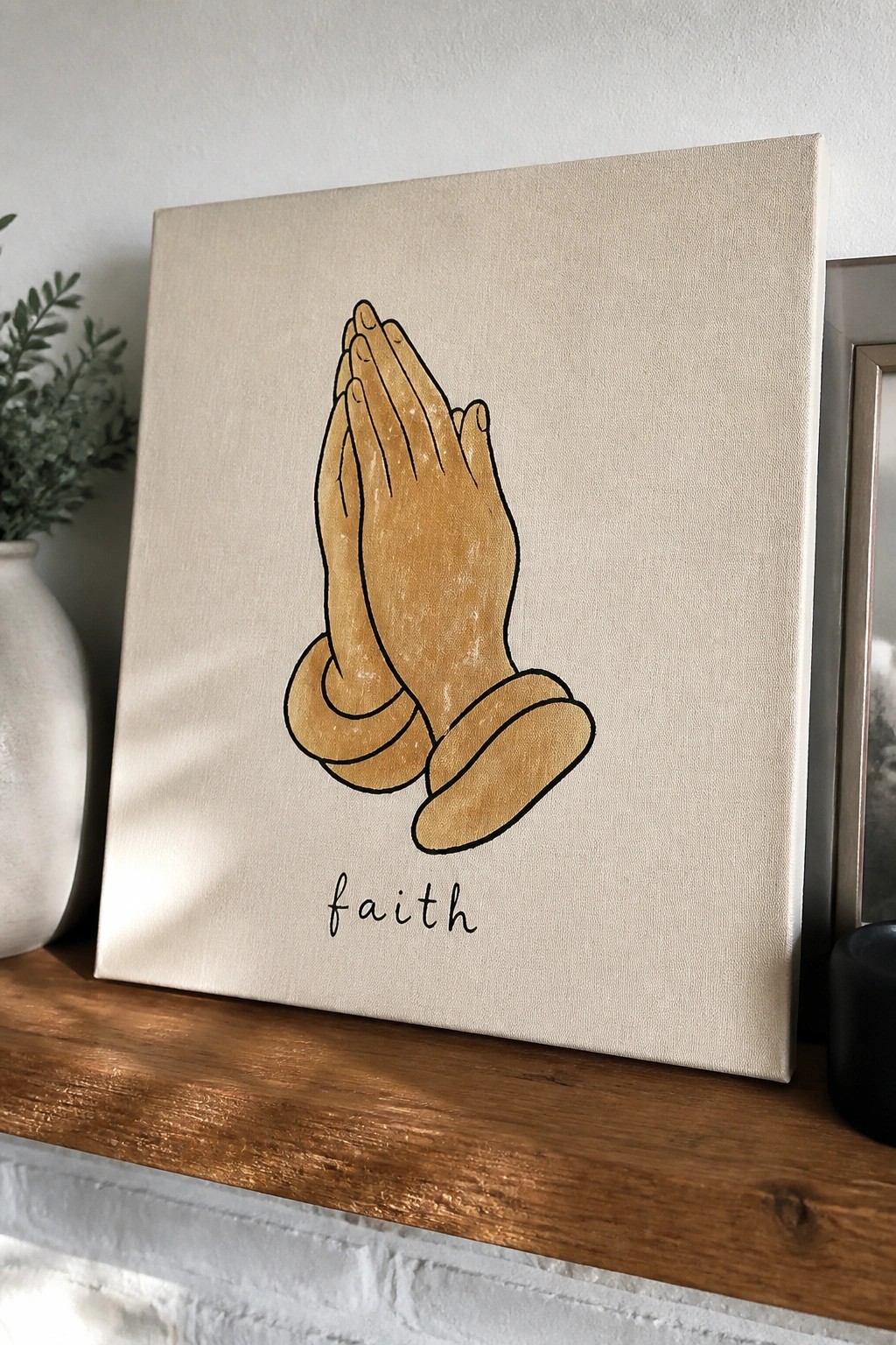
A praying hands design paired with the single word faith creates a direct and uncluttered piece of wall art. The hands use simple black outlines filled with a warm neutral tone, and the text sits centered underneath in a casual script. This keeps the focus on the central shape while the plain canvas background prevents any visual competition.
What makes this idea useful is how the clear outlines make the hands easier to transfer or trace onto a larger canvas if you want to change the size. The flat color fill means you can test different tones without worrying about blending, and swapping the word or font gives quick options for personalization. For wall art, something like this fits well on a shelf or above furniture because the layout stays balanced even when the canvas is viewed from across the room.
Minimalist Fish Symbols in a Vertical Stack
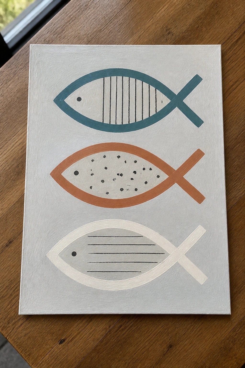
This painting idea centers on three fish symbols stacked vertically on a plain background, each rendered in a distinct color with its own simple interior pattern. One uses vertical lines, another scattered dots, and the third horizontal lines, all kept to basic outlines that emphasize shape over detail. The approach works because the consistent form lets the color and pattern changes create rhythm without added complexity.
What makes this idea useful is that the stacked format handles most of the composition, so you can focus on picking colors that fit your space or swapping the interior marks for something even simpler like solid fills. The same layout scales easily to different canvas sizes and adapts well if you want to try it with just two symbols or change the background tone. For wall pieces, this kind of repeated symbol stays interesting because the variations prevent it from feeling too uniform while still reading as one cohesive idea.
Lamb and Shepherd Crook Canvas
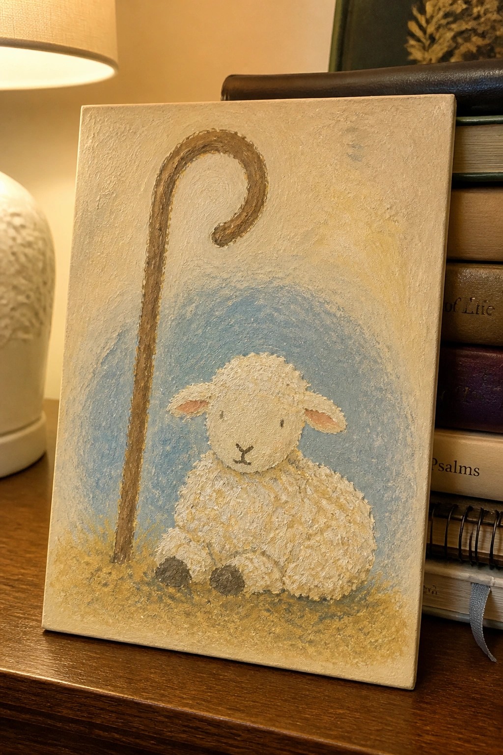
A lamb seated on a small patch of ground with a tall curved staff behind it forms a straightforward animal painting with a subtle faith element. The idea works by keeping the lamb centered low so the staff can arch over the top and balance the space. A soft blue wash behind the figure and a beige border around the edges let the white textured body stand out without extra details.
What makes this idea useful is the way the single staff gives the scene meaning while keeping the rest minimal. You can paint it on a small canvas for a desk or shelf display and swap the background color to match whatever tones already exist in the room. The rounded shapes of the lamb make it simple to adjust the size or add light grass texture if you want a slightly different version for another spot.
Minimal Crown with Text and Striped Base
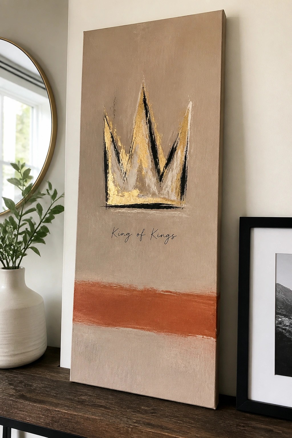
A crown painted with loose gold and black brushstrokes sits centered on a neutral background, with the words “King of Kings” written below in simple script. A single orange stripe runs across the lower section, followed by another band of the same background tone. This layout uses a small number of elements to keep attention on the crown while the horizontal bands give the canvas a clear structure.
The composition does a lot of the work here because the crown stays large and direct without extra detail. You could change the text to another short phrase or swap the orange stripe for a color that matches your room. For wall art, something like this works well in a modern space since the limited palette and vertical format make it easy to hang without overpowering other pieces.
Floral Wreath Around a Simple Cross

A circular wreath of flowers in soft pinks, creams, and muted greens creates a natural frame around a plain cross. This approach fits the floral category with a decorative layout that keeps the cross as the clear center point. The open space on the gray background and the scattered placement of blooms prevent the design from feeling crowded while still guiding the eye inward.
What makes this idea useful is how the wreath shape handles most of the composition work, so you only need to focus on balancing a few flower clusters. The neutral background lets the piece fit into many room styles and you can easily change the flower colors to match existing decor. For a smaller version, reduce the number of blooms or use a thinner ring of leaves around the cross.
Layered Neutral Rectangles with Metallic Accent
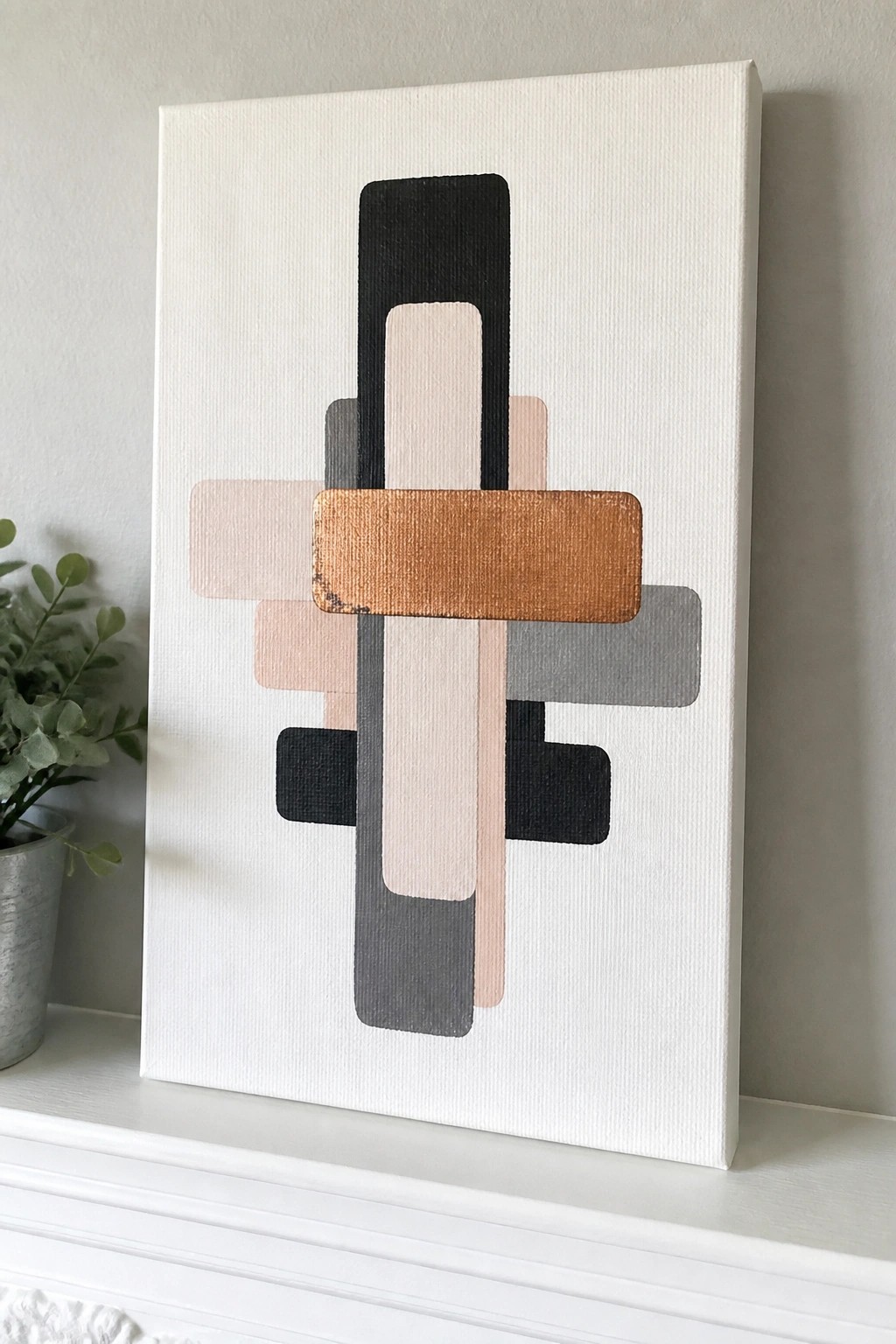
This painting idea centers on a set of vertical and horizontal rectangles arranged to overlap and create a balanced abstract composition. The design relies on a restrained palette of black, gray, soft beige, and one copper-toned bar to build visual interest through simple shape placement and slight layering. It fits the decorative abstract category because the clean edges and limited colors let the arrangement itself carry the impact.
What makes this idea useful is how the straight shapes can be measured and taped for quick results on any canvas size. The neutral base colors make it easy to match existing room tones while the single metallic bar can be swapped for another shade or material to change the look. For wall art, something like this works especially well because the structured layout photographs cleanly for Pinterest without needing complex details. The same approach could be adapted by shifting the bar positions or adding one extra color block to personalize it further.
Palm Frond with Gold Accents and Scripture
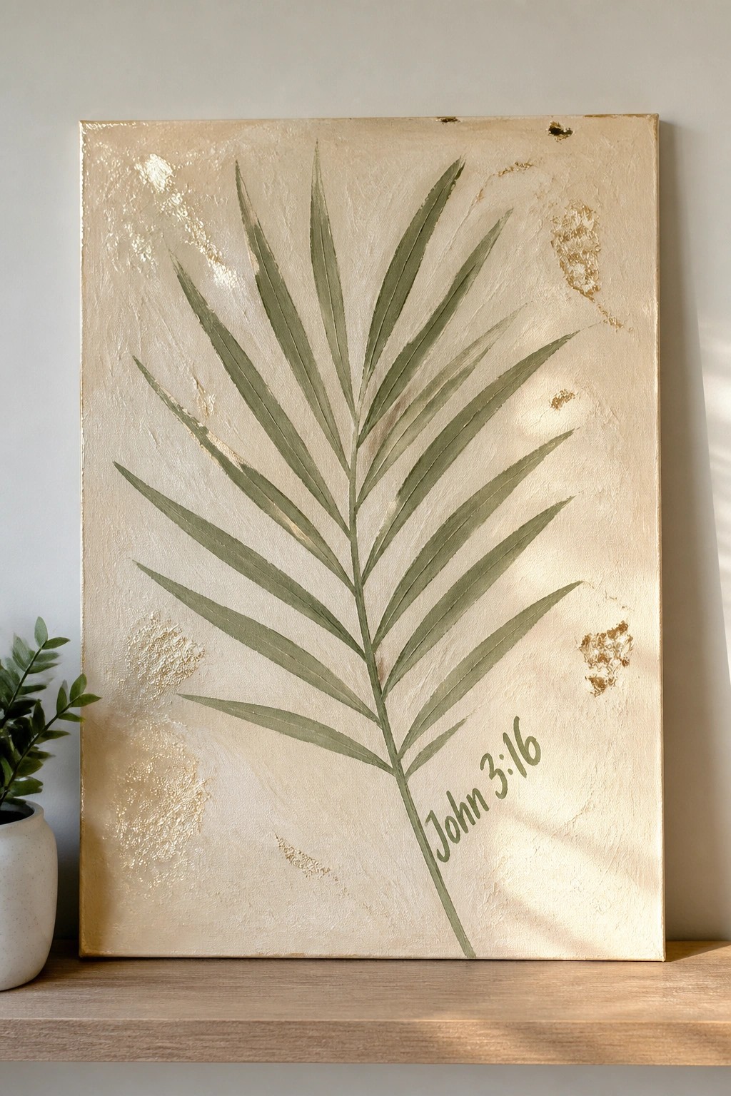
A single large palm frond painted in muted green sits centered on a textured beige background with scattered gold leaf patches. The loose brushwork keeps the leaf shapes readable while the metallic spots add subtle shine without overpowering the design. This approach falls into decorative botanical art that pairs a natural subject with a short Bible verse for wall display.
What makes this idea useful is the way the central leaf and neutral background let you adjust scale or color easily for different rooms. The gold accents can be swapped for other metallics or left out entirely if you want a simpler version. You could also change the verse or crop the leaf to fit a smaller canvas. For wall art, the clean layout works well because it photographs clearly and mixes with both modern and traditional decor.
Arched Sunset Layers with a Cross Accent
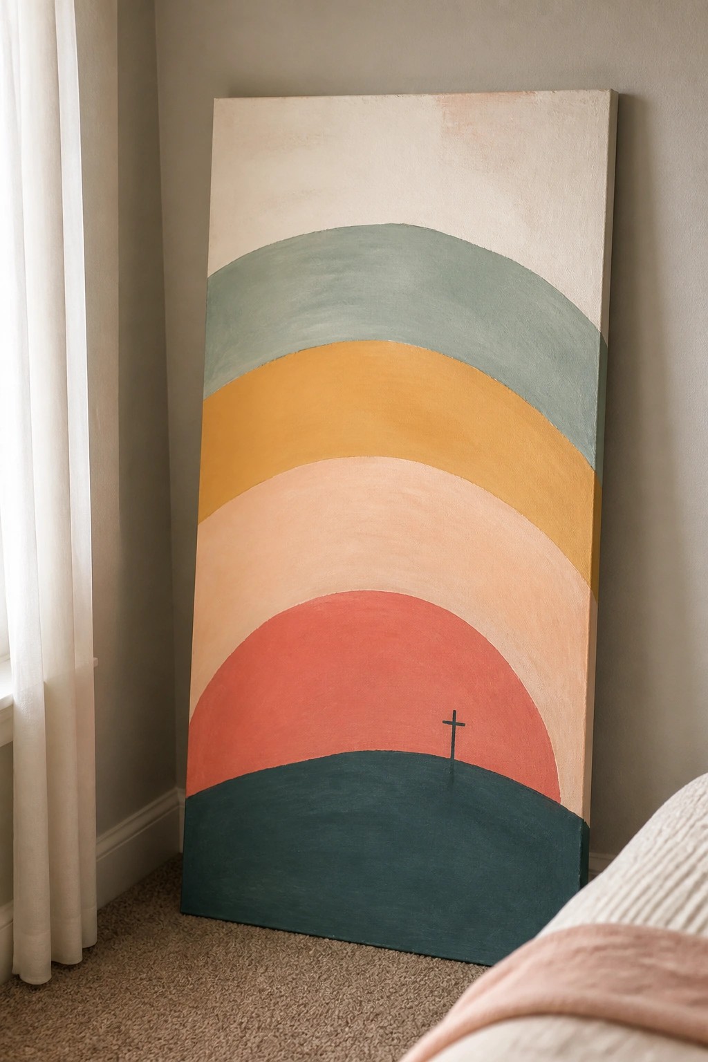
This painting idea uses stacked semicircular bands in a warm-to-cool palette to suggest a sunset over hills. The composition stays graphic and flat, relying on the curve of each layer and the contrast between the coral red band and the dark teal base to create depth. A single small cross sits on the red layer, keeping the religious element minimal within the overall abstract landscape style.
The composition does a lot of the work here because the repeating arches make the piece feel balanced even on a tall vertical canvas. The color blocks are easy to adapt by swapping in different shades to match existing decor, and the cross can be resized or moved without changing the rest of the layout. This kind of idea works especially well for modern faith-based wall art since it avoids busy details and still reads clearly from a distance.
Silhouette Nativity with Central Star Focus
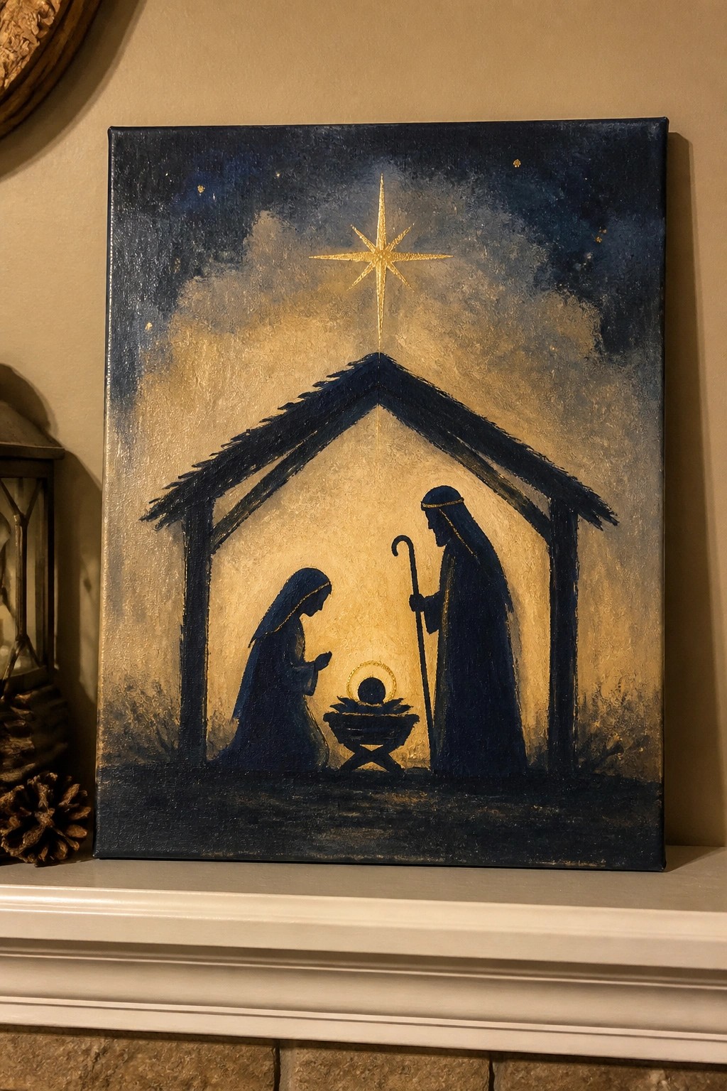
A nativity scene built from simple dark silhouettes against a lighter center area keeps the stable shape and three main figures as the clear subject. The painting idea works by placing a large star directly above the manger so the eye moves straight down the composition, while the rest of the canvas stays dark and minimal. This fits seasonal decorative art where strong contrast and basic shapes replace fine detail.
The composition does a lot of the work here because the triangular roof and vertical star handle most of the visual structure. You could swap the deep blue background for a softer gray or shrink the canvas size if you want a faster version for holiday decor. For wall art, this kind of piece stands out when the star gets a touch of metallic paint so it catches light in a room.
Anchor and Hope Typography Canvas
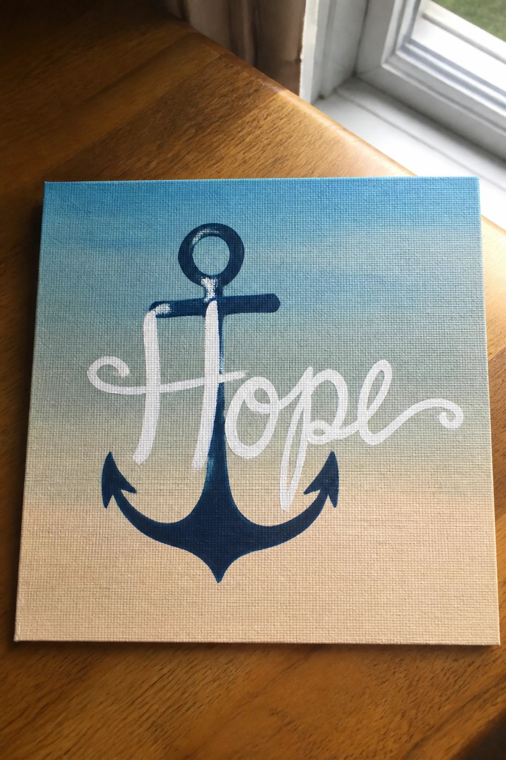
This painting idea merges an anchor silhouette with the word hope written in flowing script that curves through the middle of the shape. The background uses a simple vertical gradient from blue down to a warm neutral tone, which lets the dark anchor stand out while the white lettering stays readable. The result is a compact decorative piece that treats the symbol and text as a single unified design rather than separate elements.
What makes this idea useful is how the anchor shape already gives the lettering a clear path to follow, so you do not need to plan complex spacing. You can change the gradient colors to match a room or swap the word for another short phrase without redrawing the whole layout. The balanced negative space around the design also makes it easy to adapt to different canvas sizes or turn into a printable template for quick variations.
Horizontal Row of Stylized Churches
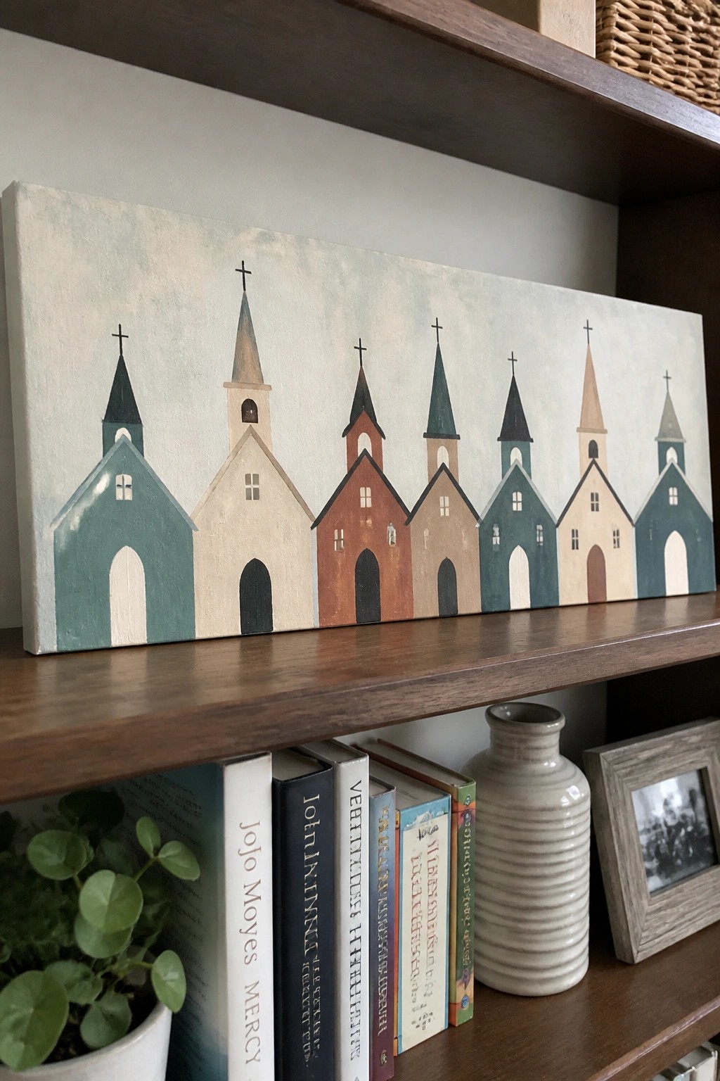
A lineup of simplified church shapes placed side by side forms the core of this painting idea. Each building uses flat color blocks and basic geometric forms for the body, door, windows, and steeple, with small crosses on top. The horizontal layout and repeated vertical lines create a steady rhythm that works as clean decorative art for a wall.
What makes this idea useful is how the even spacing and similar heights let you adjust the number of churches to fit different canvas lengths. The limited color palette keeps the piece from feeling busy, so you can swap in your own wall colors or room accents without starting over. For wall art, something like this stands out because the shapes stay readable at a distance and translate easily to smaller prints or greeting cards.
Birds on a Branch with Scripture Quote
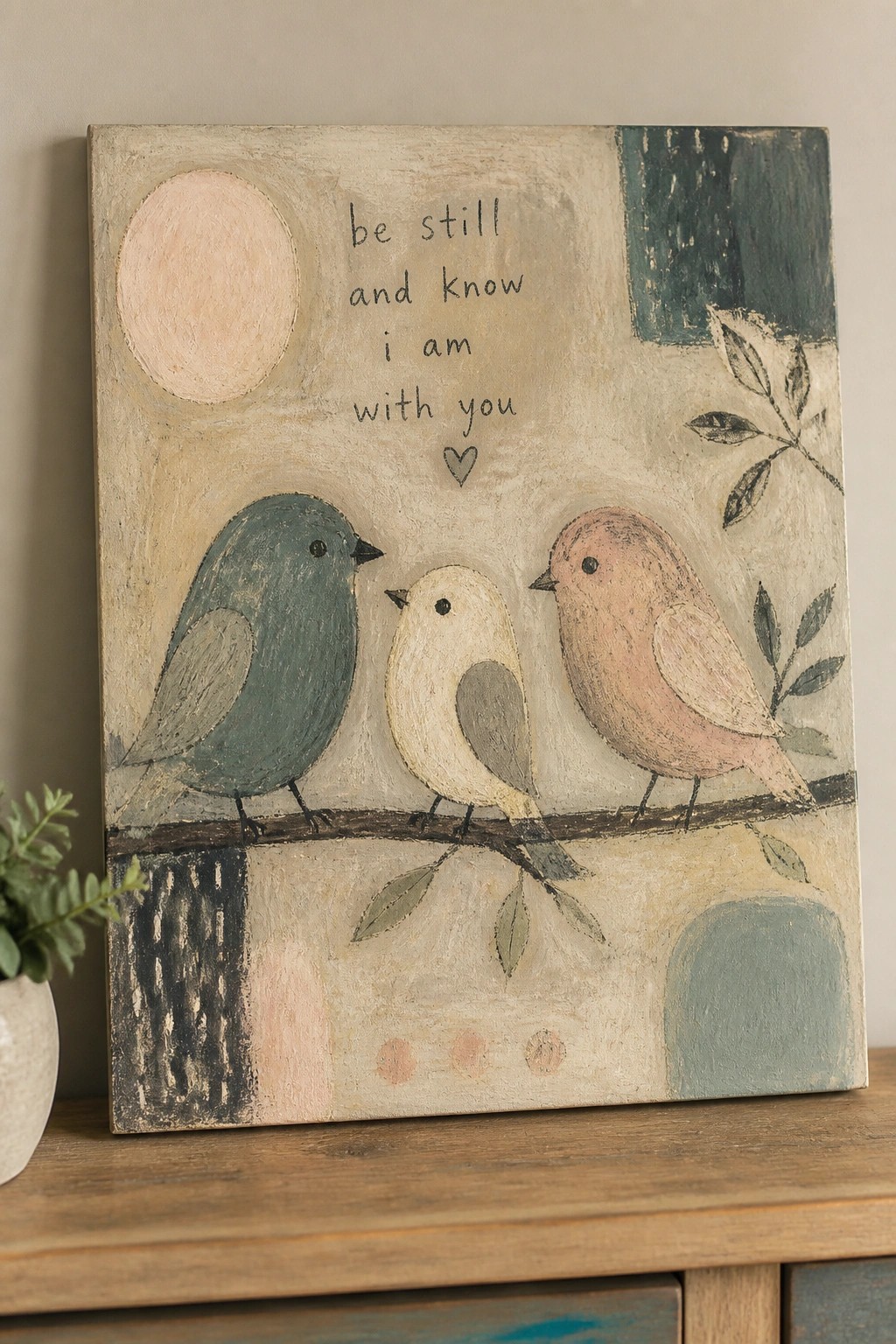
A set of three stylized birds in muted teal, cream, and blush tones sits on a single branch, paired with the text “be still and know i am with you” placed above. This is a decorative art idea that combines simple animal shapes with an inspirational quote. The composition stays balanced by keeping the birds in the lower half and using soft blocks of color plus loose leaf shapes in the background to fill space without crowding the main elements.
What makes this idea useful is how the flat bird forms and limited color palette translate easily to different canvas sizes. You can change the quote wording or reduce it to just the birds if you want a version without text. For wall art, the arrangement works well because the branch line gives a clear focal point while the background shapes prevent the piece from feeling empty. The same layout could be adapted by shifting the birds closer together or using a single background color for a quicker version.
Leafy Wreath with a Centered Cross

A circular arrangement of green leaves and branches forms a loose wreath that leaves open space in the middle for a small cross. The painting idea uses soft watercolor-style washes and varied leaf shapes to build a natural frame without crowding the center. This keeps the cross visible while the foliage adds movement around it.
The composition does a lot of the work here by balancing the wreath density so the cross stays the main focus. You can swap in different greens or earth tones to match your space or shrink the design for a smaller canvas. This type of piece works especially well for wall art because the circular layout feels complete on its own and adapts easily to different room styles.
Layered Hearts in Warm Neutrals
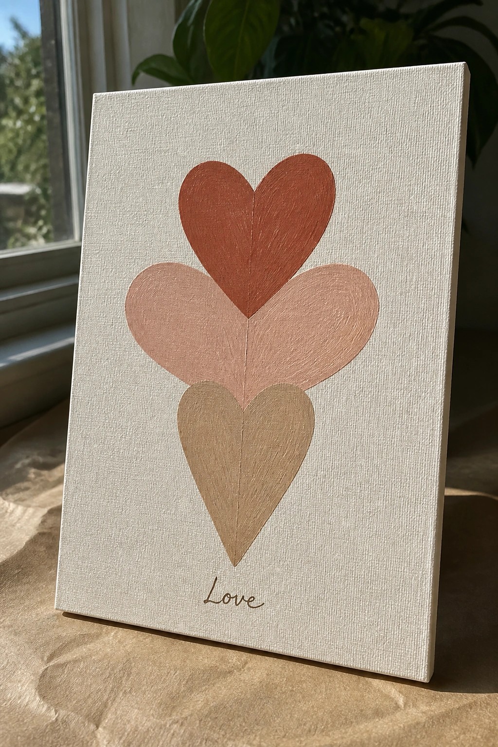
A stacked heart design places three overlapping shapes in a vertical line using a simple gradient of warm tones from deep terracotta down to soft beige. The idea relies on the offset placement so each heart edge shows clearly while the shared center line keeps the whole thing balanced. This approach falls into decorative art that uses basic shapes and a tight palette instead of extra details or backgrounds.
What makes this idea useful is how the repeated heart form and limited color range let you finish it on a small canvas without much planning. You can change the tones to match any room or swap the bottom word for a short phrase that fits your space. The vertical layout also works well for narrow walls or as part of a larger gallery arrangement where you want one clean focal point.
Abstract Cross with Bold Strokes and Soft Blocks
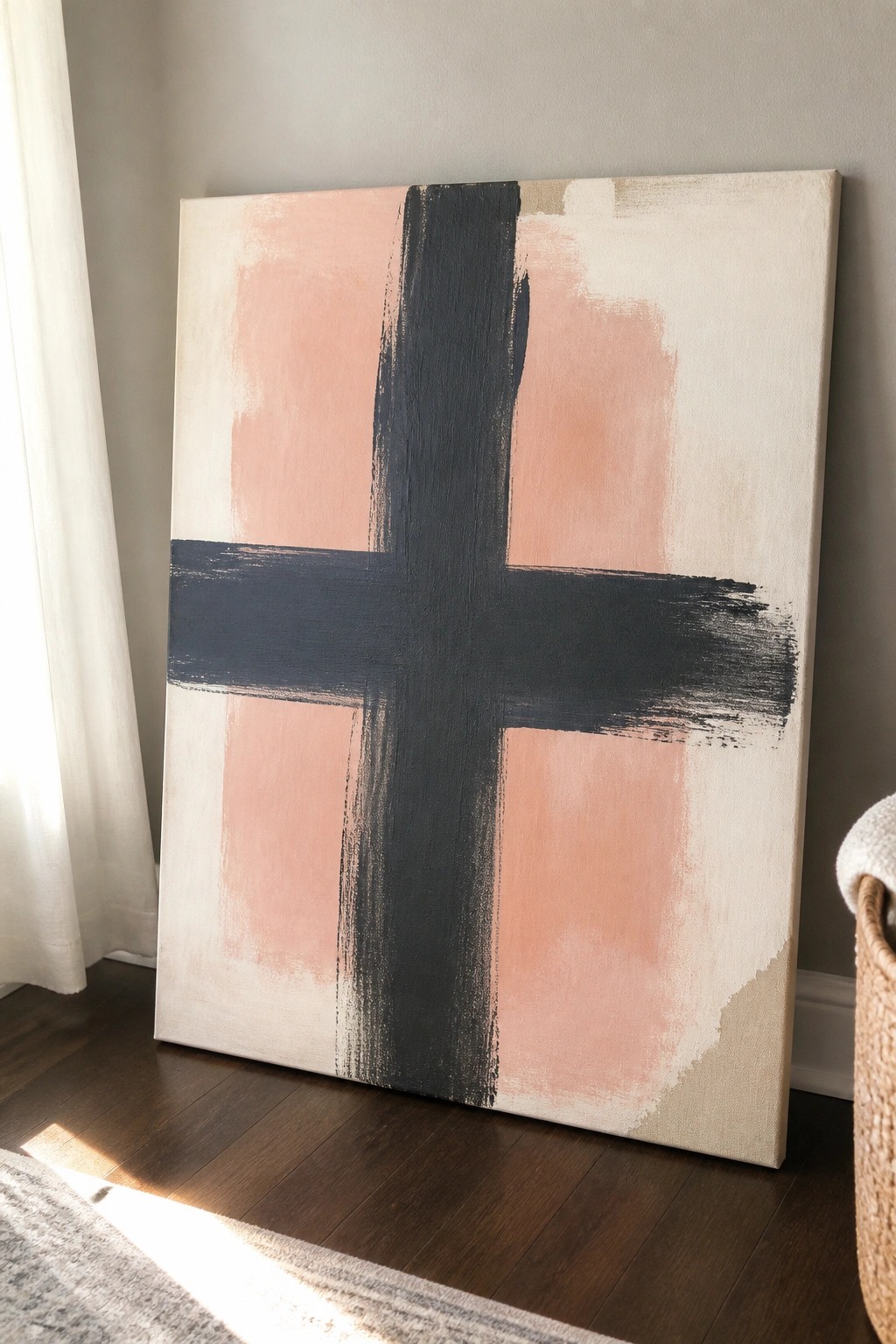
A modern cross painting idea uses wide black brushstrokes to build a simple cross shape over a background of soft rectangular color fields in peach and cream. The thick strokes create clear structure while the muted blocks keep the overall look balanced and understated. This style fits decorative abstract art that works at large scale for wall displays.
What makes this idea useful is how the background blocks naturally frame the cross without extra planning. You can swap the peach for other soft tones to match different rooms or shrink the canvas size for quicker versions. The straightforward shapes also make it easy to adjust the stroke thickness or background layout if you want a more minimal result.
Tree with Cross Detail in Teal and Gold Tones
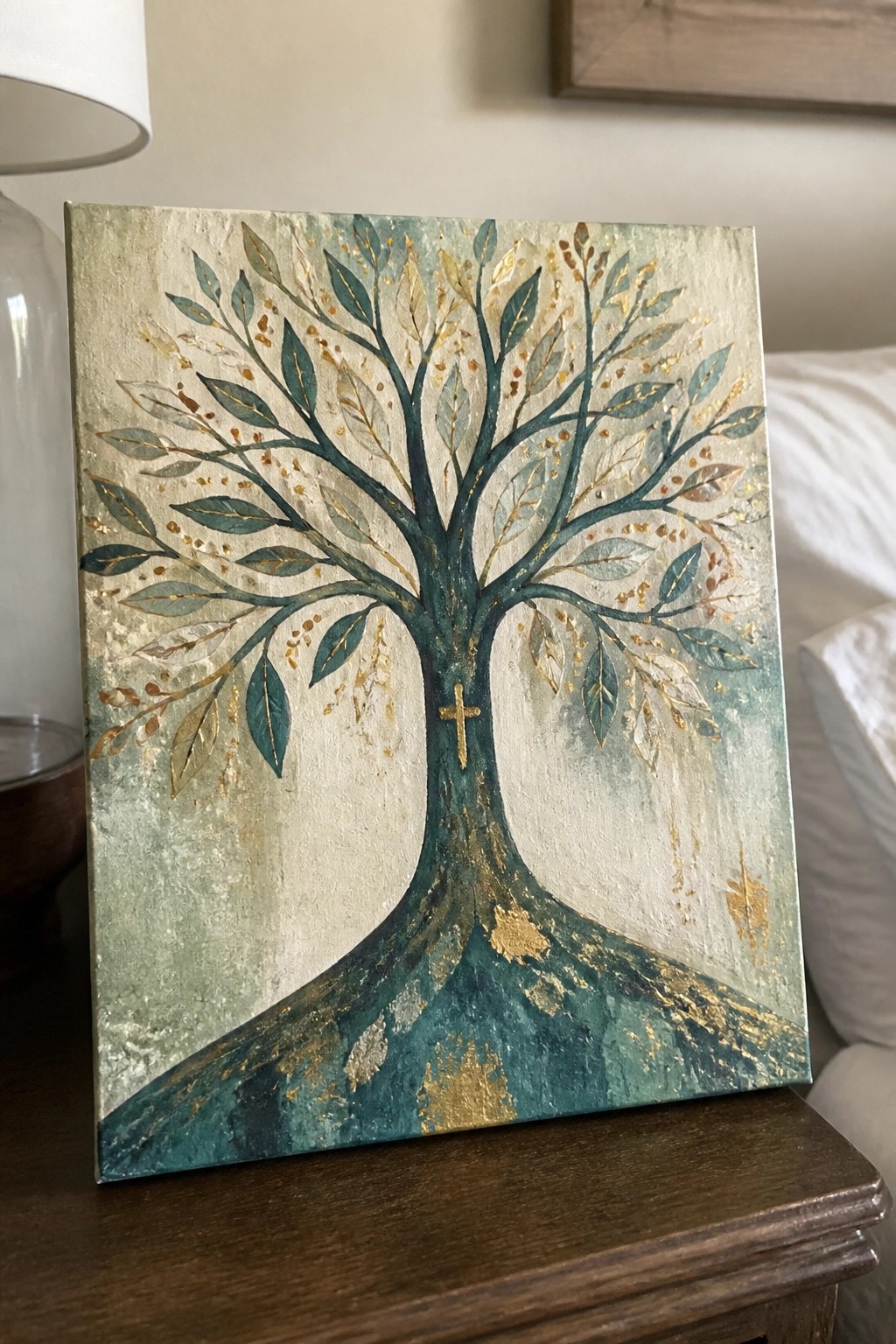
A tree painting that places a small cross on the lower trunk creates a simple way to add a faith element without making it the only focus. The idea uses a full, branching tree shape with leaves in different teal and gray shades, plus scattered gold accents along the limbs and background. The textured base and roots help anchor the design while the gold flecks add contrast across the canvas.
The composition does a lot of the work here by keeping the tree centered and balanced so the cross stays visible but not dominant. You can swap the teal tones for other colors to match a room or reduce the number of leaves for a faster version. This type of piece works well for wall art because the gold details give it enough visual weight to stand alone on a shelf or mantel.
Frequently Asked Questions
What size canvas is ideal for small versus large rooms in a faith based home? For smaller spaces like bedrooms or hallways opt for 12 by 16 inch or 16 by 20 inch canvases to keep the look balanced without overwhelming the area. In larger living rooms or entryways go for 24 by 36 inch or even bigger pieces to create a focal point that draws the eye while still blending with modern furniture. Measure your wall space first and leave at least six inches of clearance around the art for a clean modern feel.
How can I blend these modern Christian canvas ideas with my existing non religious decor? Start by selecting pieces that use neutral colors or abstract designs such as subtle cross motifs or scripture in minimalist fonts to avoid clashing. Place them alongside geometric prints or landscape art in similar tones so the faith element feels integrated rather than separate. Experiment with layouts on the floor before hanging to ensure the overall style stays cohesive and stylish.
Where are the best places to purchase high quality modern Christian canvas prints? Look for reputable online retailers that specialize in faith inspired art or sites like Etsy and Society6 which offer customizable options from independent artists. Check for canvas made with archival inks and stretched over sturdy wooden frames for longevity. Reading recent customer reviews helps confirm quality and color accuracy before buying.
What maintenance steps keep canvas art looking fresh over time? Dust the surface gently with a soft microfiber cloth every few weeks to prevent buildup. Avoid direct sunlight or humid areas like bathrooms which can fade colors or warp the canvas. For deeper cleaning use a slightly damp cloth on the frame only and never apply liquids directly to the printed surface.
How many pieces should I hang together for a gallery wall effect without making the space feel cluttered? Aim for three to five canvases in varying sizes arranged in an asymmetrical pattern to maintain a modern look. Space them two to three inches apart and align the center of the grouping at eye level. This approach highlights the faith based themes while keeping the wall balanced and inviting in any room.