I like to keep my Bible verse paintings pretty simple these days.
It helps them blend into the room without standing out too much.
I’ve found that less detail often makes the words feel more peaceful.
These are some minimal ideas I’ve put together for a clean look.
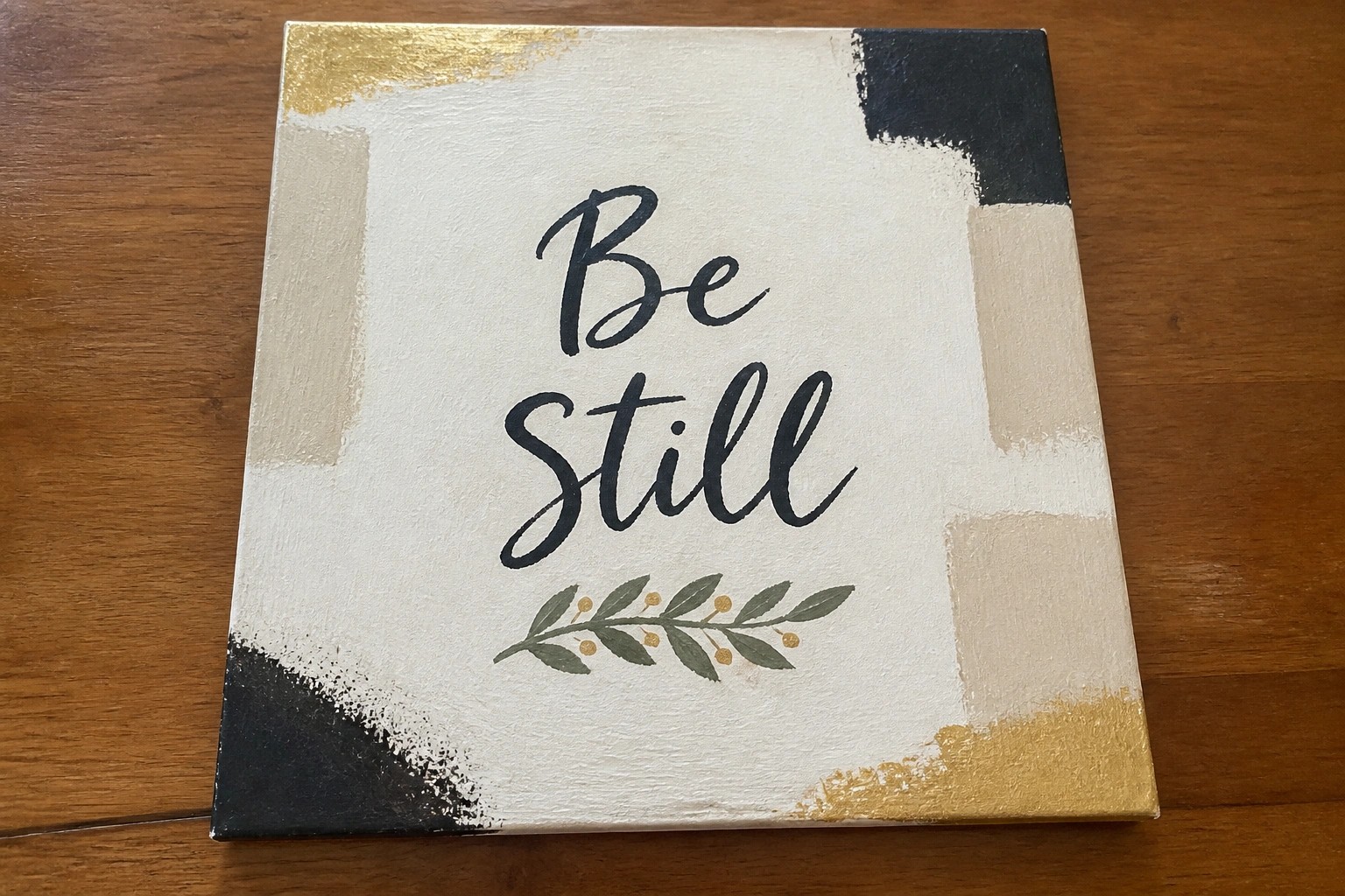
Be Still Typography on Abstract Neutral Background

A simple text-focused idea centers the phrase “Be still” in flowing script with a small leaf branch placed directly underneath. Loose brushstrokes in black, beige, and gold create an abstract backdrop that frames the lettering without competing for attention. The result is a clean decorative piece that combines typography with minimal natural detail for a balanced modern look.
What makes this idea useful is how the neutral tones and open space keep it easy to adapt to different room styles or color schemes. You could swap the leaf for another small element or adjust the brushstroke placement to change the overall feel while keeping the same layout. For wall art, the centered text and limited palette make it a straightforward option that still feels intentional rather than plain.
Minimal Sheep Landscape with Scripture
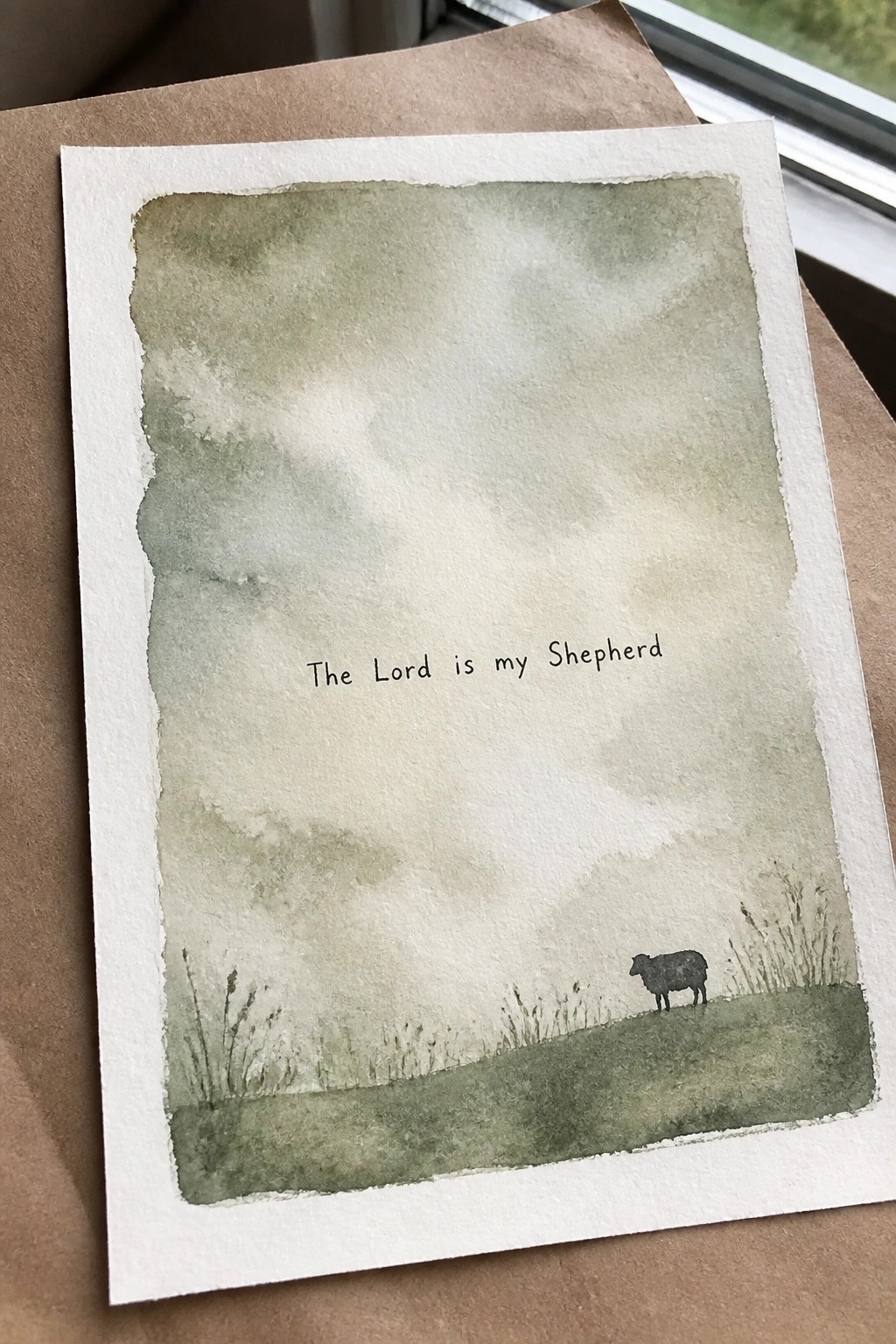
A single Bible verse sits centered in an open field of soft green washes, with one small sheep placed low on a simple hill in the bottom corner. The idea uses a landscape format where the text becomes the main focal point and the animal provides a quiet visual anchor without crowding the page. Muted layers of green keep the overall look light and uncluttered while the sparse grass details add just enough ground to the scene.
What makes this idea useful is the way the large empty space lets the verse breathe while the sheep ties directly to the words. You can easily change the animal or shift the hill line if you want to adapt it for a different verse. The limited palette also makes the layout simple to recreate in other mediums like ink or gouache if you prefer not to work with washes. For Pinterest, the clean vertical format and clear text stand out well in a feed of more crowded designs.
Verse Text Layered Over Soft Abstract Shapes
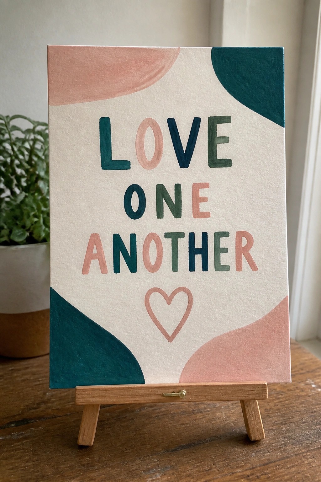
A clean way to present a Bible verse is to paint the words in large block letters with each one in a slightly different muted tone. Abstract curved shapes in teal and blush sit in the corners to frame the text without crowding it, while a simple outlined heart sits centered below. The neutral background keeps the focus on the lettering and the limited color blocks.
The composition does a lot of the work here because the text stays bold and readable while the shapes add interest without extra detail. You could easily change the color palette to match a room or shrink the canvas size for a desk piece. This approach also works well if you want to try hand lettering practice on a larger scale before moving to more detailed projects.
Faith Lettering Above a Simple Cross

This idea centers on pairing a single word with a small cross to create a focused piece of text-based art. The lettering takes up most of the space while the cross sits centered underneath, keeping the overall layout balanced and uncluttered. Soft background washes in muted tones let the main elements stay clear without competing for attention.
The composition does a lot of the work here because the word itself carries the message and the cross acts as a quiet accent rather than a full scene. You can adapt the same layout to other short words or change the background washes to match different room colors. This would be easy to turn into a quick series for wall art or small gifts since it needs little detail and works on standard paper sizes.
Minimal Sunset Horizon With Scripture Text
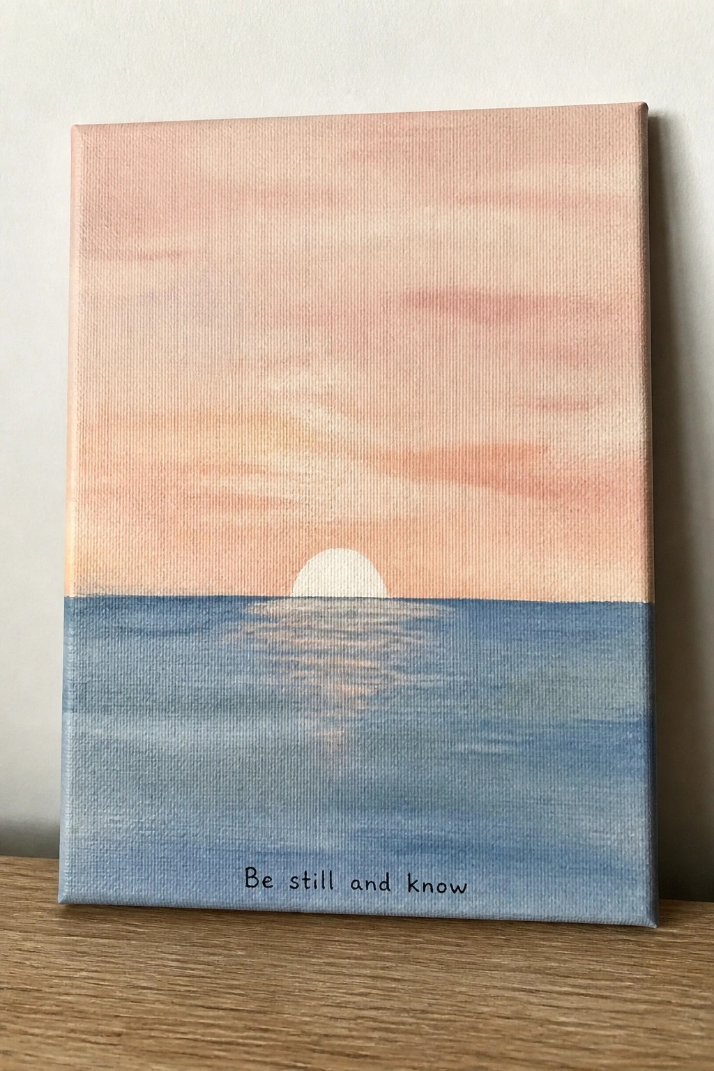
A landscape painting idea that places a small sun directly on the horizon line between a soft gradient sky and a matching band of water. The composition relies on a single clean horizontal division and gentle color blending to keep the eye moving toward the verse text centered below the water area. This style fits the landscape category while using very few elements so the focus stays on the words.
The color palette makes this easy to adapt by shifting the sky tones toward cooler pinks or warmer oranges depending on the room. What makes this idea useful is how the simple split and limited shapes let you paint it on any size canvas without needing fine detail work. For wall art the layout leaves breathing room around the text so the piece still feels modern even after you add the verse.
Minimal Dove with Olive Branch and Peace Text

A flying white dove holding a small olive branch pairs naturally with the single word Peace in a flowing script. The soft blue watercolor washes sit behind the bird to create separation without adding extra elements or busy patterns. This keeps the idea firmly in the animal and text category of decorative art, where one clear subject and a short word deliver a clean result.
The composition does a lot of the work here because the diagonal angle of the wings and the open space around the bird prevent it from feeling crowded. You could shrink the whole design for a greeting card or enlarge the text for a small canvas while keeping the same light background. For practice, this kind of subject works well because the main shapes stay simple and the color choices stay limited, making it easy to finish in one session or adjust the palette to fit different rooms.
Layered Curves with Trust in the Lord

Three stacked curved shapes in mustard yellow, teal, and gray form a simple abstract landscape on a white ground. The painting idea uses flat color blocks with soft edges and generous white space so the short verse sits cleanly at the bottom without competing for attention. This approach fits the decorative art category and keeps the composition balanced through repetition of the curve motif and a limited three-color palette.
The composition does a lot of the work here because the shapes already create movement and separation. You can change the colors to match existing decor or stretch the canvas size while keeping the same three-layer layout. For wall pieces this style works especially well because the flat areas and open space make it easy to photograph and pin. The same idea could be adapted by swapping the verse or shifting the curve heights to create a quick series.
Minimal Watercolor Circle with Centered Script

A single word verse placed over a soft sage green wash creates a clean focal point that stays simple and balanced. The circle shape contains the text without crowding it, while the three small gold dots add just enough weight at the bottom to anchor the layout. This approach fits the decorative art category and works well when you want the lettering to remain the main element.
What makes this idea useful is how little material it requires while still looking finished. The loose edges of the wash forgive uneven brushwork, and the same layout can be repeated with different words or muted colors to build a matching set. For practice, this kind of subject helps focus on lettering placement and spacing without needing complex backgrounds.
Minimal Ichthys Sign with Follow Me Text

The idea uses the fish symbol outline as a frame for the short phrase “Follow me” painted directly inside it. The layout stays centered on a light background with a contrasting border that has a lightly worn finish to add texture. This keeps the whole piece in the decorative sign category while relying on bold lines and limited elements to stay minimal.
What makes this idea useful is how the fixed shape of the fish does most of the design work, leaving only the text placement to adjust. The two-color background makes it easy to swap the border shade to match a room or try a solid background instead of the worn edge. For wall art, the same layout works at smaller sizes for shelves or grouped with other short-phrase signs.
Olive Branch with a Single Word
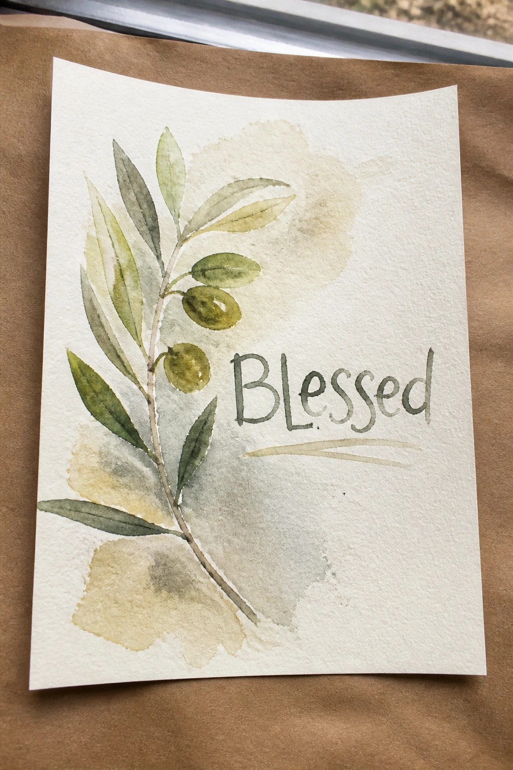
A watercolor olive branch with soft green leaves and a few olives makes an effective botanical accent when placed beside a single word in handwritten lettering. The idea uses plenty of negative space on the right side so the text stands out clearly against the light background washes. This keeps the overall look minimal while still giving the branch enough detail to feel natural rather than flat.
What makes this idea useful is that the branch can be shortened or lengthened to match whatever verse or word you want to add. The muted greens and beige tones adapt easily to different paper colors or frame styles without needing extra elements. For practice, the simple leaf shapes and loose olives give you a chance to focus on brush control and basic lettering at the same time. This format also works well for quick prints or cards since the composition stays balanced even at smaller sizes.
Give Thanks Bread and Cup Still Life
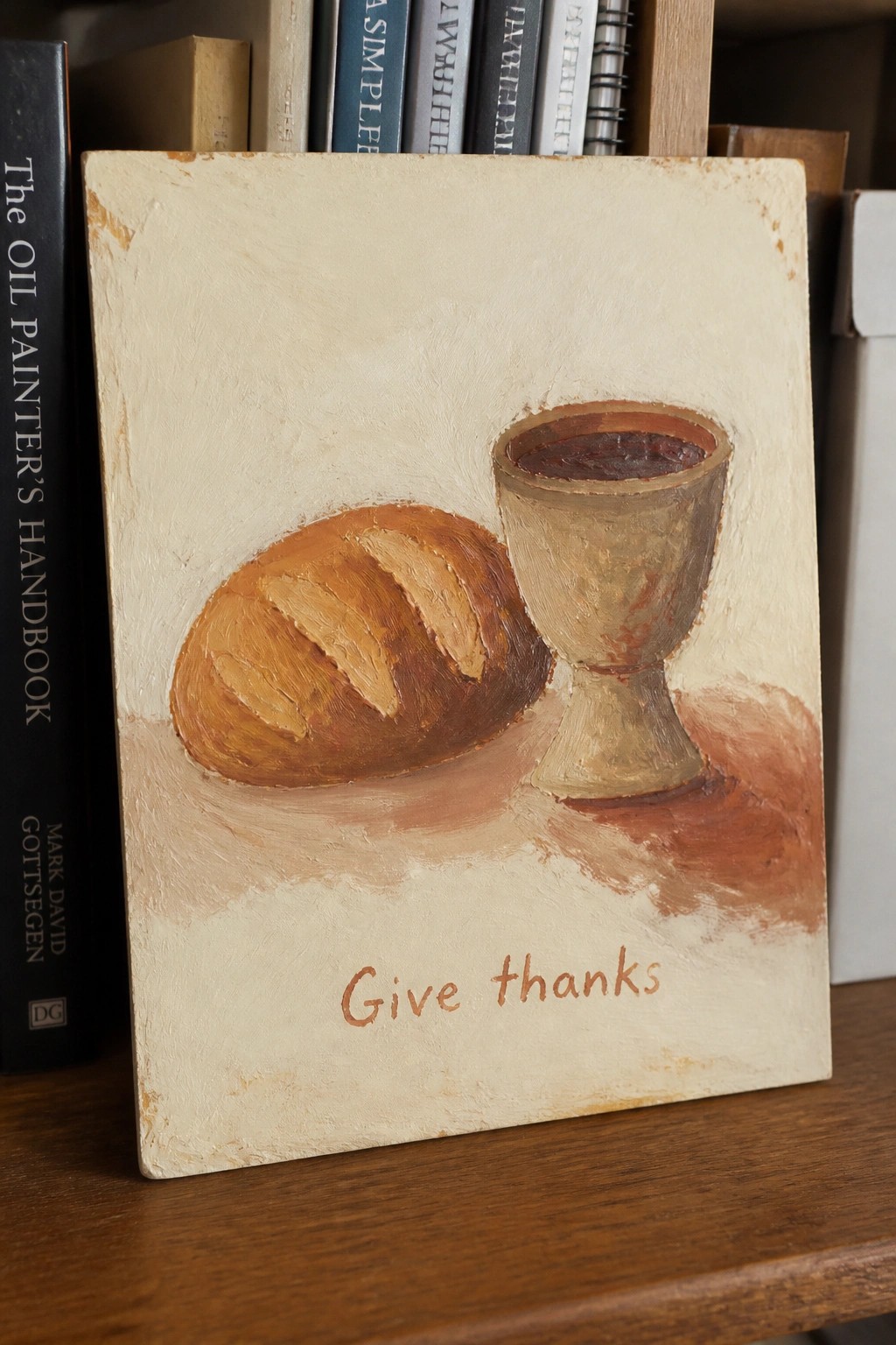
A still life of a loaf of bread next to a cup creates a clear, direct way to pair the verse give thanks with simple objects. The idea uses a balanced horizontal setup where the bread sits on the left and the cup on the right, both placed against a plain background with minimal texture at the base. Earthy browns and warm beiges keep the focus on the shapes while the text sits centered underneath in a matching tone.
The composition does a lot of the work here because the two rounded forms balance each other without needing extra elements. You can easily change the cup style or shift the text size to fit other short verses. For wall pieces this kind of subject stays minimal and modern while giving a clear nod to scripture. The same layout works just as well if you simplify the brushwork or swap the background to a single flat color.
Mixed Color Lettering with Small Sun Accent

This painting idea uses a short Bible verse paired with a simple sun drawing to create a clean decorative piece. The lettering shifts through several colors while staying compact and centered on the page, and the sun sits directly above as a small focal point. The approach fits into minimal decorative art because it relies on basic shapes and limited elements rather than detailed backgrounds or complex layouts.
What makes this idea useful is how the color changes in the letters let you use up leftover paint without needing a full palette. The layout works well for cards or small wall pieces since the white space keeps everything readable and modern. You could easily swap the sun for another basic shape or adjust the verse length to fit different paper sizes. For practice, this kind of project helps build lettering skills while staying quick to finish.
Minimal Cross with Short Phrase

A single vertical stroke crossed by a shorter horizontal one forms the main element, centered above a short line of text on a plain background. The idea uses basic line work and ample empty space to keep the focus on the shape and words without any added details or color. This approach falls into decorative art that pairs simple symbols with text for a stripped-down result.
What makes this idea useful is how the cross can be redrawn at different sizes or thicknesses to fit various canvas dimensions. The text can be swapped for other short phrases while keeping the same layout. For wall art, something like this works especially well when you want a quick piece that relies on placement rather than detail. The plain background makes it easy to adapt the colors or add a subtle texture if desired.
Winding Path to Hilltop Cross
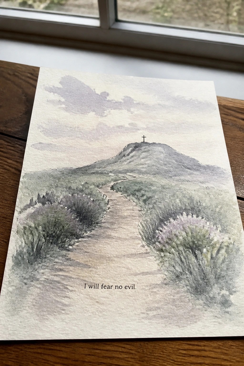
A landscape painting built around a winding path through low shrubs that leads to a distant hill works well for Bible verse art. The composition places the cross as a small but clear focal point at the top while keeping the foreground simple and open. Soft washes in muted greens and earth tones give the scene depth without clutter, which fits the clean modern style.
What makes this idea useful is how the path does most of the visual work and keeps the layout balanced. You can easily change the color palette to cooler blues or warmer browns depending on the room. For wall pieces this format leaves room for the verse text at the bottom and scales well to smaller sizes. The same idea can be simplified by using fewer brushstrokes on the shrubs or turning the whole scene into a line drawing with flat color.
Stacked Hearts with a Short Verse
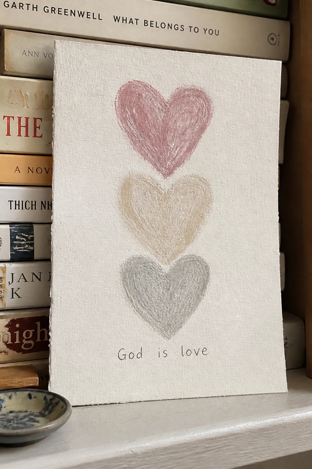
A painting idea built around three hearts stacked vertically, each filled in a different muted tone, with the phrase “God is love” placed directly underneath. The hearts use simple outlines and visible brushwork that keeps the surface textured but still minimal. This format works as decorative text art because the vertical arrangement and limited color choices keep the composition balanced and easy to read.
What makes this idea useful is how the repeated shape handles most of the visual work while the text stays small and secondary. You can swap the three colors for any set that matches your room or change the verse without redrawing the layout. For practice or quick gifts, the idea scales well to smaller canvases and needs only basic brush control.
Frequently Asked Questions
What Bible verses work best for minimal designs? Short and powerful verses such as Philippians 4:13, Jeremiah 29:11, or Psalm 46:10 stand out because they deliver a clear message with limited text. This approach keeps the focus on elegant typography and negative space rather than crowded layouts.
How can I make these prints at home without special equipment? Use free design tools like Canva to select clean sans-serif fonts and simple layouts. Print on matte cardstock in black and white, then trim the edges neatly. This method produces a professional modern result using only basic supplies.
Where should I hang minimal Bible verse art in my home? Position the pieces in calm spaces such as above a bedside table, along a hallway, or near a workspace. Pair them with plain walls and minimal surrounding objects so the design stays uncluttered and the verse remains easy to read.
What color choices keep the look clean and contemporary? Stick to black text on white or light gray backgrounds for high contrast without distraction. Add one soft accent like pale beige or muted sage if color feels necessary, but avoid multiple shades that could make the piece feel busy.
How do I customize the 15 ideas to match my personal style? Start with the suggested layouts and swap in your favorite verse or adjust the font weight slightly. Test different alignments, such as centered or left-justified text, and keep any added elements like thin lines very subtle to preserve the modern minimalist feel.