I paint with watercolors quite a bit in my spare time.
The soft colors help me create peaceful images that feel calming.
For this list I focused on Christian themes that work well with those gentle tones.
I tried painting a few examples myself before writing this.
They are simple enough that anyone can try them at home.
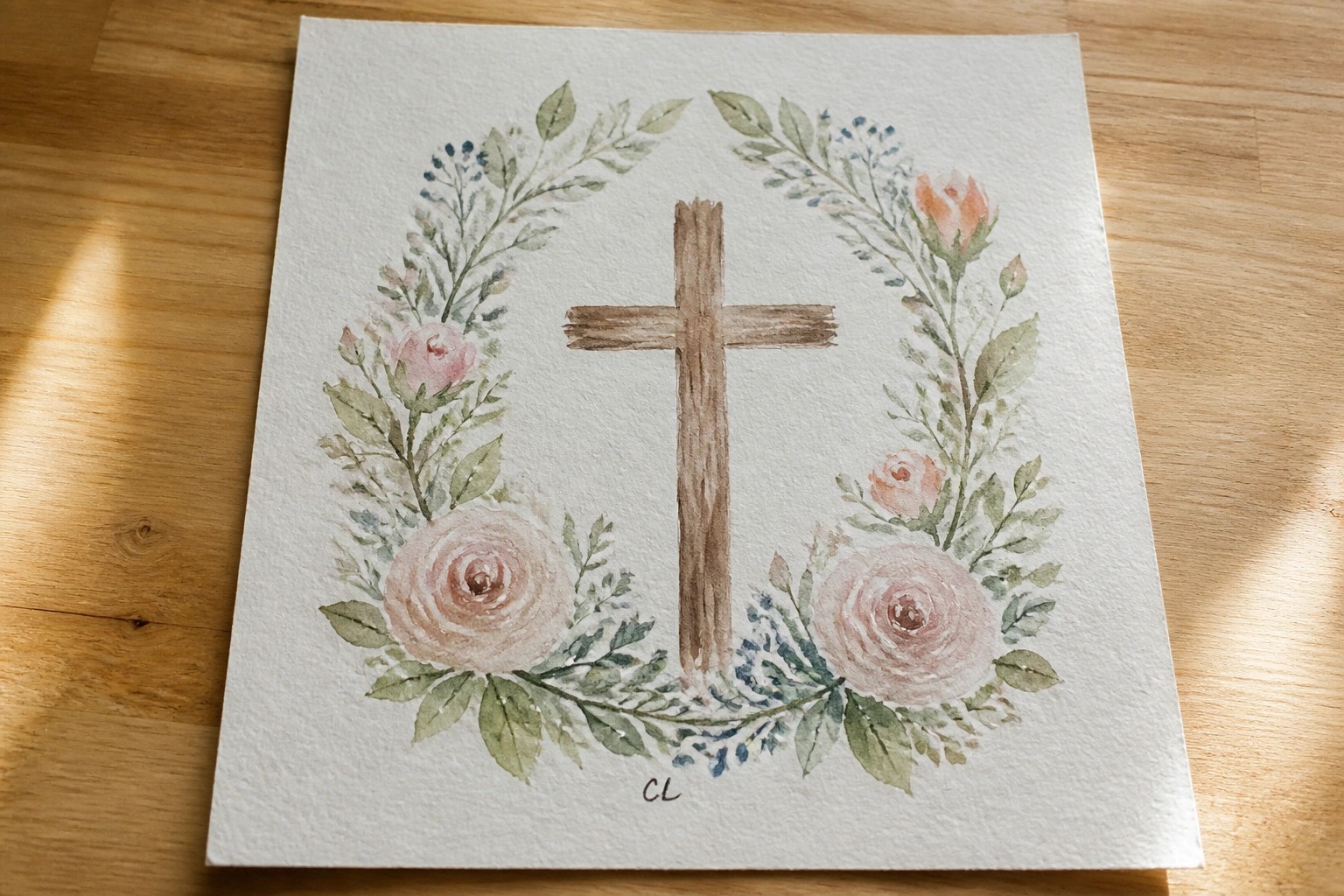
Floral Wreath Around a Simple Cross

A centered cross with a loose circular border of roses and greenery forms a clean decorative layout that pairs a religious symbol with soft botanical elements. The idea relies on spacing the flowers unevenly so some areas feel fuller while others stay open, which keeps the eye moving around the cross instead of landing only in the middle. Soft pinks mixed with muted greens and a plain background make the whole piece feel balanced without needing extra layers or texture.
The composition does a lot of the work here by letting the cross stay prominent while the flowers fill the negative space around it. This setup works well for wall pieces or small prints because the wreath can be tightened or spread out depending on the paper size. The color palette makes it easy to adapt by swapping in different flower types or trimming the number of blooms for a quicker version. For practice this kind of subject helps with basic placement and color mixing without requiring advanced techniques.
Soaring White Dove in Soft Watercolor Skies
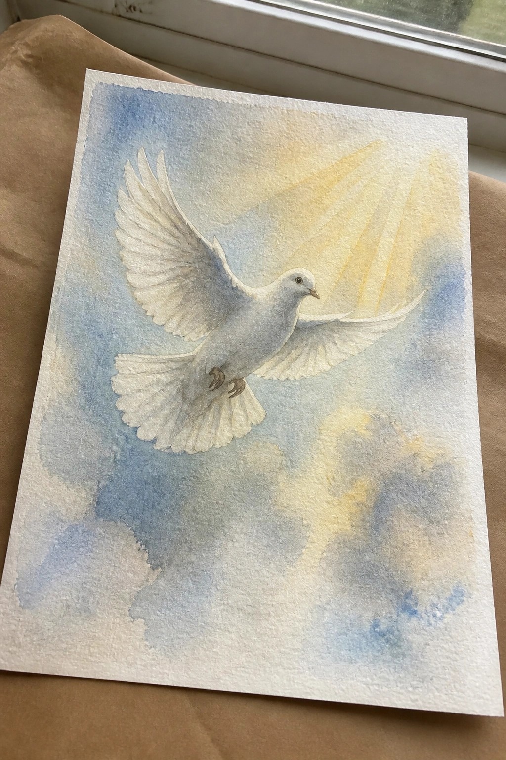
A flying white dove works well as the main subject in this animal painting idea. The extended wings create a clear sense of motion while the gentle blue and yellow background washes keep the focus on the bird without competing details. Cloud shapes and faint light rays add depth and help balance the open composition.
What makes this idea useful is how the centered placement lets you practice basic bird proportions before adding background layers. You could easily change the yellow tones to other soft shades to fit different wall colors or seasons. For wall art the simple layout keeps the dove readable even at smaller sizes, and the same idea can be scaled down for cards or practiced on cheaper paper first.
Scripture Wreath in Soft Greens and Lavender
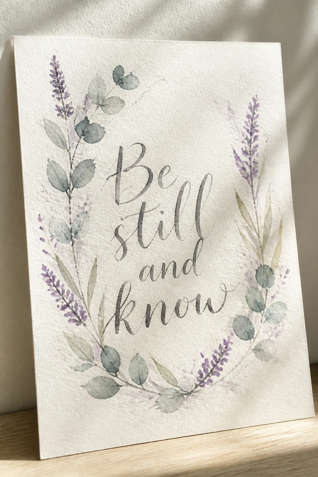
A circular wreath built from overlapping eucalyptus-style leaves and lavender stalks frames a short phrase in cursive lettering. The foliage uses blended washes of muted green with touches of purple and beige to create depth while keeping the center open for the text. This approach falls into decorative text art that pairs simple botanical shapes with lettering.
What makes this idea useful is how the wreath layout naturally directs attention to the words without extra elements. You can scale the size down for cards or keep it large for a framed piece, and the muted palette adapts easily if you want to swap in different leaf shapes. For practice, this kind of subject lets you focus on even spacing and light layering before adding the lettering in the middle.
Silhouetted Nativity Under a Bright Star
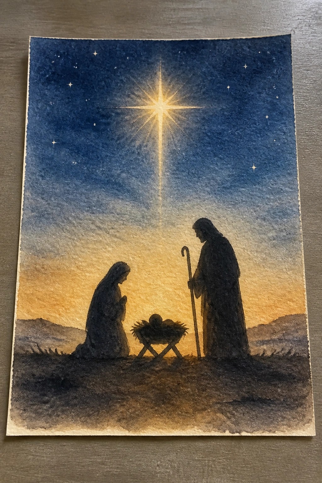
A nativity scene built around dark silhouettes of Mary, Joseph, and the manger set against a gradient sky gives a clean religious painting idea. The main focus stays on the large starburst at the top center, with the figures kept low and simple so the eye moves straight to the light source. The soft wash from deep blue down to warm orange creates separation between sky and ground without extra details on the shapes themselves.
The composition does a lot of the work here by keeping the figures minimal and letting the star carry the visual weight. This idea works especially well for Christmas cards or small wall pieces since the silhouette method removes the need for facial details or complex clothing. You could swap the warm tones for cooler blues if you want a quieter version, or crop tighter around the star and manger to make a smaller study.
Praying Hands with a Soft Halo

A pair of hands held together in a prayer position forms the core of this idea, painted with visible brush lines and a loose watercolor approach. The large circular wash behind the hands acts as a simple framing element that draws attention to the subject without adding extra details. This type of composition works as a straightforward Christian art piece that relies on shape and placement rather than intricate background work.
What makes this idea useful is the vertical layout that lets the hands take up most of the space while the circle keeps the eye centered. The color palette stays limited to warm earth tones, which makes it simple to recreate on different paper sizes or swap in softer shades if needed. For wall art, the clean arrangement translates well to prints or greeting cards without losing impact. The dripping lines at the bottom also give an easy way to add variation or stop the painting earlier if a shorter version fits better.
Rural Church with Winding Path
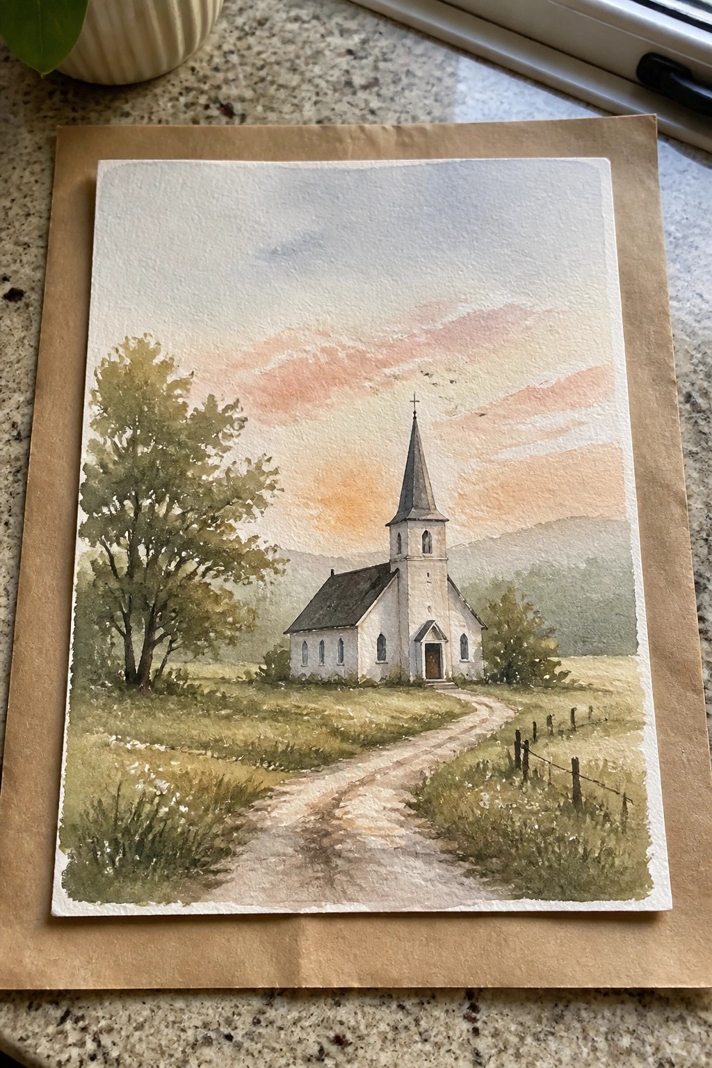
A church landscape idea like this centers on a simple white building with a tall steeple placed in open countryside. The winding path leads the eye forward while trees and fields balance the sides of the scene. Soft sky washes in warm tones give the whole composition a calm, open feel without extra detail.
The composition does a lot of the work here by using the path as a clear guide to the main subject. You can swap the sky colors for different seasons or crop the fields tighter if you want a smaller format. This works well for wall pieces or quick practice with basic washes and simple shapes. The same layout could easily be adapted into a greeting card or a larger canvas version.
Vertical Pair of Watercolor Ichthys Symbols
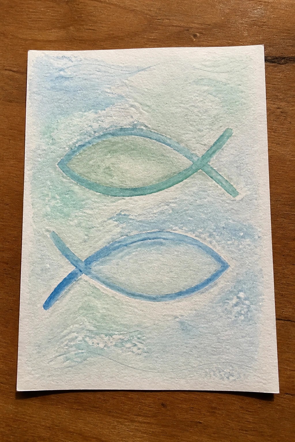
Two ichthys symbols painted in different blue-green shades create a straightforward Christian art idea with minimal elements. The top fish uses a teal wash while the lower one shifts to a brighter blue, both left with soft edges and visible paper texture inside the outlines. Faint wave lines above and below the pair add a light water reference that ties the composition together without crowding the page.
What makes this idea useful is how the vertical layout and color shift do most of the visual work, so the same approach works for greeting cards or small framed pieces. You can easily swap the blues for other soft tones or reduce it to a single fish if you want a simpler version. The loose background keeps attention on the shapes, which makes it a good practice piece when testing watercolor washes on textured paper.
Watercolor Angel Figure with Soft Background Wash

A centered angel figure with wings, halo, and clasped hands forms the core of this painting idea. The style uses rounded shapes for the head and body, paired with flowing wing outlines and a loose wash of cool purples and blues behind it. This setup lets the main subject stay clear while the background adds gentle contrast without extra details or layers.
The composition does a lot of the work here by keeping the figure large and balanced with open space on all sides. You can adapt it easily by changing the background wash to soft greens or keeping the whole piece in warm neutrals for a different look. This kind of idea works especially well for greeting cards or small prints because the main shapes stay simple to draw first, then fill with light color.
Watercolor Thorn Circle with Inner Blooms

A circular wreath made from overlapping thorny branches creates a strong frame around a small flowering branch placed in the center. The idea works as a decorative still life where the outer ring draws attention inward while the soft leaves and clustered white flowers fill the middle without crowding it. Muted brown tones for the thorns and gentle green washes on the leaves keep the whole piece balanced and easy to read from a distance.
What makes this idea useful is the clear separation between the outer ring and the center element, which lets you adjust the size of either part without losing the structure. You could simplify it by using fewer thorns or swap the flowers for a different small plant if you want to personalize it. The limited color range also makes it a good choice for testing washes and layering on larger paper while still producing something that reads well as wall art or a greeting card.
White Lilies With a Loose Green Wash
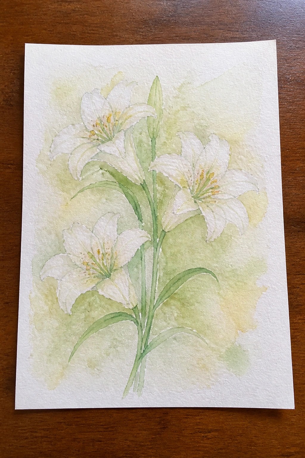
White lilies painted with several open blooms and one tall bud create a clean floral idea that relies on vertical stems for structure. The painting idea centers on grouping the flowers slightly off center so the composition feels natural rather than stiff, while the soft background wash in pale green and yellow keeps the focus on the blooms. This type of floral study works well because the limited palette and simple stem lines let the shapes stay readable even with light layering.
What makes this idea useful is how the tall vertical layout can be adjusted for different paper sizes without losing balance. You can simplify it further by reducing the number of flowers or keep the full cluster for a more finished look. The background wash is easy to adapt with any soft color that still lets the white petals stand out. For practice, this kind of subject helps with basic bloom shapes and stem placement before adding more complex details.
Palm Frond in Gentle Watercolor Greens

A single palm frond works well as a standalone subject when painted with layered greens that shift from light to deeper tones along each leaf. The idea relies on a centered stem with radiating fronds set against a very light background wash to keep the focus on the plant form itself. This botanical approach uses simple color variation and negative space around the edges to create a clean, balanced layout without extra elements.
What makes this idea useful is the straightforward composition that lets you focus on brush control and color mixing on one main shape. You can adapt it by swapping in different leaf types or softening the background further for a lighter look on a larger sheet. For wall pieces, the vertical layout fits narrow spaces and stays easy to frame without crowding. The same structure works if you want to practice wet-on-wet blending on the leaves while keeping the rest minimal.
Shepherd and Sheep on a Rolling Hillside
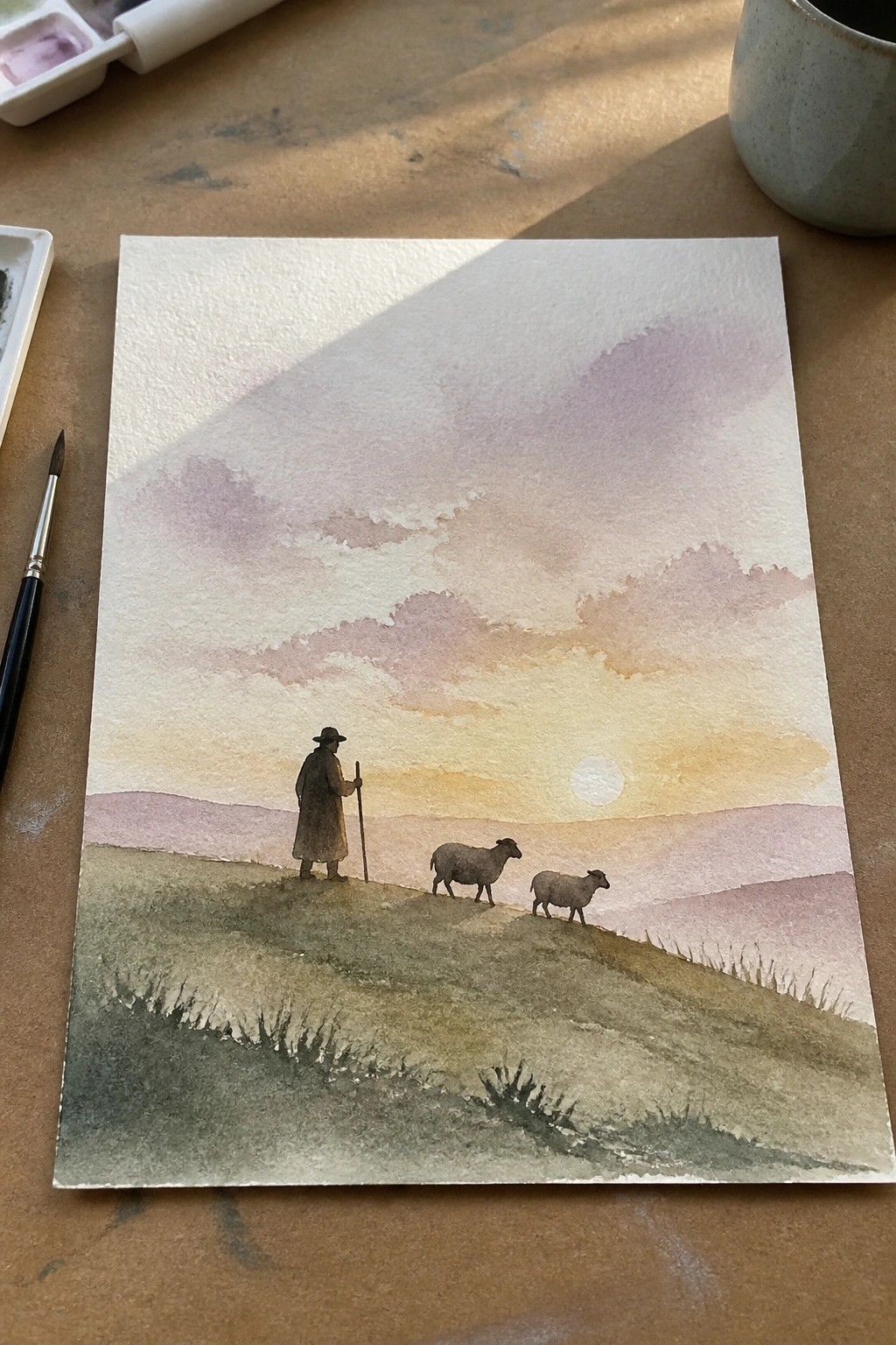
A landscape idea that places a single shepherd figure and two sheep on an open slope works well for creating quiet depth with minimal elements. The composition uses a low horizon line and a large sky area filled with soft overlapping washes in peach, lavender, and pale orange to pull the eye forward. Earthy greens and browns in the foreground ground the scene while the small scale of the figures keeps the focus on the overall setting rather than fine details.
The composition does a lot of the work here because the sky gradient and distant hills establish mood with broad strokes instead of intricate work. You could simplify it further by using just one sheep or swapping the sunset for a cooler dawn palette if you want a quicker study. For wall art this kind of scene adapts easily to different paper sizes and stands out on Pinterest when the sky colors stay soft and blended rather than bold.
Soft Pink Heart with Centered Cross
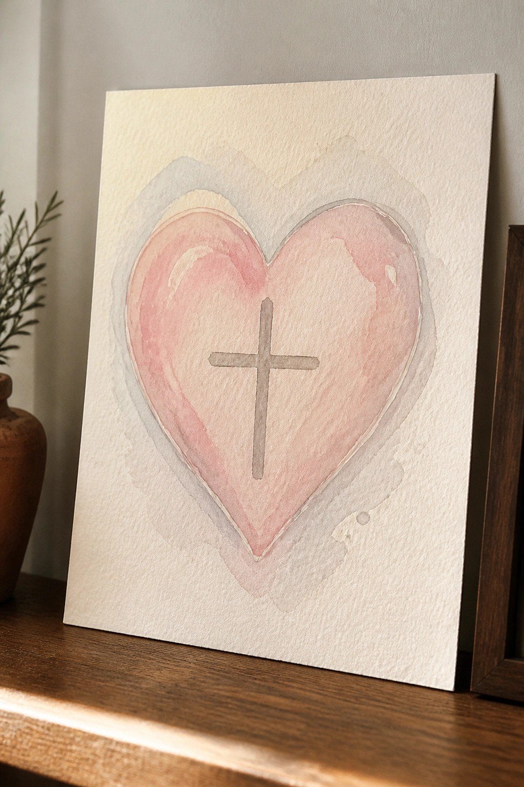
A heart shape painted in blended pink watercolor tones forms the main subject, with a simple gray cross placed directly in the middle. The composition relies on the centered placement and soft edges around the heart to keep the focus clear while the surrounding washes add subtle depth without crowding the design. This approach fits decorative Christian art that uses basic shapes and limited color layers for a straightforward result.
What makes this idea useful is how the large heart area gives room to practice even watercolor washes before adding the cross on top. The muted palette makes it easy to adjust the pink shade or switch the cross color for different wall colors or gift preferences. You could scale the whole thing down for cards or repeat the layout on a larger sheet for bigger frames.
Open Book Still Life with Small Cross Detail
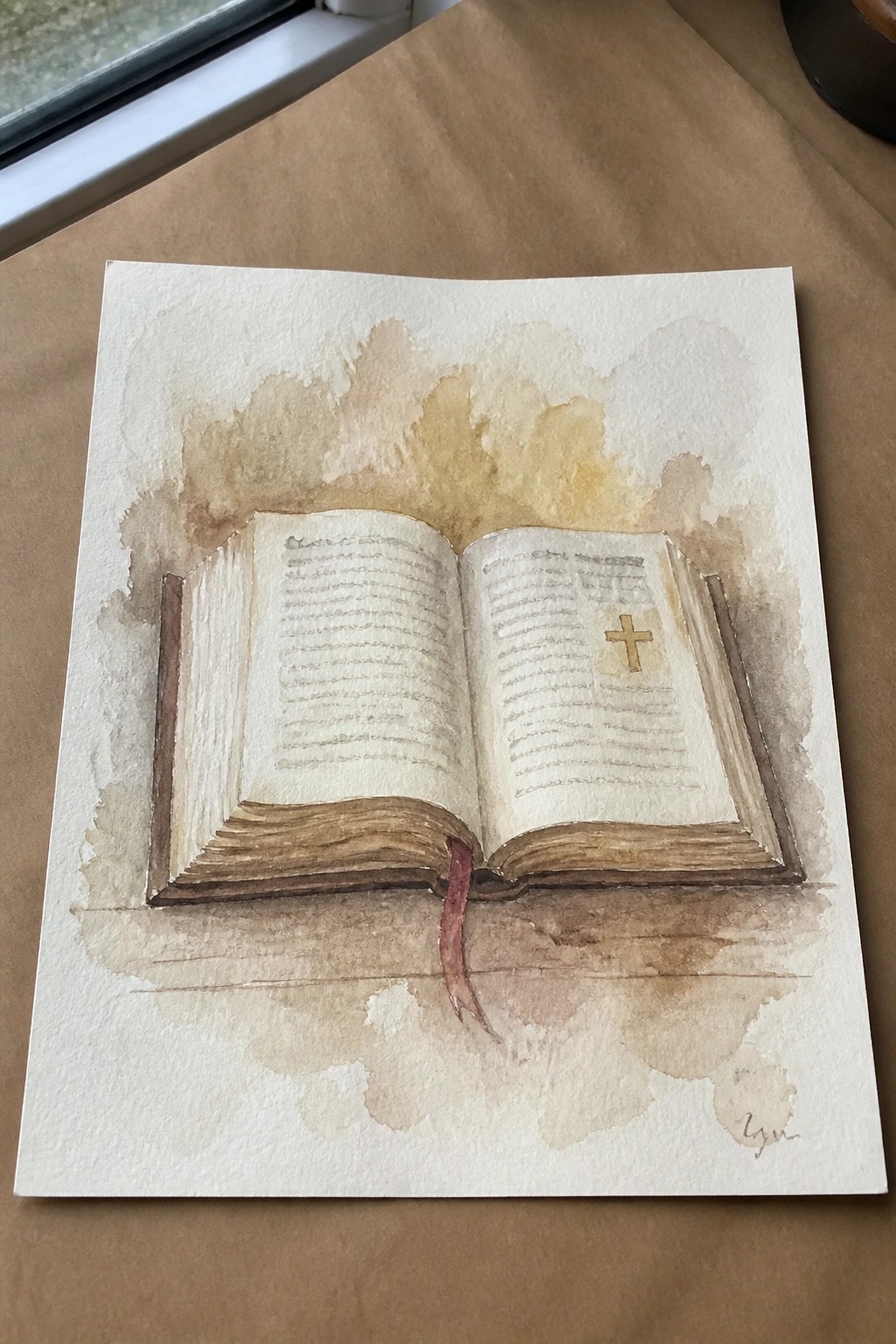
An open book still life like this focuses on the spread of pages as the main shape, with a small gold cross placed on one page to add a clear focal point without extra elements. The painting idea uses soft brown washes around the edges to create a loose border that keeps attention on the book while the red bookmark hangs down as a simple vertical line. This still life category works because the pages stay mostly blank with light lines for text, letting the overall form and the cross stand out.
What makes this idea useful is how the centered book shape is straightforward to block in first before adding any color. The neutral brown and beige palette can be swapped for other soft tones or used on different paper sizes without changing the layout much. For practice, the minimal page detail means you can repeat the subject quickly to work on even washes. This kind of piece translates easily to cards or small prints since the empty space above the book leaves room for a short line of text if needed.
Overlapping Circles with a Centered Cross
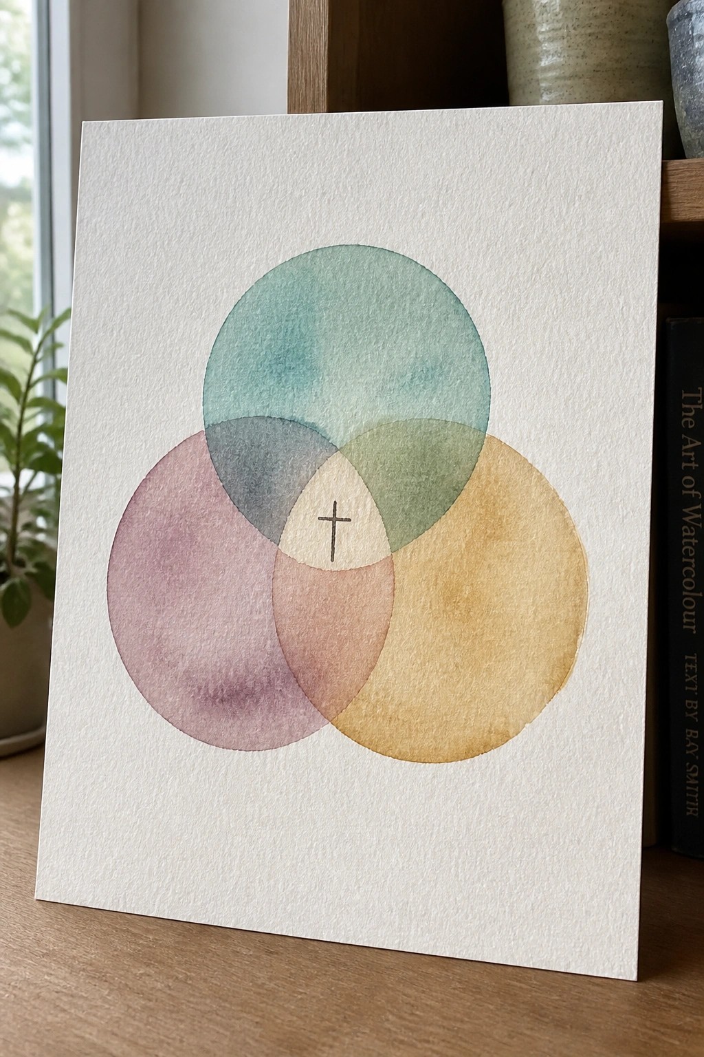
Three translucent watercolor circles in soft teal, rose, and ochre overlap to form a small central space that holds a simple black cross. The idea uses basic geometric shapes and gentle color blending to create a balanced layout where the symbol sits naturally in the middle without extra detail. This fits into the decorative category because the overlapping areas produce new color mixes that keep the composition interesting while staying minimal.
What makes this idea useful is how the circle arrangement handles most of the layout work, so you only need to choose three colors that mix cleanly. The same structure can be scaled down for cards or enlarged for bigger pieces, and the colors can be swapped for seasonal tones without changing the core setup. For practice, it gives a clear way to work on controlled washes and overlaps before adding the cross at the end.
Cross on a Rocky Island at Sunset
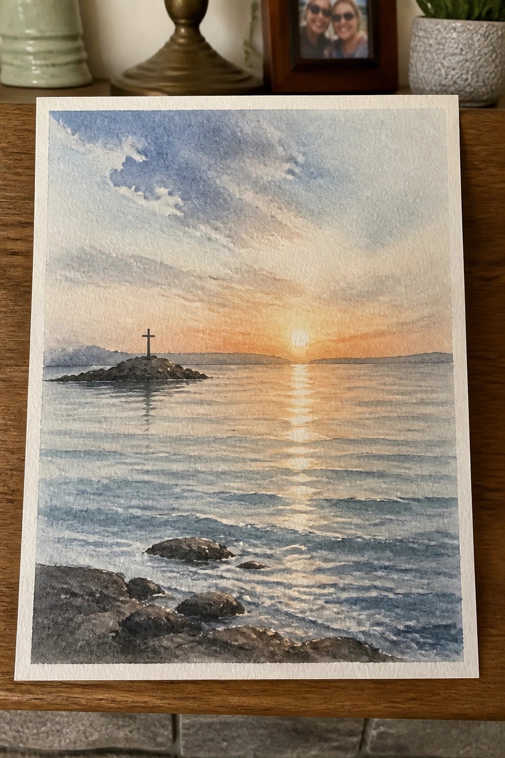
A landscape idea that places a simple cross on a small rocky island set in open water during sunset. The sun sits low on the horizon with its reflection running straight toward the viewer, while layered waves and a few dark foreground rocks create depth without crowding the scene. This approach works as a straightforward seascape that adds a single focal element rather than filling every area with detail.
The composition does a lot of the work here by using the light path on the water to lead directly to the cross. You could shrink the island or reduce the number of wave lines to make it quicker, or swap the sunset for softer morning tones if you want a different palette. For wall pieces this layout stays balanced even at smaller sizes, and the limited color range makes it easy to match with other soft watercolor sets.
Candle and Olive Branch Still Life
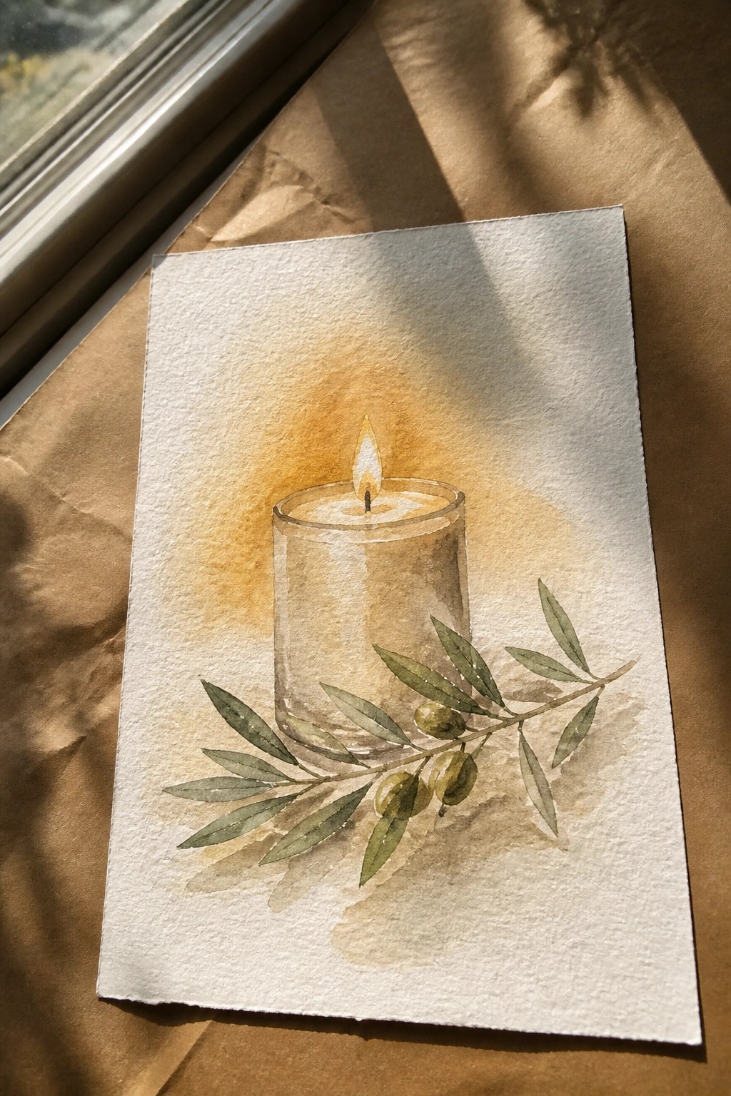
A still life of a lit candle in a clear glass holder with an olive branch resting at the base works as a compact painting idea. The candle sits near the center while the branch angles outward, giving the composition a natural flow without extra elements. The soft wash behind the flame adds subtle contrast that keeps attention on the main objects.
What makes this idea useful is how the two main pieces create interest without needing complex details. You can easily swap the olive branch for other leaves or shorten the composition for a smaller paper size. The warm background wash also makes it simple to practice light effects and produces a clean result that works for wall prints or greeting cards.
Frequently Asked Questions
What materials are best for creating soft peaceful watercolor Christian art? High quality watercolor paper with a cold press texture works well to hold light washes without buckling. Choose artist grade paints in muted tones such as soft blues, sage greens, dusty pinks, and creams. Round brushes in sizes 4, 8, and 12 allow gentle blending while a small detail brush helps add delicate elements like crosses or doves.
How can beginners start with these watercolor Christian art ideas? Begin by sketching simple outlines of familiar symbols such as an open Bible, a dove, or a cross on light paper. Apply very diluted paint in thin layers and let each layer dry before adding the next. Follow the 17 ideas by focusing on one element at a time and use reference photos of peaceful landscapes to guide your color choices.
Which Bible verses pair naturally with soft colored watercolor Christian themes? Psalm 46:10 and Philippians 4:6-7 fit beautifully because their messages of stillness and peace match the gentle color palettes. Write the verse in soft calligraphy near the artwork or leave space for it within the composition so the text becomes part of the overall serene design.
How do I keep the colors soft and avoid harsh lines in my paintings? Work with a wet on wet approach by dampening sections of the paper first then dropping in color so edges blend naturally. Limit your palette to three or four harmonious hues and lift excess pigment with a clean damp brush if areas become too dark. This method keeps the finished pieces looking calm and inviting.
What are good ways to display or share the finished watercolor Christian art? Frame pieces in simple white or light wood frames with wide mats to let the soft colors stand out. Print smaller versions on cardstock for greeting cards or devotionals or scan the originals to create digital wallpapers for phones and tablets. These options let the artwork serve as quiet reminders of faith throughout daily life.