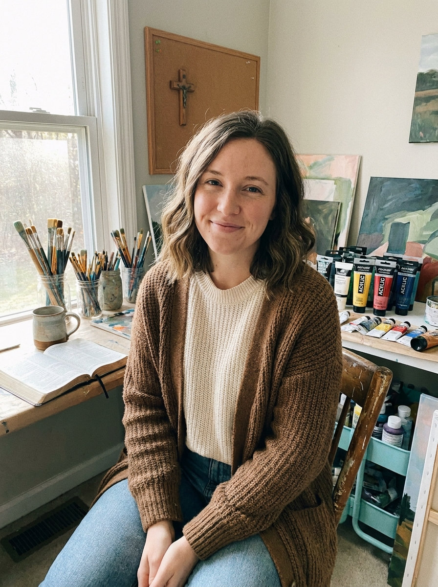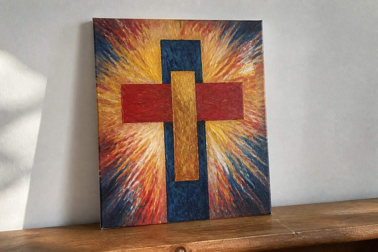
I’ve been messing around with abstract art for a while now and I keep coming back to Christian themes.
It is interesting how you can use shapes and colors to hint at bigger ideas without spelling them out.
I came up with these ideas because I wanted something that feels personal but still carries some meaning.
Some of them use simple symbols like crosses or light in ways that are not too obvious.
I hope they give you a starting point if you are looking to try something similar.
Cross with Radiating Warm Background
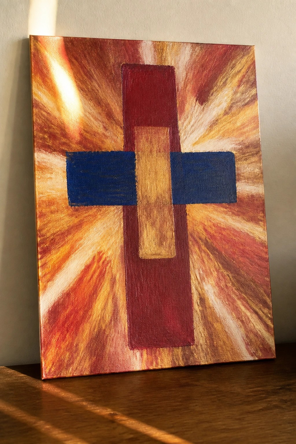
A central cross built from overlapping rectangles in red, gold, and blue sits against a background of outward-streaking brushstrokes in orange, red, and yellow. The horizontal blue bar breaks the vertical shape and creates a clear focal point while the radiating strokes add motion around the edges. This setup uses simple geometric forms against an active field of color to keep the composition balanced and direct.
The composition does a lot of the work here by letting the cross stay readable even when the background stays loose. You can change the blue bar to another shade or reduce the rays to fewer strokes if you want a faster version. For wall art this kind of piece works because the strong contrast holds up at different sizes and the limited color range makes it easy to match with existing decor.
Negative Space Dove on a Loose Color Wash
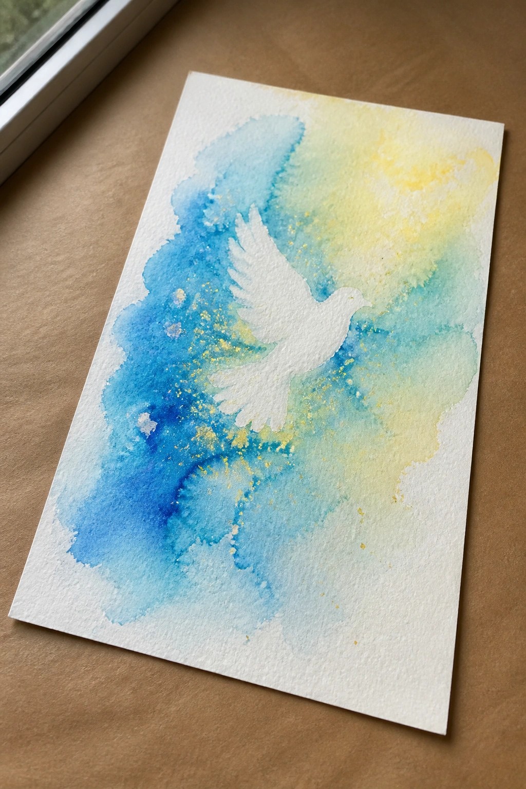
A painting idea built around negative space lets the unpainted paper become the main subject. The dove is formed simply by protecting that area while loose blue and yellow washes fill the rest of the page, with small gold flecks added for texture. This approach works because the soft color blends and irregular edges create movement without any need for detailed brushwork.
The composition does a lot of the work here since the background can stay loose and still support the clean shape. You could adapt it by switching the colors to match a room or trying a different bird outline on the same size paper. For practice this kind of subject is useful because it trains control over edges and water flow while still producing a finished piece that photographs clearly for sharing.
Abstract Fish Symbol Built from Overlapping Color Blocks
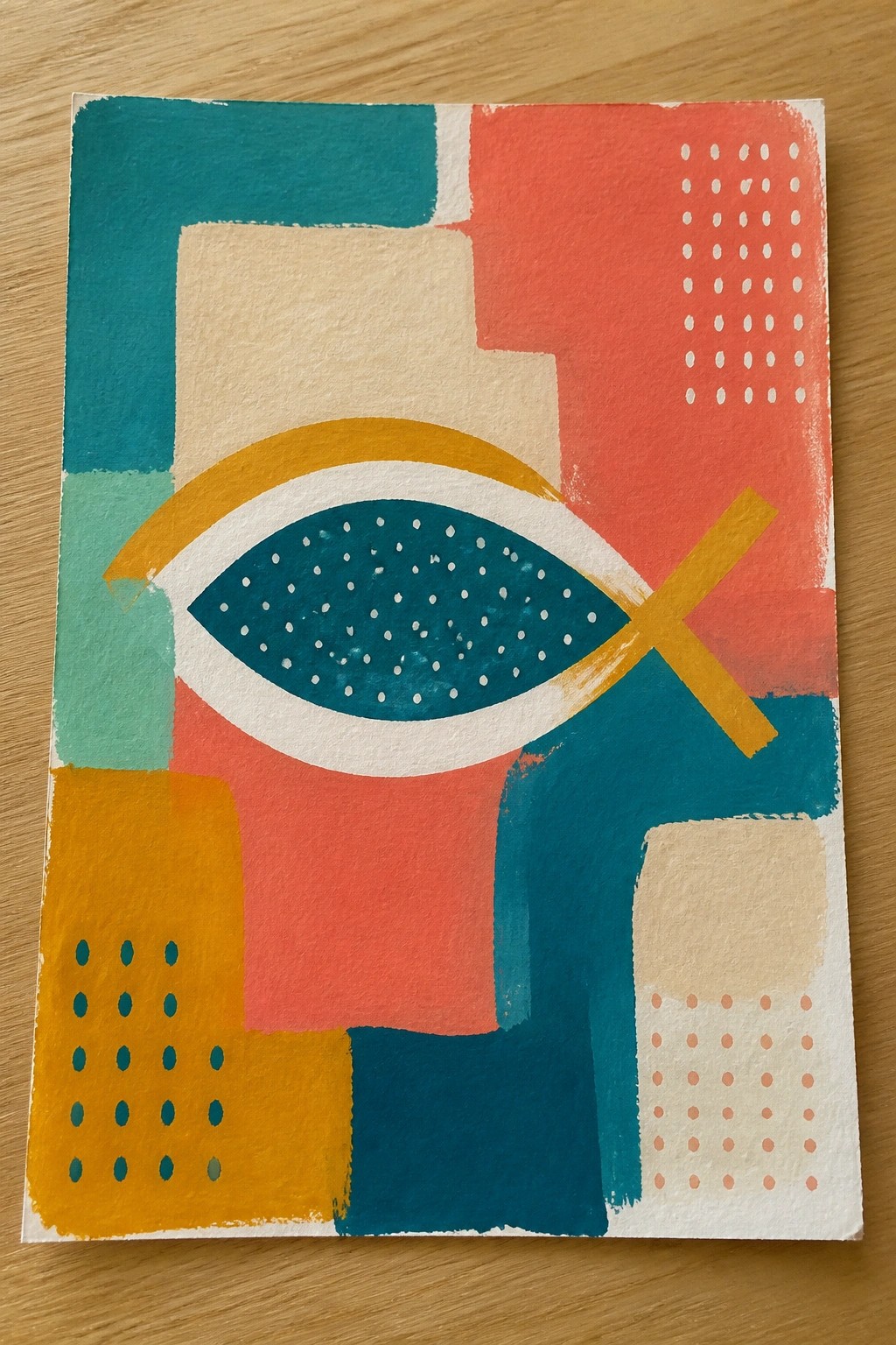
This painting idea centers on the fish symbol as the main subject in an abstract arrangement of large geometric shapes. The teal fish with white speckles is outlined in white and crossed by a yellow bar, while surrounding rectangles in coral, teal, mustard, and beige create a layered background with scattered dot patterns for texture. The composition works as decorative abstract art because the strong shapes and limited color palette keep the design balanced and readable at a glance.
What makes this idea useful is how the fish can stay the same size while the surrounding blocks are rearranged or recolored to match different rooms. You could drop some of the dot details or merge a few shapes to finish it faster on a smaller canvas. For wall pieces or gifts, the style stands out because the clear symbol paired with modern geometry gives it a clean look without needing fine detail work.
Stylized Lamb Against a Saturated Background
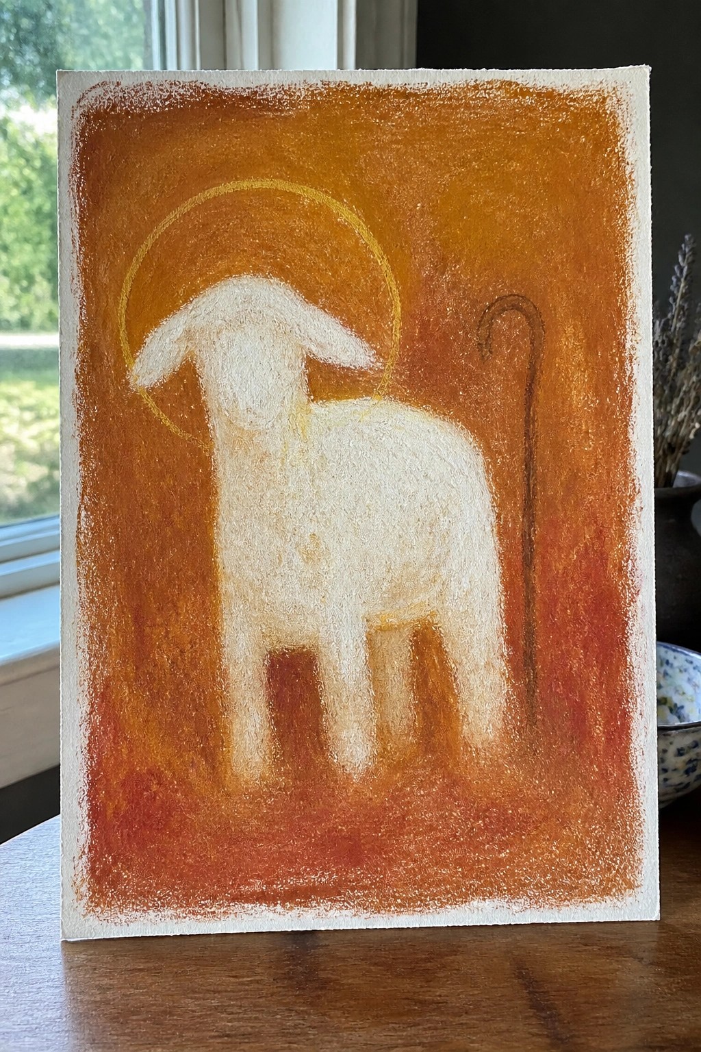
A painting idea like this uses a single white lamb as the central subject, placed against a dense orange-red field with a thin golden circle above its head and a simple curved staff to the right. The animal is kept to basic shapes with soft blending on the body and legs, which lets the strong background color carry the composition without extra detail. This kind of animal symbol works well when the goal is a clear, readable image that still feels bold rather than busy.
The composition does a lot of the work here because the limited elements make it straightforward to recreate at different sizes. You could shift the background to deep blue or muted green if the orange feels too warm for a particular space, or adjust the halo thickness to change the overall weight. For practice, this kind of subject helps with handling contrast between light and dark areas without needing multiple layers. It would also translate cleanly to smaller formats like greeting cards or prints where simple shapes read best.
Spiraling Crown of Thorns Around a Central Cross
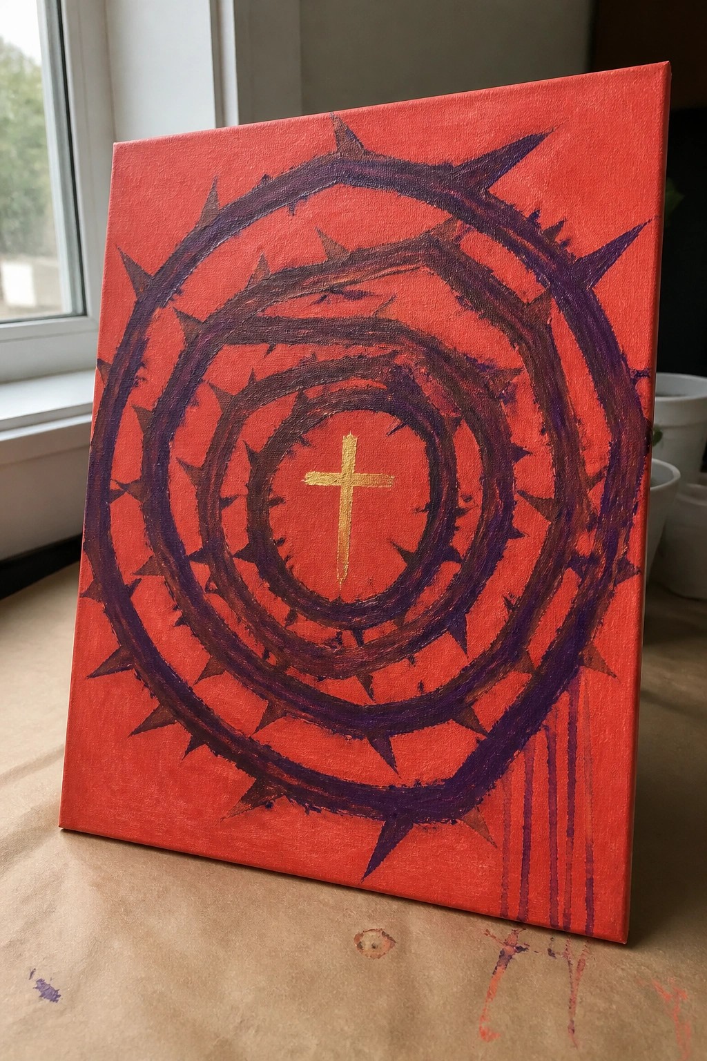
A strong abstract idea that uses repeated thorny rings to pull attention straight to a small gold cross in the middle. The radial layout keeps the composition balanced even when the brushwork stays loose and textured, and the solid red background makes the dark rings stand out without extra detail. This style works as bold symbolic wall art rather than a detailed scene.
The composition does a lot of the work here because the spiral shape is easy to sketch first and then fill in with rough layers. You can scale it down for a smaller canvas or change the background color to match different spaces while keeping the same structure. For practice, this kind of subject helps you focus on shape repetition and contrast instead of fine lines.
Abstract Communion Along a Flowing Path
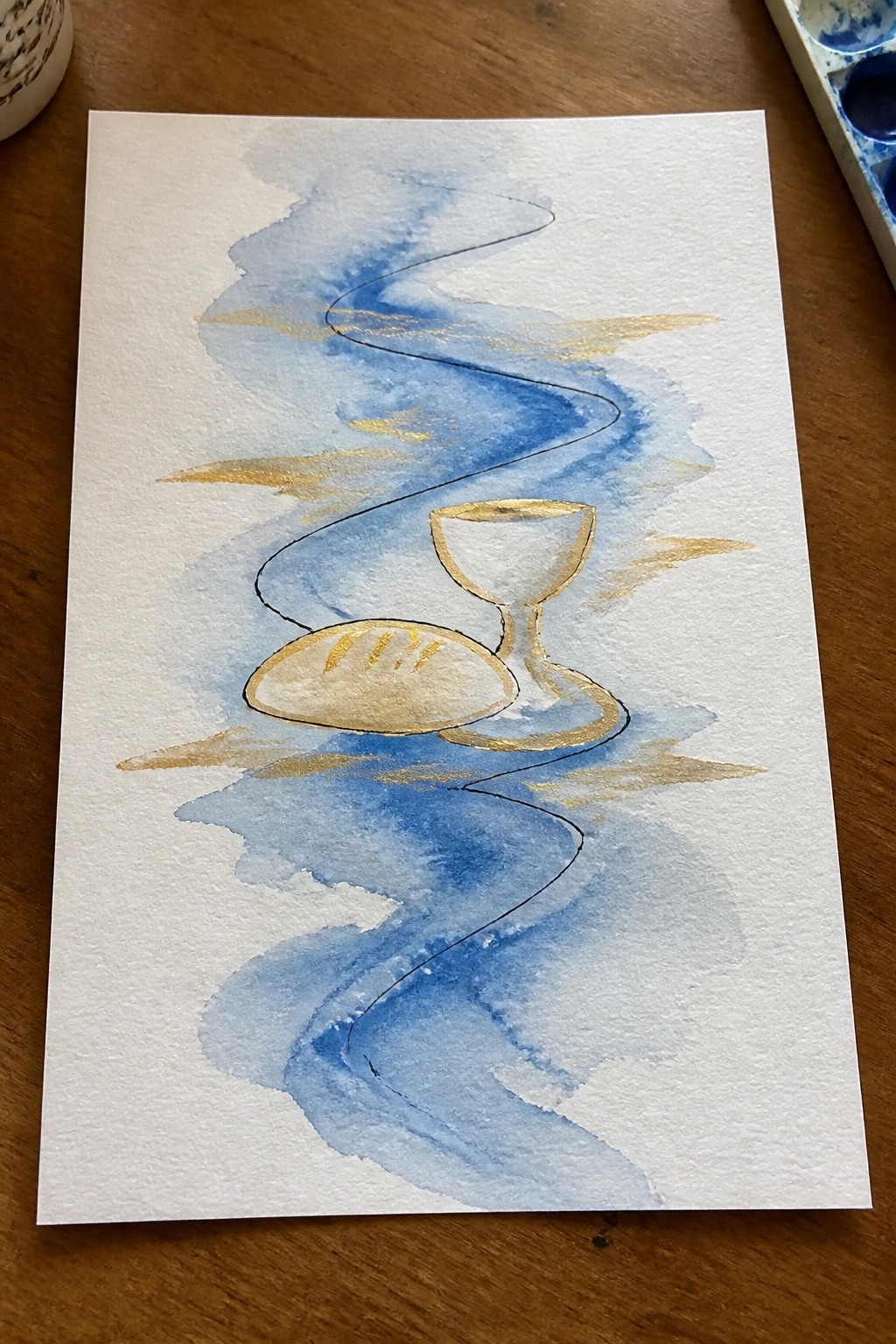
This idea centers on pairing the bread and cup with a loose, winding line that runs through soft blue washes and scattered gold marks. The vertical layout lets the symbols sit in the middle of the flow rather than filling the whole page, which keeps the focus on the two objects while the background adds movement. It works as abstract symbolic art that blends a simple still life with watercolor-style washes.
The composition does a lot of the work here because the curving line and open space make the placement of the bread and cup feel natural without needing precise drawing. You could easily scale this down for a card or stretch it taller for a narrow wall space by adjusting how much blue wash you add around the edges. Swapping the gold dashes for silver or leaving them out changes the mood quickly, and the same layout works if you want to try it in acrylics or even colored pencil.
Layered Triangles for the Holy Trinity
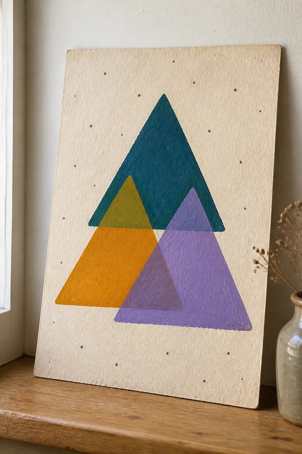
Three overlapping triangles form a simple abstract symbol for the Trinity in Christian art. A large teal triangle sits at the top while a yellow one on the left and a purple one on the right intersect to create a single larger shape. The flat color blocks and neutral dotted background keep the design clean and graphic.
The composition does a lot of the work here because the overlaps naturally draw attention to the center where the three forms meet. You can easily adapt the color palette to match your space or swap the background for a darker tone if you want more contrast. For wall art this kind of piece works well because it stays bold without needing fine details or shading.
Abstract Anchor on Geometric Blocks
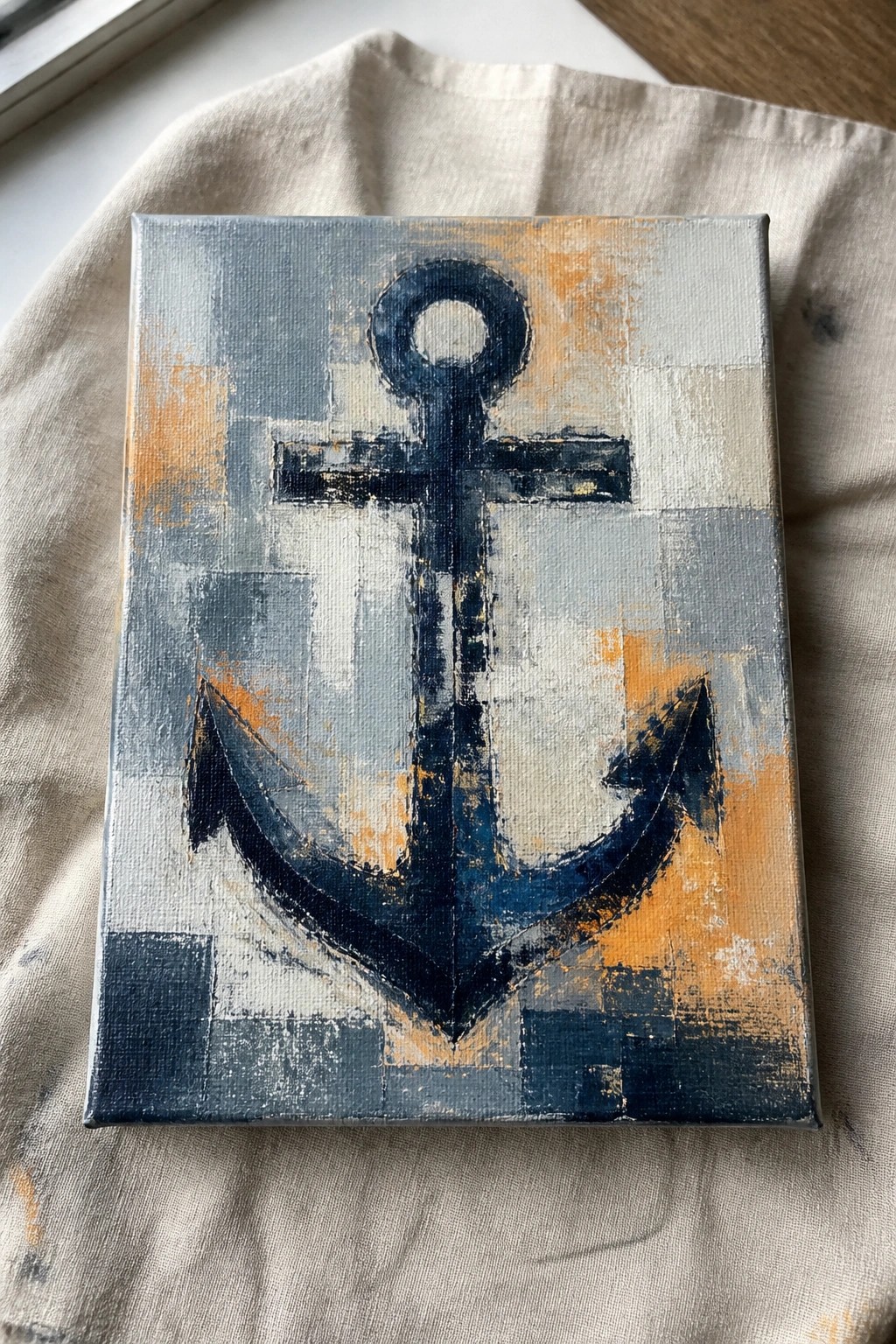
An anchor painted in heavy dark blue strokes forms the clear focal point against a background divided into irregular rectangles of blue, gray, white, and orange. The composition uses loose brushwork and visible texture to keep the central shape bold while the patchwork background adds movement without competing for attention. This approach fits squarely into abstract art that centers on a single recognizable symbol.
What makes this idea useful is the strong contrast between the solid anchor and the broken-up background, which makes the shape easy to read even at a glance. The color palette can be swapped for other neutrals or limited to two tones if you want a simpler version. For wall art, something like this works especially well because the layout stays balanced whether the canvas is small or enlarged. You could also reduce the number of background blocks to make the process faster while keeping the same overall effect.
Abstract Holy Spirit Flames in Warm Tones

This painting idea uses tall, curving flame forms in red, orange, and yellow to suggest the Holy Spirit through a simple abstract symbol. The vertical composition keeps the eye moving upward while the cool blue-gray background holds the warm colors in place. Broad, directional brushstrokes and soft color blending create movement without extra detail or outlines.
What makes this idea useful is how the flame shape can be painted larger or smaller depending on canvas size. The strong contrast between the warm center and cool background makes it easy to adapt with just a few colors. For wall art, this kind of focused abstract symbol works well because it reads clearly from a distance. You could try it with different background tones or add a faint cross shape at the base if you want more layers.
A Bright Path Cutting Through Mountain Shadows
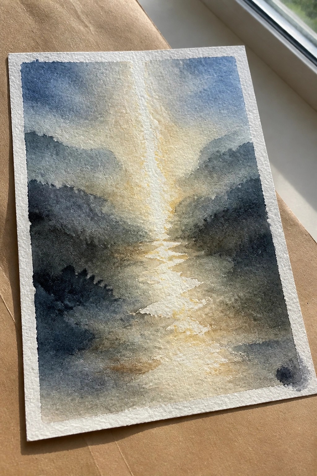
A landscape idea centered on a central beam of light descending between layered hills works well as an abstract Christian piece. The dark mountain shapes on either side frame the glowing vertical path, using strong value contrast to pull attention straight down the middle of the page. Loose washes and soft edges keep the focus on the light rather than precise details, making the composition read as both a scene and a symbol.
What makes this idea useful is how the simple split composition handles most of the work. The color palette of cool blues and grays against warm yellows can be swapped for other tones without losing the effect, and the same layout scales easily to different paper sizes. For wall pieces or quick studies, the idea translates well by tightening or loosening the edges around the light path.
Radiating Cross Mandala on Black
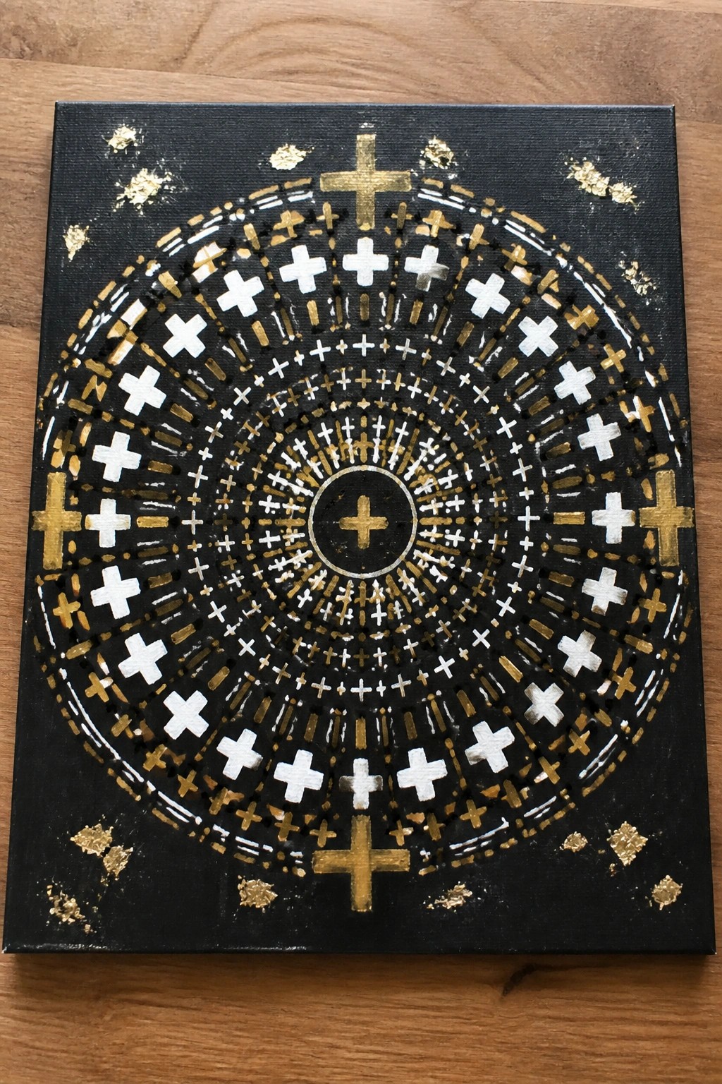
A radial pattern of crosses in white, gold, and silver builds outward from a single central cross on a solid black ground. The composition uses repeating cross shapes in three sizes to form concentric rings, with metallic accents creating contrast against the dark background. This fits into decorative abstract art because the geometric repetition and limited palette keep the design clean and structured.
What makes this idea useful is how the circular layout does most of the organizing work once the center point is marked. The color palette makes this easy to adapt by swapping in different metallic paints or reducing the rings for a quicker version on a smaller canvas. For wall art, something like this works especially well because the symmetry holds up at a distance while the scattered gold flakes add just enough variation. This would be easy to turn into a template by drawing the rings first and filling them in with stencils.
Four-Quadrant Heart Using Bold Color Blocks
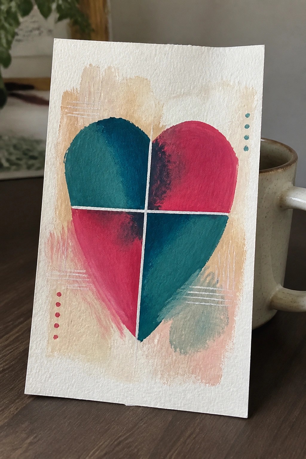
An abstract heart painting split into four equal sections creates a simple geometric pattern by alternating teal and magenta red across the shape. Straight lines through the center keep the divisions clean while the color contrast makes each quadrant stand out. This approach works as decorative abstract art that relies on shape and color rather than fine detail or shading.
The composition does a lot of the work here because the heart outline and cross lines are easy to sketch first. You can swap the teal and red for other pairs or adjust how much the background wash overlaps the edges. For wall pieces or small prints, the same layout stays effective at different sizes and requires only basic brushwork.
Layered Chevron Hills with Centered Cross
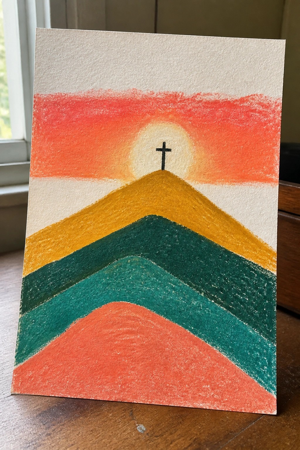
This painting idea uses a series of stacked chevron shapes to form rising hills that lead to a central cross placed against a glowing circle. The color blocks shift from warm reds and oranges at the top through yellow and into deeper greens and teal at the bottom, keeping the focus tight on the cross without extra detail. It works as abstract symbolic landscape art that relies on simple geometric forms and a limited palette.
The composition does a lot of the work here by using repeating angles to pull attention upward. You can swap the color order or reduce the number of layers to fit a smaller canvas or a quicker session. For wall pieces this approach scales easily because the flat shapes stay readable even when printed or painted larger.
Abstract Canvas Layering Scripture Over Bold Color Blocks
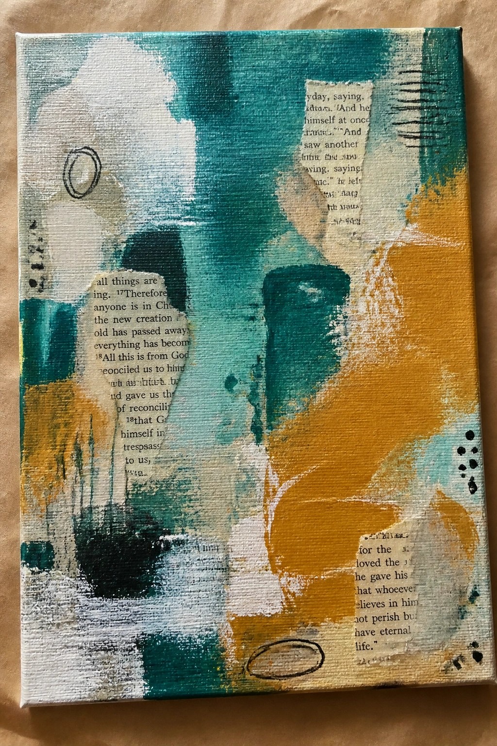
This painting idea combines large, loose brushstrokes in teal, mustard yellow, and white with sections of printed Bible text placed directly on the surface. The composition relies on overlapping shapes and varied texture to create visual movement while keeping the verses visible in selected areas. It falls into the abstract category, where the focus stays on color placement and surface interest rather than any single subject.
The composition does a lot of the work here by letting the text sit naturally within the color fields instead of forcing a formal layout. A painting like this works especially well for quick experiments because you can reuse the same color scheme on different canvas sizes or swap in other verses without changing the overall structure. The simple circular accents and scattered marks also give you an easy way to add small details without overcomplicating the piece. For wall art, the strong contrast between the teal and yellow keeps it readable from a distance.
Abstract Vine Motif in Watercolor Greens and Gold
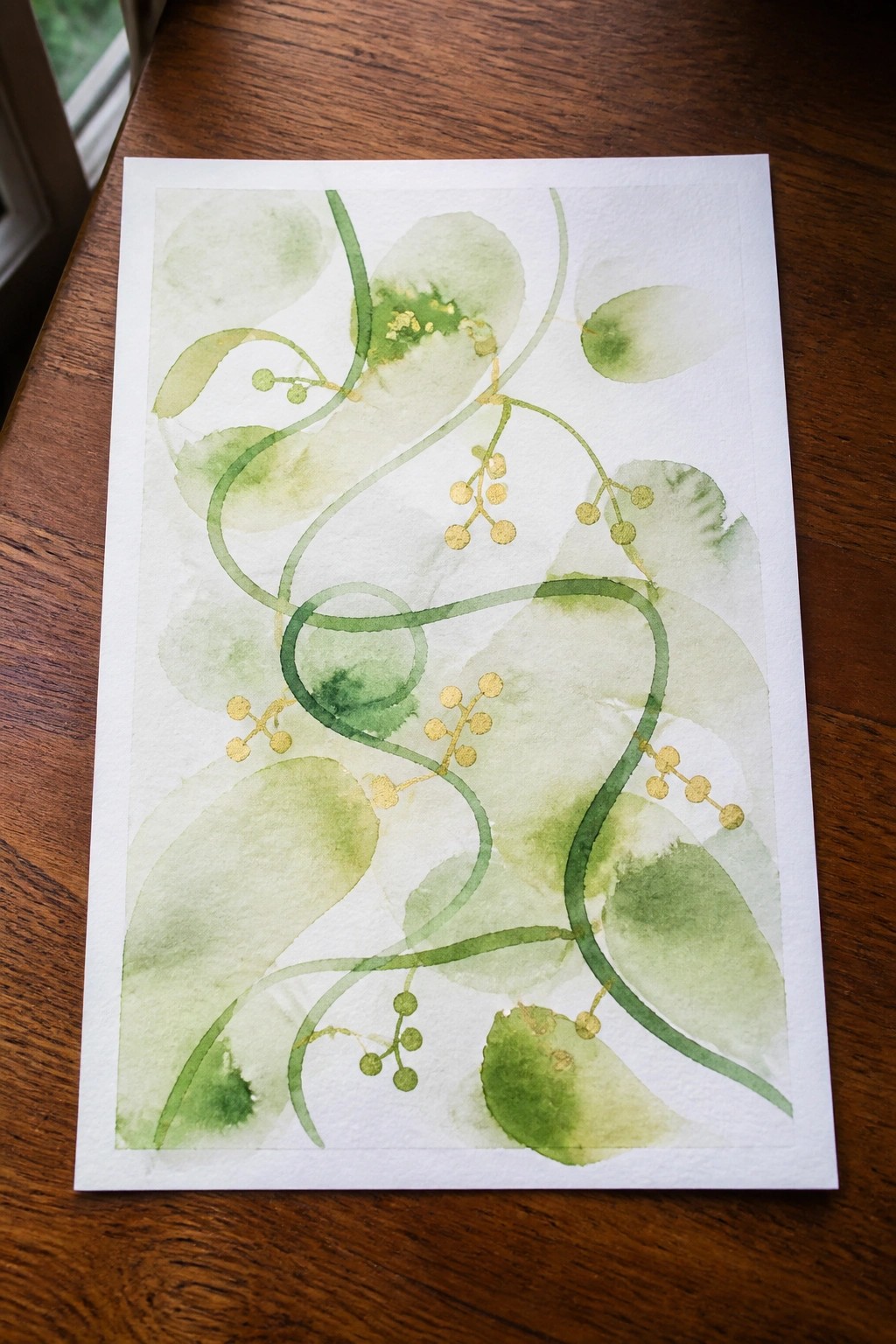
An abstract botanical idea built around flowing vine lines that twist across the page with small clustered shapes representing berries or grapes. Soft green washes create layered background forms while darker green strokes define the main vines, and gold adds contrast to the berry clusters without overwhelming the design. This fits into the abstract category with a focus on line movement and negative space rather than realistic detail.
What makes this idea useful is the way the vines connect across the composition without needing perfect symmetry. The color palette stays simple with greens and gold, so it adapts easily to different paper sizes or can be reworked with a different metallic accent. For wall pieces, the open layout leaves room to adjust spacing or add a second layer of lighter washes if more depth is needed. This kind of subject also translates well to smaller practice pieces or greeting card formats.
Abstract City Skyline with a Glowing Cross
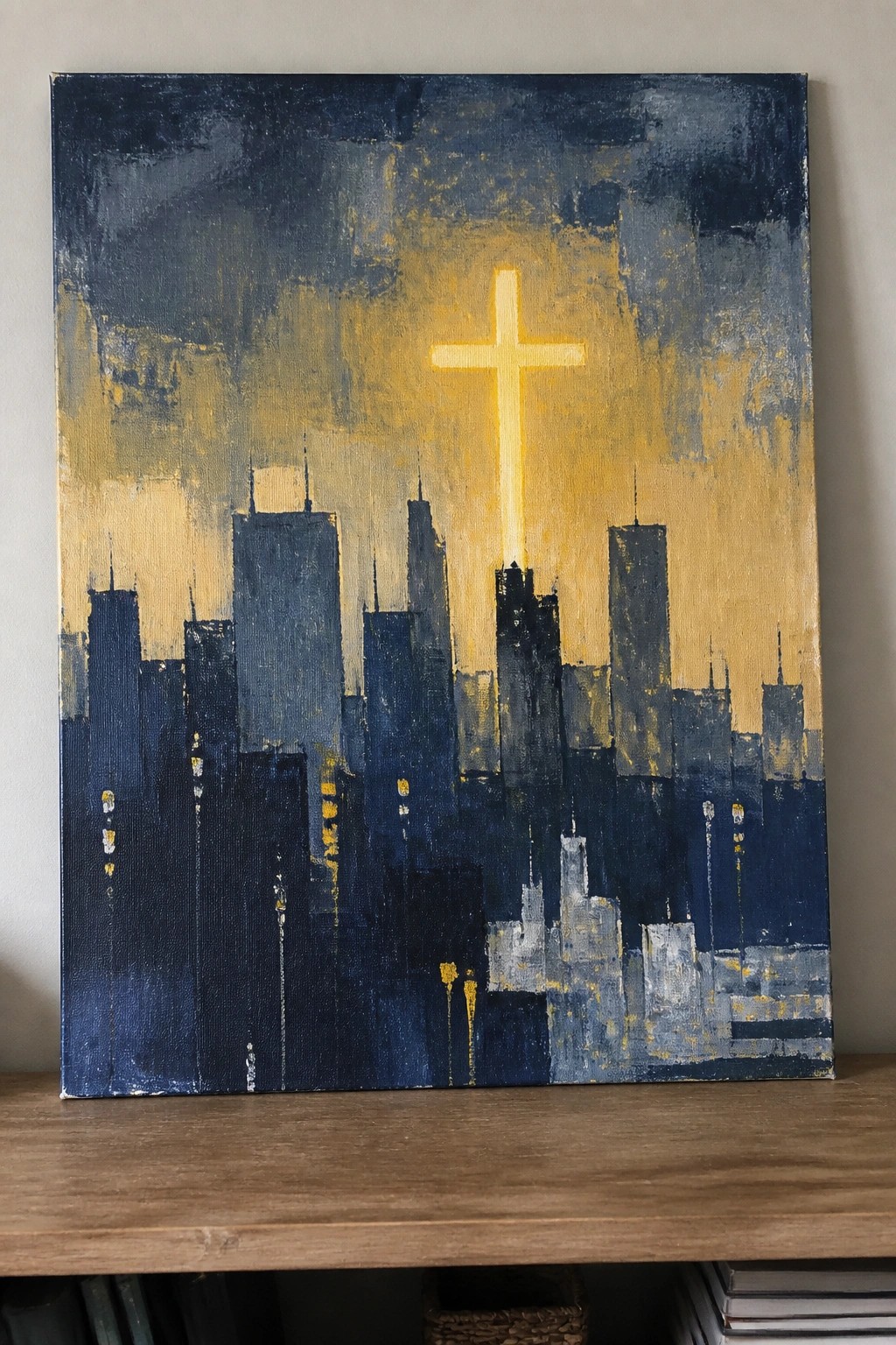
This painting idea centers on a city skyline rendered in bold dark blue shapes with a large illuminated cross rising above it. It is an abstract landscape that relies on strong silhouettes and a limited palette of deep blues against warm yellow tones to keep the cross as the clear center. The brushwork stays loose on the buildings while the cross gets clean edges and brighter color, which helps the whole piece read from a distance.
What makes this idea useful is the simple skyline structure that can be adjusted for different canvas widths without losing impact. The color palette makes this easy to adapt by changing the yellow to another accent shade or toning down the glow for a subtler look. For wall art, something like this works especially well because the cross gives an immediate focal point that still fits modern rooms. The background keeps the focus on the cross and buildings, so beginners can practice blocking in shapes first before adding the light effect.
Radiating Cross Circle Design
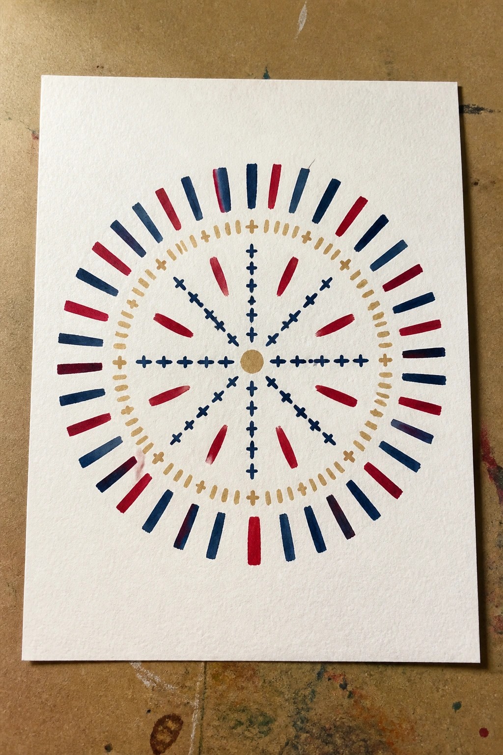
A radial abstract layout uses repeated cross shapes and short brush strokes to build outward from a small central dot into several concentric rings. The composition relies on alternating bands of navy, red, and gold accents against an open white field, which keeps the focus on the repeating geometric symbols. This type of decorative abstract works because the symmetry and limited color palette create a balanced pattern that reads clearly even from a distance.
What makes this idea useful is how the rings can be scaled up or down depending on the canvas size without losing the overall structure. The straight lines and basic cross forms make it straightforward to paint freehand or with a ruler for practice. For wall art, a design like this translates well to different color combinations and stands out in a feed because of the strong contrast. You could simplify it to fewer rings or add extra layers if you want to adapt it for a larger piece.
Shepherd Crook Over a Hillside Flock
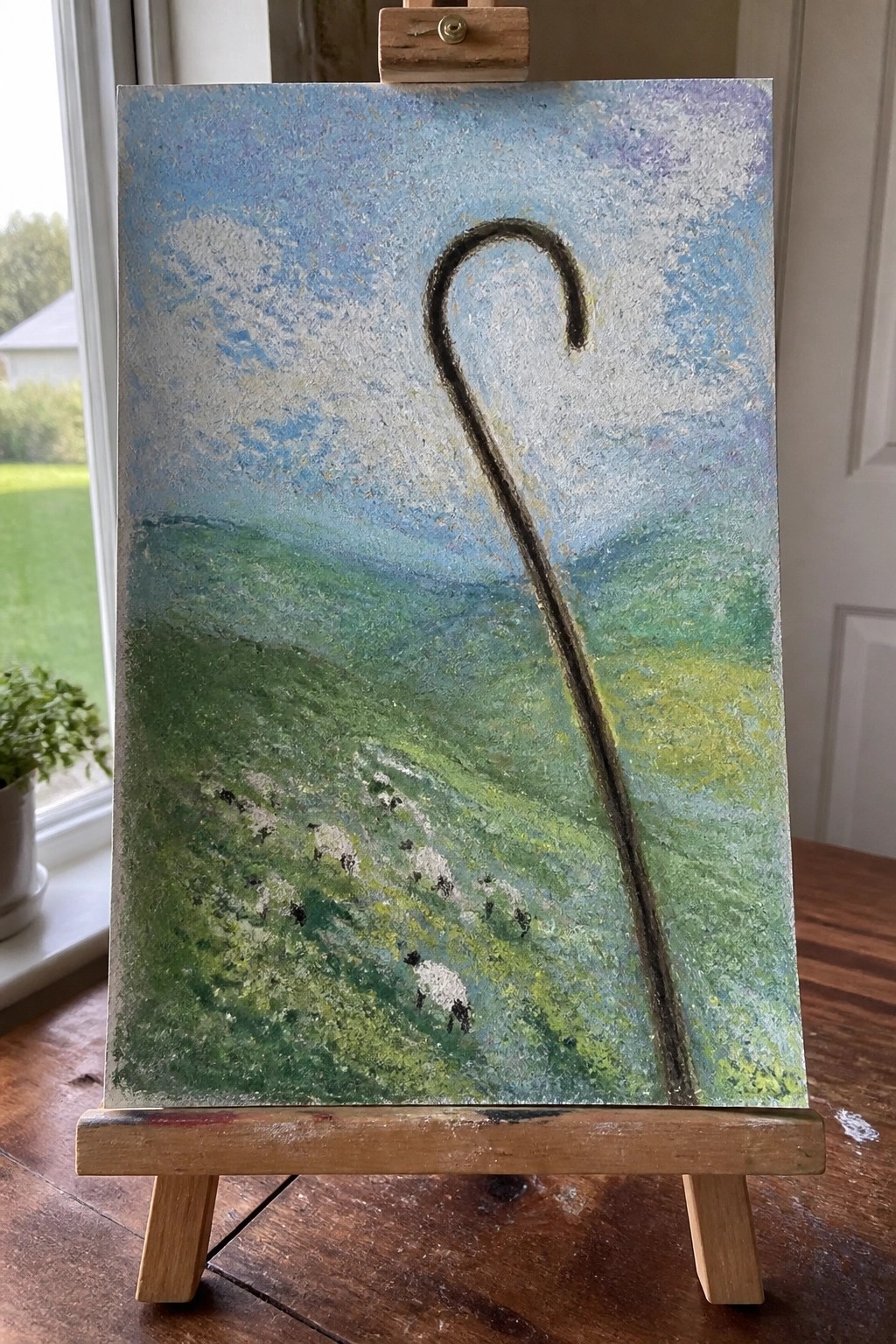
A shepherd’s crook placed as the main vertical element in a green rolling landscape with scattered sheep creates a clear Christian symbol without extra figures. The idea works as a landscape painting that layers soft sky and field colors behind the dark staff to keep attention on the symbol. Loose brushwork in the hills and sky lets the crook and small sheep stand out while still reading as a full scene.
What makes this idea useful is how the tall staff organizes the whole composition and carries the meaning on its own. You can adjust the hill colors or sky tones to match different rooms or seasons without changing the core layout. For practice, this kind of painting works well because the sheep can be simplified to quick marks and the background stays loose. The same setup could be painted smaller for cards or gifts while keeping the symbol easy to recognize.
Concentric Circles with Alpha Omega Symbol
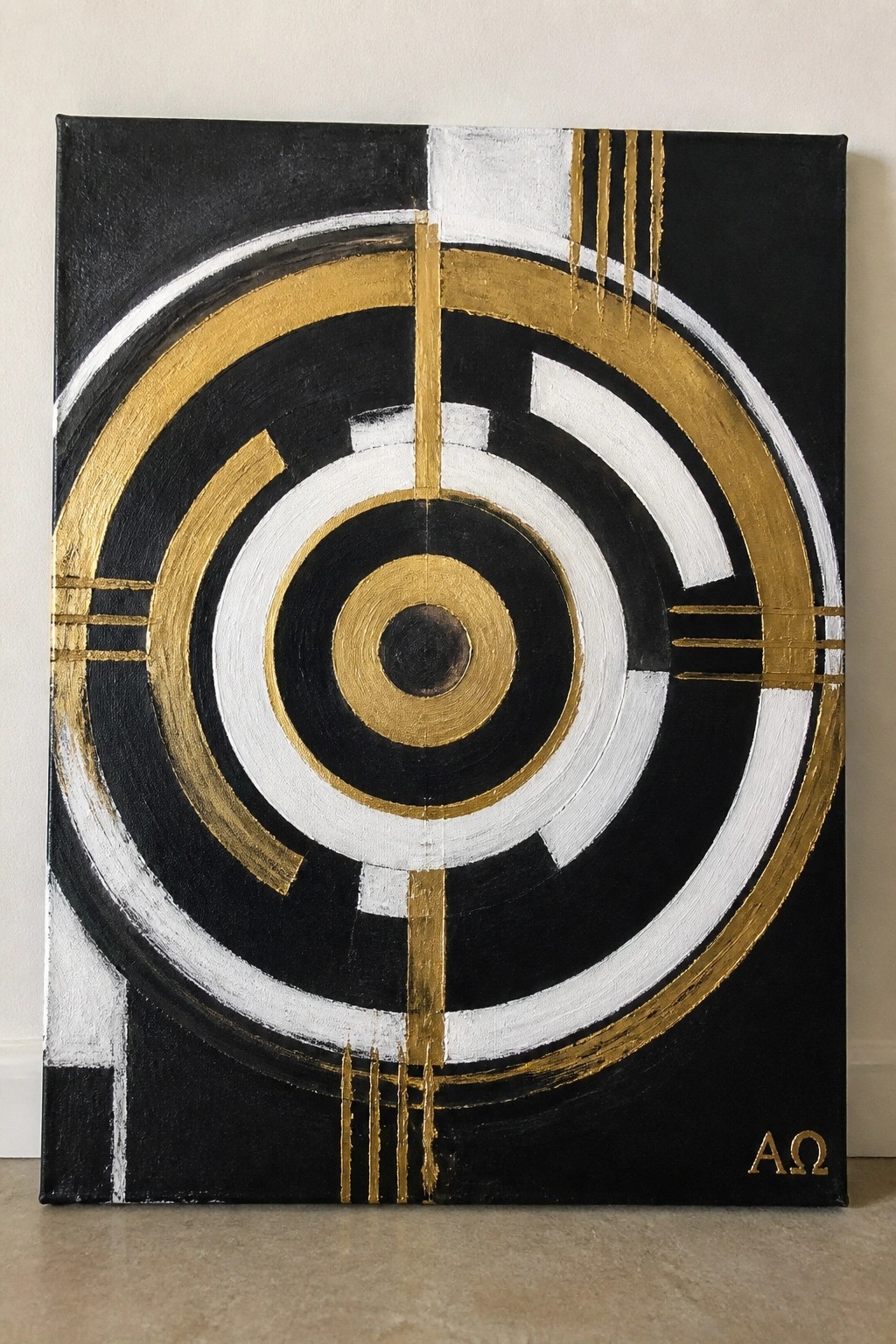
The painting idea uses a series of concentric circles in black, white, and gold to create a strong central focal point around the Alpha Omega symbol. Vertical gold lines and drips cut through the rings, adding structure and movement while keeping the overall layout simple and geometric. This approach fits abstract art, where the repeating shapes and high-contrast palette make the composition hold together even at larger sizes.
What makes this idea useful is the way the circular layout naturally guides attention to the center without needing extra elements. The black background and limited gold-and-white accents make it easy to adapt for different canvas sizes or to swap in other metallic tones. For wall art, the bold rings stand out on a screen or in a room, and the design can be simplified by reducing the number of rings or adjusting line thickness if a cleaner version is preferred.
Frequently Asked Questions
What materials work best for bringing these abstract Christian art ideas to life? High quality stretched canvases provide a sturdy base while acrylic paints offer quick drying times and intense colors perfect for bold effects. Add metallic accents or textured mediums to highlight symbols like the cross or crown of thorns and layer them gradually for depth.
How can beginners adapt one of the 19 ideas if they lack formal art training? Start by picking a simple concept such as an abstracted dove for the Holy Spirit and sketch basic shapes first. Use reference photos of symbols then experiment with broad brush strokes in vibrant hues to build confidence without needing advanced techniques.
Which Bible verses best complement the symbolism in these bold designs? Pair ideas involving light with verses like John 8:12 to emphasize Jesus as the light of the world. For resurrection themes reference 1 Corinthians 15:55 and weave the text subtly into the composition through color choices or faint outlines.
How should artists handle color choices to maximize emotional impact in these pieces? Select warm tones like deep reds for themes of sacrifice and cool blues for peace to create striking contrasts. Test combinations on small swatches beforehand so the final work draws viewers into reflection on faith.
What steps help maintain respect for Christian traditions when abstracting these symbols? Research the historical meanings of each element thoroughly before altering its form. Consult with church leaders if displaying publicly and focus on positive uplifting interpretations that honor core beliefs.