I have been playing around with cross paintings in abstract styles for a while now.
It is nice to move away from the usual detailed versions and try something cleaner.
Minimalist approaches work well if you want something that fits into any room without overpowering it.
I put together a list of 23 ideas that I think are worth trying.
Some of these came from my own attempts while others are variations I sketched out.
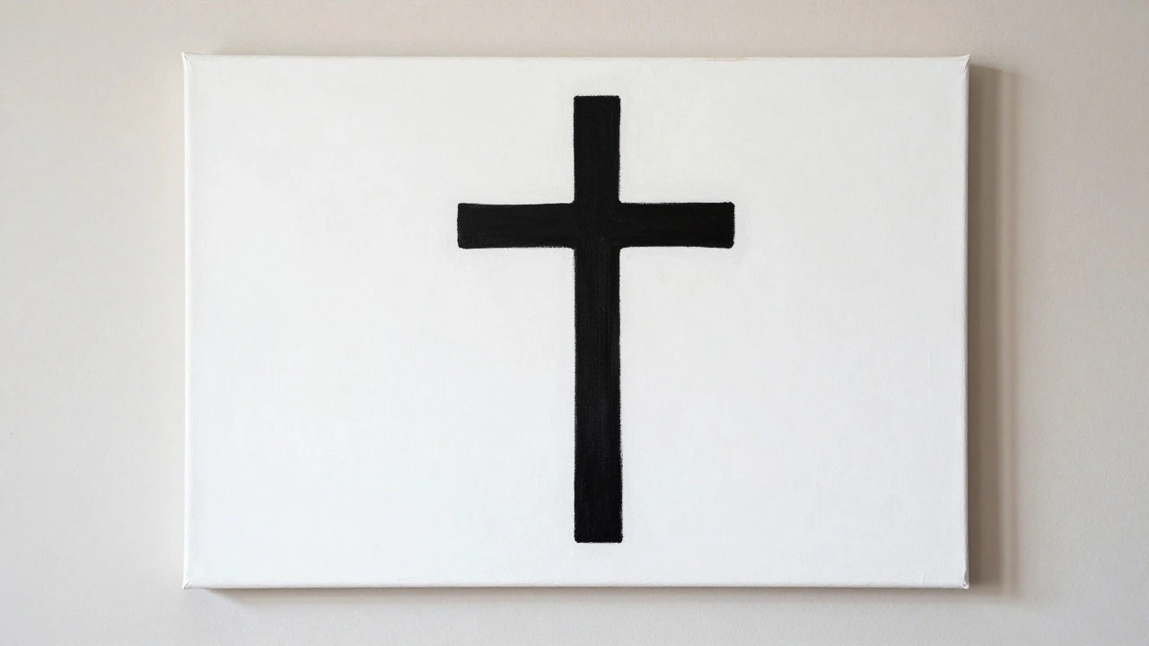
Minimalist Bold Cross on White Canvas

A bold black cross centered on a white background creates a strong minimalist statement through simple geometric shapes and high contrast. Thick, even brushstrokes form the vertical and horizontal arms, keeping the focus on clean lines rather than added detail. This approach belongs to abstract decorative art where the subject stands alone without extra elements or color variation.
What makes this idea useful is how quickly it can be completed on any canvas size while still looking intentional. The limited palette lets you adjust the cross width or edge texture for different wall spaces without buying more supplies. For practice, this kind of subject helps build confidence with straight lines and balanced proportions before moving into more complex cross designs.
Radial Overlap in Two Bold Colors

This painting idea centers on a star-shaped abstract built from eight wide, radiating strokes that cross at the center. The blue and magenta washes create natural depth where they overlap and blend, letting the color interaction carry the design instead of added detail. It works as a simple piece of abstract decorative art that emphasizes shape and loose layering over realism.
What makes this idea useful is how the basic radial layout handles most of the composition work, so you only need to focus on brush placement and color choice. You can adapt it by switching to any two high-contrast colors, changing the number of arms, or scaling it down for cards and up for larger canvases. For practice, this kind of subject helps build confidence with wet-on-wet blending without requiring fine control.
Minimalist Cross Grid in Muted Earth Tones

This painting idea uses a simple repeated cross shape painted across twelve small squares arranged in a grid. Each square pairs a solid cross in an earthy shade with a soft pastel background, creating variation through color changes rather than added detail. The layout works as abstract decorative art because the consistent shape and even spacing let the muted palette carry the visual interest.
What makes this idea useful is how the grid format lets you test different color pairings without committing to one large piece. You can swap in whatever paint colors you have or adjust the number of squares to fit a smaller canvas or sketchbook page. The same approach adapts well for wall art since the clean layout reads clearly from a distance and stays easy to match with neutral room colors.
Raised White Cross with Layered Shadows

A cross formed from thick, built-up paint layers creates a dimensional focal point by letting the physical texture catch light and cast its own shadows. The idea relies on a limited monochrome palette where white paint contrasts sharply against gray and black shading to define edges and depth. This fits a minimalist abstract category that emphasizes shape and material over added details or color variation.
What makes this idea useful is how the heavy texture and shadow placement handle most of the visual interest without needing complex drawing skills. You can adapt the same approach by changing the base color of the cross or adjusting the background tone to match different room palettes. For wall art this style works well because the raised surface gives it presence even in small sizes. The simple layout also makes it easy to personalize by varying the thickness of the paint in different sections.
Negative Space Cross with Soft Brown Border

A negative space cross formed by leaving the center unpainted creates the main subject here, while an irregular brown wash surrounds it to define the shape. The loose, organic edges of the wash give the composition visual interest without adding extra details or layers. This approach fits squarely into minimalist decorative art and works because the contrast between the clean white cross and the warm border keeps the focus sharp.
What makes this idea useful is how the border size and color can be scaled up or down depending on the paper size you have on hand. You could swap the brown for other earth tones or try a lighter wash on toned paper to change the mood without redesigning the layout. For wall art, something like this stands out on Pinterest because the high contrast reads clearly even in small preview images. The simple shapes help this feel more approachable for testing different wash techniques before moving on to more complex subjects.
Minimalist Gold Cross on Dusty Rose

A single gold cross sits centered on a textured pink field with visible brushstrokes running across the surface. The idea relies on strong contrast between the metallic gold and the matte background to keep the shape clear and balanced. Keeping the rest of the canvas plain lets the cross carry the whole composition while the texture adds just enough interest.
What makes this idea useful is how the simple layout works at different sizes, from small cards to larger wall pieces. You can swap the pink for other muted tones or try different metallic paints without changing the core setup. The centered placement removes the need to plan extra elements, so it stays quick to finish while still looking intentional for modern decor.
Bold Coral X Made from Two Thick Strokes

A simple abstract cross painted with two wide, overlapping brushstrokes creates a strong focal point using minimal elements. The idea works by letting the texture and angle of the strokes do the visual work against a plain background, keeping the overall look clean and graphic. This style sits squarely in minimalist abstract painting because it uses limited color and basic shapes to hold attention across a large surface.
What makes this idea useful is how fast it can be completed on a medium or large canvas with basic supplies. The color palette makes this easy to adapt by switching the coral for navy, black, or any shade that fits a room. For wall art, something like this stands out on Pinterest because the bold lines read clearly even in small preview images. The same layout can be scaled down for smaller panels or repeated in different colors for a set of matching pieces.
Minimalist Cross in Tonal Neutrals

A single neutral tone forms the entire composition here, with a cross shape built from slightly varied brushwork against the matching background. The idea centers on using texture and subtle shifts in value rather than multiple colors to define the form. This keeps the painting firmly in the abstract minimalist category and makes the geometric shape the clear focal point.
What makes this idea useful is how the limited palette removes color decisions and lets the brushwork carry the interest. The composition adapts easily to different canvas sizes or slight shifts in the neutral tone for a custom version. For wall art it stays modern and low-contrast, so it fits into many room styles without competing with other decor.
Abstract Pastel Shapes with Cross Marks

This painting idea uses loose organic shapes in soft peach, mint, and lavender to build a simple abstract composition. The shapes sit at different sizes and angles across the page, with small cross marks added afterward to create points of focus and break up the color areas. The limited palette and minimal marks keep the whole piece balanced while still feeling varied.
What makes this idea useful is how quickly the shapes can be laid down with a wet brush and how the crosses can be added with ink or a thin brush once the paint dries. You could swap the colors for any season or room palette and adjust the number of marks to change the density. The scattered layout also makes it easy to adapt for smaller formats like cards or sketchbook pages without losing the modern abstract feel.
Overlapped Brushstroke Cross

A cross built from thick horizontal and vertical strokes in teal and coral creates a clean minimalist design through simple color blocking. The two colors overlap at the center and along the arms, which adds just enough visual interest without needing extra layers or detail. This idea works as a modern abstract take on the cross shape using only two bold colors on an otherwise empty canvas.
The composition does a lot of the work here because the thick strokes and direct color contrast carry the whole piece. You can swap the teal and coral for any pair that fits your room or change the stroke width to make the arms narrower or wider. This would be easy to turn into a fast project on a smaller canvas or scale up for a larger wall. The plain background keeps the focus tight on the shape, so it stands out well in a collection of minimalist pieces.
Folk Patterned Cross with Floral Vines

A cross filled with repeating floral vines, scattered dots, and a large central flower forms a decorative pattern that runs along the arms and down the vertical section. Smaller blooms and leaves branch out from the center while the black outlines keep the shapes distinct. This approach turns a basic cross into a folk-style piece that relies on color repeats and simple motifs rather than shading or realism.
The repeating elements make it easy to paint without needing perfect symmetry. You can swap the color choices or shorten the vine patterns to fit a smaller canvas or a greeting card. For wall art, the strong outlines and bright dots help the design read clearly from a distance even when the background stays plain.
Minimalist Gray Cross with Textured Strokes

A single cross painted in one muted gray tone creates a strong minimalist effect through its simple geometric shape and centered placement. Thick brushstrokes form the horizontal and vertical arms with slight overlaps that add subtle texture and depth. This approach works as a decorative art idea that relies on negative space and restrained color rather than detail or multiple elements.
What makes this idea useful is the limited palette and basic layout, which let you finish it quickly on any size paper or canvas. The color palette makes this easy to adapt by swapping the gray for another neutral or shifting the background to a soft tint. For wall art, something like this keeps the focus on the shape itself and fits modern rooms without competing with other decor. You could also vary the thickness of the arms to create different proportions while keeping the same core concept.
Loose Watercolor Cross with Earthy Blends

A cross filled with soft watercolor washes in yellow, green, and brown tones creates a minimalist painting idea that relies on color flow rather than precise detail. The simple line structure holds the washes in place while allowing the colors to blend naturally across the arms and vertical beam. This approach fits abstract decorative art where the shape stays clean and the interest comes from the transparent layers inside the form.
The composition does a lot of the work here because the cross shape is easy to sketch first and the washes can be built up gradually. You could swap the palette for cooler blues or warmer oranges to match different rooms or seasons without changing the layout. For wall art or small prints this idea works well since it stays readable even when reduced in size, and beginners can practice wash control on a forgiving subject.
Minimalist Cross in Muted Gray Tones

A single cross painted in a soft gray sits against a pale neutral background. The idea uses broad brush strokes that leave visible texture and slight irregularities along the edges. This keeps the focus on the basic shape and the quiet contrast between the two tones.
What makes this idea useful is how little it requires beyond a couple of colors and simple shapes. You can adjust the gray values or switch the background to match any room without changing the overall layout. The same approach works at different sizes, so it translates easily to a small canvas or a larger wall piece. For practice, this kind of subject lets you focus on brush control and blending while still ending up with a finished piece ready for display.
Layered Blue Strokes Forming an Abstract Cross

An abstract cross painting idea built from four wide, overlapping brush strokes arranged in an X. The strokes vary in intensity and show soft edges where they cross, letting the blue tones blend slightly while keeping distinct texture along the ragged borders. This fits the minimalist abstract category because the idea centers on simple intersecting shapes and a restricted palette to hold attention.
The composition does a lot of the work here by letting the overlaps create natural variation in tone. You can adapt the same layout with different colors or stroke widths to suit a specific space, or repeat the idea in a small series by shifting the angle slightly each time. For practice, this kind of subject keeps the focus on brush pressure and water control without needing precise outlines.
Minimal Cross with Dotted Border

A single earthy-toned cross placed dead center on a plain field gains definition from a surrounding ring of small dots that act as a loose frame. The idea stays strictly minimal, using one color and one main shape so the cross remains the clear focal point. Visible brush strokes on the arms keep the shape from feeling too mechanical while the dots supply just enough boundary to hold the composition together.
The composition does a lot of the work here because the dots automatically create margins and keep the cross from floating. You can change the dot spacing or color to suit different paper sizes or wall colors, or shrink the whole layout for greeting cards. For practice, this layout trains steady brush control and centered placement without needing extra layers or details.
Bold Cross Variations with Stripes and Breaks

Four cross paintings explore simple shape variations through solid color blocks, added stripes, and a fractured section. The navy and peach versions stay flat and graphic while the striped cross layers yellow bands over navy and the fourth introduces a jagged split in the lower arm. White backgrounds isolate each treatment so the differences in pattern and form stand out clearly.
What makes this idea useful is how quickly the same cross shape can be adapted with basic color swaps or one added detail like stripes or a break. The layout works especially well for testing paint consistency or trying new color pairings on small canvases before committing to larger pieces. For wall art, grouping several versions together creates a balanced set without needing complex composition.
Abstract Cross Built from Layered Rainbow Strokes

The main idea here is an abstract cross formed entirely by dense, overlapping horizontal and vertical strokes in bright colors. The cross shape appears through the buildup of lines rather than a single outline, which gives the composition its energy and texture. A plain white background keeps the focus on the color layering and the way the strokes intersect.
What makes this idea useful is how forgiving the overlapping strokes are for practice or quick experiments. The color palette can be swapped for fewer tones or muted shades to change the mood without altering the layout. For wall pieces, the same approach scales easily to larger paper or canvas, and beginners can start with just the vertical and horizontal directions before adding more layers.
Silhouetted Cross Over Layered Hills

A single bold cross painted in solid black serves as the central element, rising from a dark foreground band into a sky built from soft gray washes. Layered hills in varying gray tones sit behind the cross to add subtle depth without adding detail. This minimalist landscape approach keeps the focus on the cross through high contrast and simple horizontal divisions.
The composition does a lot of the work here by using the dark base to anchor the cross while the lighter sky prevents the shape from feeling heavy. You could adapt the hill layers into fewer or more bands, or shift the gray tones toward blue or brown depending on the room. For wall pieces the strong vertical line reads clearly even when the painting is viewed from across the room. This setup also works well as a quick practice piece since it requires only basic washes and one strong shape.
Overlapping Strokes in Two Bold Colors

An abstract cross idea built from thick pink and blue brushstrokes that cross over each other in an X and plus pattern. The strokes vary slightly in pressure and direction, creating a layered effect where the colors overlap and blend at the intersections. This keeps the focus on simple geometric lines and strong color contrast against the white surface.
What makes this idea useful is how few elements are needed to make it work. The same layout can be painted on a smaller canvas or swapped to different color pairs like black and teal or red and gray. For wall art, the clean background lets the lines stand out without extra detail, and the overlapping areas add just enough texture to keep it from looking flat.
Abstract Cross Built from Bold Color Blocks

This painting idea centers on a strong central cross formed by layered teal brushstrokes that overlap to create both the vertical and horizontal arms. Surrounding rectangles in yellow, peach, and cream keep the layout balanced and give the cross room to stand out without extra elements. The visible texture from thick strokes turns a simple geometric shape into a complete abstract piece that works well as decorative art.
The composition does a lot of the work here because the cross provides instant structure while the color blocks fill space evenly. You could swap the teal for navy or switch the surrounding colors to match a room without changing the layout. For wall art, this kind of design scales easily to larger sizes and stays effective even if you use fewer colors or looser brushwork.
Abstract Cross with Torn Paper Layers

A cross built from overlapping brushstrokes in dark gray and black creates a bold central form against a white background. The torn paper edges around the arms expose thin layers of red and brown, adding texture through simple overlaps rather than extra detail. This approach keeps the idea firmly in the abstract category while using basic shapes to hold visual weight.
The composition does a lot of the work here because the clean white space lets the cross stand out without extra elements. You can adapt it easily by swapping the underlayer colors or adjusting the width of the strokes to fit smaller canvases for quick practice. For wall art, the same layout works well in neutral rooms where a single strong shape is enough. The torn edge effect can be simplified further with masking tape if you want a cleaner version.
Minimalist Cross with Soft Gray Wash

A thick black cross painted with bold, uneven strokes forms the main subject, set against a loose cloud-like wash of diluted gray that spreads outward from the center. The composition relies on strong contrast between the solid lines of the cross and the soft, irregular edges of the background to keep the eye focused without added details. This fits the abstract decorative category where a single recognizable shape gains presence through scale and minimal color choices.
What makes this idea useful is how the background wash does most of the visual work while the cross itself stays simple to paint. You could swap the gray for a muted blue or warm beige to match different spaces or try the same layout on smaller paper for quick practice pieces. For wall art, the clean shape and limited palette make it easy to adapt into a series with slight variations in wash size or stroke weight.
Frequently Asked Questions
What supplies work best for creating abstract cross paintings in minimalist styles? Acrylic paints on stretched canvas provide good coverage and quick drying times for clean lines. Start with a limited palette of two or three neutral tones plus one accent color to maintain simplicity. Use fine brushes or painter’s tape for precise cross outlines before filling in abstract shapes around them.
How can beginners adapt these ideas without advanced skills? Focus on one idea at a time such as a single bold cross centered on a plain background. Practice sketching basic forms on paper first then transfer to canvas with light pencil marks. Experiment with negative space by leaving large areas empty which enhances the minimalist feel and reduces complexity.
Where should I hang these types of paintings for the best visual impact? Place them in entryways or above furniture to create focal points with their simple forms. Pair a small minimalist cross piece with neutral walls to let the design stand out. Avoid overcrowding the space since abstract styles benefit from breathing room around the artwork.
What steps help customize the 23 ideas with personal meaning? Incorporate subtle elements like faint geometric patterns that reflect your interests while keeping the cross as the core subject. Layer thin washes of color for depth without cluttering the composition. Test variations on small panels before committing to larger canvases to refine your unique take.
How do I protect and maintain finished cross paintings over time? Apply a clear acrylic varnish once the paint fully dries to guard against dust and fading. Store or display away from direct sunlight and high humidity areas. Dust gently with a soft cloth rather than using cleaners that could damage the surface.