I’ve been painting with acrylics for a while now and cross designs have become one of my go to subjects when I want something straightforward.
They work well for beginners because you can keep the shapes simple and focus on color and brushwork.
I’ve tried a few different versions over the months and some turned out better than others.
Here are the ideas that felt the most practical to me when I was starting out with this style.
Colorful Floral Cross with Overlapping Stems

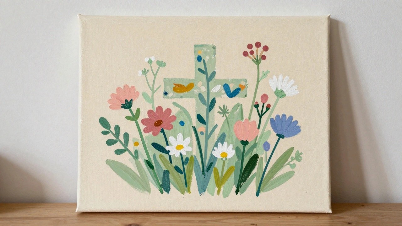
A floral cross idea works by painting a soft cross shape first and then layering stems, leaves, and blooms across it so the symbol stays visible but secondary. Different flower types in orange, pink, blue, and white are placed at varying heights to create movement, while the off-white canvas keeps the focus on the color contrast. The stems and leaves help tie everything together without needing perfect symmetry.
The composition does a lot of the work here by letting the flowers cover parts of the cross naturally. You can paint the cross with light washes or masking tape first, then build the bouquet on top, which makes adjustments easy. Swap in different bloom shapes or change the color mix to match a room, and the same layout works as a small canvas or a larger wall piece.
Rustic Cross with Halo on Blue Background

A wooden cross painting focuses on realistic grain and texture across the beams while keeping the background a single flat blue. The white halo sits directly behind the upper section to draw the eye without crowding the space. This approach uses basic layering and contrast to make the cross stand out as the clear main subject.
What makes this idea useful is the simple centered layout that lets you practice wood textures without needing extra scenery. The solid background keeps the focus tight so the piece works as quick wall art or a small canvas project. You could change the blue to a different shade or adjust the halo thickness to match your own style.
Abstract Cross Using Overlapping Color Blocks
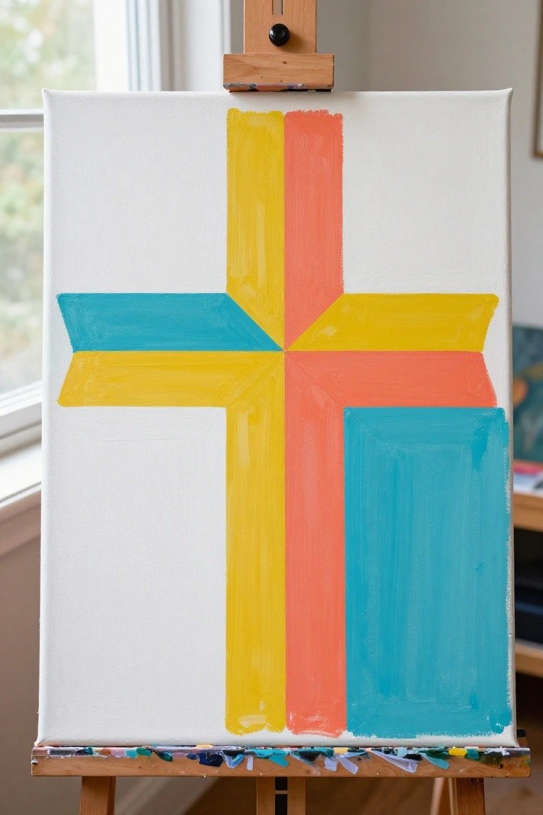
A cross formed from overlapping rectangular color bars creates a clean abstract design that relies on shape and placement rather than fine detail. The vertical yellow and orange bands run the height of the canvas while horizontal teal and yellow sections cross through the middle, with an additional teal block anchoring the lower right. This layout keeps the eye moving across the intersections while the white background prevents the colors from competing.
What makes this idea useful is how simply the bars can be shifted or resized to change the balance without redrawing anything. The color palette makes this easy to adapt by swapping in different hues that match a room or season. For practice, this kind of subject helps build control with straight edges and flat coverage before moving on to more complex subjects.
Sunset Landscape with Layered Hills and Lone Tree

A landscape idea built around a sunset works by using a simple gradient sky that moves from cool purple at the top into warm peach and coral near the horizon. Rolling hills in muted greens and blues add depth through overlapping shapes, while one dark tree placed off-center keeps the foreground grounded without adding extra elements. The approach focuses on broad color blocks and minimal detail to let the sky carry most of the visual interest.
The composition does a lot of the work here by letting the sky gradient and hill layers handle the depth. You can adapt the palette by changing the hill tones to cooler blues for a different season or keeping the tree as a silhouette to test out brush control. For practice this kind of subject helps with blending edges and planning simple foreground elements before moving into more detailed scenes.
Fox Wrapped Around a Wooden Cross

A fox curled around a wooden cross gives a simple way to combine an animal subject with a geometric symbol in one composition. The idea keeps the cross as the central structure while the fox’s body wraps around the beams to create a natural frame. A light background lets the warm orange fur and brown wood stand out without extra layers or busy details.
The composition does a lot of the work here by centering everything so the painting reads clearly even at small sizes. You can swap the background color to fit different seasons or wall colors while keeping the same fox and cross layout. This would be easy to turn into a quick series by changing the animal or the wood tone for variety.
Layered Cross with Heart Accents

A cross built from overlapping horizontal and vertical strokes in pink, gold, and teal sits at the center of this idea. Four small hearts in the same palette are placed in the open spaces around the arms, and a loose oval of colored dots creates a soft frame. The simple arrangement lets the cross stay prominent while the hearts and dots give the piece a light, balanced look that works as decorative wall art.
What makes this idea useful is how the cross can be painted first with wide strokes, then layered with thinner lines for quick depth. The color choices are easy to swap for different seasons or room styles without changing the layout. This would be easy to turn into a smaller version for a desk or to repeat the dotted border on a set of matching canvases.
Sunflowers Around a Central Cross

A brown cross painted vertically down the canvas acts as both the main support and a visual anchor for several large yellow sunflowers clustered around it. The flowers sit at varying heights with broad petals and green leaves that overlap the cross edges, creating a simple floral composition that mixes natural shapes with a clear geometric form. The limited color palette of yellow, brown, and white keeps the focus on the arrangement without extra background elements.
What makes this idea useful is how the cross provides built-in structure so you do not have to plan a full bouquet layout. You can easily change the flower type or adjust the cross color to fit different seasons while keeping the same basic placement. For practice, the bold shapes and white background make it straightforward to work on brushwork and color mixing without adding complicated details.
Patterned Cross with Scattered Florals
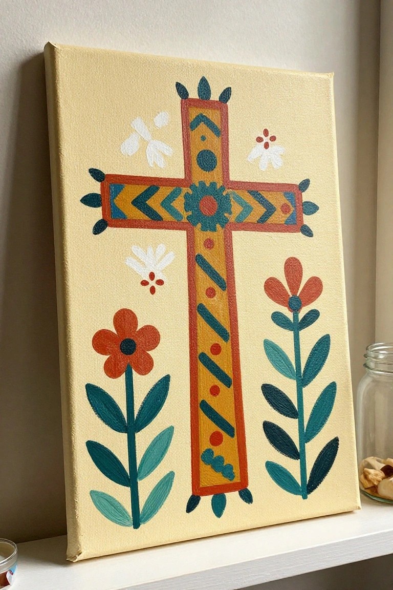
A central cross built from layered geometric bands and repeating motifs creates a strong vertical focus that holds the composition together. The idea combines structured patterns inside the cross with simpler flower and leaf shapes placed around the edges to keep the overall layout balanced and easy to read. This approach works as decorative art where the cross acts as the main subject and the florals add just enough variety without competing for attention.
What makes this idea useful is how the color blocks on the cross can be swapped for different shades while keeping the same layout intact. The open space around the edges lets you shift the flowers closer or farther apart to fit smaller or larger canvases. For wall art, something like this stands out on Pinterest because the light background makes the shapes pop even in a small thumbnail view. You could simplify the inner patterns further if you want a quicker version or add more leaves to fill empty spots.
Watercolor Cross with Bird Accent

A cross built from layered color washes forms the central subject, with a small dark bird placed on the right arm to create a single point of interest. The idea pairs a strong geometric shape with soft background blends in green, purple, and touches of orange so the cross stands out while the edges stay loose. This approach works as decorative art that combines a simple structural element with one small animal detail.
The composition does a lot of the work here because the cross keeps the layout balanced even when the background stays loose and uneven. You can change the bird to a different species or shift the color washes to match a room or season without redrawing the main shape. For wall pieces, the vertical format makes it easy to hang, and the same layout could be simplified further by using fewer colors or enlarged by adding light texture around the edges. This kind of subject saves well as a quick practice piece or a starting point for personalized gifts.
Abstract Cross with Vibrant Color Blocks

A bold black cross serves as the main subject in this abstract decorative piece, set against loose brushwork that divides the canvas into pink and purple tones on one side and yellow and blue on the other. The idea relies on strong contrast between the solid cross shape and the surrounding energetic strokes and splatters to create visual balance. This style works well as a simple yet striking decorative painting that highlights shape and color over detail.
What makes this idea useful is how the cross provides a clear focal point, so the surrounding colors can be adjusted freely without losing the overall structure. You can scale it down for smaller canvases or swap the palette to cooler tones for a different mood while keeping the same layout. The splatter accents at the bottom add interest but can be skipped for a cleaner result that works as quick wall art or a practice piece.
Colorful Birds on a Bare Branch

A painting of small songbirds in soft coral, pink, teal, and brown tones perched along a simple brown tree structure creates a clean animal-themed decorative piece. The idea centers on placing the birds at varied heights and angles to build visual balance without crowding the canvas. A plain white background and minimal branch lines keep the focus on the birds and their placement.
What makes this idea useful is how easily you can change the bird count or swap colors to fit different rooms or seasons. The open layout works well for practice because it lets you focus on basic shapes and color placement without needing fine detail work. For wall art, this kind of piece adapts quickly to different canvas sizes and can be simplified further by using fewer birds or repeated colors.
Sunset Gradient Cross Silhouette
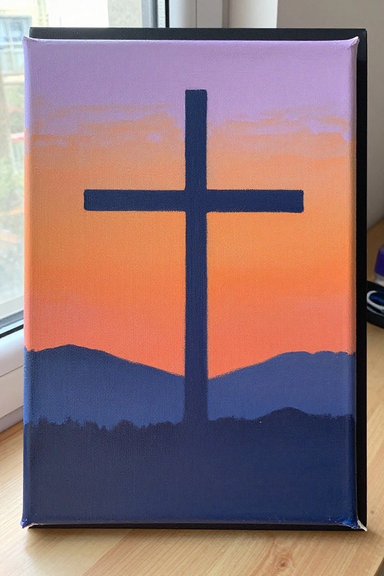
A cross placed front and center against a simple gradient background creates a clean landscape-style painting idea that relies on shape and color contrast rather than detail. The sky moves from purple down through orange tones to suggest a sunset, while the dark blue hill shape at the bottom gives the cross a grounded base and keeps the whole piece balanced. This approach works as decorative art because the limited elements let the vertical and horizontal lines of the cross dominate without extra work.
The composition does a lot of the work here since the cross sits in open space and the gradient handles most of the color interest. You can swap the sky colors for cooler tones or a different time of day, change the hill outline to match a local view, or scale the whole thing down for a smaller canvas. For practice this idea stays approachable because it uses broad strokes and only a few colors, and it holds up well as wall decor when kept bold and graphic.
Grid of Folk Cross Motifs

This idea uses a grid layout to display many small cross variations and geometric patterns side by side on a single canvas. Each square holds a different arrangement of lines, dots, or simple shapes in warm browns and yellows set against a muted green background. The limited palette and even spacing make the designs read as a unified collection rather than scattered pieces.
What makes this idea useful is that the grid format lets you test several cross styles on one surface without committing to a large single composition. The color palette makes this easy to adapt by swapping in other earth tones or adding one accent color. For practice, this kind of subject works well because the small squares keep each motif quick to finish. You could also crop the grid into individual squares later for cards or mini canvases.
Berry Tone Floral Wreath on Canvas

A circular wreath built from layered leaves and berry clusters creates a balanced frame around an open center. Two flowers placed at opposite points give the design clear structure while the surrounding leaves in varying reds, pinks, and browns fill the circle with movement. The idea fits the decorative floral category and works because the repeated organic shapes and limited palette keep the composition cohesive without tight detail.
What makes this idea useful is how the round layout handles most of the visual balance on its own. You can easily change the color range to match different rooms or seasons while keeping the same leaf and berry pattern. The open middle also lets you add lettering or leave it plain for simple wall pieces. For practice this works well because the overlapping shapes give room to experiment with color mixing and stroke direction without needing precise outlines.
Minimalist Cross in Pink and Gray

A cross built from wide pink strokes forms the core of this design, with gray painted over the right edge of the horizontal bar and down the lower vertical section to create a partial overlap effect. Soft green washes appear along the left side of the canvas, providing quiet contrast against the white background while keeping the overall layout balanced and open. This fits the decorative art category, where simple shapes and restrained color layering do the main work.
What makes this idea useful is the way the gray accents break up the pink without needing extra details or precision. The color palette makes this easy to adapt by swapping pink for blue or switching gray for a darker neutral to suit different spaces. For wall art, something like this works especially well on a mantel or shelf because the white space around the cross keeps it from feeling heavy. You could simplify it further by skipping the green washes or personalize it by changing the gray placement to one side only.
Overlapping Circles Form a Colorful Cross

A cross built from stacked and overlapping circles gives a clean graphic result without requiring precise lines or shading. The vertical stack of rounds is crossed by a shorter horizontal row that extends outward, using a palette of teal, coral, orange, and pale yellow to create contrast while keeping the overall shape easy to read. This method turns a familiar symbol into a modern decorative piece by letting the repeated shapes and limited color set do the work.
What makes this idea useful is how forgiving the circle overlaps are when your brushwork is not perfectly even. The color palette makes this easy to adapt by swapping in whatever tones you already have on hand or matching a specific room. For practice this kind of subject works well because it builds hand control and color placement without needing a lot of planning. You could repeat the same layout on a smaller panel for a set of matching pieces or stretch it taller on a bigger canvas.
Floral Cross with Lilies in Soft Pastels

A centered cross with a thin yellow border forms the main structure, while white and pale pink lilies are arranged around it to frame the shape. The flowers sit at different heights and angles so the composition stays balanced, and the light yellow and green accents on the cross help it blend with the surrounding blooms instead of standing apart. This approach works as a decorative floral piece that combines a simple geometric shape with natural elements.
What makes this idea useful is how the flowers can be added or removed to fit different canvas sizes without changing the overall layout. The soft color choices keep the painting easy to match with other wall pieces, and the same cross shape can be paired with different blooms like daisies or tulips if lilies feel too detailed. For practice this setup lets you focus on basic petal shapes and light layering before trying more complex arrangements.
Frequently Asked Questions
What supplies should a beginner gather before trying acrylic cross painting ideas?
Start with a basic set of acrylic paints in primary colors plus black and white for mixing, a few brushes of varying sizes including a fine detail brush, a canvas or wooden panel, a palette for mixing, water for thinning, and paper towels for cleaning. These items keep costs low while allowing you to explore all 18 ideas without frustration. Many beginners find that buying a starter kit from an art supply store provides everything needed for the first few projects.
How can I select colors that make my cross painting feel inspiring and personal?
Choose a color scheme that reflects the mood you want, such as soft pastels for peace or bold jewel tones for energy. Begin by sketching a simple cross outline and testing small color swatches on scrap paper to see how they interact. Layer lighter shades first and build up to darker accents for depth. This approach helps each of the 17 ideas feel unique to your own style and story.
What techniques work well for creating texture in acrylic cross paintings?
Apply paint in thin layers and allow each one to dry before adding the next to build dimension without muddling colors. Use a dry brush technique for rough, weathered effects on the cross edges or a stippling motion with the tip of your brush for dotted highlights. Keep a spray bottle of water nearby to mist the palette and prevent paint from drying too fast during detailed work.
How do I fix mistakes or make adjustments while painting with acrylics?
Acrylics dry quickly, so act fast by wiping away wet paint with a damp cloth or paper towel. Once dry, you can paint over the area with a new layer or use a fine brush to correct small details. Sanding very lightly with fine grit sandpaper works on canvas if the mistake is raised. Practicing on small test pieces first helps you learn how the paint behaves before committing to a full cross design.
What is the best way to display or protect finished acrylic cross paintings?
Allow the painting to dry fully for at least 24 hours, then apply a thin coat of acrylic varnish for protection against dust and fading. Frame the piece in a simple wooden frame that complements the colors, or hang it unframed on a small easel for a modern look. Store any unused ideas sketches in a folder so you can revisit them later and create a series of matching pieces.