I have been working with watercolors for a while now and I find they suit simple subjects really well.
Christian scenes can come across as gentle when the colors stay soft and the details stay light.
I looked for paintings that keep an open feel without too much detail or dark shading.
These are the ones that stood out to me as easy to look at and pleasant to try copying.
My own attempts have turned out better when I follow that same approach.
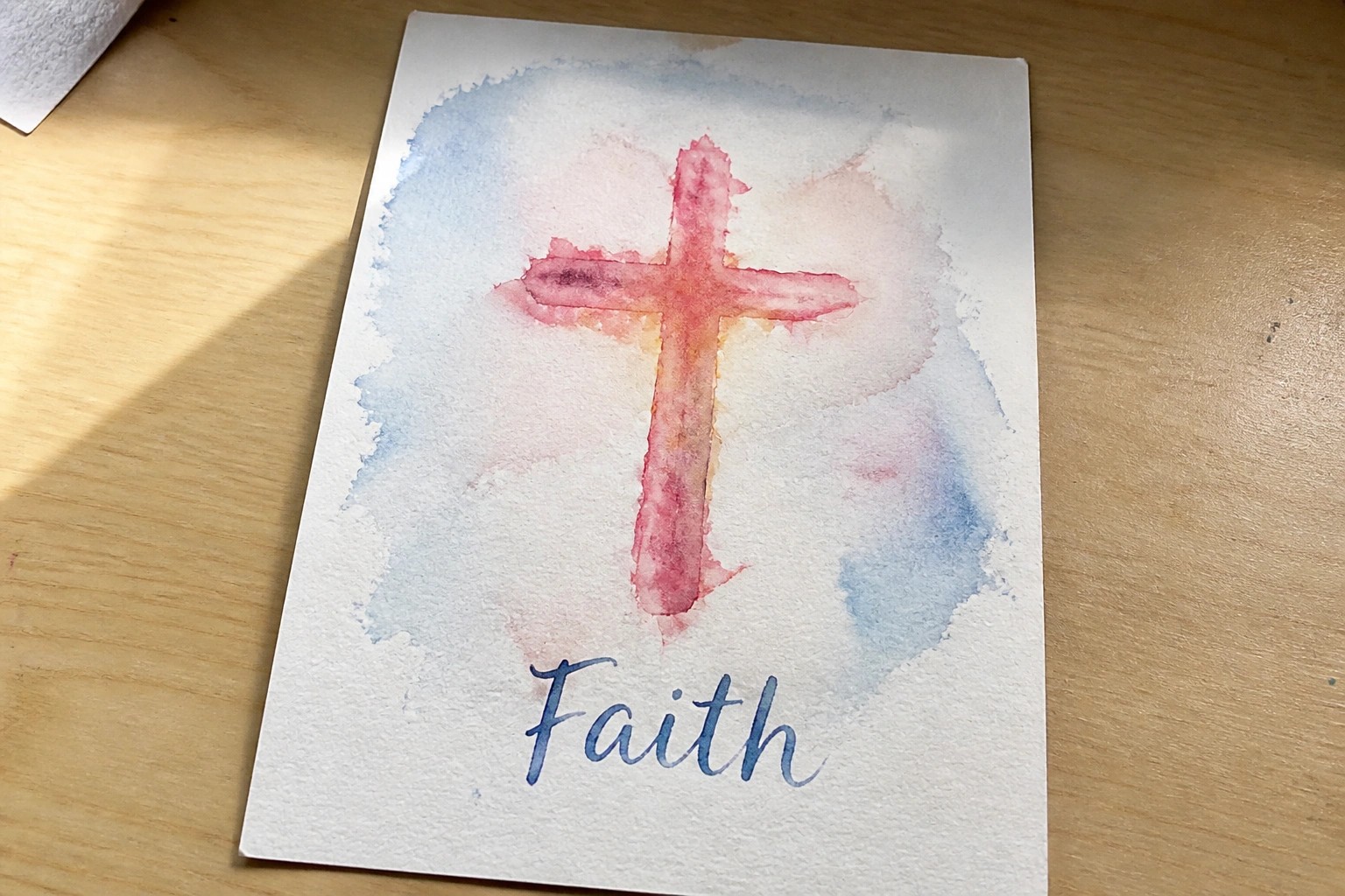
Watercolor Cross with Soft Wash Background
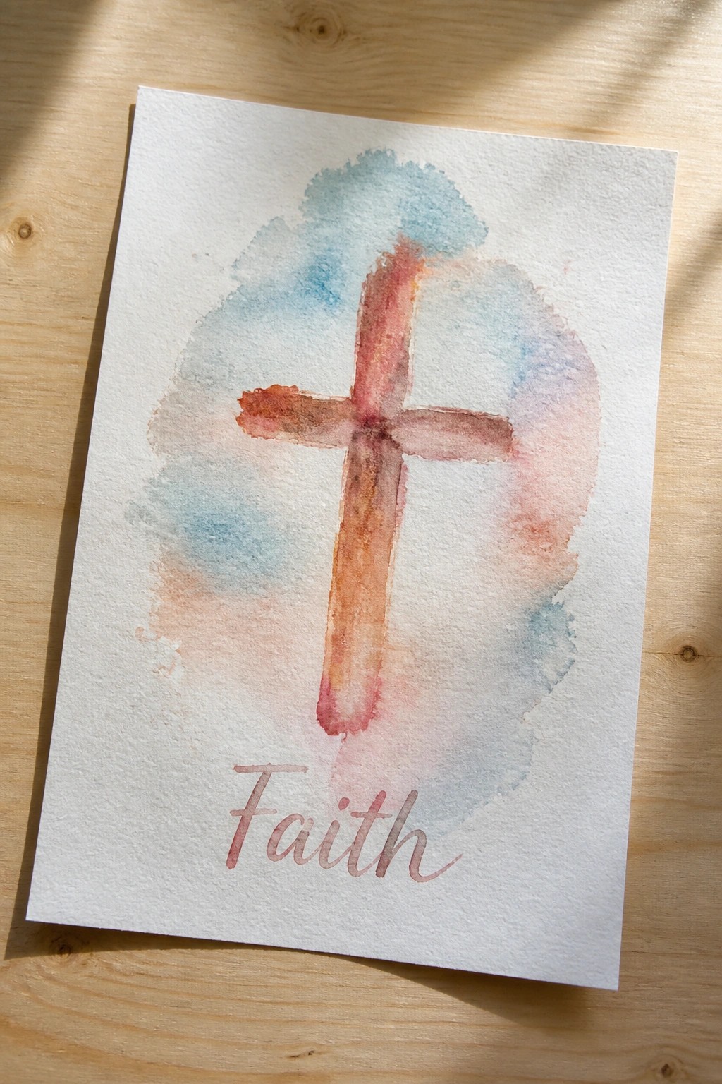
A simple cross painted in warm terracotta and rust tones forms the main subject, placed over a loose cloud of blue and peach watercolor washes. The wet-on-wet blending creates soft edges and light overlaps that keep the background airy and unfussy. The addition of the word Faith in a gentle script below turns the piece into a complete decorative artwork rather than just a symbol study.
What makes this idea useful is how the background wash handles most of the visual interest, so the cross itself can stay fairly basic in shape. The same layout adapts easily to different paper sizes for cards or small framed pieces. Swapping the wash colors or changing the word to a short verse lets you personalize it without starting over. For Pinterest, the light color mix and centered layout make it easy to spot in a feed of Christian watercolor ideas.
Dove Soaring Over a Sunset Horizon
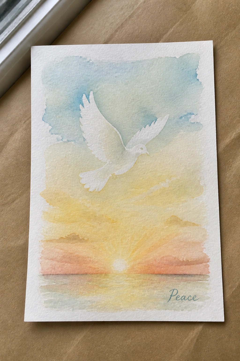
A flying dove placed against a gradient sky forms the core of this painting idea, with the bird positioned above a low horizon line where the sun meets the water. The sky uses layered washes that move from cooler tones down to warmer sunset hues, while the water reflection mirrors the same colors to create visual balance. This approach works as a nature scene that combines an animal subject with a simple landscape layout.
What makes this idea useful is the strong contrast between the light bird and the darker background, which lets the shape stand out without extra detail work. The horizontal layout and limited color range make it straightforward to adapt by swapping the sunset for a sunrise or shifting the tones to match different seasons. For practice, this kind of subject helps build skills with washes and negative space around the bird. The composition would translate well to a small print or card since the main elements stay readable even at reduced size.
Shepherd and Sheep in Layered Hills
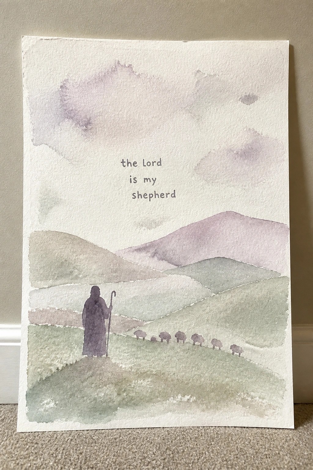
This painting idea pairs a shepherd figure and a small flock of sheep with a series of soft, overlapping hills that recede into the distance. The verse sits in the upper half of the page, using the open sky area as natural negative space so the text becomes part of the composition rather than an add-on. The muted greens, taupes, and purples keep the whole scene light while the simple shapes of the hills create depth without extra detail.
What makes this idea useful is the way the hills do most of the visual work, letting you focus on placement rather than complex drawing. You can change the hill colors to match a room or shrink the flock to three or four sheep if you want less to paint. For wall pieces or gifts, the layout leaves room to swap in a different short verse without redesigning the whole scene.
White Lilies Anchored by Scripture and Symbol

A loose cluster of white lilies with soft green foliage forms the main subject here, combined with a small fish symbol and a short Bible verse placed directly below. This painting idea pairs a botanical floral arrangement with minimal Christian text elements to create a balanced decorative piece. The open layout with leaves spreading outward prevents the center from feeling crowded while the verse anchors the bottom edge.
The composition does a lot of the work here by letting the flowers take most of the space and keeping the added symbols small and contained. What makes this idea useful is that the verse and fish can be swapped for different scriptures or left out entirely depending on the intended use. The color palette makes this easy to adapt by shifting the flower tones or background wash while keeping the same layout. For practice, this kind of subject works well as a template for greeting cards or small framed pieces.
Rural Church in a Gradient Sky
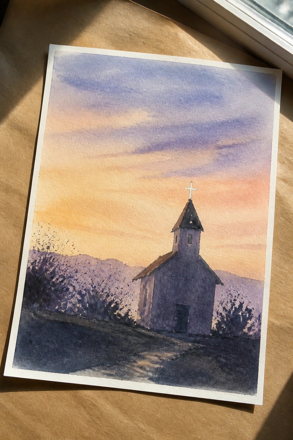
A small church with a pointed steeple and cross sits slightly off center in an open landscape, backed by low hills. The idea centers on a simple architectural subject placed against a large sky that moves from warm orange near the horizon into cooler purple and blue tones above. This landscape approach keeps the focus on the building while the sky and foreground path create depth without adding extra elements.
The composition does a lot of the work here by letting the sky dominate and using the path to guide the eye toward the church. You can adapt it by changing the sky colors to softer pastels or keeping the hills in one muted tone if you want quicker practice. For wall art, the vertical format and limited detail make it easy to scale down or adjust the building size to fit different paper sizes. The same idea works well as a starting point if you want to add a few more trees or change the roof color later.
Bread and Fish Still Life with the Word Give

A still life that pairs three loaves of bread with a single fish creates a clear Christian reference while keeping the layout simple and open. The bread sits above the fish in an easy diagonal flow, and the soft background wash lets the main shapes stand out without extra detail. Adding the word “Give” in a light script turns the painting into a quiet message piece rather than a straight food study.
What makes this idea useful is how the subject matter already carries meaning, so you do not need complex details to make it work. You can swap the word for another short phrase, change the number of loaves, or shift the fish to a different angle without losing the overall balance. For wall art or small gifts, the loose watercolor style and limited color palette keep the piece light and easy to frame. The same layout also works well as a quick practice study if you want to focus on shape and negative space instead of tight rendering.
Crown Centered in a Leafy Wreath
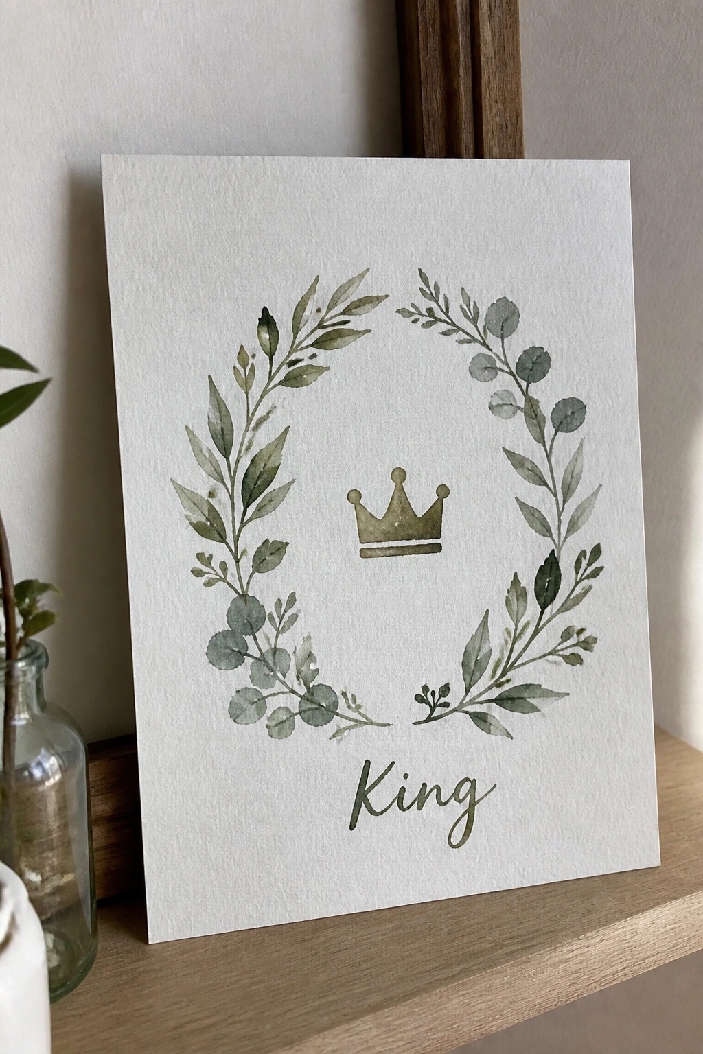
A simple wreath of overlapping green leaves creates a loose circle with a small gold crown placed in the open center and the word King written in cursive below. The idea relies on a balanced round layout that keeps the crown as the clear focal point while the foliage adds natural texture around it. This approach works as decorative Christian art because the elements stay minimal and the white space holds everything together without extra layers.
What makes this idea useful is how the circular shape does most of the visual work, so you can paint it quickly on paper or canvas. The limited green and gold palette makes it simple to change the word or resize the wreath for cards, journals, or small prints. For practice, the loose leaf shapes help you work on brush control without needing fine detail.
Sunrise Seascape with a Small Boat and Short Text
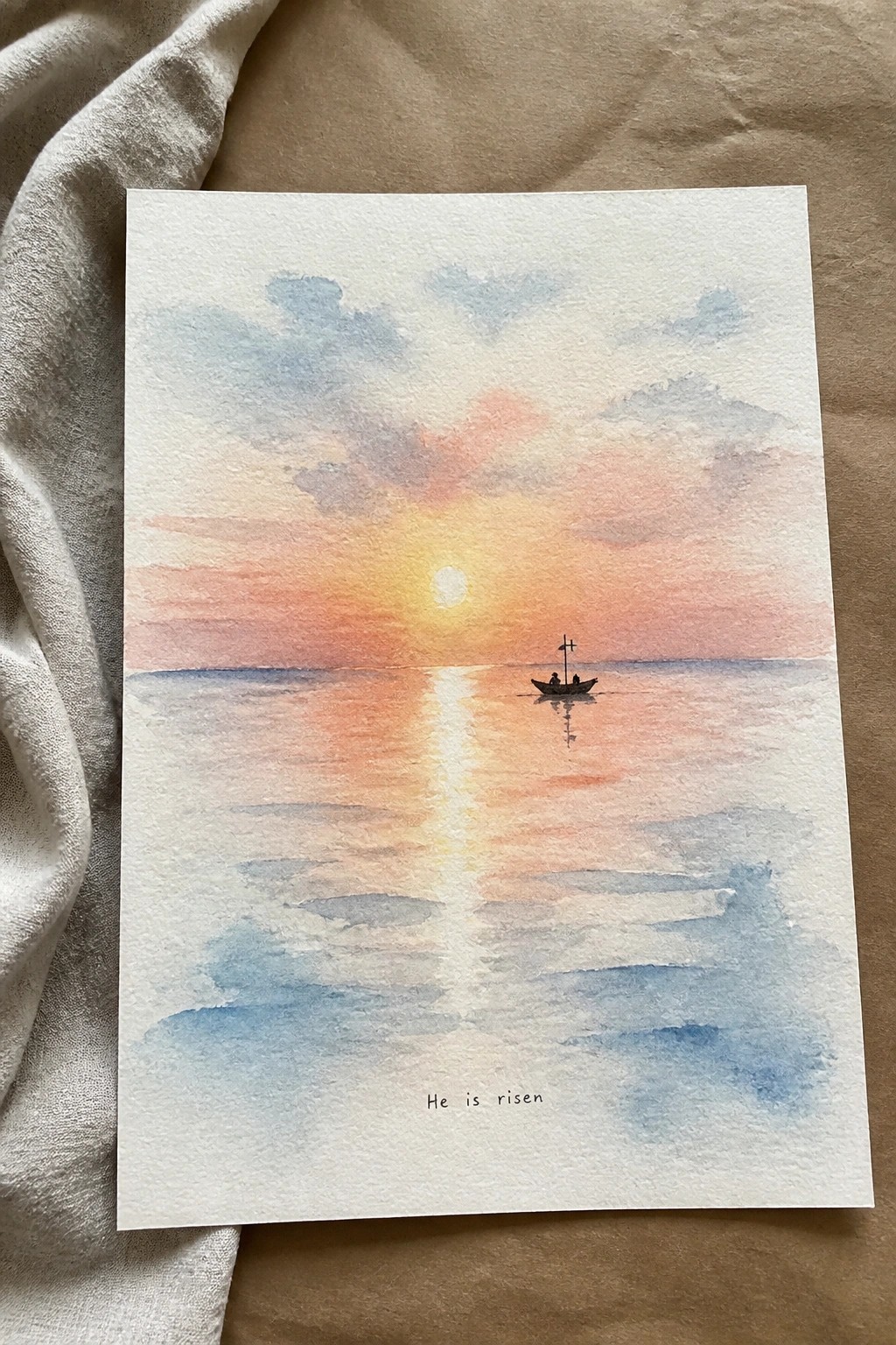
A sunrise over open water paired with a small boat gives a clear, simple structure for a Christian watercolor piece. The idea uses a low sun and its bright reflection to create a strong center line that pulls the eye across the page, while soft horizontal cloud bands and light wave shapes fill the space without crowding it. This keeps the painting in the landscape category but leaves room at the bottom for a short phrase.
The composition does a lot of the work here because the reflection and horizon already organize the page, so you do not need many extra details. You can shift the sky colors toward more pink or more blue depending on the time of year or the look you want, and the boat can stay small or be left out if you prefer a simpler version. This approach works especially well for wall pieces or cards since the open water area makes text placement easy without fighting the rest of the painting.
Sheep Row with Scripture Quote
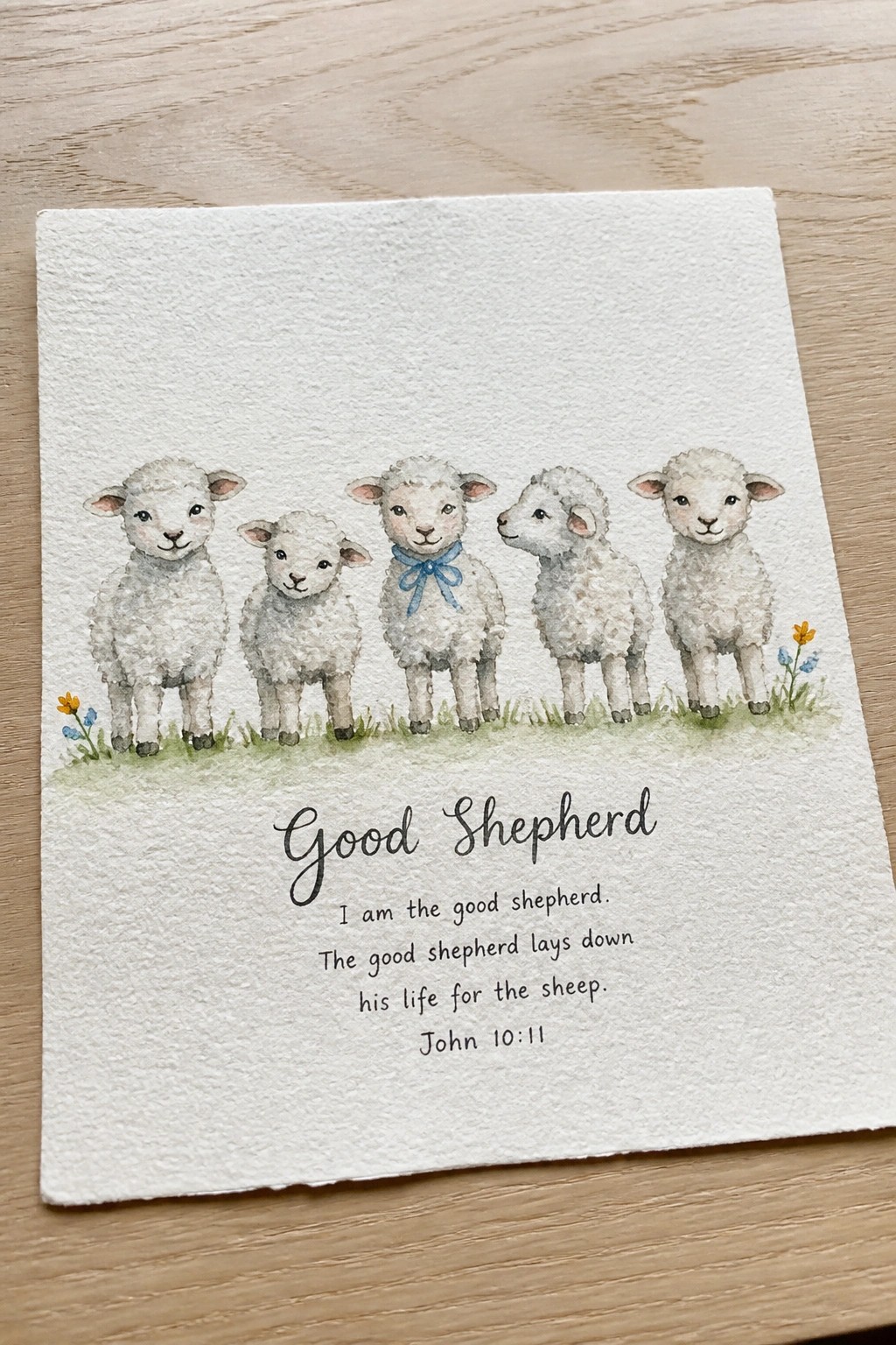
A straightforward animal illustration idea that lines up five small sheep across a narrow band of grass, leaving the lower half open for a short Bible verse. The concept works by keeping the figures similar in size and spacing them evenly so the eye moves across the page without crowding. This fits into a decorative quote style where the animals act as a visual header rather than the main focus.
What makes this idea useful is the clear division between the painted section and the text area, which makes it simple to swap in different verses or resize for cards. The limited color palette and repeated sheep shapes also reduce the amount of detail needed, so the same layout could be tried with three sheep or adjusted for a taller format. For wall art or printables, the balanced spacing keeps the piece from feeling cluttered even when the quote takes up more room.
Open Book Framed by Loose Wildflowers
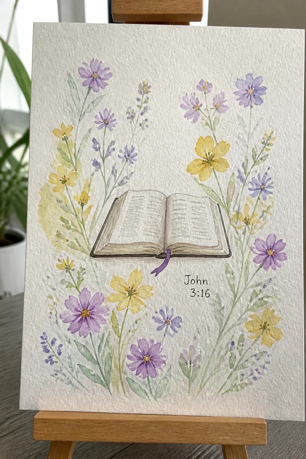
An open book with a purple ribbon bookmark sits at the center, encircled by scattered clusters of purple and yellow flowers on thin green stems. The arrangement leaves breathing room around the book while still creating a loose wreath shape that keeps attention on the pages and the verse reference placed to one side. This style works as a floral still life with a built-in spot for text.
What makes this idea useful is how the flowers act as a flexible border rather than a tight ring, so you can add or remove blooms without changing the overall balance. The same layout adapts easily to other verses or even non-religious quotes by keeping the open book as the anchor. For practice, the scattered stems let you work on loose shapes and varied heights without needing perfect symmetry.
Abstract Color Washes in a Loose Grid with Text
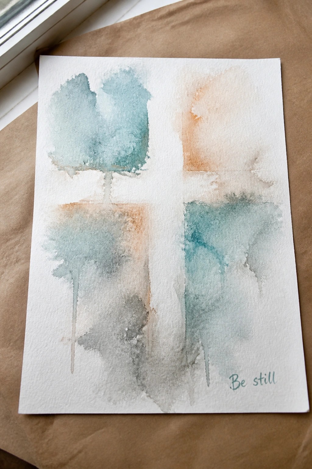
This painting idea uses a simple four-section layout filled with soft, overlapping watercolor washes in teal, peach, and gray. The sections stay open and airy through light layering and some dripping edges, letting the colors blend naturally without tight outlines. Placing a short phrase in one corner turns the color study into a finished decorative piece that stays minimal.
The composition does a lot of the work here by breaking the page into smaller areas, which keeps the washes manageable even if your paint spreads more than expected. You can adapt the same idea by changing the color mix to match a room or trying it on a larger sheet with one dominant section. This approach stands out for quick practice or small wall pieces because the grid gives structure while the soft edges and limited palette keep the whole thing light and easy to repeat.
Paired Birds on a Branch with a Circular Backdrop
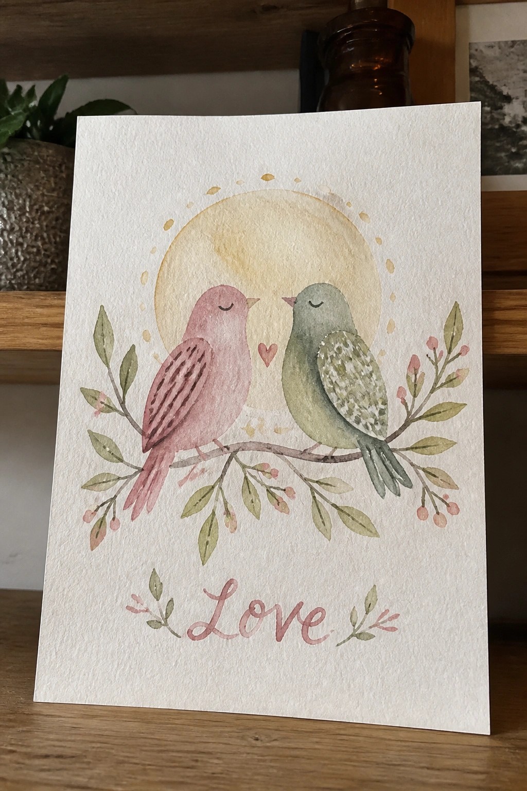
Two birds facing each other on a single branch form the main subject here, with a large soft circle placed behind them to create depth without adding complexity. The leaves and small clusters of berries spread outward from the branch to fill the sides evenly while keeping the center open. Placing simple text below the branch keeps the layout balanced and gives the piece a clear focal structure.
What makes this idea useful is how the branch works as a built-in divider that separates the illustration from the word at the bottom. You could easily change the circle color or size to fit different paper formats or swap the birds for another simple shape while keeping the same layout. For wall art this kind of composition stands out on Pinterest because the elements stay readable even when the image is viewed small. The color palette makes it straightforward to adapt by shifting the birds and leaves to match whatever tones you already have on your palette.
Mountain Cross Under a Starry Gradient Sky
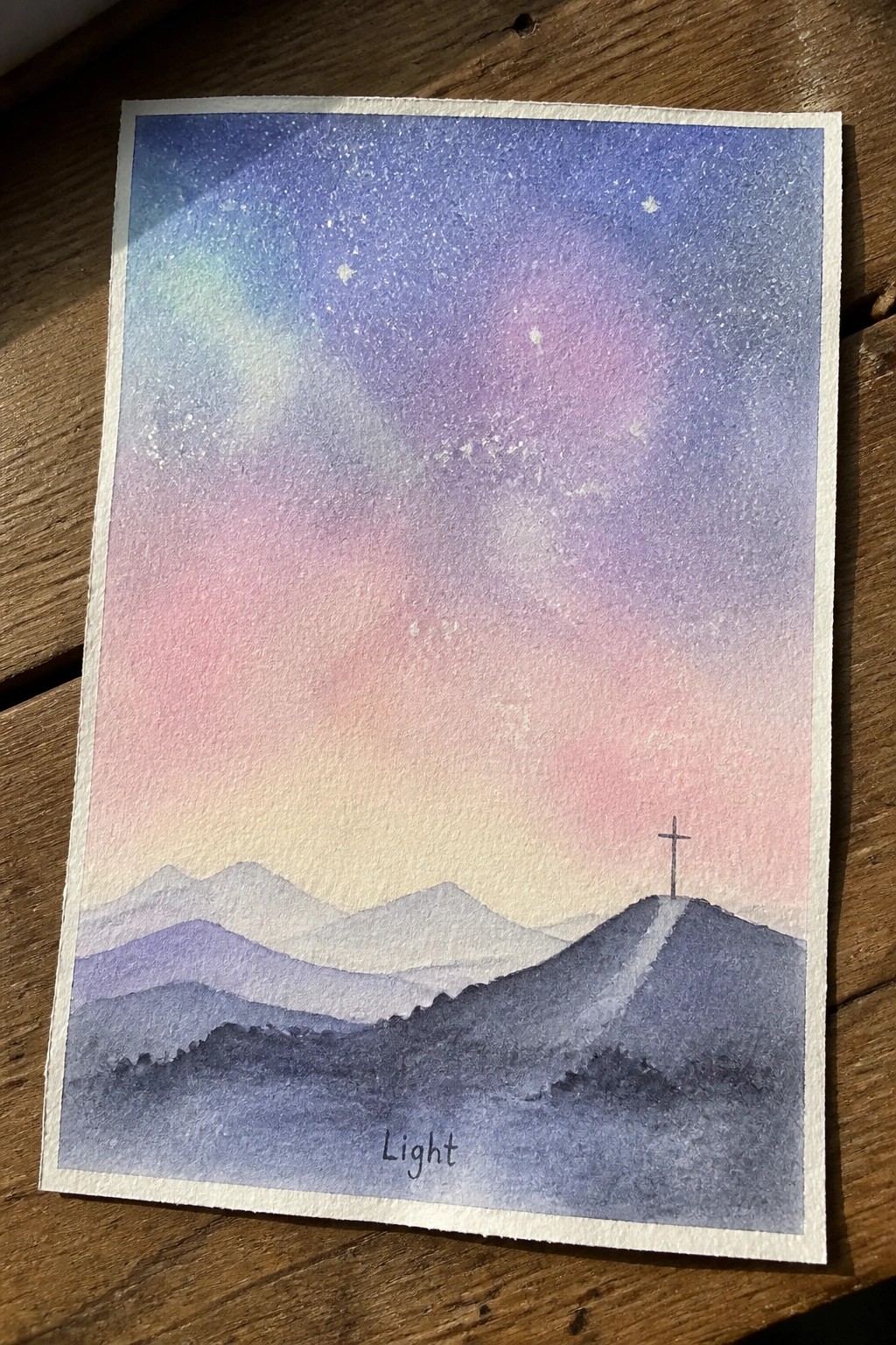
A landscape idea built around layered hills and a single cross placed on the right side of a ridge works well for Christian watercolor collections. The sky takes up most of the space with a smooth shift from deep blue at the top into soft pink and purple near the horizon, dotted with small white stars. This setup keeps the composition balanced while the cross stays visible without competing with too many other elements.
The composition does a lot of the work here because the sky gradient supplies the main color interest and the hills only need a few overlapping shapes. You can adapt the same layout by changing the sky colors to match a different time of day or by moving the cross slightly for a fresh arrangement. For practice or quick pieces, the idea scales down easily to smaller paper while still reading clearly as a finished painting.
Light Teal Ichthys with Corner Florals

A simple ichthys symbol painted in soft watercolor gradients of teal and turquoise forms the main focus, with a pale yellow wash added around the edges for subtle contrast. Delicate floral clusters and leaf sprigs in the same color family sit in opposite corners to frame the symbol without filling the center space. This approach keeps the composition balanced and open while fitting neatly into a decorative scripture art category.
What makes this idea useful is the way the central symbol stays large and readable while the corner florals add interest without extra layers. The color palette is easy to swap for other soft tones if you want to match existing decor or try different paper textures. For quick gifts or small wall pieces, the layout adapts well to different sizes since the white space does most of the work.
Soft Arched Nativity with a Single Star
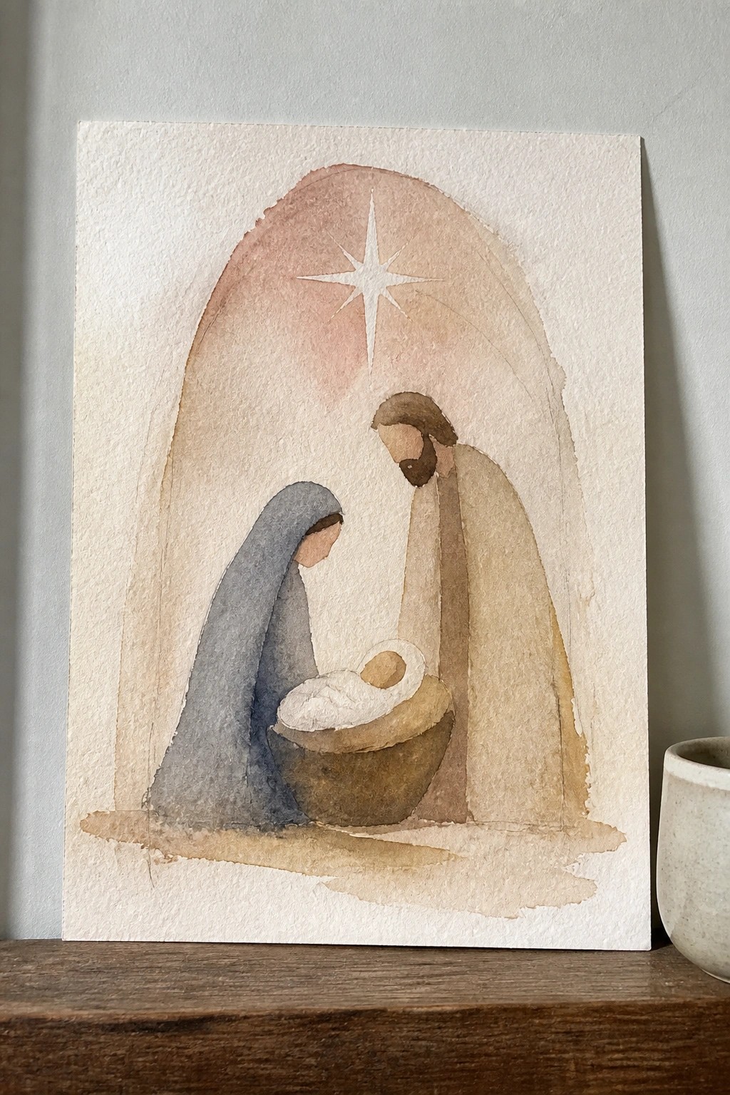
A simple nativity idea centers on the holy family grouped around the manger, framed by a large arch and topped with one prominent star. The approach relies on broad washes and minimal detailing so the figures stay the focus while the arch and star supply the setting. Limited earth tones and a pale background keep the whole scene light without extra elements competing for attention.
What makes this idea useful is how the arch and star do most of the compositional work, so you do not need complex backgrounds. The same layout could be painted smaller for cards or enlarged for a wall piece, and the muted palette is easy to swap for whatever colors you already have on hand. For practice, the loose shapes let you work on basic figure placement without getting stuck on fine details.
Crown of Thorns Wreath with Centered Text
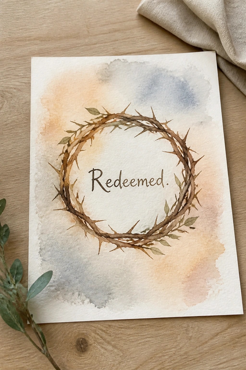
A crown of thorns wreath forms the main subject here, painted in muted browns with small leaves tucked among the branches and the word Redeemed placed directly in the open center. The soft background wash in warm and cool tones keeps attention on the circle without competing elements. This approach works as decorative religious art where the wreath shape itself creates a natural frame for the text.
What makes this idea useful is the clear circular layout that lets the text sit comfortably without extra planning. The muted palette can be swapped for other earth tones or kept minimal depending on the paper and brush size you have on hand. For wall art, something like this scales easily to a smaller card format or stays the same size for a simple print. The background wash also means you can test different color mixes without changing the main wreath structure.
Lone Cross on a Beach Landscape
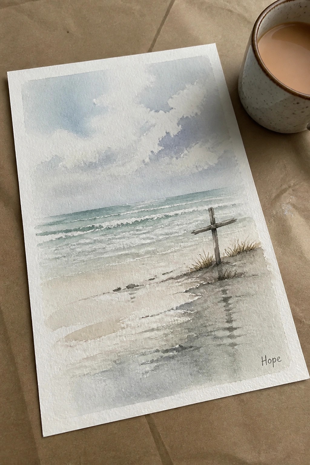
A simple wooden cross placed on the sand near the shoreline creates the main focal point in this Christian landscape idea. Horizontal layers of water, wet sand, and sky keep the eye moving across the scene while the cross stands out through its vertical shape and darker tone. The soft watercolor washes let the background recede so the cross remains the clear subject without needing extra detail.
The composition does a lot of the work here by using open space and a single strong element. You can easily change the sky colors or move the cross closer to the water for a different feel. This works well as a small practice piece or a quick painting for gifts since the shapes stay basic and the palette stays limited. For wall art the same layout could be scaled up with slightly stronger contrast in the waves.
Horizontal Row of Floral Crosses with Soft Color Variations
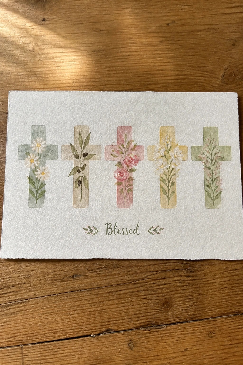
A simple way to build this painting idea is to repeat the same cross shape five times in a straight line while filling each one with a different floral arrangement. The concept works as decorative Christian art that stays light because the flowers stay contained inside the cross outlines and the colors stay muted. The even spacing and matching size across the crosses keep the whole piece balanced without needing extra background elements.
What makes this idea useful is that the repeated shape gives you an easy structure to follow while the flowers let you practice different plant types in one sitting. You could swap the florals for leaves or berries, shift the color order, or shrink the whole thing down for a greeting card. The layout also translates well to canvas or wood because the clean row format reads clearly from a distance. For Pinterest, this kind of tidy, themed arrangement tends to get saved when people search for easy Easter or faith-based decor.
Frequently Asked Questions
1. Where can I buy prints or originals of these watercolor Christian paintings? Many artists featured in collections like this sell high quality prints through their personal websites or platforms such as Etsy and Fine Art America. Search for the specific painting title or artist name to find options ranging from small affordable prints to larger canvas reproductions. If an original is available it is often listed directly on the artist’s site with details on pricing and shipping.
2. What watercolor techniques help achieve a light and airy Christian painting style? Focus on wet on wet applications to blend soft colors gently and leave plenty of white paper showing through for a fresh feel. Use diluted washes with pale tones like soft blues and gentle greens while avoiding heavy outlines. Layering translucent colors sparingly and allowing areas to dry naturally creates the delicate airy effect common in these inspirational pieces.
3. How do I choose a frame that complements a light and airy watercolor Christian painting? Select simple light colored frames such as white or natural wood to keep the focus on the artwork itself. Avoid ornate or dark frames that could overpower the soft style. Opt for acid free mats and UV protective glass to preserve the delicate watercolor pigments over time.
4. Can these paintings work well as gifts and how do I pick the right one? Yes they make meaningful gifts for occasions like baptisms or housewarmings due to their uplifting themes. Consider the recipient’s favorite Bible stories or preferred color tones when selecting from the collection. Many prints can be customized with added scripture text to make the gift more personal.
5. What steps should I follow to care for watercolor Christian paintings at home? Keep them away from direct sunlight and high humidity to prevent fading or warping. Dust frames gently with a soft cloth and avoid touching the painting surface. For unframed pieces store them flat in archival sleeves and consider professional framing soon after purchase for best protection.