I have tried a few canvas projects over time to add some quiet interest to my walls.
Cross designs came up as something simple that did not need much planning or special tools.
I kept the colors soft and the shapes basic so the pieces would blend into my rooms without standing out too much.
These ideas helped me fill empty spaces while keeping the overall look calm and uncluttered.
If you enjoy small painting sessions they might be worth trying at your own pace.
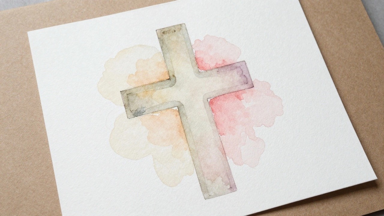
Watercolor Cross with Soft Blended Washes

A cross formed by simple outlined shapes and filled with translucent watercolor layers in muted greens, pinks, yellows, and purples creates an easy decorative painting. The colors are applied loosely so they overlap and extend past the edges in soft patches rather than staying contained. This method keeps the focus on color blending and shape rather than fine detail or realistic rendering.
The composition does a lot of the work here because the basic cross structure lets beginners practice wash techniques without worrying about proportions. You can swap in different color combinations to match existing room colors or try the same idea on a larger canvas for bigger wall pieces. The loose edges also make it simple to adapt into cards or smaller studies while still looking intentional.
Grid of Matching Rolling Hill Landscapes

A series of small canvases painted with layered hills and distant mountains under soft skies creates a cohesive landscape set. Broad horizontal strokes build depth through overlapping shapes in muted greens, blues, and warm sky tones. The repeated composition across multiple pieces turns a simple landscape idea into a modular wall arrangement that reads as one larger scene.
What makes this idea useful is the small canvas format, which lets you finish each piece quickly and vary the sky colors or hill tones without starting over. The limited palette and soft edges make it straightforward to match the set or repaint sections to fit a room. For wall display, grouping them in a grid gives more impact than a single canvas while keeping each one easy to handle, and you could shift the colors toward cooler tones or warmer ones depending on the season.
Daisies Layered Over a Cross Shape
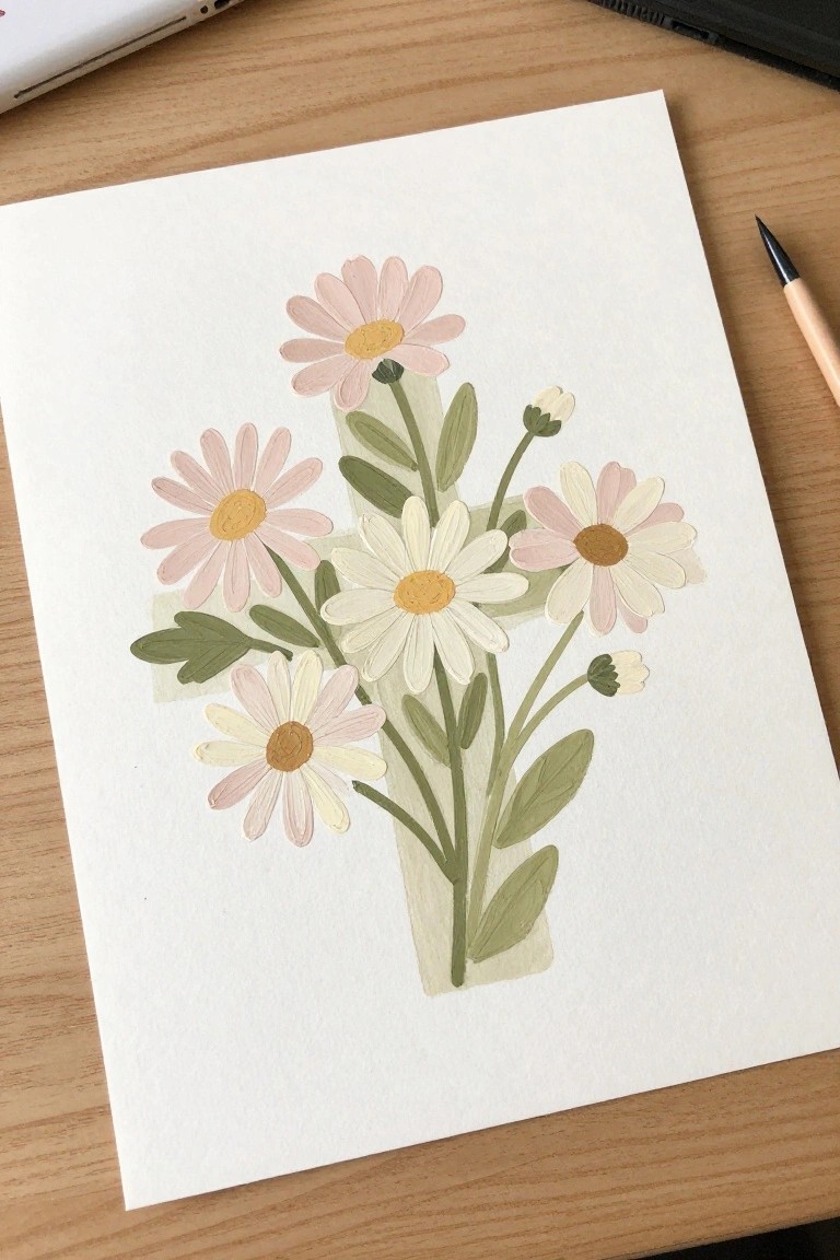
A floral painting idea that uses a cross as the main structure for arranging a bouquet of daisies. The flowers sit at varying heights around the vertical and horizontal lines, with green stems and leaves filling the gaps to create a full but orderly look. The soft pink and white petals against the muted green tones keep the focus on the shape while adding gentle color variation.
The composition does a lot of the work here by letting the cross guide flower placement and spacing. You could adapt it by changing the petal colors to match a room or reducing the number of blooms for a faster version on a smaller canvas. For wall art, something like this stands out on Pinterest because the geometric element gives the floral subject a clear point of interest.
Sunset House Landscape Painting

A landscape idea built around a small house set against a bold sunset sky makes a strong starting point for practicing color gradients. The main focus stays on layering warm tones across the upper half of the canvas while keeping the house and trees as simple dark shapes below. This setup creates clear contrast and lets the sky carry most of the visual interest without requiring fine detail work.
What makes this idea useful is how the sky can be adapted with different warm color mixes or even swapped for cooler tones to change the time of day. The house shape is easy to resize or simplify further depending on canvas size, and the foreground lines can be reduced or replaced with flat color if you want a quicker version. For wall art, the bright upper section gives the piece impact even on a small scale, so it works well for testing layouts before committing to larger pieces.
Layered Blue Cross with Green Background Accents

A white cross with thick layered blue borders forms the main subject against a soft wash of greens that fade around the edges. Small clusters of blue flowers sit at the inner corners to add subtle detail without crowding the design. The approach works as decorative art by using simple shapes and color blocking to keep the cross as the clear focal point.
What makes this idea useful is the way the background wash creates contrast while staying easy to paint with loose strokes. You could change the blue tones to match any room or scale the cross larger or smaller depending on your canvas size. The flower accents are optional so the design stays flexible if you want a cleaner version or need something quick for wall art.
Four-Panel Lake Reflection Landscape

Split a simple waterside scene across four canvases so the horizon runs straight through the middle of the grid. The top panels hold the sky and treeline while the bottom panels pick up the same shapes as reflections in the water. This layout keeps the painting balanced because the repeated colors and shapes across the divide make the separate pieces read as one image.
The composition does a lot of the work here because the straight horizon and vertical tree placements make alignment easy. You can swap the tree shapes or soften the colors to match a photo from your own area without changing the overall structure. For wall art, something like this stands out on Pinterest because the grid format gives it a clean, modern look while still showing a full landscape.
Layered Hearts with Mixed Patterns

A cluster of hearts in different sizes creates an easy decorative painting by letting each one carry its own color or simple pattern. Overlapping the shapes builds depth while the added leaf accents break up the layout and keep the eye moving across the canvas. This approach fits decorative art that relies on bold shapes and a limited palette rather than precise detail.
What makes this idea useful is how quickly you can change the color scheme or swap patterns to match existing decor without redrawing the whole layout. The plain background does most of the work by letting the hearts stand out, and you can shrink the design for a smaller canvas or greeting cards. For practice, this kind of subject helps you test brush control on curves and straight lines while still producing something ready to hang.
Bird Silhouettes Across a Color Grid

A set of matching bird silhouettes painted on separate canvases gives you a simple way to build a larger wall piece without needing complex scenes. The same basic bird shape repeats on each canvas while the backgrounds shift through soft washes of blue, green, pink, and brown. Keeping the birds as solid shapes against those gentle gradients lets the color changes carry the interest instead of added details.
What makes this idea useful is how the repeated outline keeps the project approachable even if your brush control varies from canvas to canvas. You can change the background colors to fit a room or swap the bird shape for another simple animal without breaking the grid layout. For wall art, something like this fills space evenly and still looks intentional if the colors end up slightly uneven. The same approach works if you want to test different paint mixes on small canvases before committing to a bigger piece.
Layered Hills with a Subtle Cross Overlay

A landscape painting idea that uses broad horizontal bands of color to form rolling hills and sky, then adds a single vertical cross shape in a lighter tone across the middle. The idea works because the cross sits softly against the background rather than standing out as a separate object, and the limited color range keeps the whole piece calm and balanced. Simple shapes and soft edges make this a straightforward landscape approach with a built-in focal point.
What makes this idea useful is how easily the hill layers can be adjusted in height or color while keeping the cross placement centered. The muted palette of blues, purples, and beige translates well to different room styles without needing many supplies. For practice, this kind of subject helps with blending large areas and testing how much detail to leave out. It would also translate to a smaller canvas or a version with different sky tones if you want to change the mood.
Layered Paper Cross with Watercolor Leaves

A cross formed from torn paper strips in soft beige tones serves as the base for a vertical branch painted in watercolor. The stem runs down the center while the leaves in greens, dusty reds, and pale yellows spread across the horizontal arms. This setup lets the flat paper shape handle the cross structure so the painted leaves can stay loose and natural.
What makes this idea useful is how the paper strips do most of the work defining the cross without any need for straight edges or masking. The neutral palette makes it simple to match existing wall colors or switch leaf tones for different seasons. For wall art, something like this fits easily on a small canvas or board and can be adapted by using different plant shapes or paper textures. It would also translate well to a quick series by changing only the leaf colors each time.
Pastel Overlapping Circle Mandala

A mandala-style design made from overlapping circles and rounded petal shapes forms a symmetrical decorative piece. Four large ring clusters sit around a central circle, each one built with dotted rings, small leaf marks, and solid centers that create steady visual balance. The soft coral, teal, and cream palette with scattered gold dots keeps the composition orderly and easy to read as decorative art.
What makes this idea useful is the repeating circular layout that can be adjusted for square or round canvases without much trouble. You can change the color order or drop some inner dots to match the size of your canvas or your current paint supply. For wall display, the clear structure helps the piece hold attention even from a distance while still leaving space to personalize the shades or simplify the rings.
Pastel Cross with Gradient Color Blocks
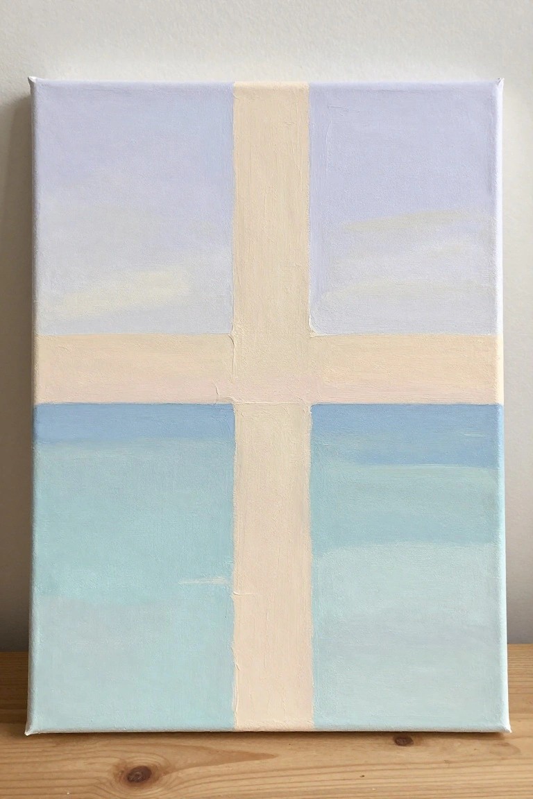
A cross made from a neutral stripe divides the canvas into four sections that each hold a soft gradient. The top sections use pale lavender tones while the bottom ones shift through light blue and aqua, all applied with loose horizontal strokes. This creates a balanced geometric layout that stays simple yet gives each quadrant its own quiet color story.
The straight cross lines make it easy to mask off with tape before painting the sections, so the idea works well even for someone new to canvas work. Swapping the lavender and blue for other soft pairs lets the same layout match different rooms or seasons without changing the structure. The even spacing and gentle color changes also help the finished piece photograph cleanly for Pinterest, where balanced but unfussy designs tend to get saved.
Sleeping Cat Inside a Layered Cross

A sleeping cat sits at the center of a cross-shaped design built from overlapping rounded layers. The idea combines a simple animal subject with a geometric frame that uses soft peach, beige, and gray tones to create depth without crowding the space. This keeps the composition balanced and lets the curled cat remain the clear focal point.
The composition does a lot of the work here by turning the cross into a ready-made border. You can adjust the layer colors to fit different wall palettes or swap the cat for another small animal if you want variety. This would be easy to turn into a small series by changing only the inner subject while keeping the same frame structure. For practice, the rounded shapes and limited palette make it straightforward to repeat without needing many supplies.
Lily of the Valley Stems in Loose Clusters

A floral painting idea built around lily of the valley focuses on several thin green stems with small bell-shaped flowers and a few broad leaves at the base. The arrangement places the tallest stem slightly off center while the leaves create a balanced lower shape that supports the lighter flowers above. This approach keeps the composition simple yet structured, relying on soft color shifts rather than heavy outlines.
The color palette makes this easy to adapt by using the same muted greens and creams for other spring flowers like snowdrops or bluebells. You could reduce it to two stems for a smaller canvas or spread the leaves wider to fill a larger square format for wall art. For practice, this kind of subject helps work on light washes and spacing without requiring precise line work.
Moonlit Landscape with Lone Tree Silhouette
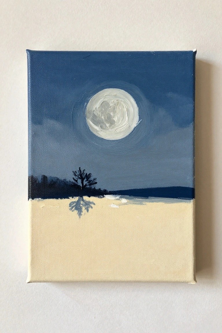
A moonlit landscape idea centers on a large glowing moon set against a dark blue sky with simple cloud layers. The composition places the moon high and centered so it becomes the main focal point, while a single dark tree silhouette sits on the horizon to break up the lower half. A pale foreground creates contrast and gives space for a soft reflection without adding extra elements.
The composition does a lot of the work here because the big circular moon is simple to paint first and the rest builds around it. You could easily change the sky colors to purples or deeper indigos or swap the tree for another shape if you want variety. This kind of painting works especially well on small canvases and adapts quickly for practice since it relies more on shape placement than fine detail.
Pastel Striped Coffee Cup
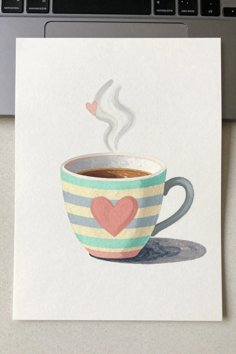
A coffee cup with horizontal stripes and heart accents works as a simple still life idea. The bands of color wrap around the curved form while the handle and rising steam lines break up the pattern. This approach keeps the focus on basic shapes and limited color blocks rather than fine detail.
The composition does a lot of the work here because the stripes already define the cup’s volume. You could swap the color order or change the heart size to match different decor styles. This would be easy to turn into a small series by varying the stripe width or steam direction across a few canvases. For wall art, something like this fits well on a narrow canvas without needing complex backgrounds.
Winding Path Landscape in Muted Greens

A curving path through layered foliage makes a strong landscape painting idea because the trail itself creates natural movement and depth. Loose washes in soft greens and beiges build the surrounding greenery while a few taller clusters with small purple accents add just enough detail to hold interest. The composition stays simple by letting the path guide the eye and keeping the background light so the shapes do not compete.
The composition does a lot of the work here since the path already supplies structure and direction. You can adapt it easily by changing the plant colors to match different seasons or by reducing the foliage to fewer brushstrokes if you want a faster version. For wall art this type of scene works well in a set of similar landscapes because the neutral palette fits most rooms without clashing. A painting like this also saves well as a Pinterest reference since the clear focal line makes the idea easy to recognize and copy.
Cross on a Mountain Peak
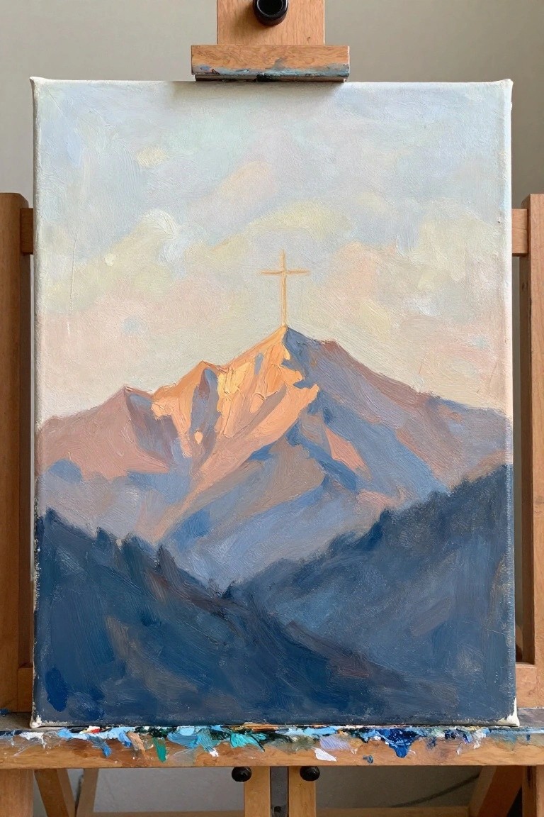
A landscape painting centered on a mountain summit with a cross at the top gives a clear focal point against the sky. The idea uses strong light on the upper ridges against cooler shadowed slopes to build depth with simple color blocks. Broad brushwork keeps the shapes readable while the cross adds a distinct vertical element that anchors the whole scene.
The composition does a lot of the work here by keeping the cross high and the lower ridges in darker tones so the eye moves straight to it. You can adapt the palette by swapping the warm highlights for cooler tones if you want a different time of day or a more subdued wall piece. For practice this works well because the main shapes are straightforward and you can scale the size up or down without losing the idea. Try cropping tighter around the peak or adding a second smaller cross if you want a quick variation.
Muted Cross Over Color Blocks
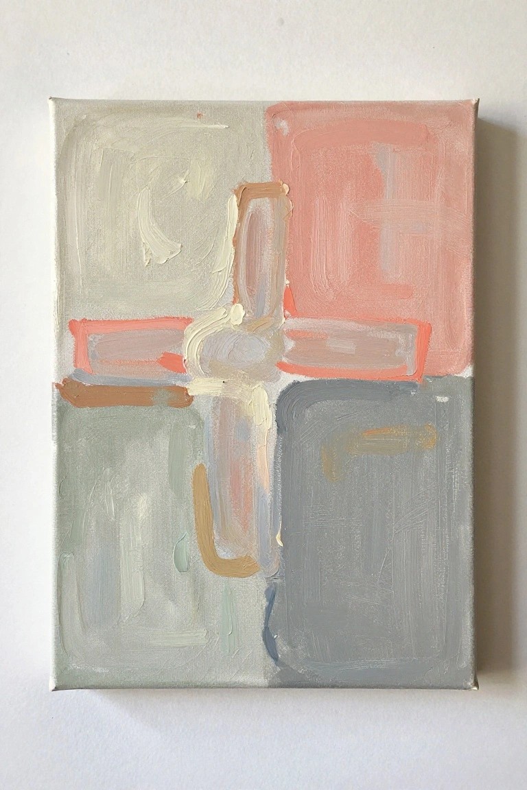
An abstract cross idea built from overlapping brushstrokes works well when the central form sits across a background divided into four soft color sections. The intersecting strokes in warm neutrals and gray create a focal point while the surrounding sage, coral, and blue-gray fields keep the overall layout balanced. This approach belongs in the decorative abstract category, where simple shapes and low-contrast colors do most of the visual work.
What makes this idea useful is that the divided background already organizes the canvas, so you only need to focus on placing the cross strokes. You can change the accent colors to fit a specific room or repeat the same block layout on a smaller canvas for faster practice. The loose layering also means small adjustments to the cross shape still read clearly, which helps the finished piece stay calm enough for everyday wall display.
Frequently Asked Questions
1. What basic supplies are needed to start these cross canvas painting projects? You will need stretched canvases in various sizes, acrylic paints in soft neutral tones like blues, greens, and beiges, paintbrushes of different widths, a pencil for sketching simple cross outlines, and a sealant spray to protect the finished pieces. Many of the 19 ideas use minimal colors to keep the process straightforward and the results calming.
2. How do I choose colors that promote a peaceful home display? Focus on muted palettes such as soft grays paired with sage green or light lavender with warm white. These shades avoid high contrast and instead create a soothing visual flow. Test small swatches on paper first to see how the colors interact under your home lighting before committing to the canvas.
3. Are these cross designs suitable if I have never painted before? Yes, the ideas emphasize basic shapes and repetitive strokes rather than detailed work. Start with the simplest patterns like single large crosses or overlapping lines. Practice on scrap paper to build confidence, and remember that slight imperfections add to the handmade charm of a peaceful display.
4. What are some effective ways to arrange multiple finished canvases on a wall? Group three to five pieces in a loose grid or staggered formation at eye level. Leave a few inches between each canvas to allow the eye to rest. Consider placing them above a sofa or in a hallway where natural light can highlight the soft colors without glare.
5. How long does it typically take to complete one of these paintings? Most of the 19 ideas can be finished in one to two hours once the design is sketched. Larger canvases or those with multiple layers may need an extra session for drying time between coats. Working in short bursts helps maintain focus and keeps the activity relaxing rather than rushed.