
I have always liked having scripture around my house in a quiet way.
Painting on canvas lets me choose soft colors that feel peaceful.
Neutral tones work well with my furniture and they do not stand out too much.
Over time I have tried different designs and some turned out better than others.
Here are a few ideas that might work if you want something similar.
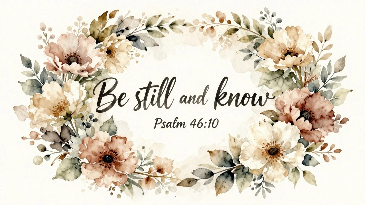
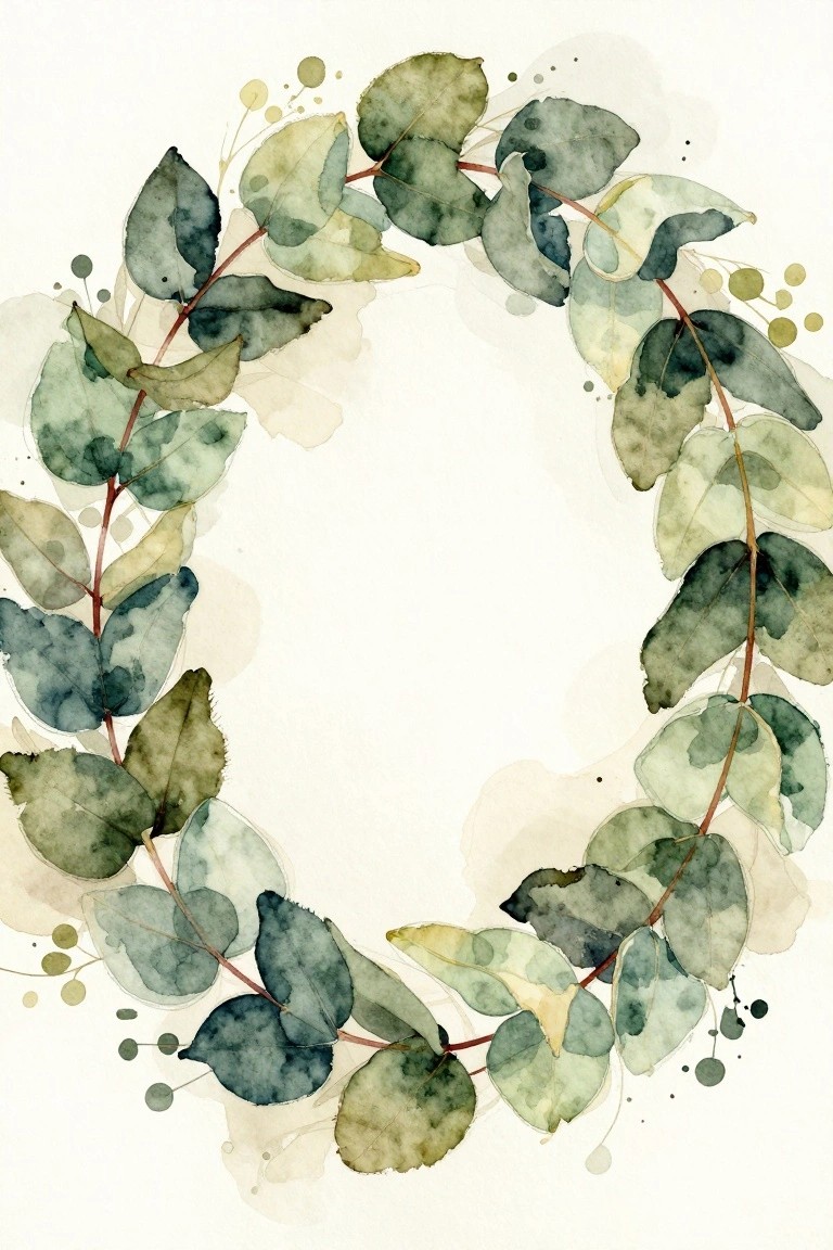
Neutral Floral Wreath Scripture Canvas
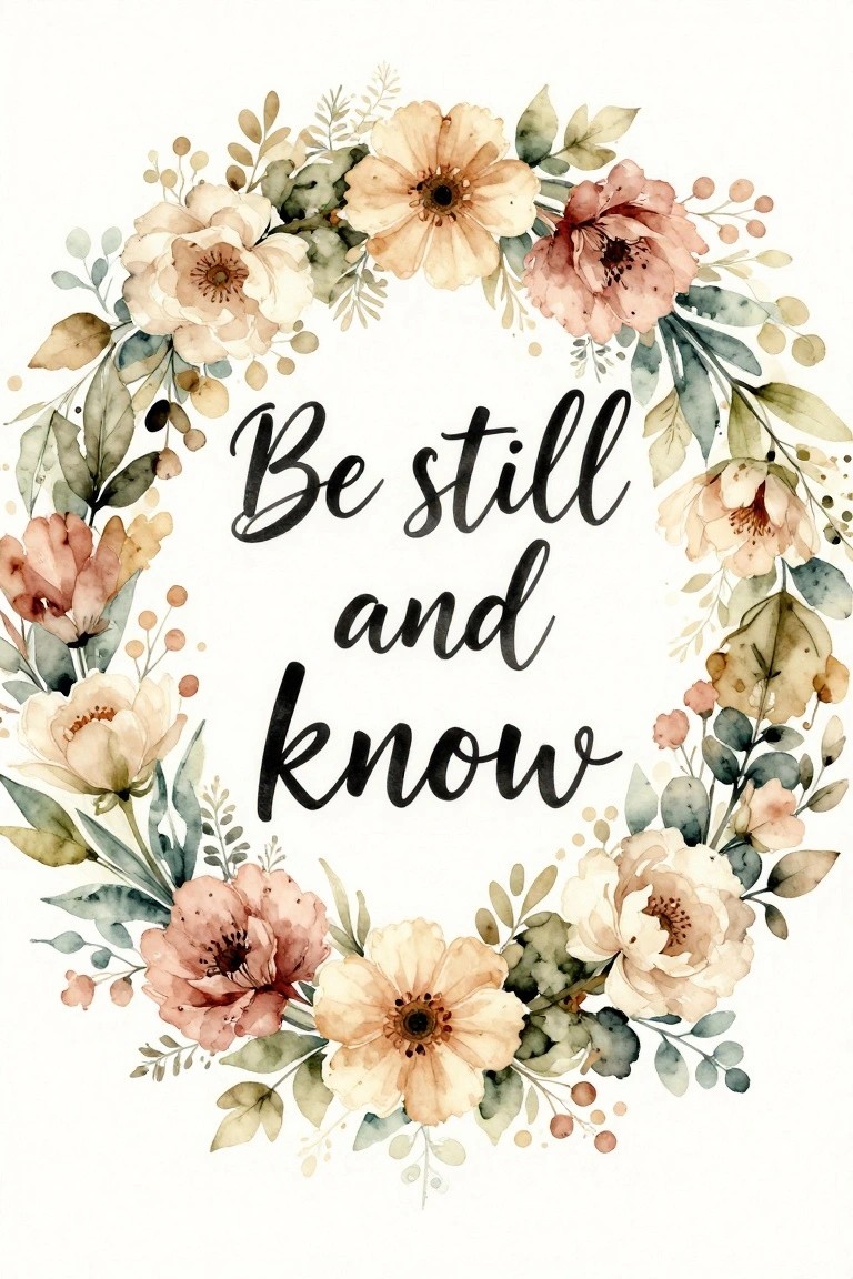
A circular wreath made of soft neutral flowers and leaves forms the main structure for this scripture canvas idea. The painting places the text in the open center so the lettering remains the focus while the blooms create a loose frame around it. Watercolor-style blending and varied leaf shapes give the wreath movement without overcrowding the space.
The composition does a lot of the work here because the open center naturally highlights the words and keeps the design balanced even if the flowers are not perfectly even. You can adapt the idea by using fewer blooms or switching the palette to match other room tones while keeping the same wreath layout. For canvas work this format is easy to scale up or down and works as a standalone piece or part of a set of similar neutral scripture prints.
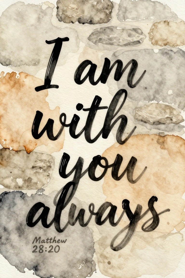
Soft Watercolor Cross with Scripture Reference
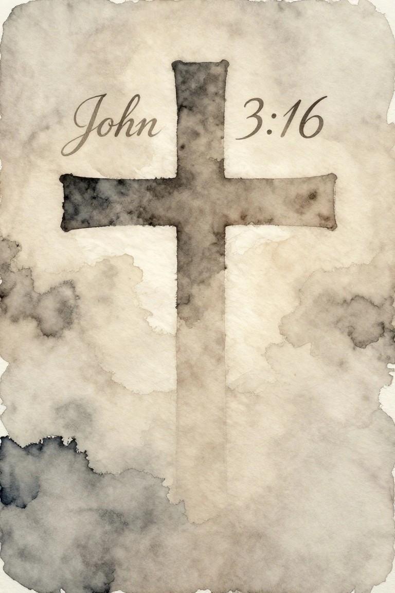
A cross painted in layered neutral washes forms the main shape while the verse reference sits on the arms in a simple script. This kind of painting idea fits the decorative scripture category because the soft edges and muted tones keep the piece calm rather than bold. The composition works by letting the cross shape carry most of the visual weight while the text stays secondary and easy to read.
What makes this idea useful is how little detail is actually required once the cross outline is set. You can adapt the same layout on any canvas size by adjusting how much water you add to the washes for lighter or deeper tones. For wall art, something like this fits a soft neutral collection because it stays quiet next to other minimal pieces. The background texture also makes the finished piece look complete without extra layers.
Mountain Landscape Canvas with Psalm 23 Verse
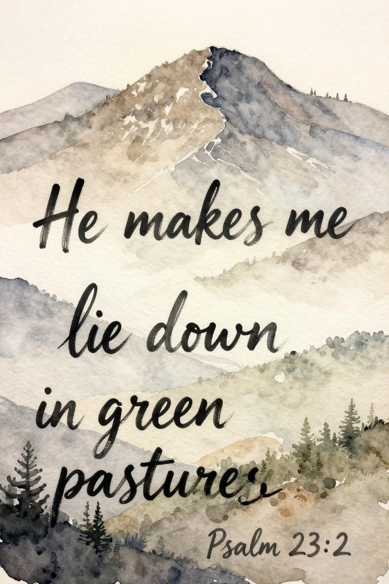
A scripture canvas idea like this pairs a soft mountain range with the verse from Psalm 23:2 placed directly across the center. The landscape uses overlapping peaks in muted grays and browns, with a band of trees along the lower edge to frame the text. This layout keeps the lettering prominent while the background stays quiet and balanced.
The composition does a lot of the work here because the mountains recede naturally behind the words. You could scale the peaks smaller for a 8×10 canvas or stretch them wider for a horizontal piece above a bed. The neutral tones also make it simple to swap in different verses later without repainting the whole scene.
Eucalyptus Wreath Border for Scripture Canvases
A wreath made from layered eucalyptus branches creates a natural frame that leaves the center open for text or negative space. The leaves overlap in soft, irregular clusters with visible stem lines, giving the shape structure while the muted green tones keep the overall look light. This approach works as decorative art that stays simple enough to paint on canvas without needing precise botanical detail.
The composition does a lot of the work here because the circular layout guides the eye inward without extra elements. You can paint the wreath first, then add a short verse in the middle using the same neutral palette or a slightly darker tone for contrast. Scaling the size down makes it suitable for smaller canvases, and swapping in different leaf shapes lets you personalize it while keeping the same soft aesthetic.
Tall Grass Scripture Landscape
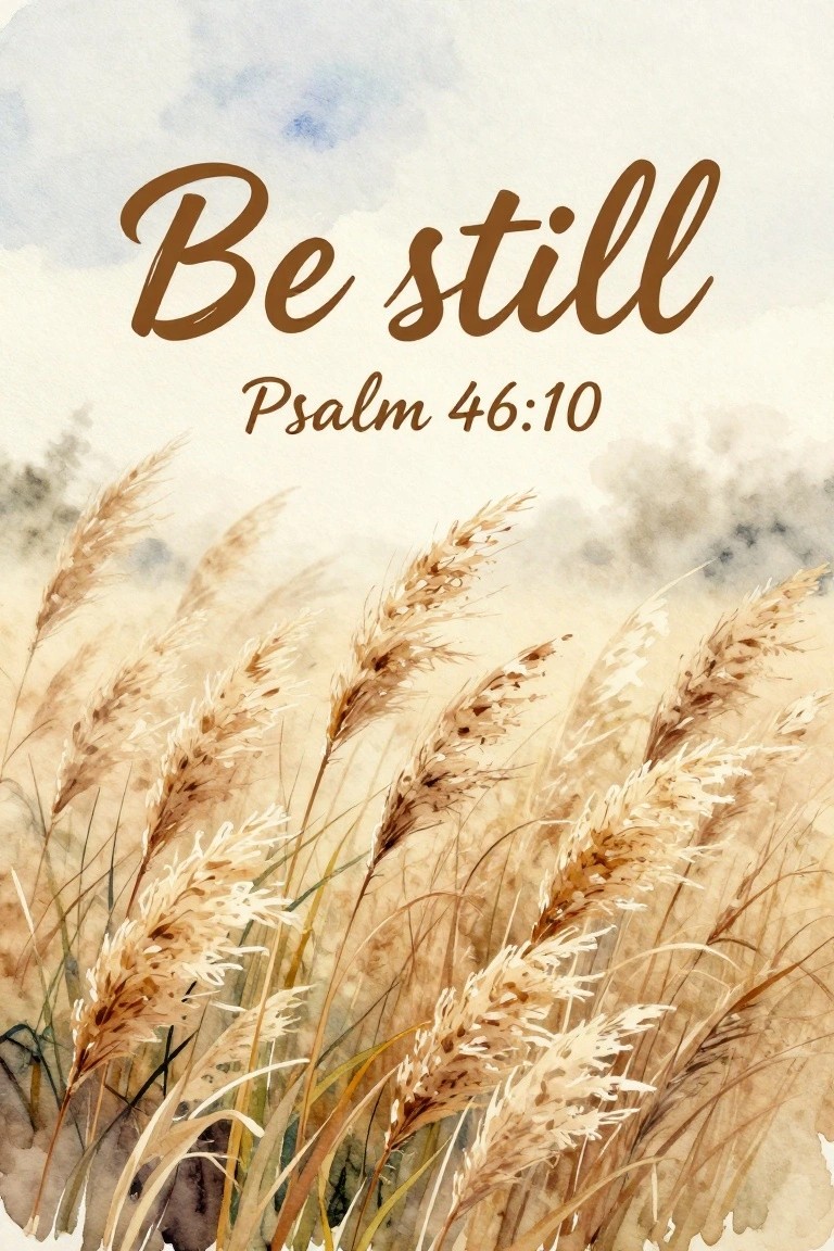
A landscape-style canvas idea that pairs tall, feathery grasses with overlaid scripture text works well for a soft neutral aesthetic. The grasses occupy the lower portion of the frame in layered beige and brown tones while the verse sits centered above them against a pale sky wash. Loose vertical strokes and dry-brushed seed heads create texture without needing fine detail, and the muted palette keeps the focus on the text.
What makes this idea useful is the simple vertical composition that leaves plenty of open space for lettering. You can scale the grasses down to fit a smaller canvas or stretch the sky area if you want larger text. The neutral tones also make it easy to match existing decor or try different verse placements without repainting the whole background. For practice, starting with the grass field first lets you test washes before adding the words.
Gold Script Quote on a Soft Neutral Wash
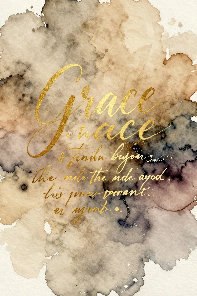
A gold script quote layered over a loose abstract background of warm browns, beiges, and soft grays forms the core of this canvas idea. The lettering sits slightly off-center, letting the mottled wash create natural variation around the words. This approach fits into decorative text art where the background stays minimal so the message stays clear.
What makes this idea useful is how the background can be painted quickly with diluted colors and left to blend on its own. You can swap the quote for any short verse and keep the same neutral palette to match other pieces in a room. For practice, this kind of layout helps you focus on lettering size and placement without needing precise details in the wash.
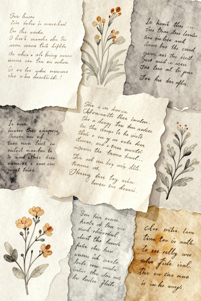
Layered Scripture Collage with Watercolor Botanicals
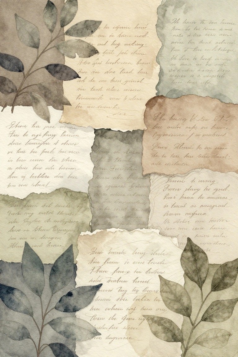
The idea is to build a collage from torn paper pieces that each carry a section of handwritten scripture paired with loose watercolor leaves. The pieces overlap at different angles and heights, letting the torn edges create natural breaks between text blocks and plant details. This approach fits decorative art that combines text and botanical elements in a soft, neutral palette of greens, browns, and off-whites.
What makes this idea useful is that the torn edges and overlapping layers cover up any uneven edges or paint bleeds, so the result still looks deliberate. You can adapt it by changing the number of paper pieces to fit a smaller canvas or by swapping leaf shapes for ones you already know how to paint. The neutral colors also make it simple to match other wall pieces without needing new frames or mats.
Sunset Scripture Landscape
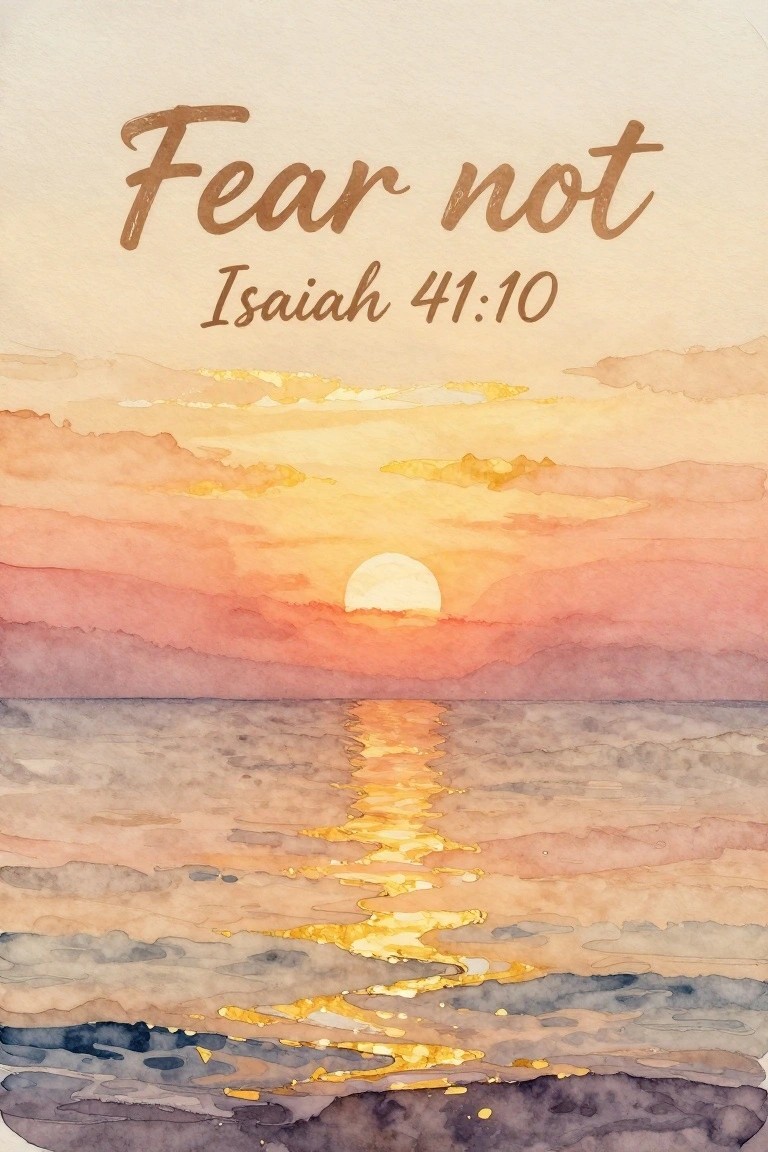
A landscape painting idea that layers a soft sunset over water beneath the text “Fear not” from Isaiah 41:10. The composition relies on stacked horizontal bands of sky and water, with the sun and its bright reflection creating a clear center line that guides the eye. This approach fits decorative scripture canvas work that combines a simple scene with overlaid text for neutral wall art.
What makes this idea useful is the way the verse sits in the upper portion, leaving the lower two-thirds open for easy adjustments to the horizon or cloud shapes. The warm neutral palette of peach, rose, and muted blue-gray translates well to other soft aesthetic rooms without needing extra colors. For practice, this kind of subject works well on a medium canvas where you can focus first on the reflection path before adding text. You could simplify it further by cropping to just the sun and water or swap the verse for another short phrase while keeping the same layout.
Weeping Willow Over Calm Water
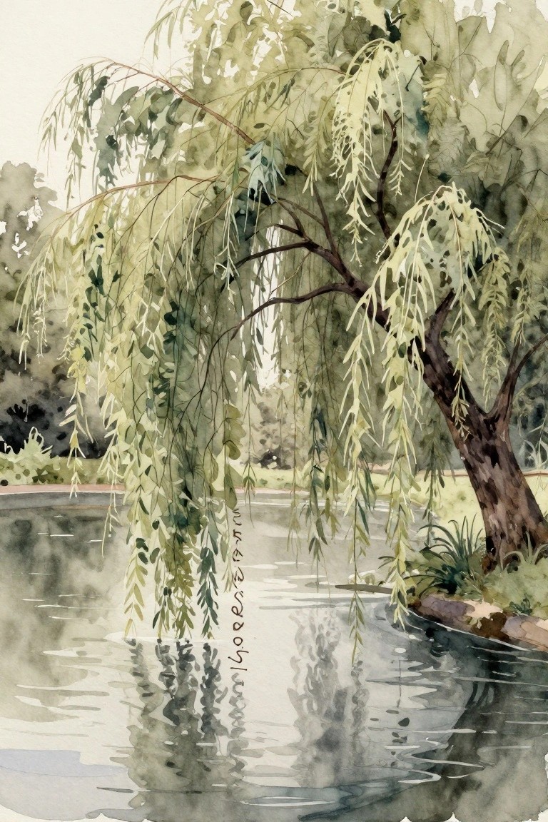
A weeping willow landscape idea works by letting the long, drooping branches fill most of the frame while their reflection anchors the lower half. The soft green and brown palette stays muted so the eye moves easily from the trunk to the hanging foliage and back down to the water. This setup keeps the composition simple yet full, with the branches creating natural lines that guide the view without extra details.
The composition does a lot of the work here because the vertical branches and their mirror image create balance on their own. You can scale it to a medium canvas and leave open space on one side for a short scripture verse in a light neutral tone. The same idea adapts easily if you want fewer layers or a slightly wider water area, and the soft edges make it a good reference for anyone painting landscapes in a calm aesthetic.
Scripture Quote on Distressed Paper with Loose Watercolor Border
A centered bible verse on an aged paper square forms the main subject here, with small leaf illustrations placed around the text for balance. The painting idea uses a soft torn-edge layer to separate the quote from the surrounding washes, which keeps the lettering readable while the outer ring of color adds movement. This approach fits the decorative typography category and works because the neutral paper area holds the focus against the brighter washes.
What makes this idea useful is the way the text area can be scaled up or down depending on canvas size without changing the overall layout. The loose washes around the edges give room to experiment with color order or density while still keeping the piece calm enough for a neutral room. You could simplify it further by using only two or three wash colors or swap in different leaf placements to match other pieces in a set. For Pinterest, the combination of readable text and soft color framing tends to get saved quickly as a ready-to-adapt template.
Neutral Watercolor Florals with Scripture
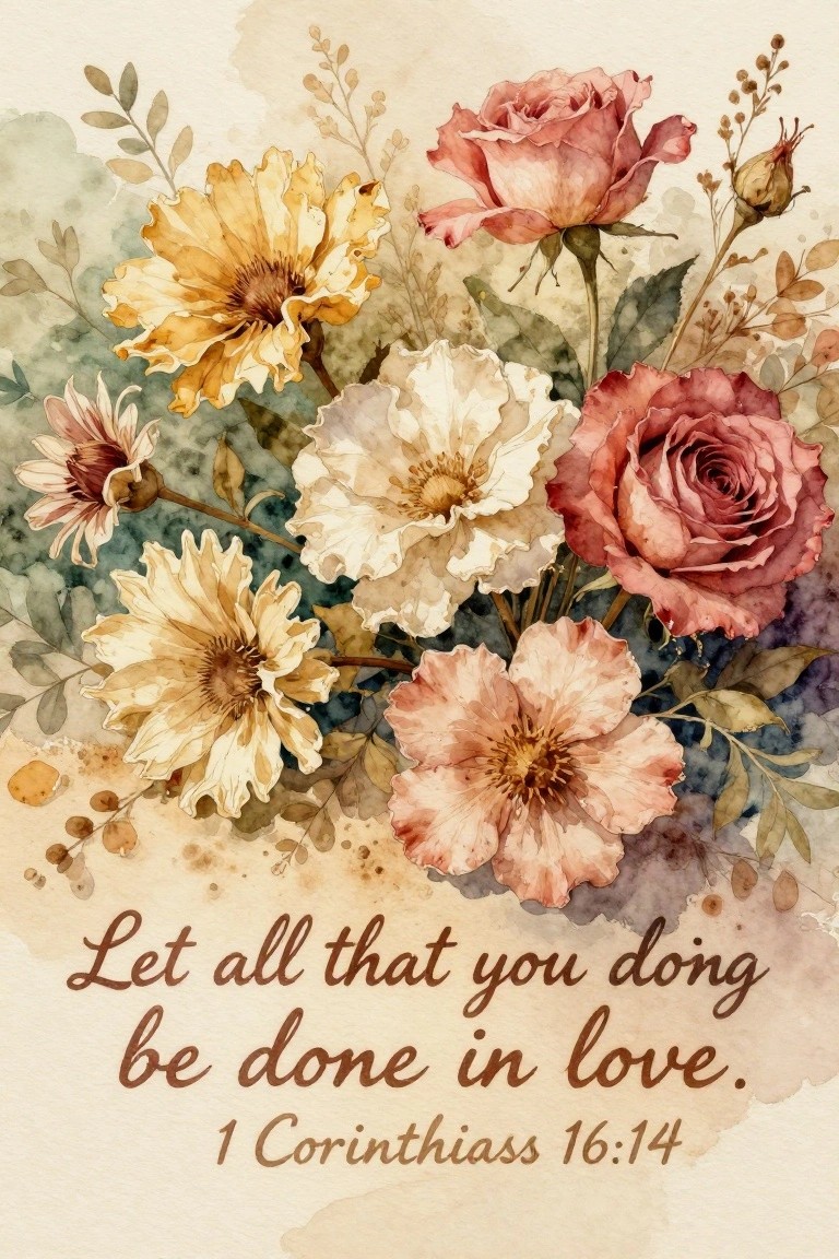
A clustered arrangement of roses and daisy-like blooms in soft yellow, peach, and muted pink makes up the main subject, with the scripture text placed directly underneath in a simple script. This approach works as decorative floral art where the flowers occupy the upper two-thirds of the space and the verse anchors the lower section. Overlapping petals and varied bloom sizes create a natural grouping that still leaves room for the text to remain readable.
The composition does a lot of the work here because the flowers fill the frame without needing precise symmetry. A painting like this works especially well for canvas sizes between 11×14 and 16×20 since the loose grouping scales easily. The color palette makes this easy to adapt by swapping in whatever soft neutrals you already have on hand or reducing the number of flower types if you want a quicker version. For wall art, something like this pairs well with other minimal pieces because the text keeps it from feeling purely botanical.
Neutral Watercolor Scripture Quote
A hand-lettered Bible verse in flowing black script forms the main focus, placed over loose overlapping watercolor shapes in soft beige, gray, and brown tones. The composition works by keeping the text large and centered while the background shapes stay irregular and low-contrast so they support rather than distract. This style falls into decorative scripture art that suits a soft neutral aesthetic on canvas or paper.
The composition does a lot of the work here because the simple background shapes can be painted quickly with a large brush and still look intentional. You can adapt the same layout by swapping the verse, shifting the shapes toward cooler grays, or scaling the whole piece up for a bigger canvas. For wall art this approach stands out on Pinterest because the high-contrast lettering pops against muted tones without needing extra details.
Wheat Field Scripture Canvas with Neutral Tones
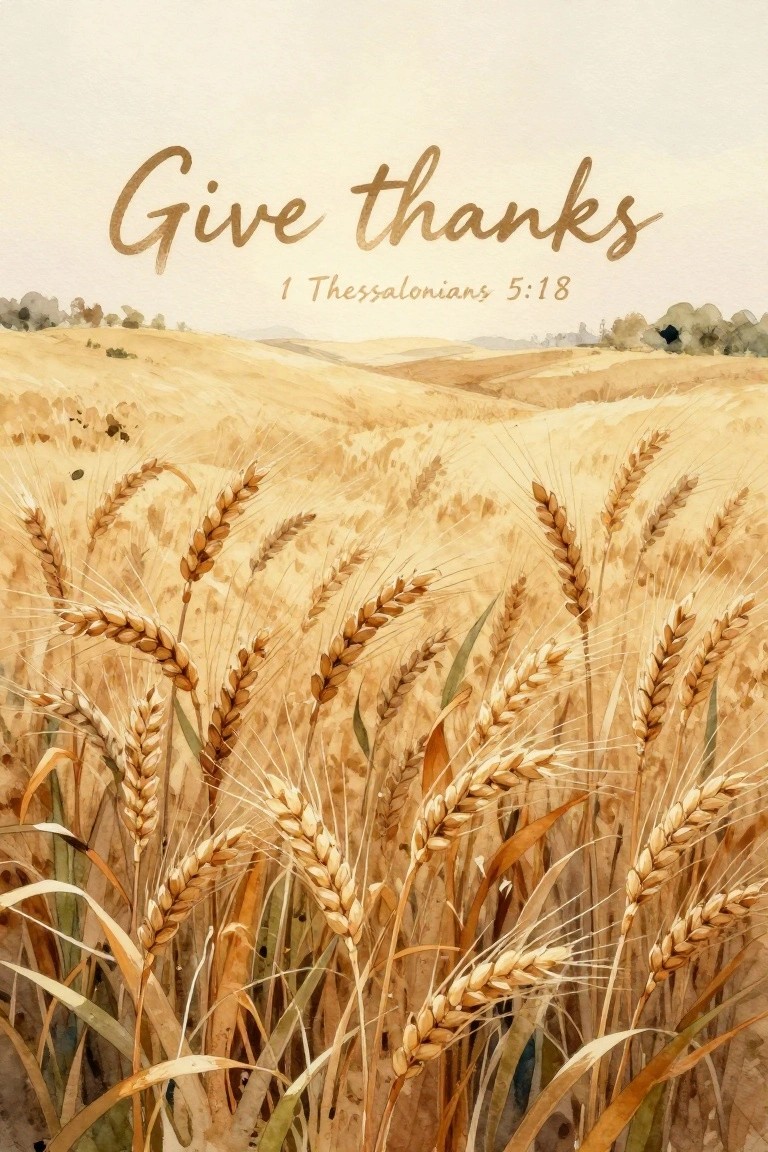
A wheat field landscape makes an effective base for scripture canvas art when the tall stalks fill the lower portion and leave room for text above. The idea uses a limited palette of golden beige, soft brown, and pale cream to keep the whole piece in a soft neutral range. Layering the verse across the sky area turns the field into a quiet daily reminder without extra decoration.
The composition does a lot of the work here because the wheat creates natural movement and leads the eye upward to the text. You can simplify the stalks into broader shapes if you want a quicker version or keep the finer lines for more detail on a larger canvas. This layout adapts easily to different sizes and works well as a standalone wall piece or part of a set with other field or landscape prints.
Starry Night Sky Canvas with Centered Scripture
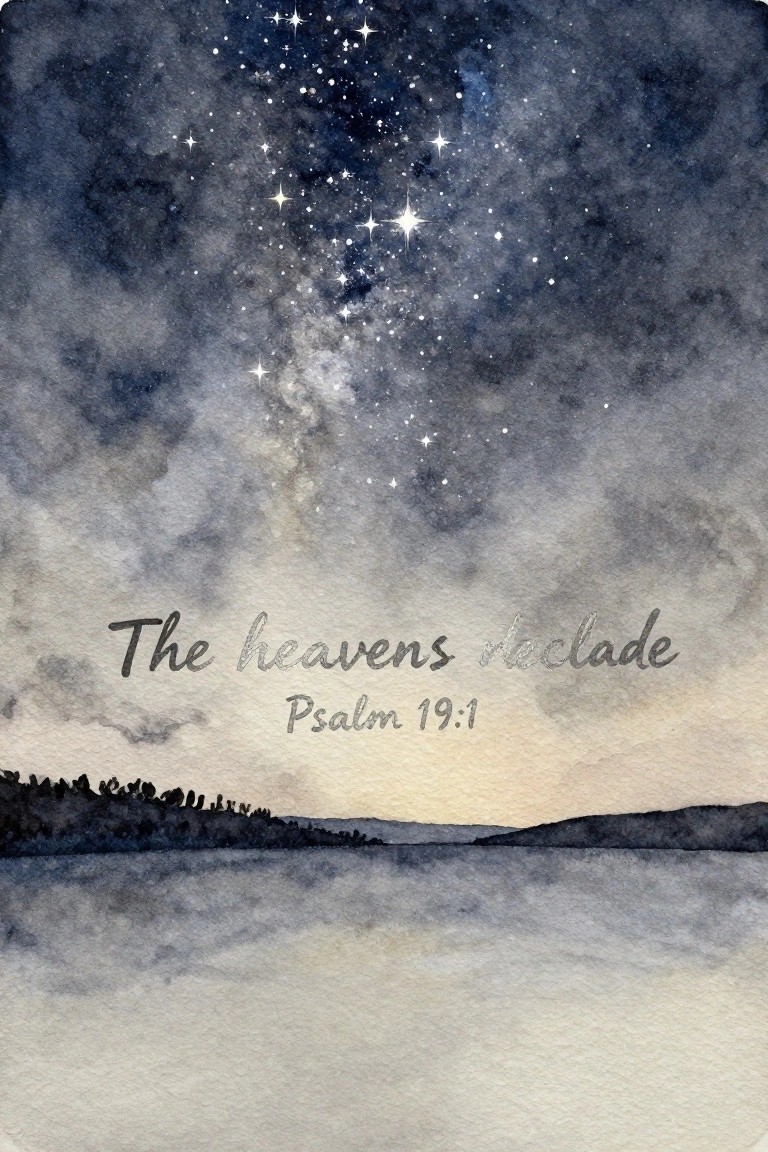
A night sky painting idea works well when a wash of deep blues and grays holds scattered white stars that grow denser toward the top and fade into a pale horizon. The dark land silhouette across the bottom keeps the lower third simple so text can sit clearly in the middle without competing elements. This approach falls into landscape scripture art and uses a soft neutral palette that stays calm on canvas.
The composition does a lot of the work here by leaving an open band for the verse, so you can swap the quote or adjust its size without repainting the sky. The same layout adapts easily to other color washes if you want to match a specific room. For practice, start with the sky wash first and add stars last so the text remains the main focus. This format also saves well on Pinterest because the vertical shape and centered text read clearly even in small previews.
Abstract Flowing Layers with Scripture Text
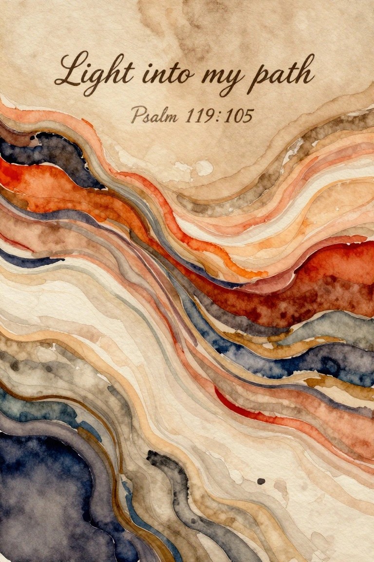
This idea uses broad horizontal bands of watercolor that curve and overlap to suggest gentle movement across the canvas. The layers shift between soft neutrals, warm terracotta, and muted blue-gray, keeping the focus on the scripture text placed near the top. It works as decorative abstract art that leaves plenty of open space around the words.
The composition does a lot of the work here because the flowing lines naturally frame the text without extra planning. You can simplify the idea by using fewer color bands or stretch it by adding more layers for a larger canvas. The neutral base with small warm accents makes it simple to match different room palettes or swap the verse for another short passage.
Torn Paper Scripture Collage with Botanical Details
Arrange handwritten scripture lines on irregular torn paper scraps alongside small clusters of simple florals painted in soft orange and gray tones. The overlapping fragments create a natural layered look where the text stays readable but the botanicals add quiet visual interest between the pieces. This approach works as mixed media decorative art that stays firmly in a neutral palette.
What makes this idea useful is how the torn edges let you shift pieces around on the canvas until the spacing feels right. You can keep the florals minimal with just a few stems or add more if the canvas size allows extra room. The limited color range makes it straightforward to match existing neutral decor without mixing in bright shades. For practice, this layout also helps build comfort with combining text and small studies on one surface.
Peony Wreath Around Centered Scripture Text
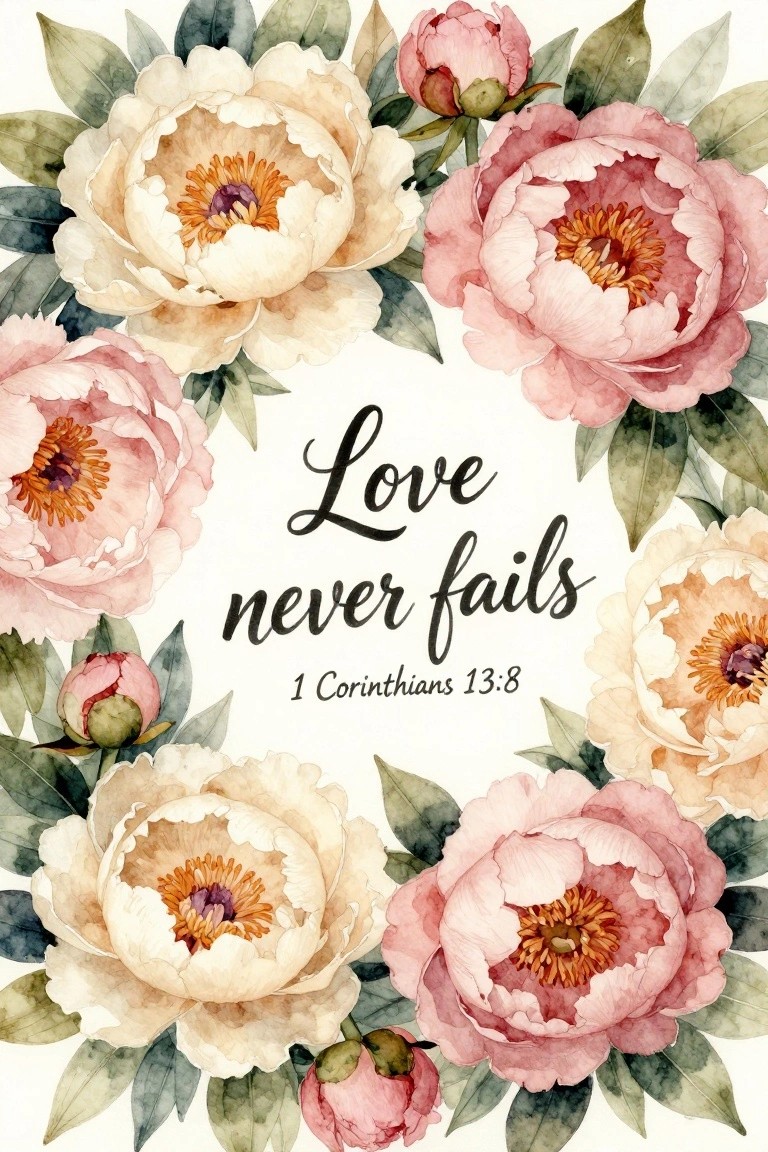
A circular border of peonies in soft cream, blush, and muted rose tones frames a short bible verse in the center. The flowers vary in size and openness, with some buds tucked in to fill gaps, creating an even ring that keeps the text as the clear focal point. This layout works as a decorative canvas piece that stays balanced even when the florals take up most of the space.
The composition does a lot of the work here because the round shape naturally guides the eye inward without extra planning. You can swap the peonies for any similar round-petaled flower and still keep the same effect, or shrink the wreath to leave more white space around the edges. For wall art this style stands out on Pinterest because the neutral palette and readable text make it easy to picture in different rooms.
Dove with Peace Scripture on a Soft Wash Background
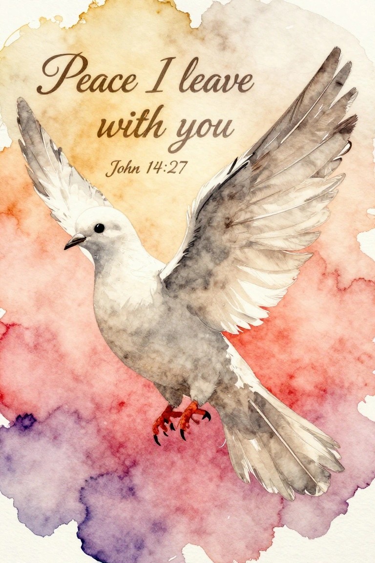
A flying dove paired with an overlaid scripture quote makes a clean canvas idea that blends an animal subject with text. The bird is positioned diagonally across the frame with wings fully extended, while the verse sits in the open upper space so the two elements balance without overlapping. Soft blended background colors keep the overall look light and let the dove stand out as the main focal point.
What makes this idea useful is how the text placement leaves room to adjust size or font without redesigning the whole piece. You can swap the background tones for cooler neutrals or shrink the dove to fit a smaller canvas while keeping the same layout. The approach works well for beginners because the bird can be built in simple layers and the background requires only loose washes. It also pins easily since the combination of bird and verse reads as both decorative and intentional.
Circular Scripture Quote with Soft Neutral Layers
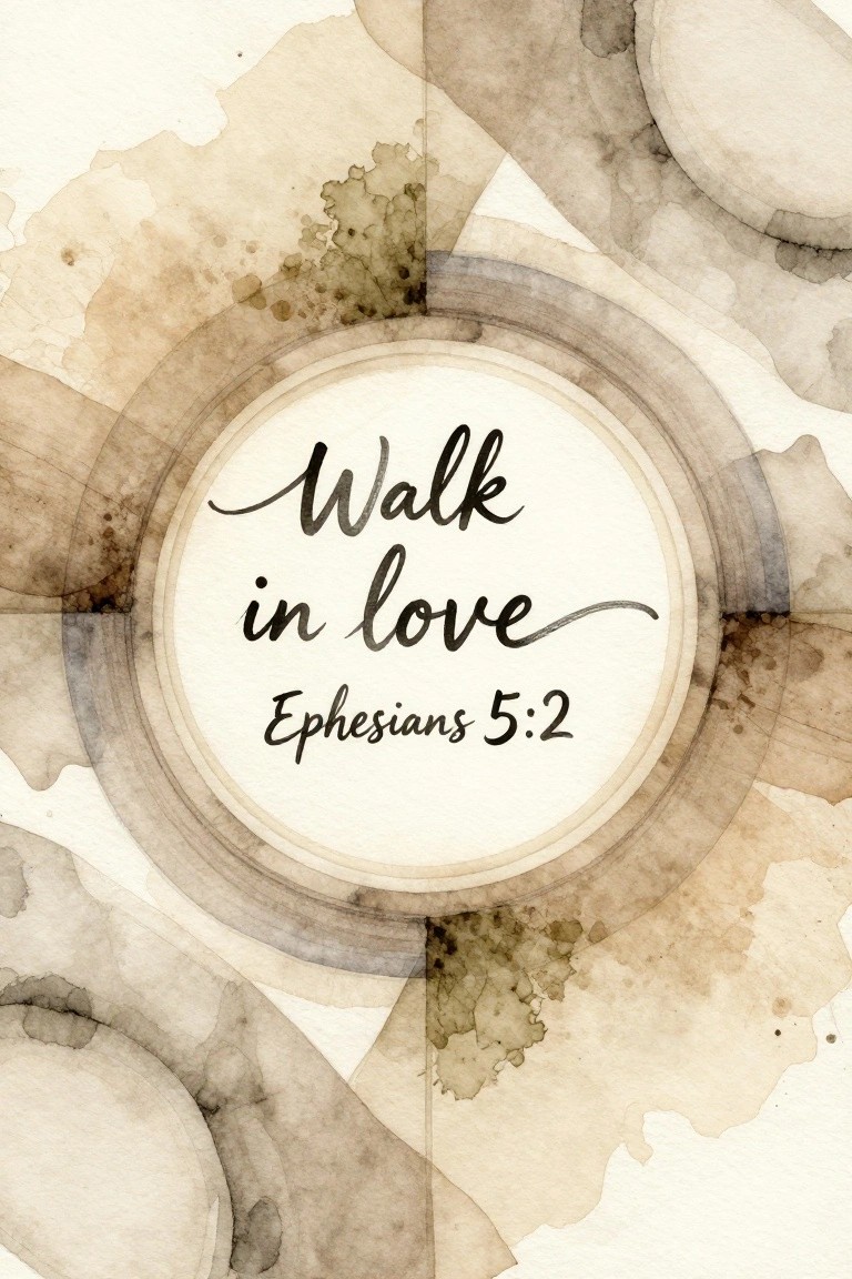
A scripture verse in elegant calligraphy sits centered inside a crisp circular border. Muted watercolor washes in beige, taupe, and soft brown form loose abstract shapes that surround the circle without crowding it. This decorative approach works because the text stays the main focus while the gentle background shapes add quiet visual interest on a neutral canvas.
What makes this idea useful is how the round format keeps the composition balanced even when the outer shapes stay loose and unplanned. The neutral palette adapts easily to different room colors or other short verses. For wall art, the design translates well to canvas because it needs only basic brushwork and leaves room to adjust scale or add subtle texture if desired.
Lavender Scripture Quote with Soft Floral Border
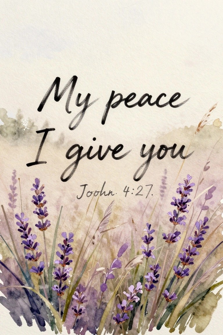
A painting idea that layers delicate lavender stems across the lower portion of the canvas pairs nicely with a centered scripture quote in flowing script. The flowers vary in height and density to create a natural edge while leaving open space above for the text to remain clear and readable. Muted watercolor washes in beige and soft gray keep the background simple so the purple blooms and dark lettering hold the focus.
What makes this idea useful is how the text takes center stage while the flowers provide just enough detail at the base. You could scale the lavender cluster smaller for a narrower canvas or extend it further across a wider one without changing the overall layout. The neutral background makes it easy to match existing decor, and swapping the verse or adjusting the stem colors gives quick options for personalization.
Frequently Asked Questions
What size canvas works best for creating a peaceful focal point without overwhelming a room? A medium size like 16 by 20 inches often strikes the right balance for soft neutral spaces. It allows the scripture text to remain legible from across the room while leaving enough empty canvas space to keep the overall look airy and calm. Measure your wall area first and consider grouping two or three smaller canvases if you need more visual weight without clutter.
How do I choose scriptures that feel truly peaceful rather than overwhelming? Focus on short passages with themes of rest, light, or stillness such as Psalm 46:10 or Matthew 11:28. Read the verse aloud to check its rhythm and length. Shorter lines leave more negative space on the canvas, which supports the soft neutral aesthetic and prevents the design from feeling busy or heavy.
What is the easiest way to create these pieces on a budget? Start with affordable stretched canvases from craft stores and use printable vinyl or iron-on transfers for the text. Choose a single neutral paint color such as warm taupe or soft gray for the background. Print your chosen scripture in a simple serif font, cut it out, and adhere it before sealing with a matte varnish. This method costs under twenty dollars per piece while still looking custom and serene.
Where should I place scripture canvas art to enhance a soft neutral bedroom or living area? Hang pieces at eye level above a bed or sofa to create a gentle reminder of peace each day. Avoid direct sunlight to keep colors from fading. Pair the art with natural textures like linen pillows or wooden frames in the same muted tones so the whole area feels cohesive and restful rather than stark.
How can I maintain the soft neutral look if my room has varying light throughout the day? Select canvases with off-white or light beige backgrounds that reflect light gently instead of absorbing it. Test the piece in the actual room at different times before hanging. If needed, add a sheer curtain to diffuse harsh afternoon light, which helps preserve the calm aesthetic and prevents any text from appearing too stark against the neutral palette.