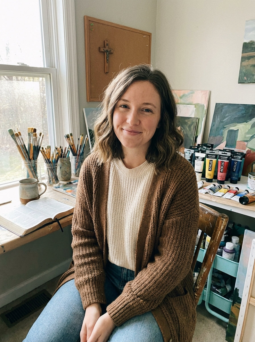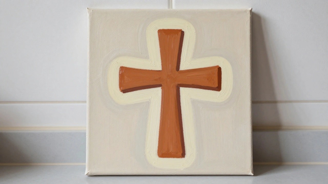
I started painting crosses as a way to practice without too much pressure.
Each idea comes with steps that build on each other.
I noticed my confidence grew after finishing a few of these simple designs.
Trying different colors and patterns kept things interesting for me.
These are the ones I would recommend to someone new to this kind of craft.
Layered Cross with Contrasting Outline
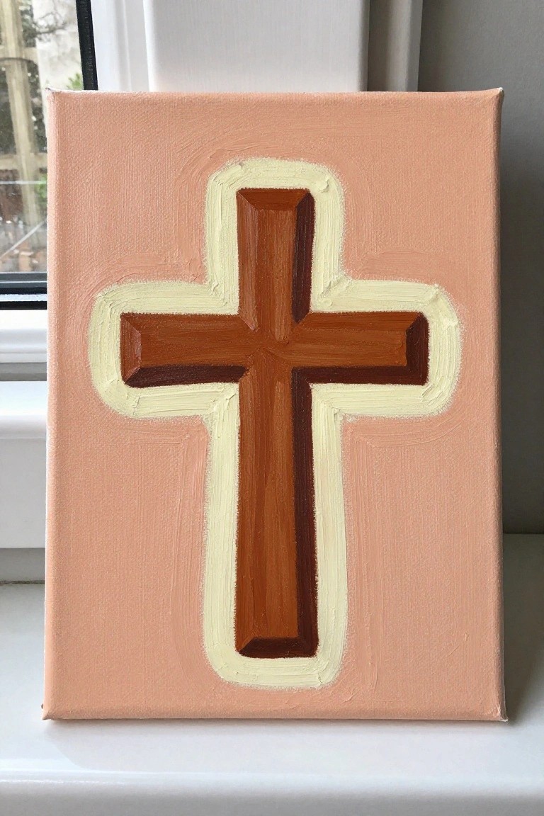
A central cross painted in warm brown tones with subtle shading on the arms creates a slight dimensional effect, while a thick cream border separates it cleanly from the solid peach background. This painting idea relies on basic geometric forms and color contrast rather than fine detail or blending. It works as straightforward decorative art that highlights shape and edge work.
What makes this idea useful is the clear focal point and limited color range that let you practice even brush strokes and edge control. The background color can be swapped for any solid tone to fit different spaces, and the outline thickness is easy to adjust if you want a bolder or thinner look. For practice, this kind of subject helps build confidence with layering without requiring a lot of elements.
Gradient Cross Accented by Small Red Flowers
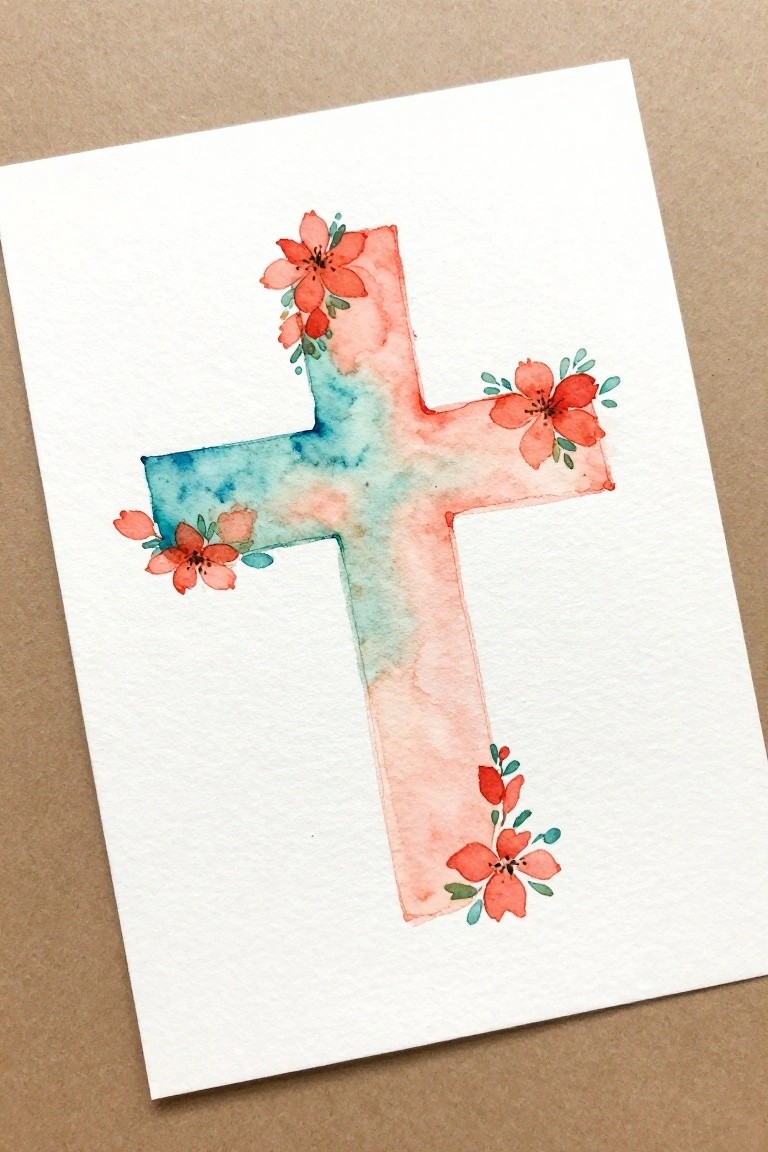
A cross painted with a blue-to-coral watercolor gradient and finished with small clusters of red flowers at the arm ends gives a clean decorative result. The flowers sit at the tips rather than covering the whole shape, so the cross stays easy to recognize while the color wash adds interest. This style works as floral decorative art because the loose blooms soften the edges without needing tight control or extra layers.
What makes this idea useful is the way the gradient does most of the work and the flowers stay small and repeatable. You can change the blue and coral to any two colors that fit a room or season and still keep the same layout. For practice the simple flower shapes let you focus on blending and placement without a busy background. This kind of cross also saves well on Pinterest because the soft wash and limited flower spots read clearly even at small size.
Floral Cross with Dots on Striped Background
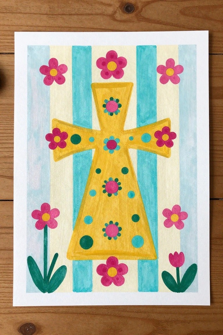
A central yellow cross forms the main subject, covered with small pink flowers, green accents, and scattered blue dots as repeating details. Vertical stripes in blue and cream create a simple backdrop that frames the cross while leaving space for additional pink flowers placed at the corners and sides. This setup turns a basic cross shape into a decorative piece by layering easy patterns and balanced placement rather than complex shading.
The composition does a lot of the work here by using stripes as a built-in guide for placement and contrast. You can adapt the idea by changing the flower colors or shrinking the cross to fit a smaller panel for practice. For wall art, the repeating dots and blooms make it quick to finish while still looking full. This approach stands out on Pinterest because the bright yellow against stripes gives clear visual pop without needing lots of layers.
Weathered Cross with Minimal Grass Base
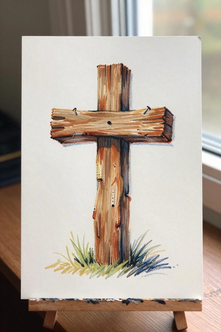
A rustic cross built from uneven wooden planks makes a strong focal point through its vertical shape and visible grain. The painting idea uses layered brown tones and short brushstrokes to suggest rough texture on the wood, while a narrow strip of grass at the base adds just enough context without crowding the space. This still life approach keeps the composition clean so the cross shape and surface details stay front and center.
What makes this idea useful is how the plain background removes pressure to fill every area, letting you focus on practicing wood texture and simple layering. The limited color range of browns and a few grass tones can be swapped for cooler or warmer shades depending on the wood effect you want. For practice, this kind of subject scales down easily to smaller paper sizes and can be adapted by changing the grass colors or adding a faint horizon line later.
Minimalist Cross on Sage Green
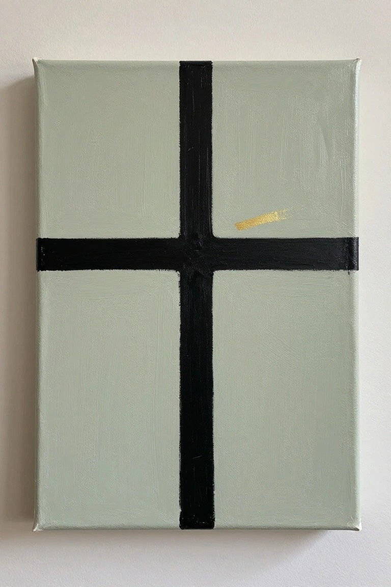
A thick black cross formed by two wide intersecting strokes sits centered on a soft sage green background. The design keeps the focus on the strong vertical and horizontal lines while a narrow gold streak in the upper right adds a small metallic contrast. This approach works as a straightforward decorative piece that relies on basic shapes and a limited palette rather than detail or shading.
What makes this idea useful is how the background color does most of the visual work before the cross is added. The layout stays balanced even if the black lines are slightly uneven, so it gives beginners room to practice straight strokes without needing perfect precision. You can easily change the green to another muted tone or swap the gold mark for a different accent color to match a room or mood.
Geometric Cross from Patchwork Blocks
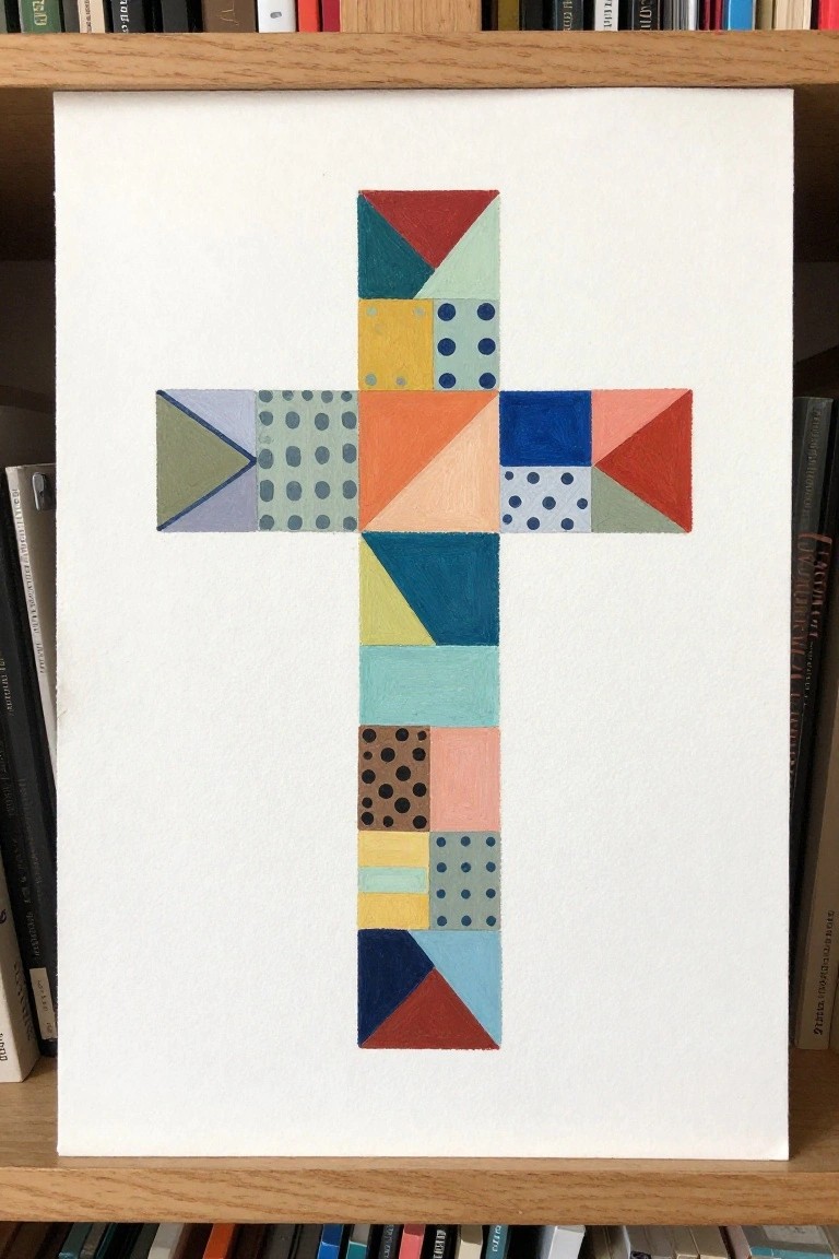
A cross built from separate colored blocks and triangles gives you a clean shape without needing to paint fine details. The variety of solid fills, dots, and angled cuts inside the grid adds movement while the overall outline stays easy to follow. This works as decorative art where color placement and simple division do most of the visual work.
What makes this idea useful is the built-in grid that helps keep proportions even from the start. You can swap in any color scheme or replace a few blocks with stripes or solid fills to change the mood quickly. For wall pieces it scales well to different canvas sizes, and the white background keeps the focus tight so the design stays readable even when simplified.
Cross Silhouette at Sunset
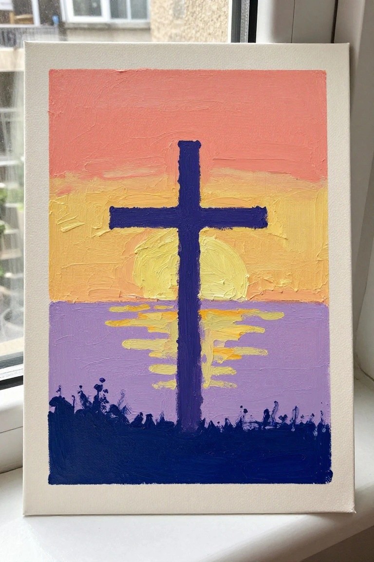
A cross placed in the center of a sunset scene gives a clear focal point while the sky and water handle the color work. The idea layers a simple gradient from pink through yellow into purple, with the cross cutting across the horizon to create balance. Horizontal strokes suggest reflections in the water and a solid dark band at the bottom grounds the whole composition.
The composition does a lot of the work here because the cross shape is bold and easy to paint first before filling in the background. You can change the sky colors to match different times of day or swap the foreground for grass or sand if you want a different setting. This kind of layout works well for practice since the main elements stay large and the reflections only need loose marks rather than exact lines. For wall art, the strong vertical shape holds attention even when the painting stays fairly small.
Tie-Dye Rainbow Cross
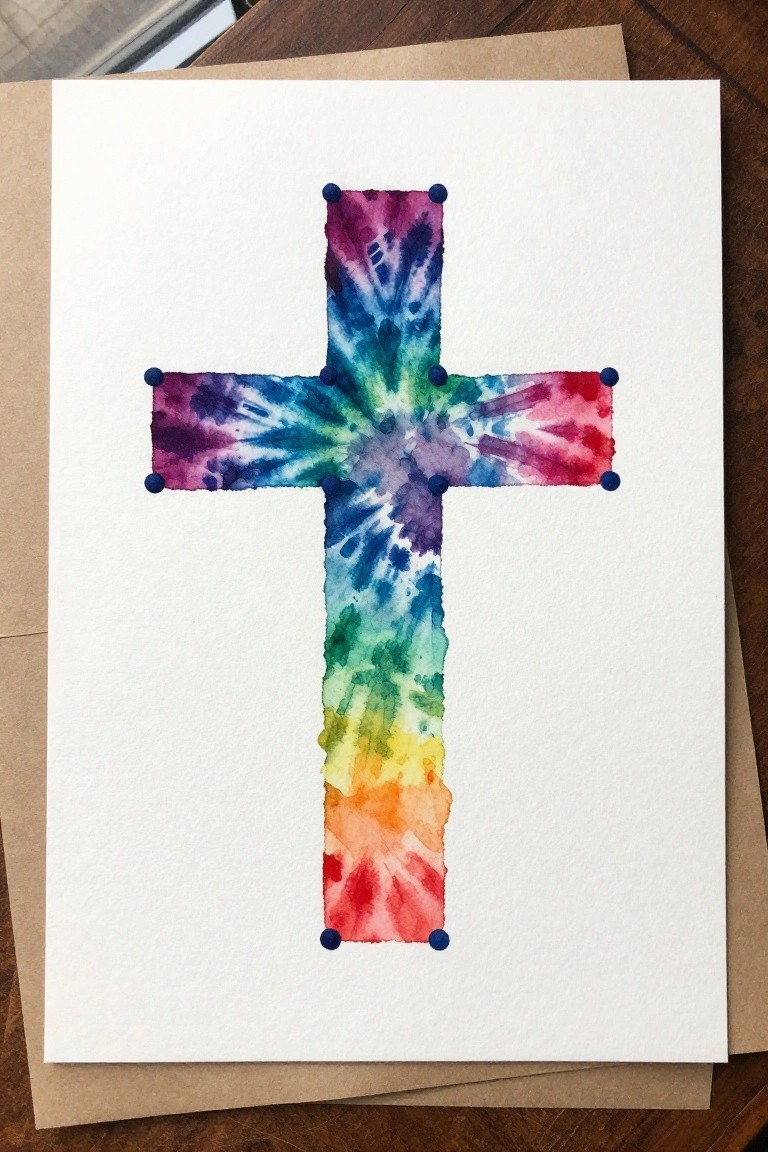
A cross painted with a radial tie-dye effect lets the colors spread naturally from the center to create a bright, layered look. The rainbow sequence runs through purple, blue, green, yellow, orange, and red, with the pigment allowed to bleed and overlap in the middle. Small blue dots placed at each arm end keep the shape readable even when the colors get busy.
What makes this idea useful is how the wet-on-wet method does most of the blending work once the paper is damp. You can scale the same layout down for greeting cards or keep it larger for a simple wall piece. The fixed cross outline gives beginners a clear structure while the loose color application adds variety without extra brush control.
Layered Flowers Over a Central Cross
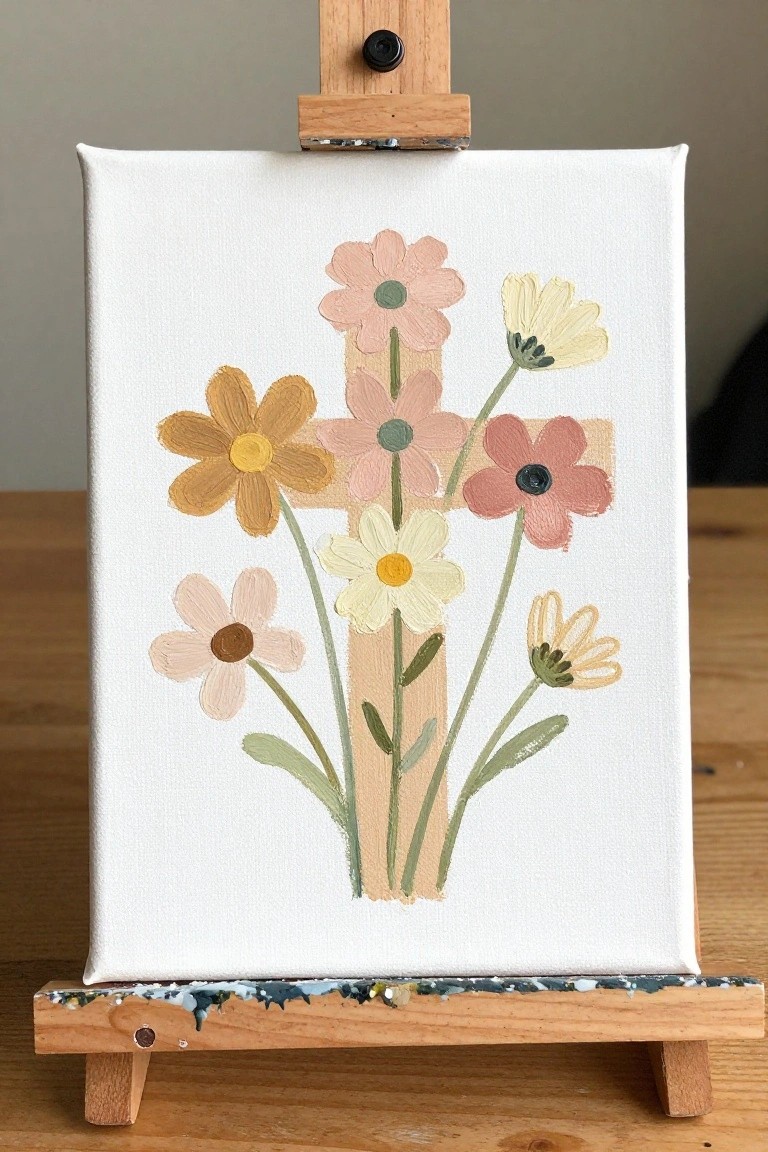
A simple cross in a muted wood tone serves as the main structure, with flowers of varying sizes and colors placed so their stems cross over the form. The arrangement uses a soft palette of peach, mustard, cream, and dusty rose to keep the focus on shape and placement rather than precise detail. This approach turns the cross into a decorative base that supports a loose floral grouping without requiring complex perspective.
What makes this idea useful is the clear central anchor the cross provides, which helps position the flowers evenly without needing perfect symmetry. The limited color palette makes this easy to adapt by swapping in different shades or adding fewer blooms if you want a simpler version. For practice, this kind of subject works well because the overlapping stems and petals let you focus on basic layering and color mixing while still producing a finished piece that reads clearly from a distance.
Bold Cross in Blue with Red Outline and Yellow Stripe
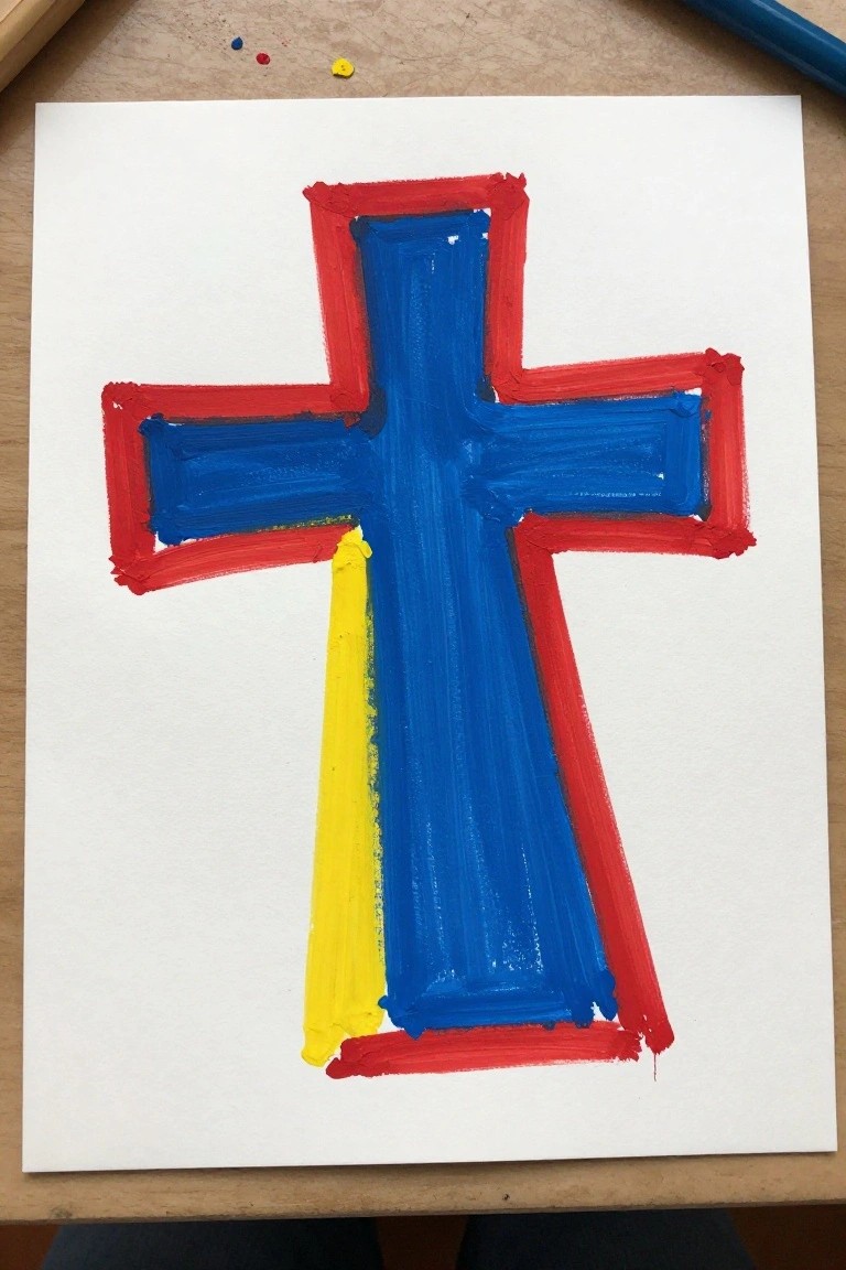
A cross built from thick blue brushstrokes and framed by a red border gives the design a clean graphic presence. The narrow yellow stripe running along the lower left arm breaks up the symmetry just enough to add interest. This kind of painting idea sits comfortably in the decorative art category, where strong shapes and a limited palette do most of the work.
What makes this idea useful is how the flat color blocks and wide strokes reduce the need for fine detail. You can swap the yellow for any accent color or change the background to match a room’s palette. For practice, this layout helps you focus on keeping edges straight and learning how much paint to load for even coverage. The simple structure also translates easily to larger canvases or smaller greeting cards.
Hilltop Cross with Layered Misty Background
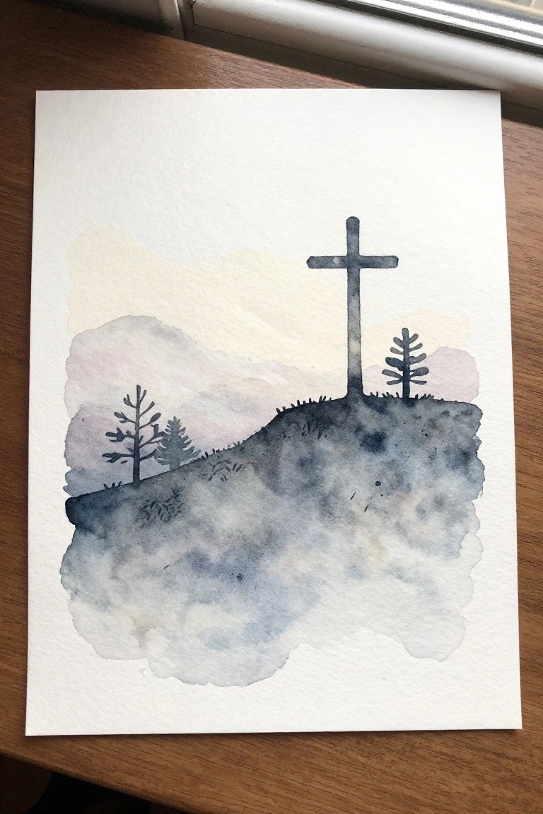
A landscape painting idea built around a single cross standing on a ridge works well because the cross becomes the clear focal point against softer hills and trees. The composition relies on overlapping shapes in muted blues and grays to suggest distance without needing many details or precise lines. This approach fits the landscape category and keeps the emphasis on shape and placement rather than fine brushwork.
What makes this idea useful is the way the background layers can be simplified or expanded depending on the paper size. The limited palette makes it easy to swap in different sky tones or add a few more trees without changing the whole layout. For practice, the same structure works if you paint the cross first and then build the hills around it. This type of piece also translates cleanly to smaller canvases or cards since the main shapes stay readable even when scaled down.
Bold Cross with Thick Brushstrokes on Neutral Ground
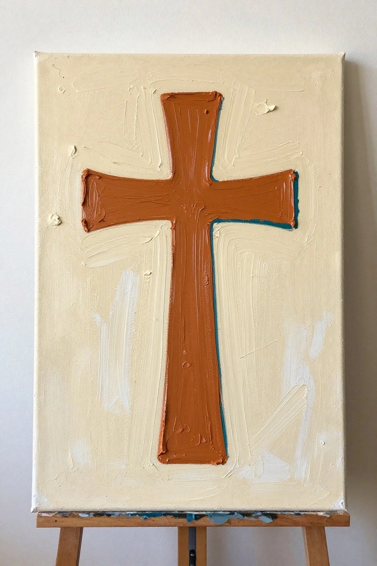
A single cross painted in a warm brown tone creates a clear focal point when centered on a light background. Thick, directional brushstrokes build the shape while letting the canvas texture show through, which keeps the overall look simple yet substantial. The limited color use and straightforward placement make the composition easy to read from a distance.
What makes this idea useful is how the large shape and single main color remove most of the usual choices that slow beginners down. You can change the brown to black, navy, or even a soft gray and keep the same layout, or swap the cream background for a pale blue or warm gray to match a room. The format also works at smaller sizes for quick studies or repeated versions with slight color shifts.
Cross Silhouette Over a Gradient Sunset Sky
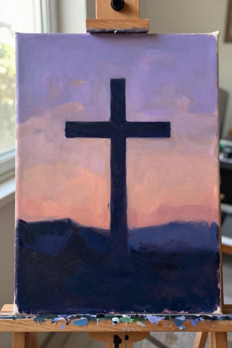
A centered cross silhouette against a blended sky of purple fading into peach and orange gives the painting its main impact through strong contrast rather than detail. The dark foreground band anchors the cross and keeps the eye from drifting, while the loose sky application avoids the need for smooth gradients or fine edges. This fits the category of simple symbolic landscapes that rely on shape and color blocks instead of intricate elements.
What makes this idea useful is how the limited palette and blocked-in shapes let you practice blending without worrying about perfect realism. You can shift the sky to cooler blues and greens for a different mood or keep the same layout but change the cross thickness to suit a taller or wider canvas. For wall pieces, the bold vertical form stands out even when the brushwork stays visible, and it adapts easily to smaller studies or larger versions by adjusting how much sky shows above the cross.
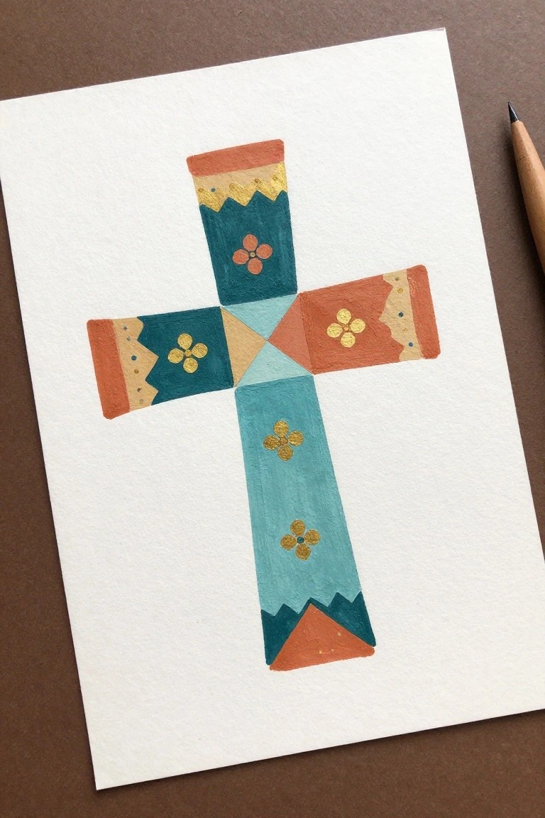
Blocky Cross with Patterned Sections and Floral Motifs
A decorative cross built from separate color blocks gives you a clear structure for practicing both flat color application and small repeating patterns. Each section holds a single tone with a simple four-petal flower and a few border details that keep the eye moving across the arms without needing tight control. The balanced layout and limited motif set make it easy to finish one area at a time while still creating a cohesive piece.
What makes this idea useful is that the divisions act like built-in stopping points so you never feel overwhelmed by a large blank space. You can swap the flower shapes for stars or dots, shift the palette to match fabric or room colors, or shrink the whole design to fit a greeting card. For practice or quick gifts, the same grid approach works well because the shapes stay readable even if the brushwork stays loose.
Rope-Wrapped Cross Over Beach Scene
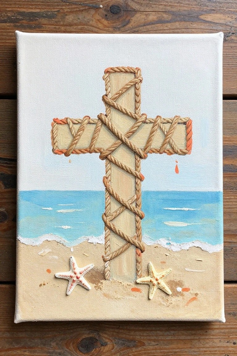
A rope-wrapped cross forms the main subject here, placed over a simple beach and ocean background with starfish added at the base. The rope creates a layered texture across the cross arms and vertical beam while the sand and water occupy the lower half of the canvas. This setup combines a central decorative symbol with coastal landscape elements in a balanced vertical composition.
The composition does a lot of the work here by using the rope as built-in texture instead of relying on detailed brushwork. The neutral rope and sand tones against the blues make it simple to adjust the color scheme or swap in different small objects like shells. For wall art, this idea works especially well when scaled to a medium canvas size so the wrapping stays visible without becoming too tight to paint.
Negative Space Cross with Floral Clusters
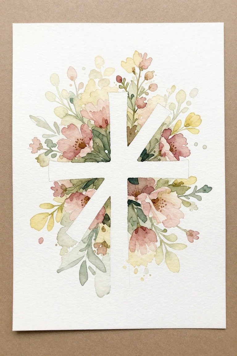
This painting idea uses a clean cross shape left in white as the central element, with loose clusters of pink, yellow, and green watercolor flowers and leaves arranged around the arms to fill the space. The florals vary in size and density, creating an irregular border that lets the cross stand out through contrast rather than detail inside the shape itself. It fits the decorative art category by combining a simple geometric form with organic floral painting.
What makes this idea useful is how the negative space handles most of the composition work, so you only need to focus on painting the flowers around the edges. You can adapt the color palette easily by swapping the soft pinks and yellows for other seasonal tones or reduce the number of flower clusters if you want a simpler version. For wall pieces, the layout keeps the cross readable from a distance while the surrounding details add interest up close. This approach also translates well to different paper sizes without losing the main shape.
Birds on a Wooden Cross
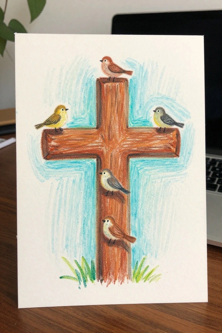
A wooden cross serves as the main structure here, with small birds placed at different points along the beams and a simple blue background with grass at the base. This creates a clear central subject that mixes a religious symbol with basic animal shapes, making it easy to build the scene layer by layer. The straight lines of the cross give natural spots for the birds to sit, which helps keep the overall layout balanced without needing complex perspective.
What makes this idea useful is the way the cross itself acts as built-in guides for placing the birds, so you can focus on shapes and color instead of figuring out the full composition. You could swap in different bird colors or reduce the number of birds to fit a smaller canvas or practice session. For wall pieces or greeting cards, the setup works well because the cross keeps the focus while the birds add variety without extra background details.
Rainbow Cross Formed by Stacked Color Bands
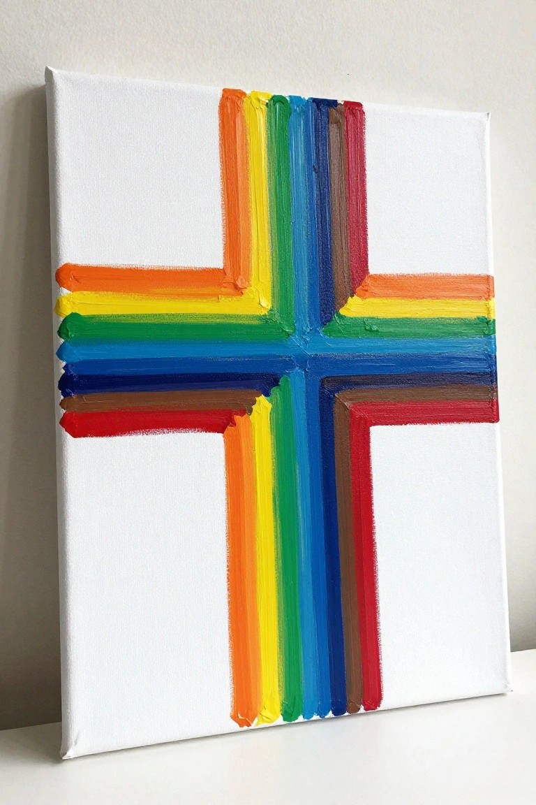
A cross built from thick horizontal stripes in rainbow order creates a bold geometric shape against a plain white background. The vertical and horizontal arms use the same sequence of colors but stop short in places to leave white space that defines the overall form. This approach keeps the focus on color repetition and simple straight strokes rather than detailed rendering.
What makes this idea useful is how the white canvas does most of the work by shaping the cross through negative space. The color order can be swapped or limited to fewer hues if you want a quicker version or a version that matches a specific room. For wall art this layout stays graphic and modern without needing precise symmetry, so small brush variations add interest instead of looking like mistakes. The same striped method works at different sizes too, from small practice canvases to larger statement pieces.
Three Crosses in Muted Watercolor Tones
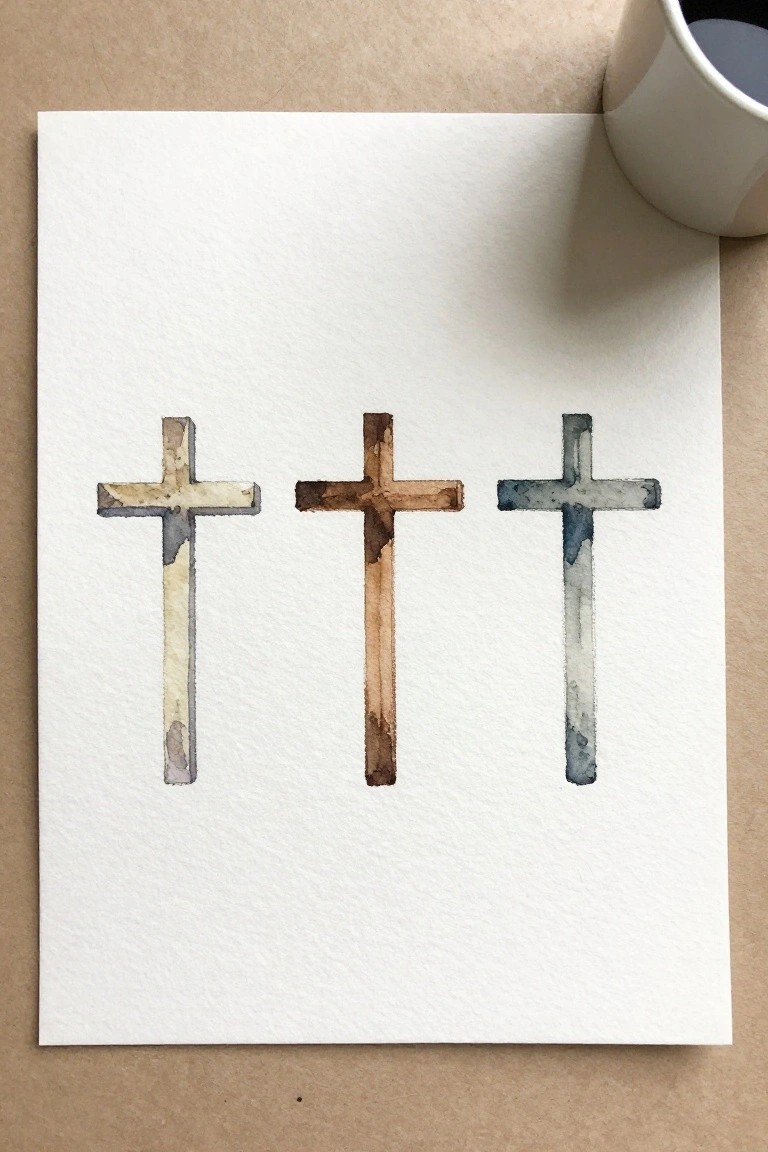
A row of three crosses painted in soft, blended watercolor washes gives you a clean way to practice color variation on simple shapes. Each cross uses a different muted palette, shifting from warm beige and gray to deeper brown and then cool blue-gray, which adds interest without needing extra details. The even spacing and vertical alignment keep the layout balanced and easy to read at a glance.
The composition does a lot of the work here by letting the color changes carry the visual weight against the plain background. You can swap the tones for any limited palette you already have or scale the crosses down to fit greeting cards and journal pages. This setup works well for quick practice sessions because the shapes stay basic while still letting you test blending and edge control.
Grid Mosaic Cross with Warm and Cool Blocks
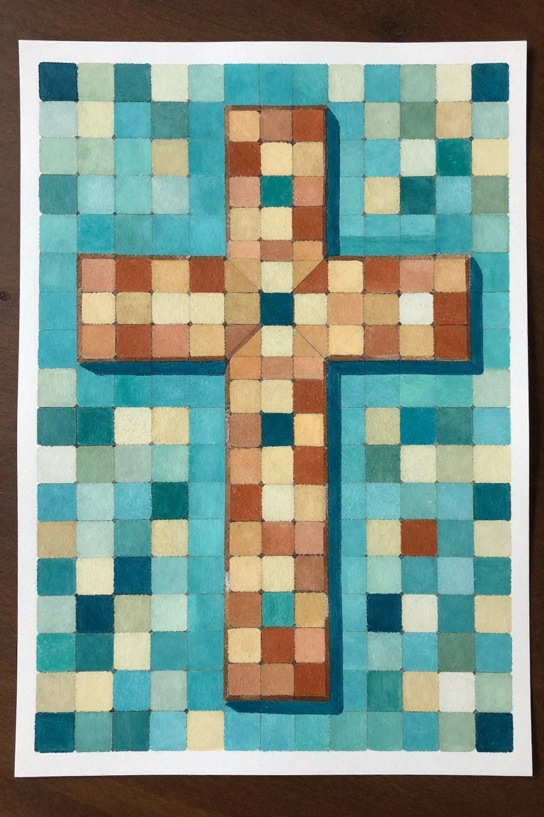
This painting idea builds a cross entirely from small squares arranged in a grid. The cross uses a set of warm browns, oranges, and beiges while the background squares stay in cooler blues and greens. The clear color split makes the shape read strongly without any extra shading or detail work.
What makes this idea useful is how the grid does most of the planning for you. You can change the warm tones to any other color family or adjust the size of the squares to fit a smaller canvas. For wall pieces the high contrast helps the cross stand out even when viewed from across a room. The same layout also works if you want to test different color combinations before committing to a larger piece.
Frequently Asked Questions
1. What basic supplies do I need to get started with these cross painting ideas? You will want a few canvases or wooden panels, acrylic paints in basic colors, a set of small and medium brushes, a pencil for sketching, and some painter’s tape for clean lines. Start with inexpensive materials so you can practice without worry. Many of the 20 ideas use only three or four colors at first to keep things simple.
2. How do I pick the first idea that matches my current skill level? Look for projects that use straight lines and basic shapes before moving to curves or details. The article lists ideas in order of difficulty so begin with the earliest ones that focus on one color or simple crosses. This step-by-step approach helps you finish quickly and see progress right away.
3. What should I do if I make a mistake during a project? Let the paint dry completely then paint over the area with the background color. Keep a small notebook nearby to note what went wrong so you can adjust the next time. The ideas are designed to build confidence so treat early mistakes as normal practice rather than failures.
4. How long does it usually take to complete one of these beginner projects? Most of the simpler cross painting ideas can be finished in one to two hours if you work in short sessions. Break each idea into the steps listed in the article such as sketching first then blocking in colors then adding details. Working this way prevents feeling overwhelmed and keeps your momentum going.
5. How can I display or share my finished cross paintings to stay motivated? Frame small pieces with inexpensive mats or hang them on a string with clips in your workspace. Take photos of each completed project and keep them in a folder on your phone so you can look back and see how your skills have grown. Sharing online in beginner art groups can also bring helpful feedback and new ideas.