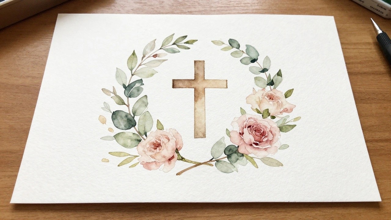
I have been painting simple watercolor pieces to go along with my Bible reading for a while now.
The ideas in this list are ones that I have found useful for adding a bit of color without making things too complicated.
They work well for devotional art because they stay gentle and do not require advanced skills.
Most of them use basic shapes and soft blends that anyone can try.
I hope they give you some starting points if you enjoy this kind of creative time too.
Cross Framed by a Soft Leaf and Rose Wreath
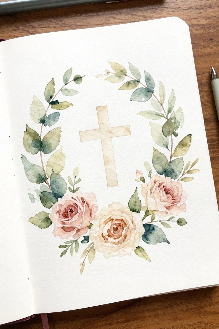
A cross placed in the center of a loose circular wreath gives this painting a clear devotional focus. Branches of muted green leaves curve around the top and sides while two roses in soft pink and cream sit at the bottom to balance the design. The simple arrangement keeps the cross as the main element while the flowers and leaves create a gentle frame that works well on journal pages.
The composition does a lot of the work here by guiding attention inward without extra detail. You can shrink the wreath for smaller Bible margins or swap the rose colors to match different themes. This kind of layout adapts easily if you want to add handwritten verses around the edges. For practice, the open space makes it straightforward to adjust leaf shapes or test new color mixes.
Dove with Olive Branch and Text Label
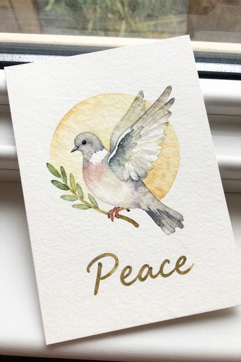
A dove holding an olive branch works well as a standalone subject for devotional pages or small cards. The bird sits slightly left of center with wings lifted, balanced by the branch on the left and a single soft circle behind it. The word placed underneath keeps the layout clean and readable while the muted tones on the bird prevent the piece from feeling busy.
What makes this idea useful is how the circle acts as a built-in frame that reduces the need for extra background work. You can shrink the whole thing for a Bible margin or enlarge the circle for a card front without changing the main elements. The simple branch and limited color range also make it easy to swap in different text or leave the word out if you want a quicker version for practice.
Open Book with Soft Background Washes
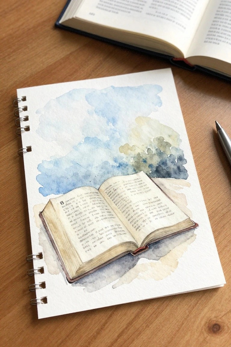
An open book forms the main subject in this still life painting idea, with visible text lines on the pages and a simple binding detail. The composition keeps the book low on the page so the loose blue and muted green washes above can act as a light, non-distracting backdrop. This style works as decorative art that pairs well with journaling because the object stays clear while the background stays minimal.
What makes this idea useful is the way the background can be scaled up or down depending on the journal size or the amount of blank space needed for notes. The book can be drawn with basic rectangle shapes and a few horizontal lines for text, so it adapts easily if someone wants to change the page angle or add a ribbon bookmark. For Bible journaling pages, the open book leaves plenty of room around the edges for added dates, small icons, or extra verses without crowding the main image.
Shepherd and Sheep in a Sunset Field

A landscape painting idea built around a lone shepherd and single sheep works well for devotional pages because the open field and distant hills keep the focus on quiet presence rather than busy detail. The composition places the sheep low in the foreground and the shepherd higher on the slope, creating a natural path for the eye that leads toward the setting sun. Soft washes of green and purple separate the layers of grass and hills, while the warm sky gradient adds a gentle backdrop without crowding the scene.
What makes this idea useful is the simple division of space into foreground grass, mid-ground figure, and background hills, which lets you scale the size up or down easily for journal margins or larger paper. You can swap the sunset for a sunrise or change the sky to soft blues if you want a morning version, and the single sheep keeps the subject approachable even if you are still learning how to place figures. For wall pieces or cards, the same layout works in a vertical or square format with less sky so the field takes up more room.
Bread and Fish Watercolor Series
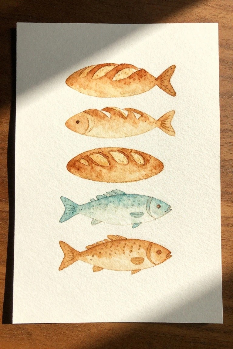
A simple way to explore the loaves and fishes theme is to paint a short vertical row that mixes bread-shaped fish with actual fish. Use the same earth-tone washes for the top three pieces so the scored crust texture reads as scales, then shift to a cooler blue-green for one of the lower fish to create a gentle contrast without breaking the set. The even spacing and consistent left-to-right orientation keep the strip compact enough to fit along the edge of a journal page or inside a margin.
What makes this idea useful is how easily the same layout scales down to two or three figures or stretches to fill a full page. You can swap the blue fish for another brown one if you want the whole strip to stay in a single palette, or add a faint wash behind the row for extra separation on busy spreads. The repeated oval shape is forgiving for quick practice while still giving a clear nod to the Bible story, which helps it stand out in a feed of more literal illustrations.
Repeating Heart and Cross Pattern for Journal Margins
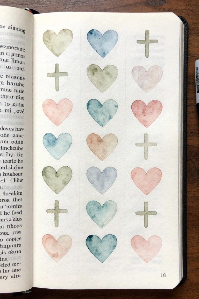
The painting idea uses a simple vertical grid of watercolor hearts and small crosses placed side by side in three columns. Soft, low-saturation colors repeat across the shapes with visible paper texture showing through the light washes. The layout works as a repeating decorative element that fills space evenly without crowding the page.
What makes this idea useful is how the fixed column structure adapts easily to different journal sizes or margin widths. You can limit the palette to three or four colors you already have mixed and adjust heart size slightly to fit more or fewer repeats. The same grid also works as a quick practice exercise for controlling wash consistency while staying on theme for devotional pages.
Hope Integrated into an Anchor Silhouette
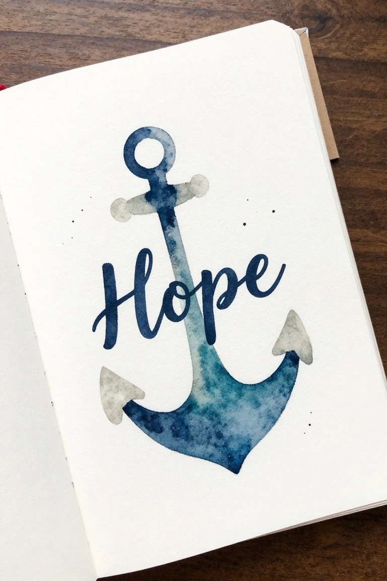
An anchor outline acts as the main shape while the word Hope is painted directly across it in cursive lettering. Watercolor washes build the form through varying blue tones that follow the anchor’s curves and points. This creates a single focal element that merges a simple symbol with text for a clean decorative result.
The anchor’s basic outline keeps the layout easy to scale down for journal margins or expand for larger pages. You can swap the word for another short phrase or change the wash colors without redrawing the whole shape. The centered placement leaves plenty of white space around it so the idea works well for quick devotional entries or repeated practice pages.
Pastel Rainbow with Short Faith Phrase

A rainbow built from soft overlapping watercolor bands forms a gentle arch across the page, with colors blending gradually from pink through yellow and into purple. Small gold dots placed sparingly along the edges add a subtle highlight that keeps the focus on the shape and the text below. This approach works as decorative art that combines a simple curved motif with lettering for quick devotional pieces or journal spreads.
What makes this idea useful is how the rainbow shape handles most of the visual weight, so the text can stay small and centered without extra elements. You can swap the phrase for any short verse or word and shift the color sequence to suit different pages or seasons. The open space around the arch makes it easy to resize for cards or smaller journal inserts while keeping the same balanced layout.
Moonlit Boat with a Cross
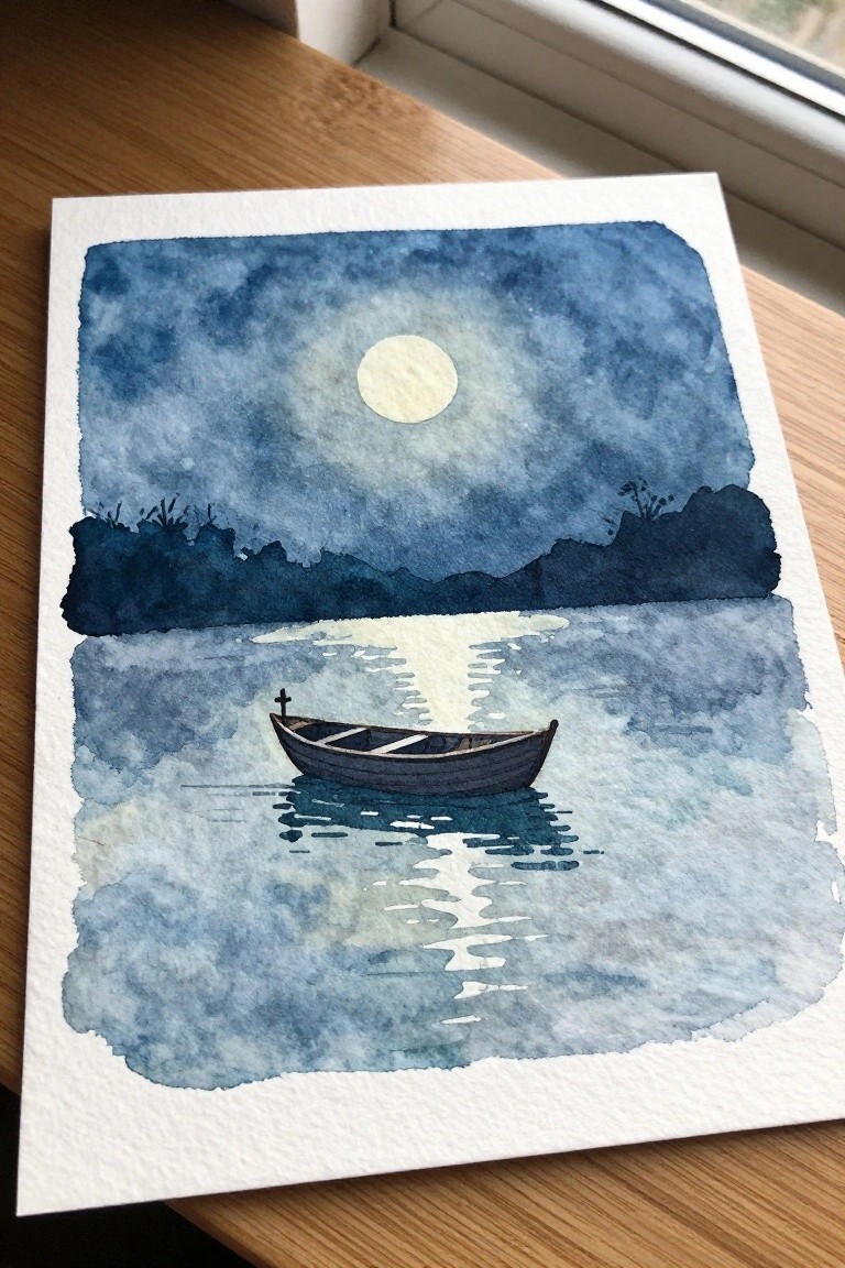
A small boat carrying a cross on still water under a bright moon forms a clean devotional painting idea. The layout places the boat low in the frame with a horizontal band of dark land above and a glowing circle of moon centered in the sky, which keeps the eye moving between the cross detail and the water reflections. Soft blue washes and simple shoreline shapes give the scene enough structure without crowding the main subject.
The composition does a lot of the work here by leaving open water around the boat so the cross stays easy to spot. You can shrink the whole scene for a journal page or stretch the sky for a larger piece while keeping the same moon and boat placement. The limited color range also makes it simple to swap in different blue tones or add faint stars without changing the basic layout.
Soft Floral Wreath for Scripture Borders
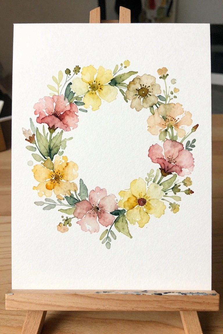
A circular floral wreath gives you a ready-made border that leaves the center open for verses or notes. The idea centers on arranging different blooms in a loose ring so the shape itself frames the page without filling it. Overlapping petals in soft yellows, pinks, and peaches with scattered leaves keep the look balanced while the white space in the middle stays usable.
The composition does a lot of the work here because the ring shape already guides placement and reduces the need for extra planning. You can shrink the whole wreath to fit journal margins or swap in different flower shapes to match the season. For practice, this kind of subject works well since the open center lets you test color mixing without worrying about a full background.
Gentle Sunset Landscape with a Winding Path
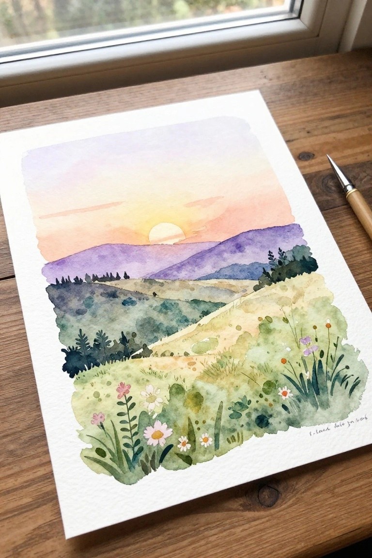
A landscape idea built around layered hills at sunset gives the eye a clear focal point with the low sun and soft sky gradients leading into the distance. The winding path through the fields creates natural depth while the foreground meadow keeps the scene grounded with scattered wildflowers and varied greenery. This approach fits the landscape category and works because the simple shapes and overlapping colors let the composition carry the interest without needing fine detail everywhere.
The color palette makes this easy to adapt by shifting the sky toward cooler tones or reducing the number of flowers for a faster version. A painting like this works especially well for Bible journaling since the open middle ground leaves space to add a short verse or date. The simple shapes help this feel more approachable for practice pieces that can still look finished on their own. For wall art, something like this scales up nicely if you keep the same soft blending in the hills.
Lamb with Floral Garland
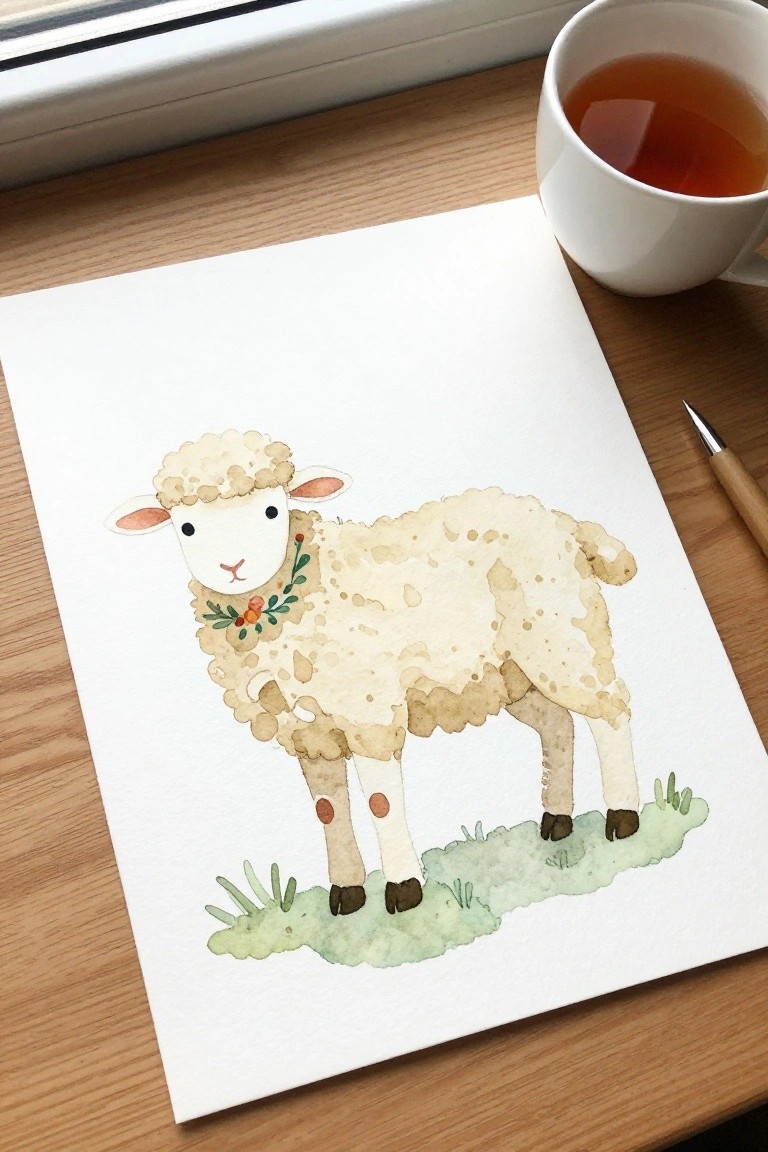
A lamb painting idea centers on a cute animal subject where the wool texture comes from soft, irregular watercolor washes in warm beige tones. The small flower collar and simple grass base create a balanced focal point while leaving most of the page open. This approach fits the cute animal category and keeps the overall layout clean and easy to place on a journal page.
What makes this idea useful is how the minimal background lets the lamb stand out without extra work. The neutral palette can be swapped for cooler tones or different flower colors to match a chosen verse or season. For practice, the basic shape and spotty texture are simple to repeat at a smaller size, and the same layout works well for cards or framed pieces.
Soft Watercolor Birds on Branches
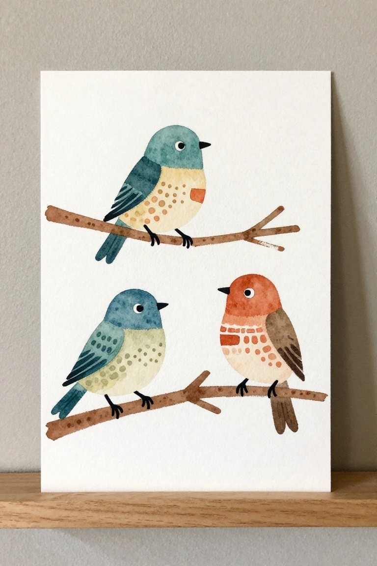
Three small birds perched on separate branches form a simple animal subject that works well for watercolor. The idea relies on placing one bird higher and two lower to create balance without symmetry, using soft teal, blue, and warm orange tones with light dot patterns on the bodies. Loose brushwork on the wings and tails keeps the shapes easy to paint while the thin branches add structure.
What makes this idea useful is how the basic bird shapes can be sketched quickly and colored with a small palette that matches many journal pages. You can drop one bird or change the branch angles to fit different page layouts or pair it with short scripture text below. The light background keeps the focus on the birds, so the same setup works for both quick practice pages and small framed pieces.
Wildflowers in a Clear Jar
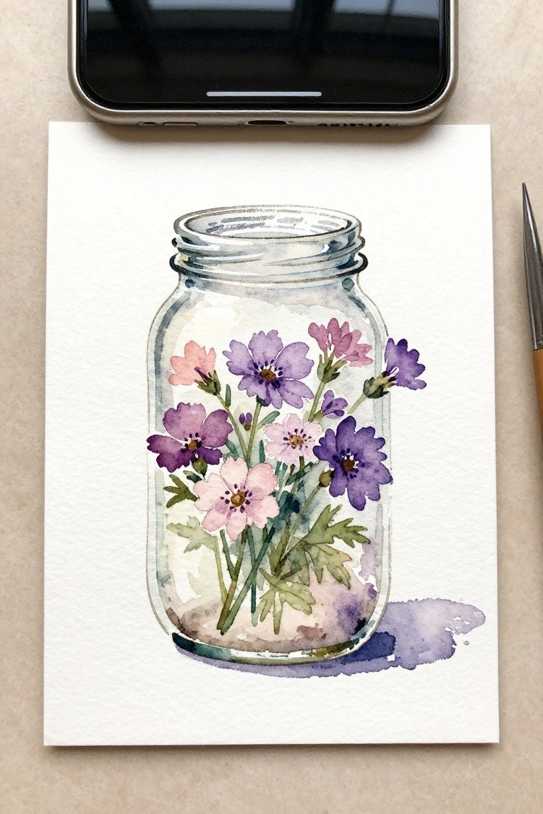
A still life of flowers placed inside a glass jar gives a contained floral subject that stays compact on the page. The jar shape frames the blooms while allowing stems and leaves to remain visible through the sides. Layered washes in soft purples and pinks with green accents let the flowers vary in height and density without needing tight outlines.
What makes this idea useful is how the jar acts as a built-in border so the composition stays tidy for journal pages. You can change the flower types or colors to match whatever you have available and keep the jar outline loose for faster versions. The same setup works for quick daily sketches or slightly larger pieces meant for a devotional notebook.
Stone Path Leading Toward a Cross
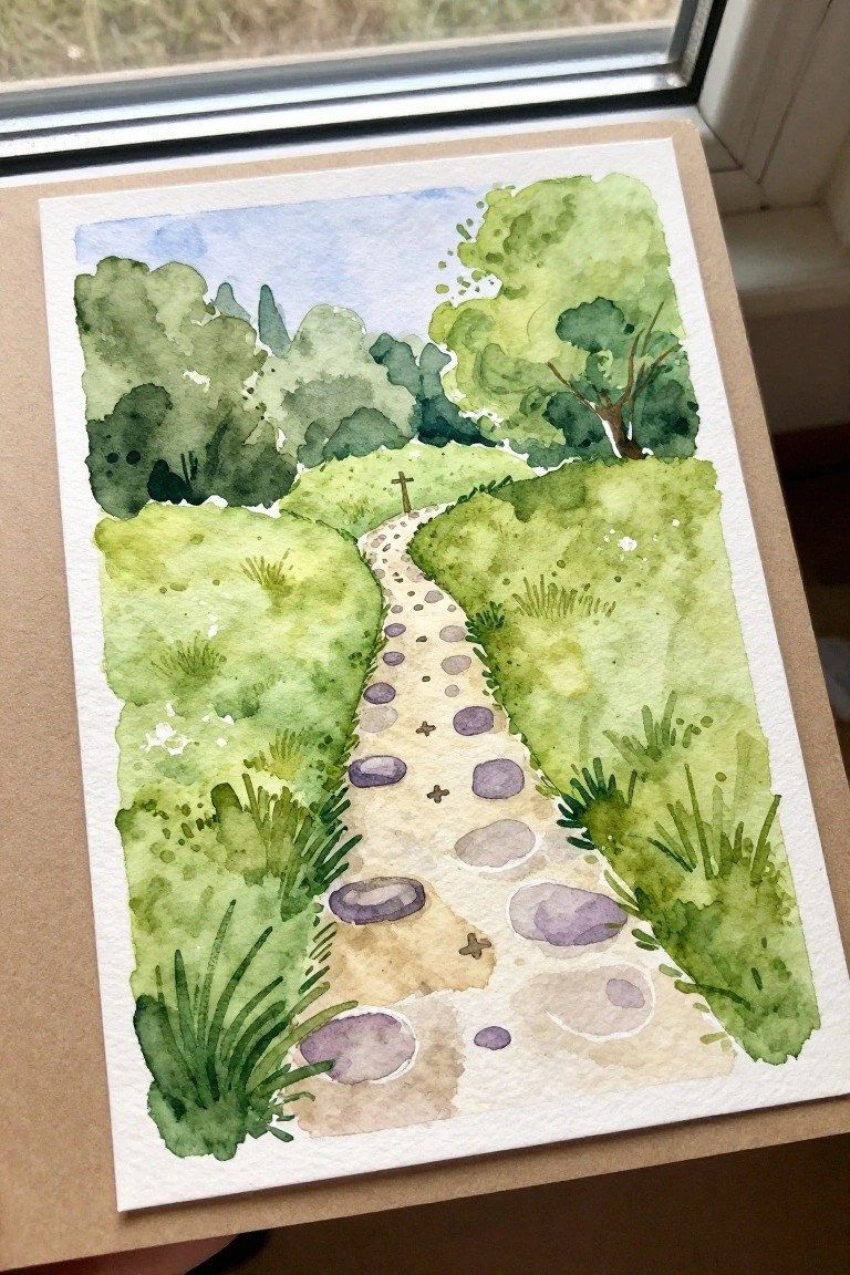
A landscape with a winding stone path through layered green hills makes a strong devotional painting idea. The path acts as a clear focal line that moves the eye forward while the soft foliage on both sides keeps the scene balanced. This fits the landscape category and works especially well when the cross sits at the far end as a small but central point.
What makes this idea useful is how the path shape can be lengthened or curved to match different journal page sizes. The green areas can be built with one or two washes instead of many if you want a quicker version. For Bible journaling this layout leaves open space along the sides for short verses or dates without overlapping the main path.
Hanging Light Bulb with Scripture Text
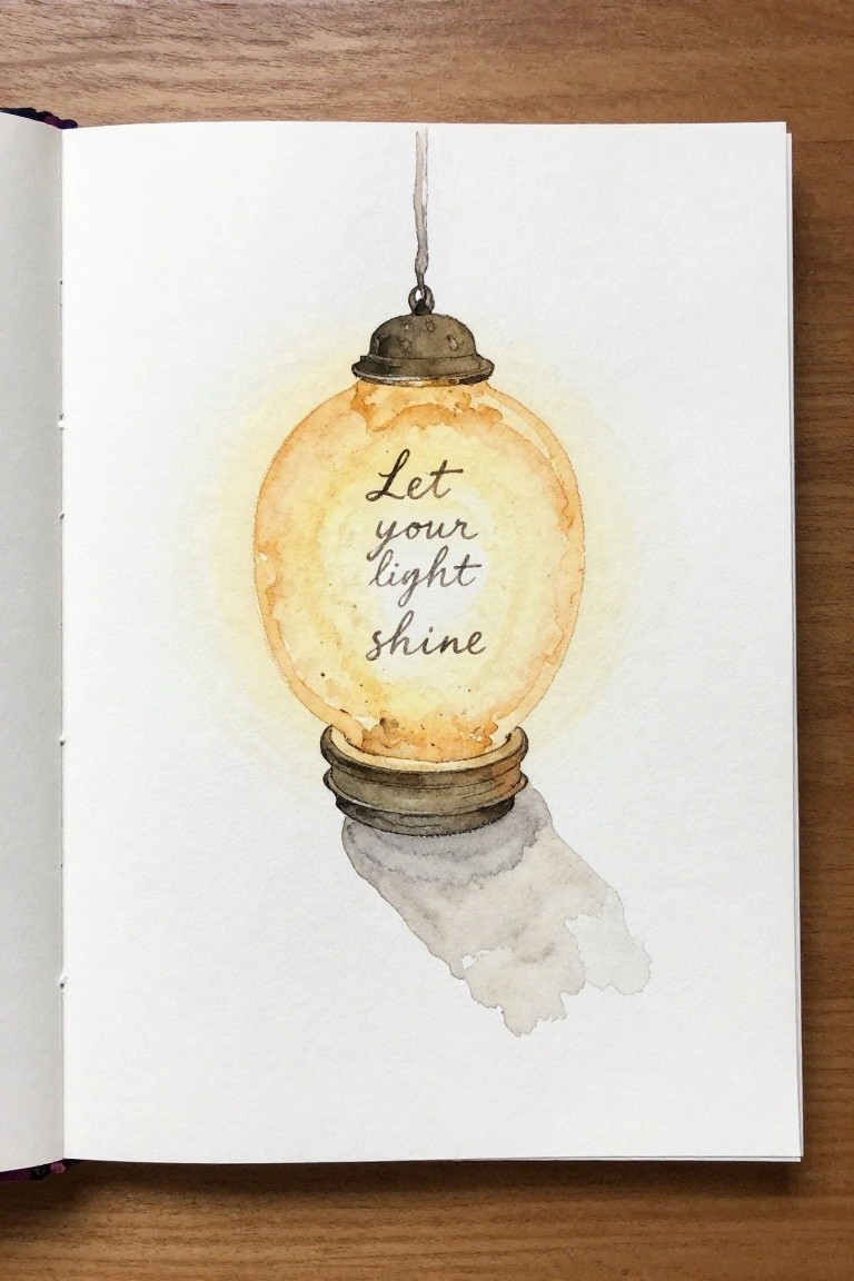
A hanging light bulb painted in soft yellow and brown washes holds the phrase “Let your light shine” in the center. The idea uses a familiar object as a frame for short text, with the rounded glass shape keeping the lettering contained and readable. Gentle color blending around the bulb creates a subtle glow while a loose gray shadow below adds simple grounding on the page.
The composition does a lot of the work here because the bulb shape naturally guides the eye to the text without extra elements. This would be easy to turn into other versions by changing the phrase or shifting the bulb to a cooler blue tone for different journal entries. The limited color palette and clean background make it a practical choice for fitting into Bible journaling spreads where space is tight.
Blueberry Cluster Still Life
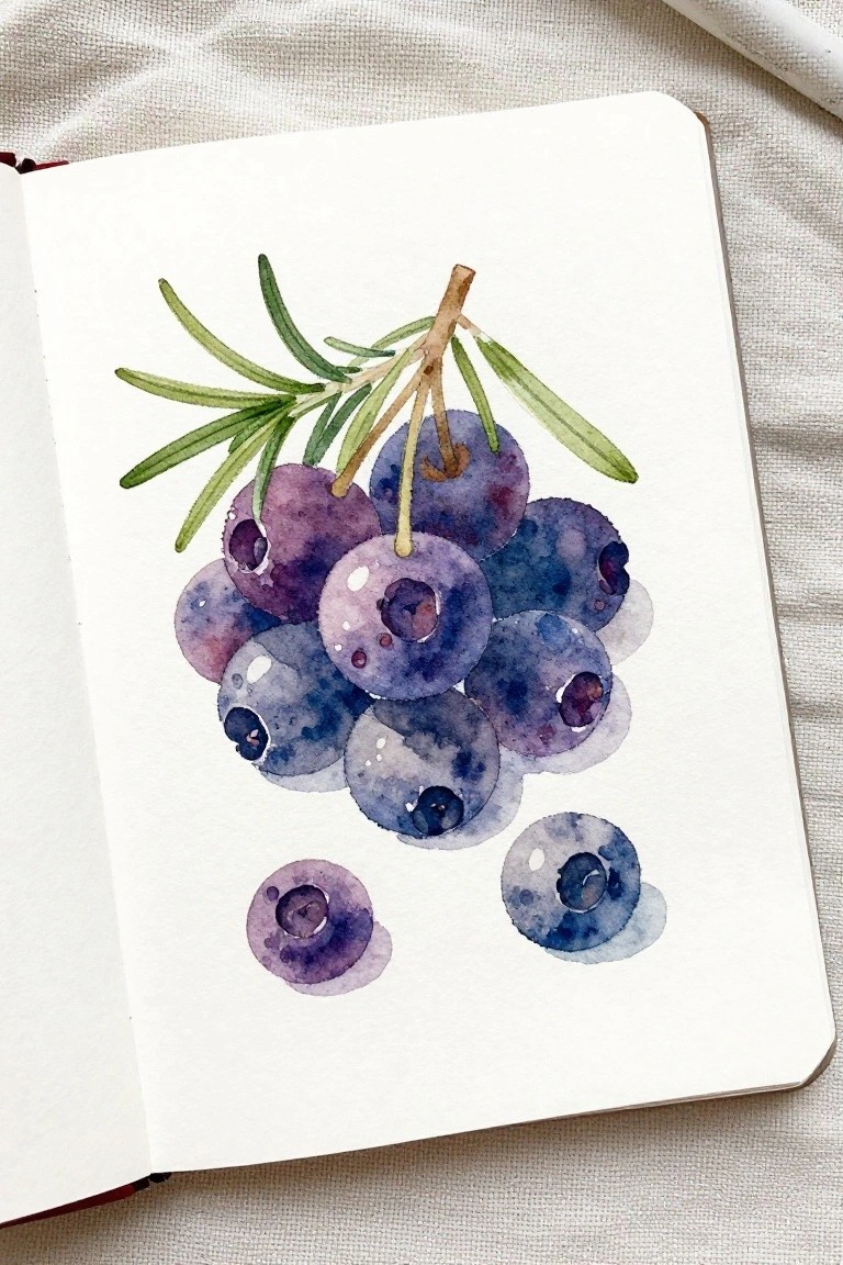
A still life of blueberries on a short stem with needle-like leaves creates a compact subject that fits easily into small spaces. The berries are built with soft overlapping washes in blue and purple tones, and the loose grouping with a few separate berries below keeps the layout balanced without needing precise symmetry. This approach belongs in the food and nature still life category and works for margin decorations or page accents.
What makes this idea useful is the round berry shapes that let you practice simple layering and color blending without complex outlines. The limited palette of cool tones can be swapped for other fruit colors or scaled smaller to sit beside a short verse. For practice pages, the same cluster can be repeated in different sizes to test how much detail holds up at reduced scale.
Frequently Asked Questions
What supplies are best for creating soft faith watercolor paintings for Bible journaling?
Start with a set of watercolor paints in gentle hues like soft blues, lavenders, and earth tones, along with cold press paper that handles light washes well. Add a few round brushes in various sizes, a water spray bottle for blending, and archival ink pens for adding text. These basics allow you to layer translucent colors without overwhelming the page, keeping the focus on devotional messages.
How can beginners achieve the soft effects described in these painting ideas?
Begin with light pencil sketches of simple shapes like crosses, doves, or open books, then apply very diluted paint in multiple thin layers. Let each layer dry fully before adding the next to build depth gradually. Practice on scrap paper first to control water amounts, which helps create the gentle, ethereal look suited to faith themes without harsh lines.
What are some practical ways to integrate scripture into these watercolor designs?
Choose a short verse that matches the mood of your painting, such as one about peace or hope, and letter it in the center or along the edge using a fine brush or pen after the paint dries. Leave soft white space around the text so it stands out. This turns the artwork into a personal reflection tool for your Bible pages or journal entries.
How do I adapt the ideas if I have limited time or space for full paintings?
Focus on small elements like single flowers, subtle borders, or abstract washes that fit in the margins of your Bible. Use a travel palette and pre-cut paper swatches for quick sessions. Even five minutes of soft color application can enhance a devotional entry when paired with a handwritten note about your thoughts that day.
How should I preserve these watercolor pieces for long term devotional use?
Once dry, apply a light coat of archival fixative spray to protect the colors from fading. Store finished pages in a dedicated journal or sleeve protectors to prevent smudging. For Bible inserts, choose acid free paper and avoid overhandling to keep the soft faith imagery intact for repeated inspiration.