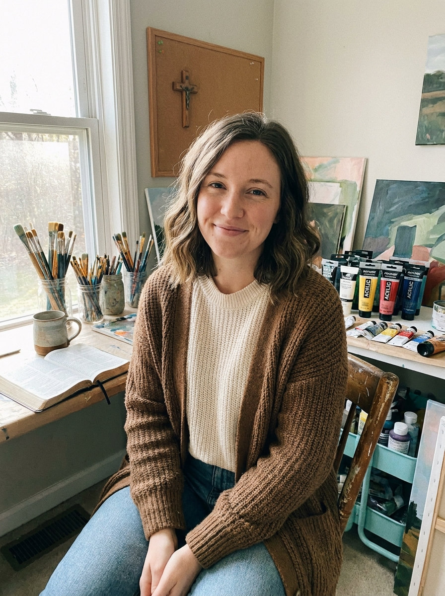
I have been trying out some easy watercolor paintings with simple cross designs lately.
They keep to minimal Christian themes and do not take much time to finish.
I like how these work for small projects or gifts without needing a lot of supplies.
Most of them use basic shapes and soft colors that anyone can try.
Here are the 21 ideas that turned out best for me.
Negative Space Cross Over Blended Watercolor Washes

A negative space cross forms the main subject by leaving the paper white while soft watercolor washes in peach, orange, and purple fill the surrounding area. The washes meet with loose edges that create gentle contrast without any hard outlines or extra details. This keeps the design minimal and lets the cross stand out through simple color placement rather than added elements.
The composition does a lot of the work here since the washes can be made larger or smaller to match different paper sizes. You could change the top and bottom colors for different seasons or keep the palette neutral for everyday use. This would be easy to turn into quick practice pieces or small cards because the shapes stay straightforward and require no fine brushwork.
Cross with a Loose Floral Wreath
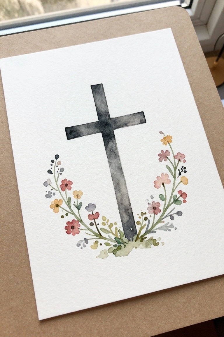
A centered cross paired with a partial floral wreath at the base makes a clean decorative piece. The flowers and leaves sit low so they frame the vertical line without crowding it, and the soft watercolor edges keep the whole thing light. This approach lands in the floral decorative category while staying simple enough for a small canvas or card.
The composition does a lot of the work here by leaving most of the paper empty, which makes the cross stand out immediately. You can swap the flower colors for different seasons or match them to a room without redrawing the layout. For practice, this kind of subject is easy to scale down or simplify by using fewer blooms and keeping the stems loose.
Minimal Trio of Crosses with Scripture

Three simple cross shapes painted in separate watercolor washes sit evenly spaced across the page, each using a single color gradient from top to bottom. The idea centers on repeating the same basic form while varying only the hue and value, then anchoring the group with a short handwritten verse below. This keeps the whole piece in the decorative art category and lets the clean horizontal layout and generous white space do the visual work.
The composition does a lot of the work here by giving each cross its own breathing room so the eye moves naturally from left to right. What makes this idea useful is how quickly it can be adapted by changing the number of crosses, swapping in different earth or jewel tones, or shrinking the whole design to fit a card. For wall art, something like this stays legible even at small sizes and works well when you want a quiet piece that still reads as intentional. The simple shapes also make it straightforward to practice even washes without adding extra elements.
Blue Dove with One Wing Raised

A single bird painted in layered blue washes perches on a thin branch while holding one wing partially open. This animal painting idea uses soft color blending and negative space to define the feathers and body without tight outlines. The horizontal branch anchors the composition and lets the raised wing create a clear focal point against the empty background.
The composition does a lot of the work here by balancing the wing shape with the branch below. A painting like this works especially well for small cards or journal covers since the main shapes stay readable at any scale. You could simplify the wing further or repeat the same bird in a row to create a series. The limited palette also makes it easy to test different blue mixes without needing many colors.
Watercolor Branch with Varied Green Leaves
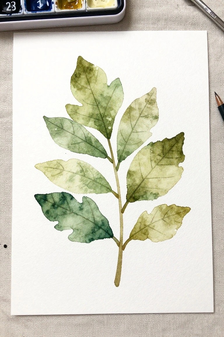
A single vertical stem holding several leaves in different green shades forms a straightforward botanical painting idea. The leaves range from pale yellow-green to deeper blue-green tones, with light veins sketched in to give each one shape while keeping the overall look loose. This approach fits into simple nature studies because the natural arrangement of the branch creates balance without needing extra elements or tight control.
What makes this idea useful is how easily you can change the leaf count or swap in different greens depending on what paints you already have mixed. The vertical layout works for both small cards and larger wall pieces, and you can simplify it further by using fewer leaves or one flat wash. The soft edges and uneven coloring prevent it from feeling stiff, which helps it stand out when shared as a quick practice piece.
Hilltop Cross at Sunset
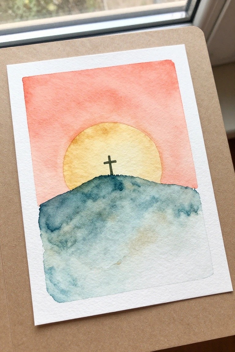
A simple landscape idea places a small cross on top of a rounded hill that sits directly in front of a large sun. The sky uses a smooth gradient from coral pink down to lighter peach tones, letting the dark hill and bright sun create strong contrast with minimal shapes. This approach fits the minimal Christian design category because the composition relies on just three main elements: the gradient background, the sun circle, and the hill silhouette.
What makes this idea useful is how the large sun shape guides the eye straight to the cross without needing extra details. The color palette makes this easy to adapt by swapping the pink-orange tones for cooler blues or warmer yellows depending on the season or mood. For practice, this kind of subject lets you focus on clean washes and one small line drawing rather than complex layers. A painting like this works especially well for greeting cards or small prints where the bold sun keeps the design readable at any size.
Fish Silhouette with Cross Symbol
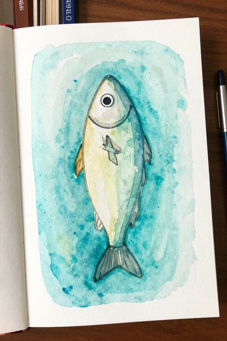
A fish outline with a small cross placed on its body creates a direct Christian symbol that stays simple to paint. The vertical layout keeps the fish centered while a loose blue wash fills the space around it to suggest water. This setup works as an animal-based design that relies on basic shapes and light color layers rather than fine detail.
The composition does a lot of the work here by using the wash as a soft frame so the fish and cross stay easy to read. You can swap the blue tones for other shades or resize the whole thing for cards and bookmarks without losing the idea. For practice this kind of subject stays approachable because the main shapes hold up even if the edges stay loose.
Cross with Scattered Autumn Leaves
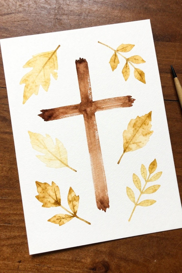
A central cross painted in layered brown tones forms the main subject, with several yellow and brown leaves placed around it in an uneven but balanced layout. The idea combines a strong religious symbol with simple seasonal foliage to create a clean decorative piece. The limited color range and loose arrangement keep the focus on the cross while the leaves add natural texture and movement.
What makes this idea useful is how the cross provides a clear structure that the leaves can surround without needing perfect symmetry. You could adapt it by using fewer leaves for a more stripped-down version or shift the leaf colors to match other seasons. The approach works especially well for small framed pieces or quick seasonal cards since the elements stay minimal and easy to adjust.
Lamb Beside a Simple Cross
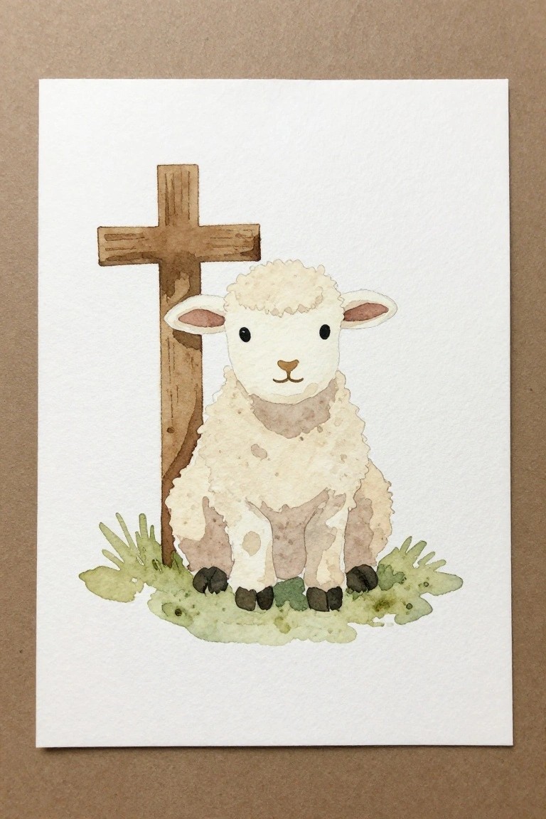
A lamb placed next to a plain wooden cross makes a straightforward animal painting idea that pairs a rounded subject with a strong vertical shape. The composition works because the cross anchors one side while the lamb fills the center, and the small patch of grass at the bottom keeps everything grounded without adding clutter. Soft washes on the wool and a limited color range let the two main forms stand out clearly against the empty background.
What makes this idea useful is how few elements are involved, so you can focus on basic shape placement and light layering. The neutral palette makes it easy to swap in different paper tones or adjust the grass color if you want to try it on tinted paper. For practice, this kind of subject scales down well for cards or stays simple enough to repeat in a small series.
Hilltop Church with Steeple and Cross

A church building with a tall steeple and cross on top works as a straightforward landscape idea that keeps the focus on the structure itself. The dark hill and simple foliage at the base create a solid foundation while the sky shifts from warm tones near the horizon to cooler shades above. This setup uses the steeple height and the cross outline to give the whole piece clear vertical balance without needing extra elements.
The composition does a lot of the work here by letting the steeple shape carry the main interest. You can adjust the sky gradient to fit different times of day or reduce the foreground bushes if you want a cleaner lower edge. For practice this kind of subject stays easy to scale down for cards or keep larger for wall pieces since the main shapes read well even with loose brushwork.
Patterned Cross with Colored Dots
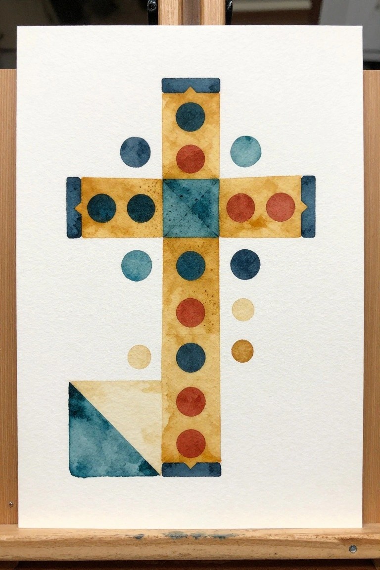
A cross formed from rectangular watercolor sections acts as the foundation, with rows of circles placed at regular intervals along the vertical and horizontal arms. The circles repeat in size and color groupings to create a balanced, grid-like rhythm that keeps the eye moving through the design. This approach fits into decorative art by using simple repeated shapes instead of detailed illustration.
What makes this idea useful is how the even spacing of the circles does most of the compositional work. You can easily change the palette or drop some of the circles if you want a quicker version on a smaller sheet. For practice, this kind of subject helps with shape control and color placement without requiring advanced techniques. The plain background also makes the finished piece easy to scan for Pinterest.
Rainbow Striped Cross Using Overlapping Bands
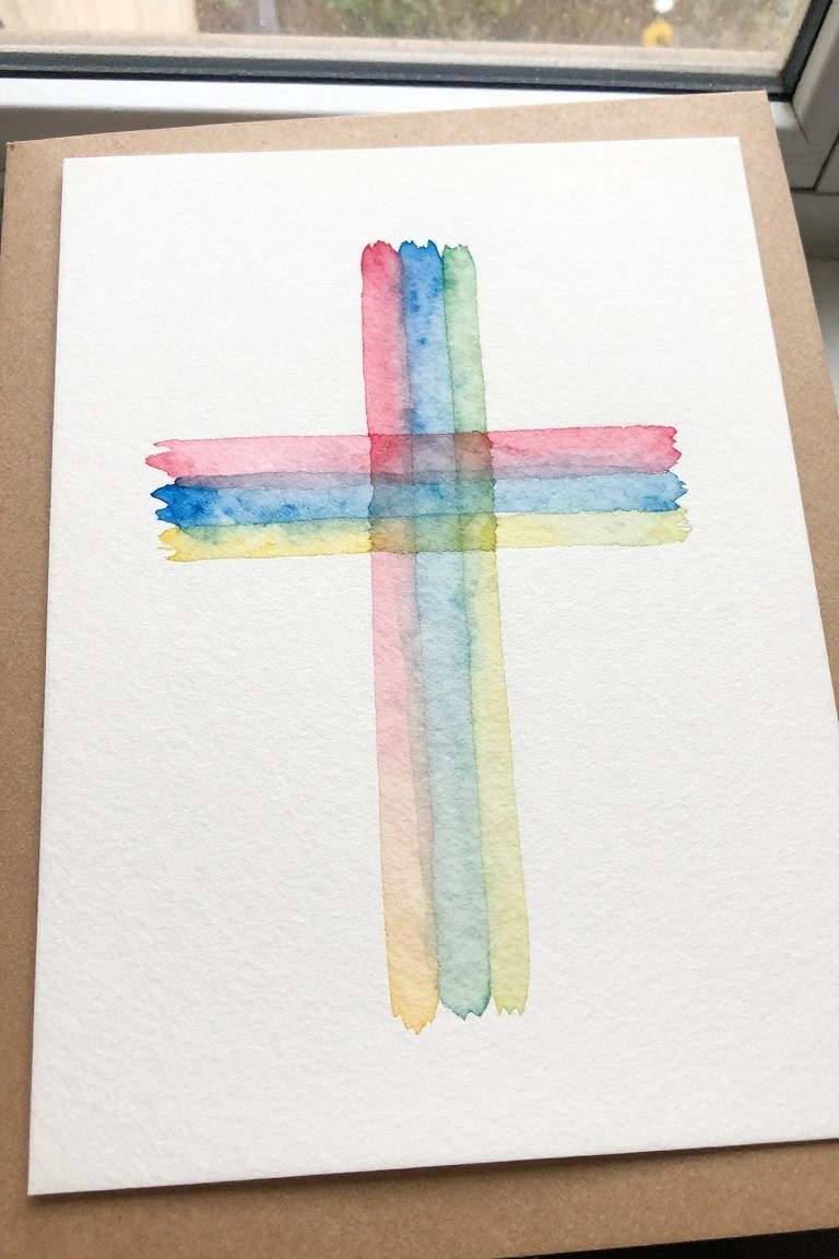
A cross built from wide horizontal and vertical watercolor stripes creates a clean design with soft color transitions. The bands in pink, blue, green, and yellow cross at the center so the colors mix slightly where they meet, adding subtle depth without extra layers. This keeps the whole piece minimal while still showing clear structure through simple brush strokes.
What makes this idea useful is how quickly the same layout can be repeated on different paper sizes or with new color choices. You could shorten the stripes for a tighter frame or swap the palette to match a season or room. The overlapping bands do most of the visual work, so it works well for quick practice pieces or small cards without needing precise details.
Minimal Cross with Crown of Thorns
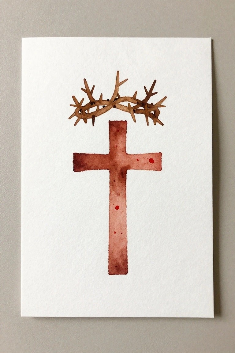
A cross with a crown of thorns placed directly above it forms a clean, centered composition that stays focused on the two main shapes. The painting idea relies on a vertical layout where the crown sits at the top of the cross arms, using loose brown washes for the thorns and a deeper red-brown for the cross itself. This keeps the design minimal while the slight texture from the watercolor gives the cross a bit of depth without extra details.
What makes this idea useful is how the simple placement lets you adjust the cross color for different seasons or events without changing the layout. The open white space around the design makes it easy to add text underneath for cards or prints, or shrink it down for smaller projects like bookmarks. The same structure works on larger paper if you want a straightforward piece for a wall.
Watercolor Lily Cluster Arrangement

A cluster of lilies forms the core of this floral painting idea, with multiple blooms arranged at varying heights and angles to fill the space naturally. The composition relies on overlapping petals, visible stamens, and long leaves that anchor the stems at the base for visual stability. Soft washes of pale yellow and cream on the flowers contrast with the deeper green foliage to keep the focus on the blooms themselves.
The composition does a lot of the work here by letting the natural shape of the lilies guide the layout instead of requiring precise symmetry. You can adapt the color palette by shifting the petals toward cooler tones or simplifying the leaf count for quicker sketches. This kind of subject works especially well for greeting cards or small framed pieces because the vertical flow fits narrow spaces without extra background work.
Minimal Cross on a Grassy Hill
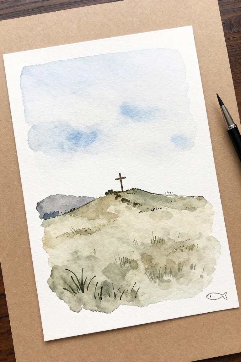
A single cross positioned at the top of a low hill gives this landscape its clear focal point while the pale sky and soft ground washes keep the rest of the scene open. The painting idea relies on simple horizontal layers of color to suggest grass and distant land, with the cross placed high enough to stand out without extra detail around it. This approach fits the minimal Christian design category because the subject stays small and the background stays light.
What makes this idea useful is how the empty sky area lets you shift the hill lower or higher depending on the paper size you have. The soft greens and earth tones can be mixed from just two or three colors, so the whole piece stays quick to paint. For cards or small prints, the fish symbol in the corner adds a quiet Christian detail without changing the main landscape. The same layout works if you want to try different cross shapes or leave the hill even more bare.
Hands Cradling a Cross
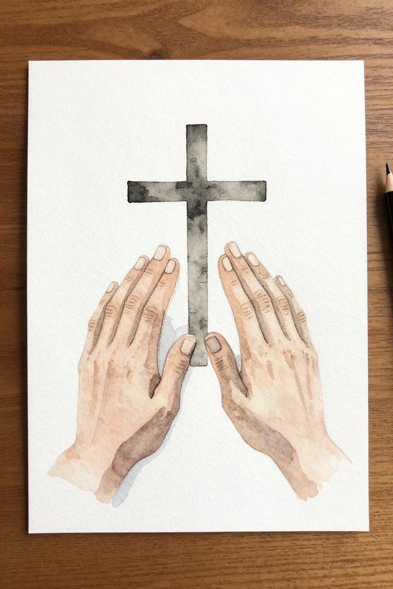
A pair of hands holding the base of a cross forms a clean Christian design that stays minimal. The cross sits centered and upright while the hands rest below it in a natural position, with soft skin tones contrasting the darker cross shape. This layout uses negative space around the main elements to keep the whole piece balanced and easy to read from a distance.
What makes this idea useful is how the centered arrangement works at different sizes without losing clarity. You can swap in a thinner cross or adjust the hand angle to match the size of your paper or card. The plain background also makes it simple to scan or photograph for sharing online. For practice, this kind of subject helps with basic shape placement and value contrast before adding more detail.
Leaf Wreath Framing a Small Cross
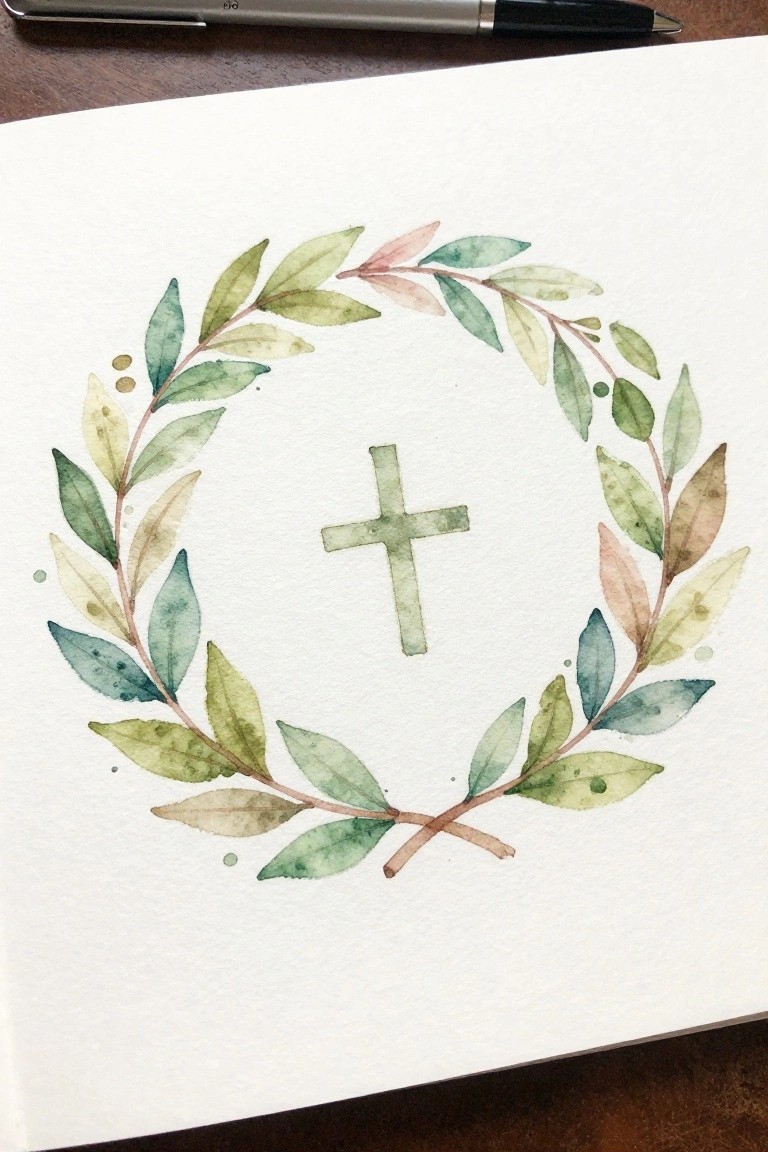
A wreath made from overlapping leaves works as the main element here, creating a loose circle that holds a simple cross in the open center space. This approach fits into decorative Christian art by letting the foliage do most of the visual work while the cross stays small and understated. The crossed stems at the bottom give the circle a grounded finish without crowding the design.
What makes this idea useful is how the uneven leaf spacing and mixed greens let you work quickly without perfect symmetry. You can shrink the whole wreath for greeting cards or stretch the leaves farther apart on larger paper for wall pieces. For practice, paint the leaves first in one session and add the cross later so the proportions stay easy to adjust.
Three Crosses with a Soft Background Wash
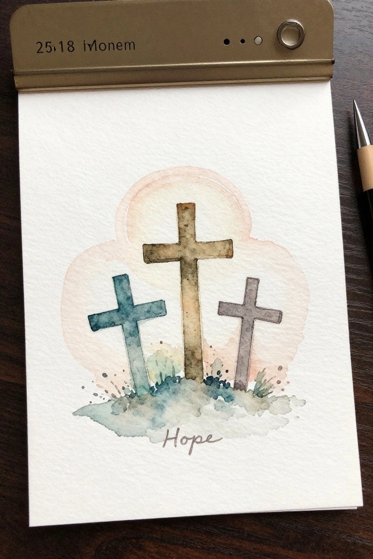
A central cross stands taller than the two smaller ones placed on either side, all resting on a simple ground layer with a rounded wash behind them. The idea relies on basic shapes and a limited color range to keep the focus on the arrangement rather than on fine details. This setup fits into a minimal decorative style that works for small-scale pieces or quick studies.
What makes this idea useful is the balanced layout that guides placement without requiring advanced drawing skills. The soft wash behind the crosses can be adjusted in size or tone to fit different paper dimensions or to match existing decor. Adding a short word at the base like hope turns the design into a ready card or journal page with almost no extra steps.
Watercolor Bow as a Decorative Accent
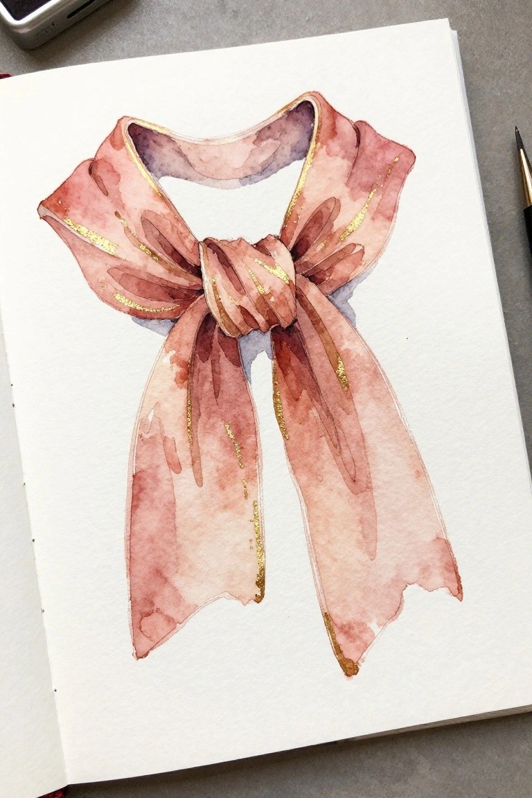
A decorative bow works well as a standalone painting idea when the goal is to focus on soft shapes and flowing lines. The concept uses loose watercolor washes in muted pink and brown tones to build the loops and trailing ends, with the central knot placed slightly off-center to create balance. Thin gold lines follow the edges of the ribbons to add definition without overcrowding the simple form.
The composition does a lot of the work here because the negative space between the ribbons keeps the piece from feeling heavy. You can adapt the same layout for smaller formats like gift tags or journal covers by reducing the number of folds. The color palette makes this easy to adjust for different seasons or projects while still keeping the overall look clean. For practice, this kind of subject helps with controlling wet edges and deciding where to stop adding detail.
Cross in Rainy Clouds
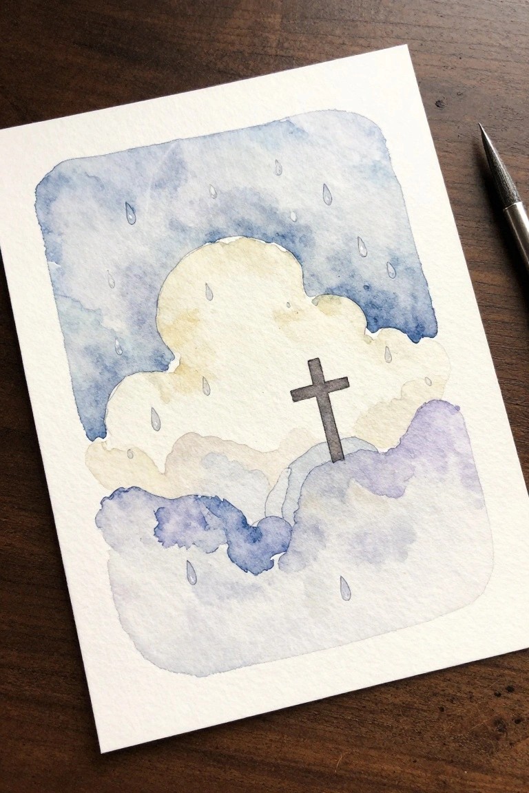
A cross centered among soft overlapping clouds with raindrops falling around it creates a simple sky scene that works well for minimal Christian designs. The idea relies on loose cloud shapes in cool blues and muted purples to build depth while leaving the cross as the main focus against lighter areas. This approach fits a decorative sky category where the background layers do most of the visual work and the cross stays small and understated.
What makes this idea useful is the limited number of elements that still give a complete composition without needing fine detail. The color palette of blues with soft beige accents makes it easy to adapt by changing the cloud tones or adding more rain for a different mood. A painting like this works especially well for cards or small prints because the layout stays balanced even when scaled down. The simple shapes help this feel more approachable for trying wet-on-wet washes around a negative space cross.
Cross with Leaning Staff and Wildflowers
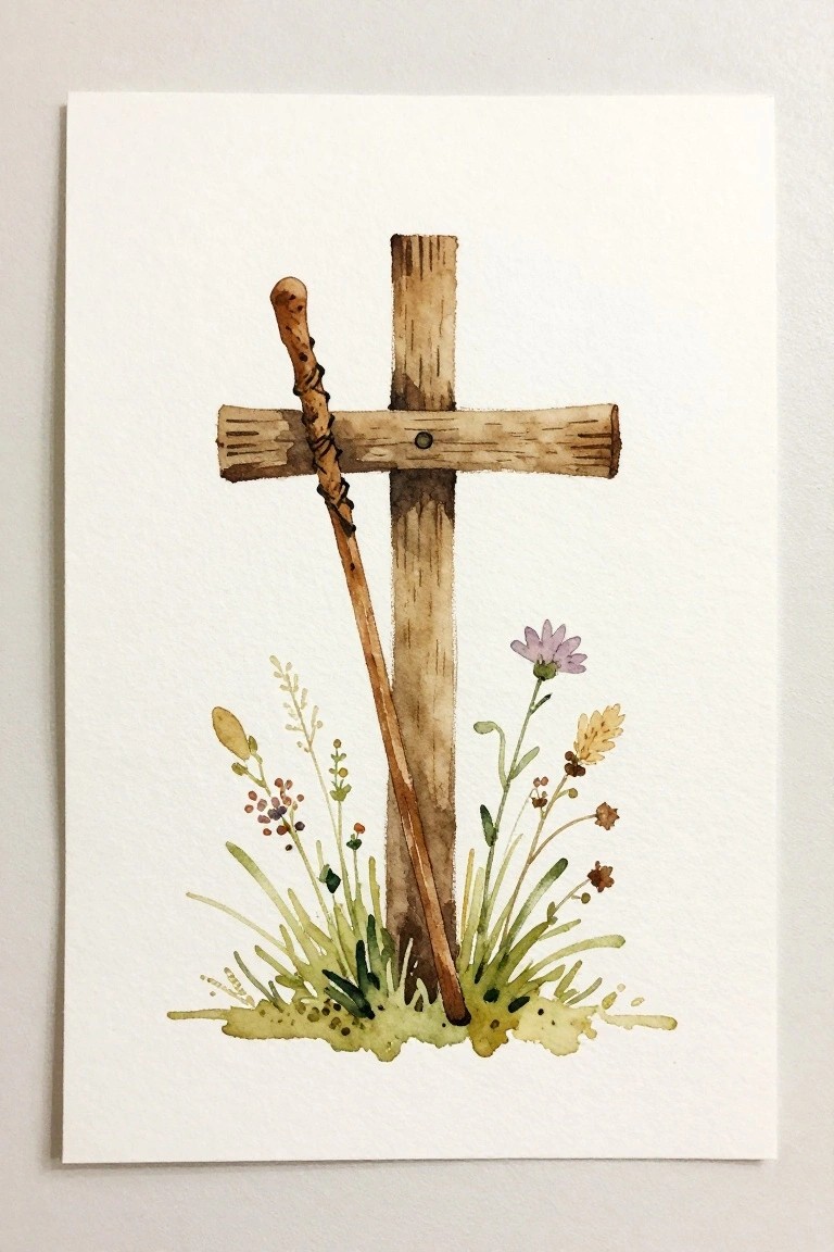
A cross paired with a simple leaning staff forms the main subject, while a small patch of wildflowers and grasses at the base keeps the lower half grounded. This still life style idea works because the vertical lines of the cross and staff stay balanced against the loose greenery below, and the neutral brown tones let the soft purple and yellow flowers stand out without extra layers. The open white space around the elements keeps the whole piece feeling light and uncluttered.
What makes this idea useful is the way the leaning staff gives the cross more shape without adding extra objects. You could change the flowers to match different seasons or shrink the design to fit a small card. The plain background also makes it simple to add a short verse later if you want to turn it into a gift.
Frequently Asked Questions
What materials do I need to create these minimal Christian cross paintings?
You will need watercolor paper of at least 140 pound weight to prevent warping, a basic set of watercolor paints in muted tones such as soft blues, sage greens, and warm beiges, round brushes in sizes 2 and 6 for control, and a mechanical pencil for faint sketches. Keep a water container and paper towels nearby for blending and corrections.
How can beginners approach these easy painting ideas without feeling overwhelmed?
Begin by selecting one simple cross outline from the list and practice it on scrap paper first. Sketch lightly, then apply a single wash of color before adding any subtle Christian elements like a small fish symbol. Work in short sessions to build skill and refer back to the article for step by step guidance on each idea.
What makes a design minimal when focusing on Christian themes?
Minimal designs rely on clean lines, plenty of white space, and just one or two soft elements such as a faint cross paired with a tiny dove or heart. Limit your color palette to two or three shades and avoid extra details so the spiritual symbol remains the quiet center of the piece.
How do I incorporate watercolor techniques effectively for these crosses?
Apply a light wet on wet wash for soft backgrounds that suggest sky or water, then switch to a drier brush for sharp cross edges. Build color in thin layers and let each dry fully before the next to prevent muddiness. This approach keeps the overall look light and suitable for minimal Christian artwork.
Where can I display or use these finished paintings?
Frame them simply for wall decor in a prayer space or give them as handmade cards for encouragement. You can also scan the images for personal use in digital journals or print them on fabric for small banners. Store extras in a portfolio to protect the delicate watercolor surfaces.