
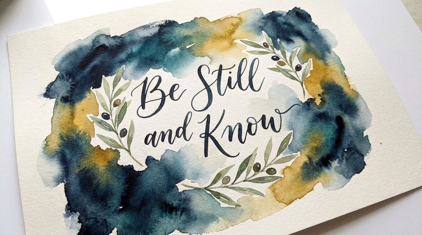
I have always liked keeping my Bible verse paintings simple.
Minimal designs fit nicely with the clean look I want in my home.
I have tried a few different approaches over the years and found that less detail often works better.
These ideas come from what I have painted myself and what feels easy to do.
I think they can help if you are looking for something straightforward to try.
Sunburst Verse on Watercolor Background
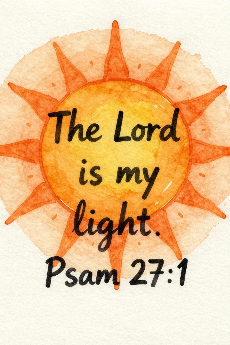
A sunburst design places the full bible verse directly inside the central circle of a simple sun shape. The rays extend evenly around the edges to create a balanced frame that keeps attention on the text. Warm yellow and orange tones fill the sun while the background stays plain, making this a clean example of decorative typographic art.
The composition does a lot of the work here because the circular layout naturally guides the eye to the words without extra elements. You can adapt the size of the rays or swap the color palette to fit different rooms. This idea works especially well for wall pieces since the limited shapes keep it minimal and easy to scale down for smaller prints or cards.
Winged Cross on Watercolor Wash

A central cross with simple wings placed over a loose blend of warm pinks, reds, and purples keeps the focus on the shape while the soft background adds subtle depth. The idea pairs the bold dark cross directly with short verse text underneath, creating a clean decorative piece rather than a detailed scene. This approach works as minimal religious art that stays graphic and uncluttered.
The composition does a lot of the work here because the strong central shape holds up even when the background colors shift to match different room palettes. You can simplify it further by using a single wash or stencil the cross for faster versions on smaller panels. For wall art this style stands out on Pinterest because it reads clearly in thumbnails while still fitting a modern, low-detail aesthetic.
Olive Branch Botanical Verse
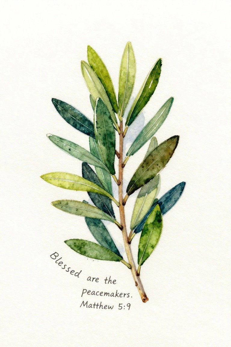
A single olive branch painted in loose watercolor greens forms the core of this idea, with leaves arranged along a central stem to create a natural vertical line. The verse sits in the lower left corner, keeping the focus on the plant while adding a clean text element that balances the composition. This approach falls into botanical illustration with integrated scripture, using soft color shifts and simple leaf shapes to keep the overall look minimal and modern.
What makes this idea useful is how the branch can be scaled up or down depending on the canvas size, and the green palette adapts easily to whatever tones you have on hand. You could swap in a different short verse or leave more negative space around the text to change the mood without redrawing the branch. For wall art, the vertical layout works well in narrow frames, and the subject stays recognizable even if you simplify the leaf details or try it in a single color wash.
Layered Arch Composition with Scripture
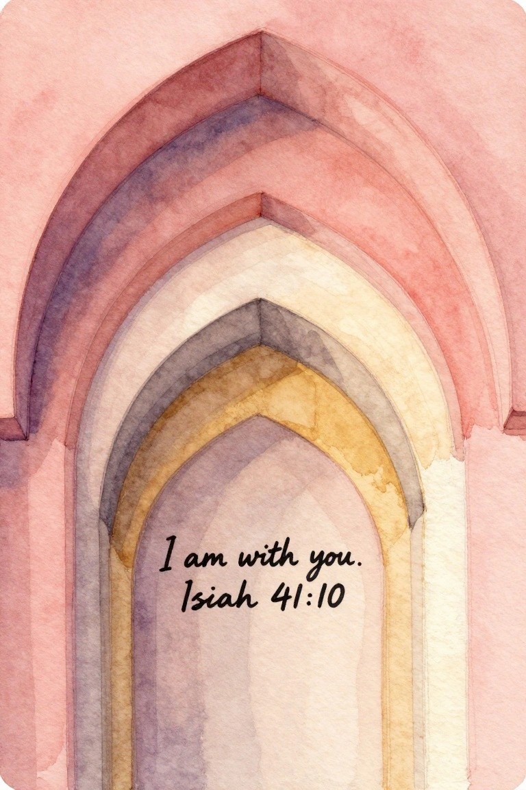
A series of nested arches painted in soft watercolor washes forms the core of this idea. The painting uses gradual color shifts across the arches to build depth while keeping the overall layout symmetrical and clean. This approach fits into decorative art that pairs a simple repeating shape with overlaid text.
What makes this idea useful is how the arches can be scaled up or down to match different frame sizes without losing balance. The muted palette of pinks, purples, and warm yellows adapts easily to other verse choices or even blank space if you want a more abstract version. For wall pieces, the vertical flow guides the eye straight to the text, which helps the design stay readable even when printed small.
Blue Wave Scripture Watercolor

A seascape painting idea that pairs layered blue waves with a short Bible verse placed in the open space above. The composition uses a simple top-to-bottom layout where the text sits in the lighter area and the darker, flowing waves fill the lower two-thirds. This keeps the design minimal while still giving the water visible movement through overlapping brushstrokes and varying tones.
What makes this idea useful is how the verse and waves work together without extra decoration. The limited blue palette makes it easy to adapt by changing the intensity of the washes or shifting the wave height to fit different canvas sizes. For wall pieces, the clean layout helps the text stay readable even when the painting is viewed from a distance. You could simplify it further by using fewer layers or try the same idea with a different verse that fits a similar water theme.
Heart Shape with Short Scripture Text
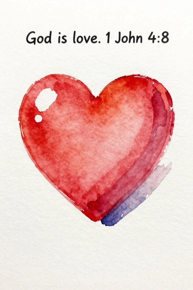
A single heart painted in soft red and purple washes sits below a short Bible verse on an otherwise empty page. This idea keeps the focus on one recognizable shape paired with minimal text to produce clean scripture art. The blended color areas and irregular edges give the heart enough interest without adding extra details or layers.
What makes this idea useful is how the heart can be scaled up or down depending on the size of the canvas or paper. The limited color palette makes it simple to match with existing wall colors or frames. For practice the shape stays forgiving while still teaching basic blending and edge control. The same layout works for other short verses if the heart is swapped for a different basic form.
Eucalyptus Cluster with Scripture Text
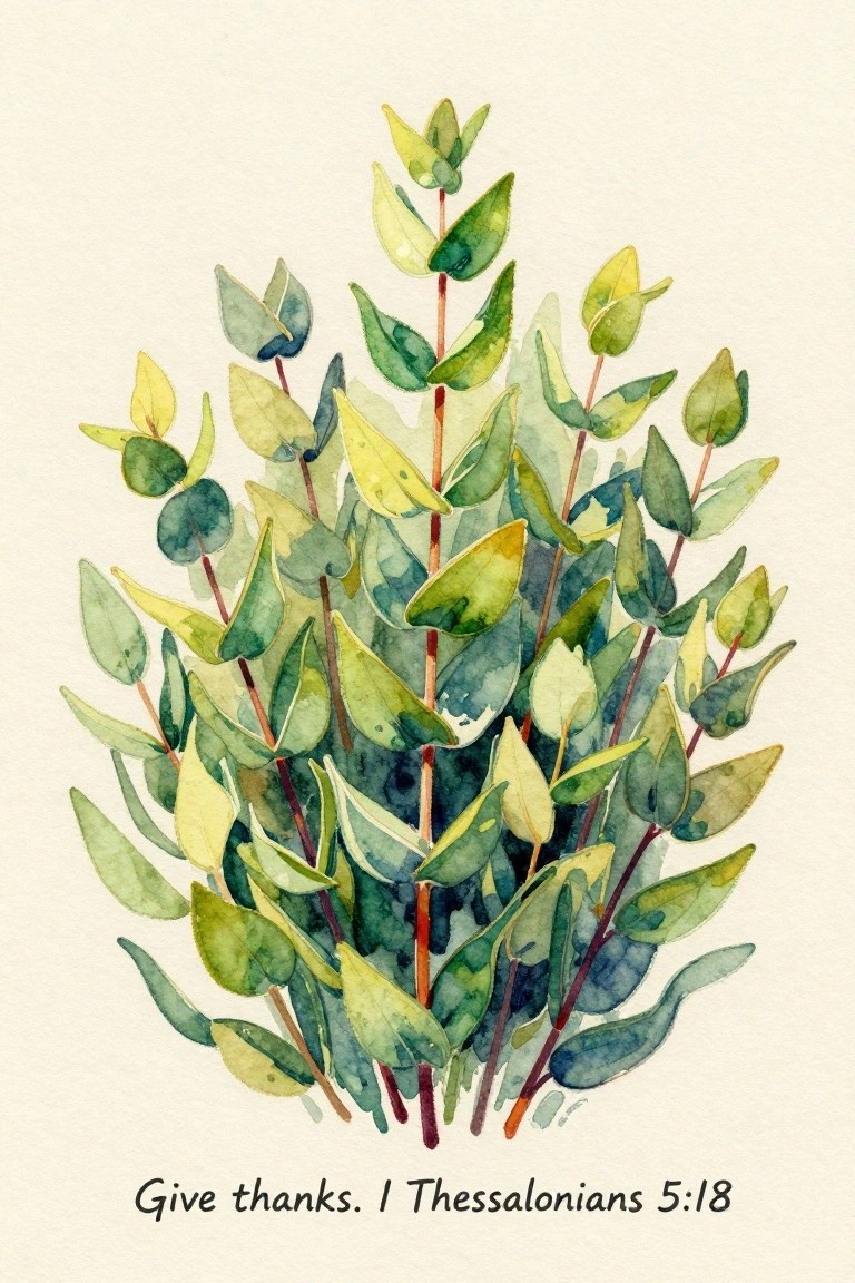
A botanical painting idea that centers on a dense bunch of eucalyptus-style leaves in layered greens and soft yellows works well for minimal Bible verse art. The stems are kept thin and vertical so the foliage can overlap naturally while still showing individual leaf shapes. This approach keeps the focus on the plant form with the verse placed simply underneath in a clean script.
What makes this idea useful is how the varied leaf angles create fullness without needing perfect symmetry. You can adapt it by reducing the number of stems or shifting the color mix toward cooler tones if you want a different mood. For wall pieces, the open background makes the whole thing easy to frame without extra elements. The same layout could be tried in a smaller sketchbook version first to test leaf placement before committing to a larger piece.
Large Moon Behind Mountain Silhouette
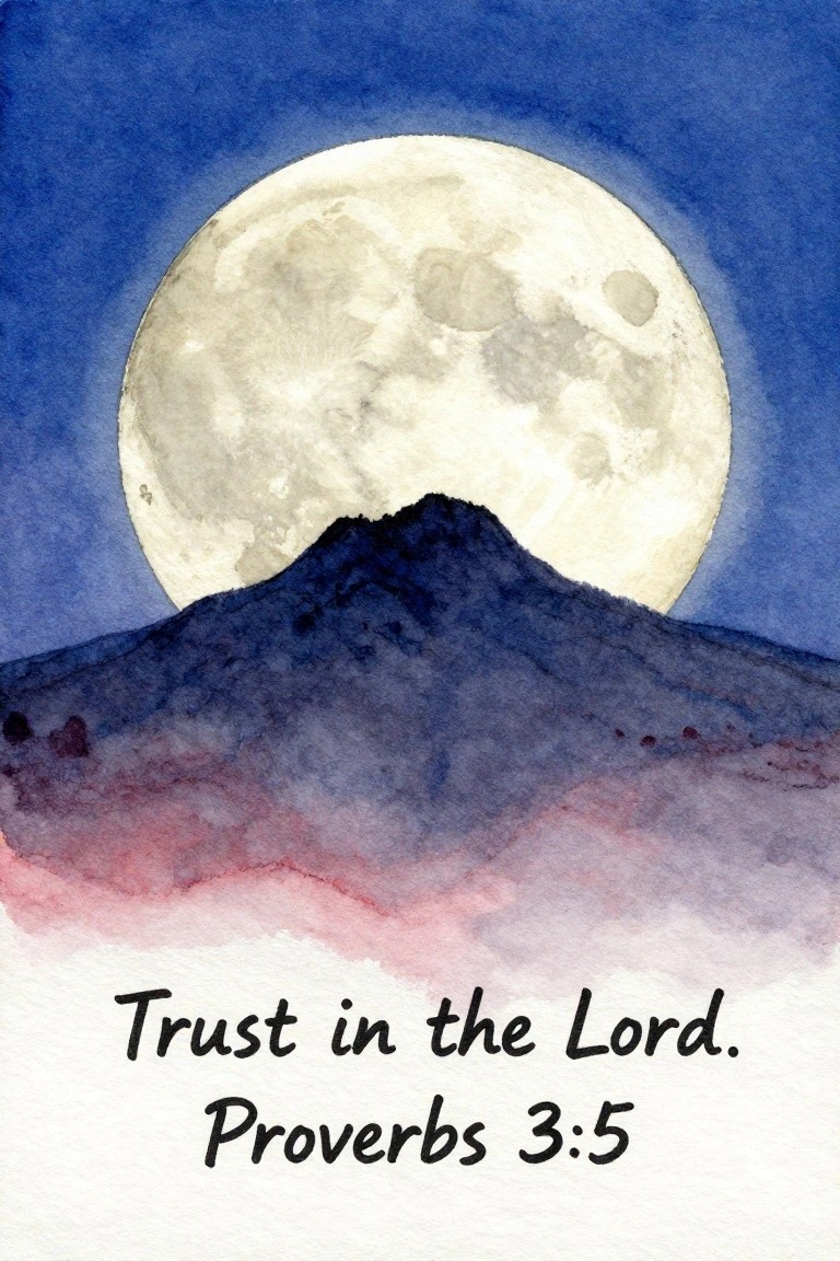
A landscape painting idea that pairs a large moon with a simple mountain shape and a short Bible verse creates a balanced piece for modern wall decor. The round moon takes up most of the upper space while the dark mountain forms a clean base layer, leaving room for the text to sit below without competing for attention. This format works because the main shapes stay bold and the background stays uncluttered.
The composition does a lot of the work here since the moon and mountain are easy shapes to block in first. You can swap the sky color or shift the mountain height to fit different frames or room tones. For practice, this kind of subject lets you focus on layering one element at a time before adding the verse. It also translates well to smaller canvases or prints because the layout stays readable at any scale.
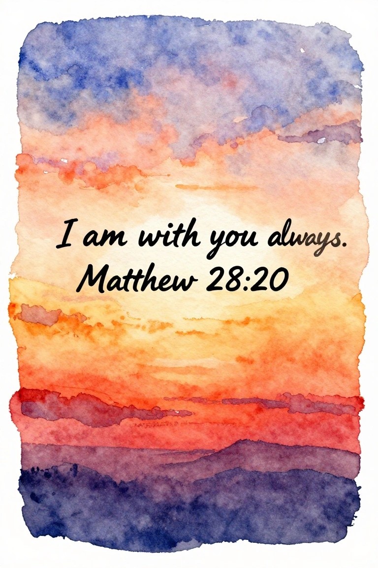
Minimal Sunset Reflection with Scripture
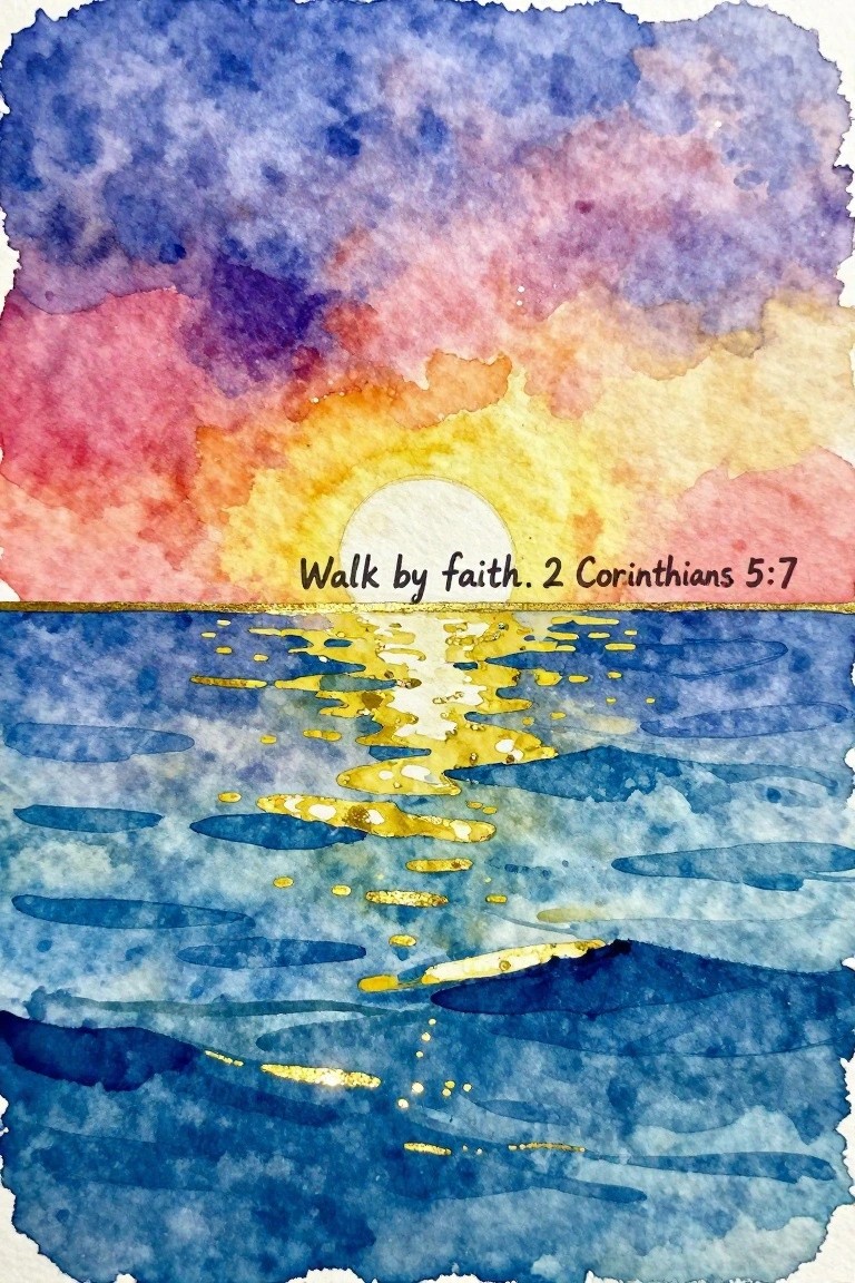
A sunset landscape works well here by centering a simple circular sun just above the horizon and letting its reflection stretch across the water in scattered light marks. The idea relies on a clean horizontal split between sky and sea, with the verse placed directly along that dividing line so the text becomes part of the composition rather than an add-on. Warm oranges and pinks in the sky transition into cool blues below, keeping the whole piece balanced and easy to read from a distance.
What makes this idea useful is how the horizon line gives a ready-made spot for the verse without crowding the image. You can scale the same layout down for a greeting card or stretch it across a wider canvas while keeping the color blocks the same. The reflection marks on the water can be reduced to just a few strokes or dots if you want a quicker version, and the strong sky gradient still carries the piece even with minimal detail.
Layered Mountain Peaks with Scripture
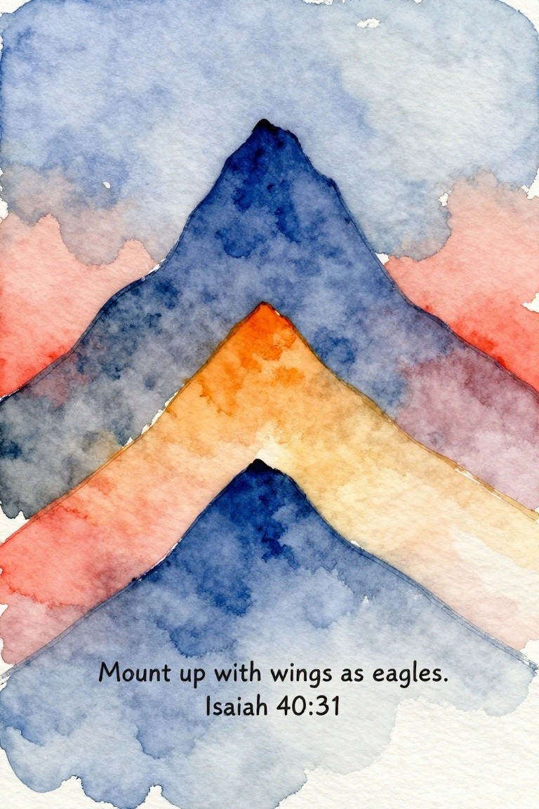
A stacked mountain landscape creates an effective minimalist Bible verse piece by using overlapping triangular shapes in cool blues and warm orange tones. The staggered layers build a sense of depth while keeping the overall design simple and balanced. This fits the landscape category and leaves clear space at the bottom for the verse text.
What makes this idea useful is how the color blocks can be swapped for any palette that matches a room without changing the structure. The simple shapes make it straightforward to resize for different frame dimensions or to try in acrylic if watercolor feels too loose. For wall art, this layout keeps the focus on the verse while still offering enough visual interest to stand out in a feed.
Gradient Sunset Sky with Scripture Text
A layered sunset landscape uses horizontal bands of orange, red, and purple fading into cooler blue tones at the top. The Bible verse is centered in the lightest part of the sky so the text remains easy to read. This keeps the composition simple while the color transitions create a natural focal point without added elements.
The composition does a lot of the work here by letting the lighter sky area handle contrast for the text. You can change the order of the color bands or shift the verse placement slightly to match different frame sizes. For wall art this style stays minimal enough to fit modern spaces yet still feels complete with just the gradient and lettering.
Leaf Wreath Border with Centered Verse
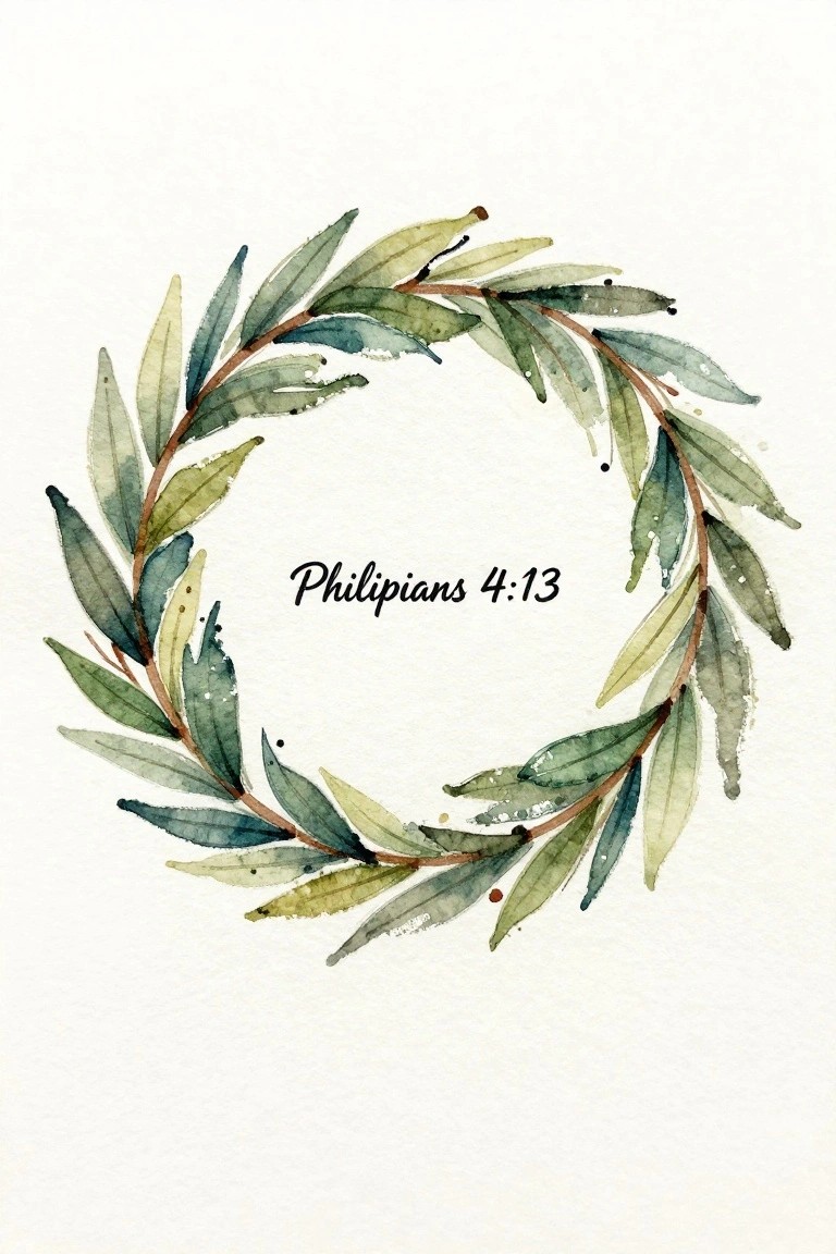
A simple circular wreath made from layered leaves forms the main element here, leaving the center open for the Bible verse text. The leaves vary slightly in shape and angle, creating a loose ring that feels balanced without being perfectly symmetrical. This approach fits into decorative art, where the focus stays on the clean frame rather than heavy detail or background elements.
The composition does a lot of the work here by keeping the leaves spaced enough to show the white paper while still forming a clear circle. You could swap the greens for other muted tones to match different rooms or reduce the number of leaves for a faster version. This style stands out on Pinterest because the open center makes the verse easy to read at small sizes, and the same wreath shape can be reused with other short verses.
Minimal Watercolor Seascape with Centered Verse

A simple seascape idea that layers a Bible verse across the open sky area above the waterline. Broad horizontal washes of blue and yellow create the sky and sea, while the sandy foreground stays light and textured with just a few darker marks. The layout keeps the verse as the main focal point by leaving plenty of negative space around it.
What makes this idea useful is the straightforward division of the page into sky, water, and sand bands, which makes placement of the text easy to plan. You can swap the yellow for other sunset tones or shrink the sand section if you want a taller water area. For wall decor this works well because the loose horizontal strokes stay clean even when printed or painted at a larger size.
Single Word on a Blended Watercolor Background
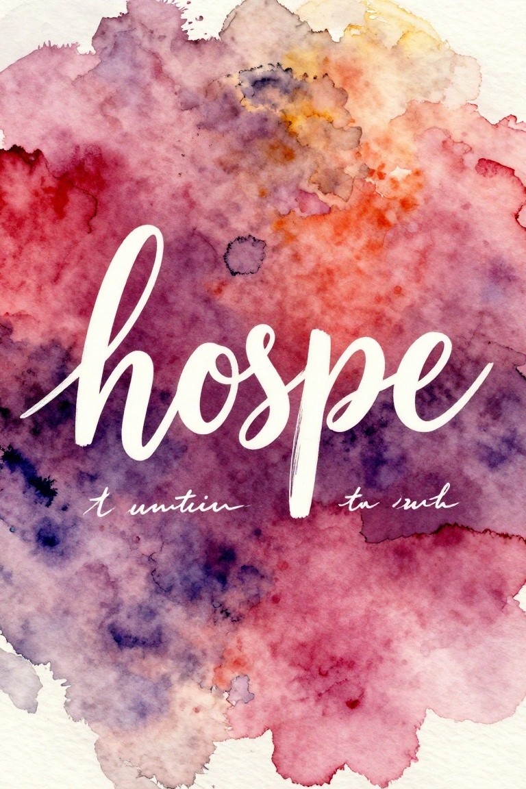
A simple painting idea like this uses a loose wash of warm and cool tones as the full background, then places one word in white script across the center. The soft edges and natural color shifts in the wash create enough visual interest on their own, so the text stays readable without extra lines or details. This approach fits the decorative typography category and works especially well when you want the focus to stay on the word itself.
What makes this idea useful is how little drawing is required once the wash is down. You can swap the word for any short verse or phrase and change the palette to match a room or season without changing the layout. The background keeps the focus on the lettering, so even a basic brush lettering style looks finished. For wall art, this format prints or scans cleanly and stays minimal enough to fit the clean modern look the rest of the list aims for.
Abstract Overlapping Circles with Scripture
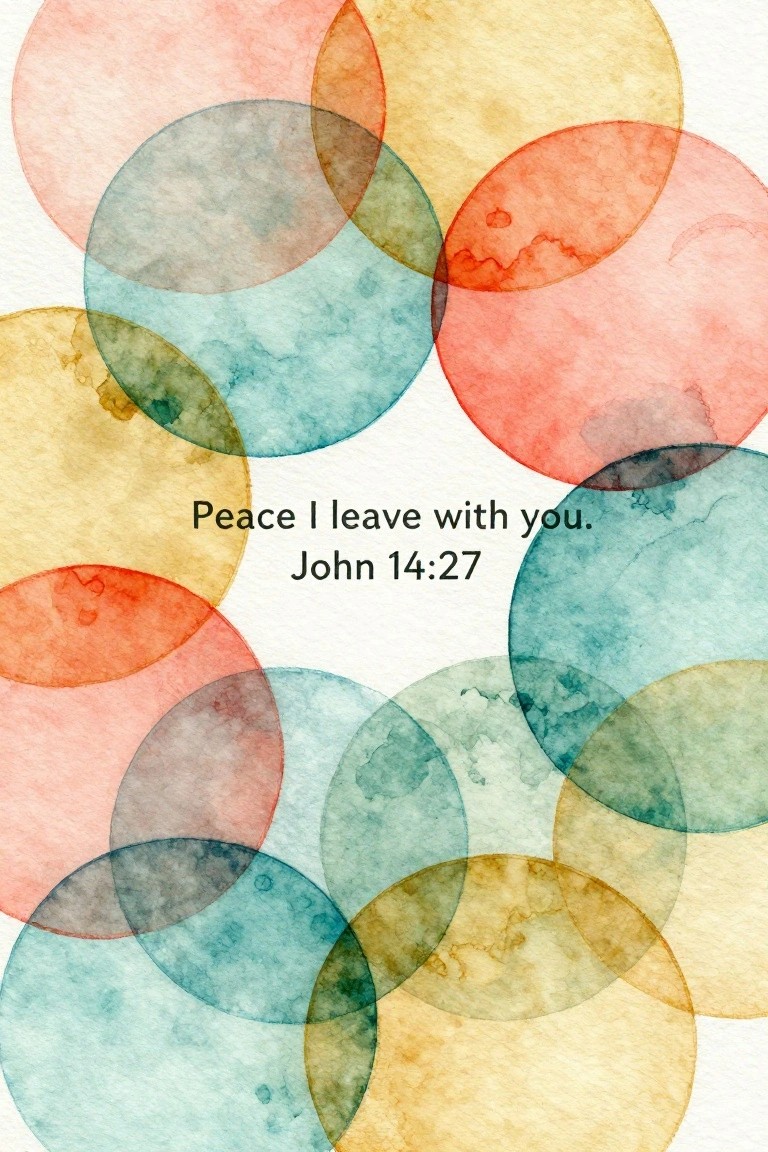
This painting idea uses a loose arrangement of translucent overlapping circles in soft watercolor hues to form an abstract background. The circles vary in size and sit at different angles, allowing colors to mix where they intersect and creating subtle texture through the layered washes. It belongs to the category of decorative abstract art that leaves room for a short text element like a Bible verse in the center.
What makes this idea useful is the way the plain white negative space keeps the layout balanced without extra planning. The color palette can be swapped out easily to suit different rooms or seasons while the circle shapes stay the same. For practice, this kind of subject lets you experiment with transparency and edge control on a small scale before trying larger pieces. It also translates well to prints or cards since the composition holds up even when simplified to fewer circles.
Frequently Asked Questions
What Bible verses work best for minimal art designs? Short verses with powerful messages like Philippians 4:13 or Psalm 23:1 pair well because they allow for simple typography without needing extra imagery. Focus on phrases under 10 words to keep the layout balanced and easy to read in a modern space.
How can I make sure my Bible verse art stays clean and uncluttered? Select one font style such as sans serif and limit colors to two neutral tones like black and soft gray. Place the text off center or in a single line on a plain background to maintain that fresh modern feel without adding borders or decorations.
Where are good places to display minimal Bible verse prints at home? Hang them in entryways, above desks, or in bedrooms where they can serve as quiet reminders. Use slim frames in matte black or wood tones to blend with contemporary furniture and avoid competing with other wall items.
Can I create these designs without professional design skills? Yes, free tools like Canva let you upload a Bible verse, choose minimal templates, and adjust spacing quickly. Start with a square canvas size for versatility and export at high resolution for printing on quality paper or canvas.
What if I want to customize the ideas for a specific room color scheme? Match the text color to an accent already in the room such as navy or terracotta while keeping the background white or light beige. This approach keeps the modern look intact while making the piece feel personal and coordinated.