During Lent I decided to paint the Stations of the Cross as a way to mark the season.
It gave me a quiet project to work on in the evenings after work.
I kept the paintings small and simple without adding too much detail.
In the end I had 21 of them.
I am posting them here for anyone who might want to see them.
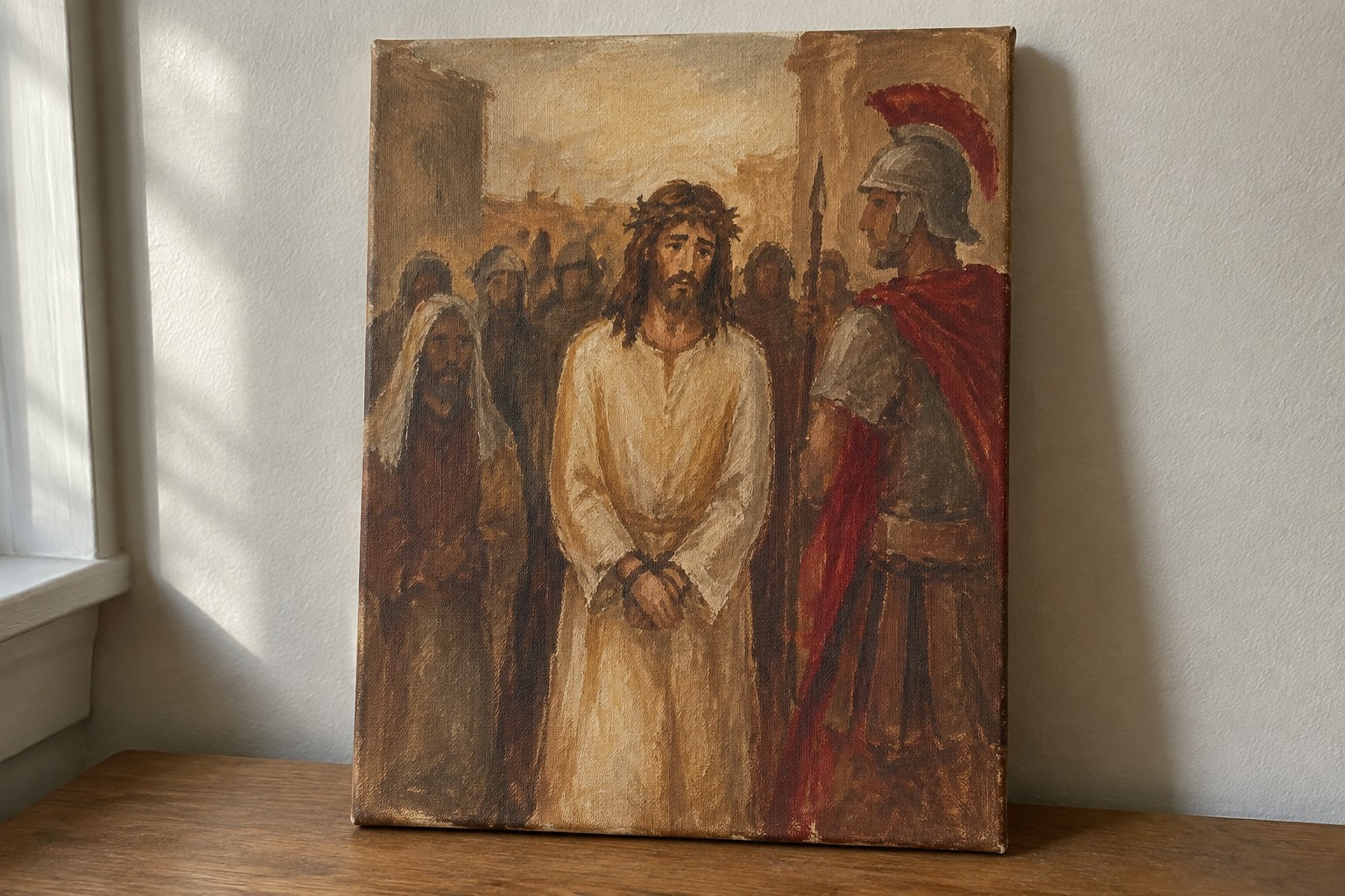
Jesus Standing Bound Before the Soldier

A narrative religious painting that centers on the moment of judgment, with Jesus in a simple robe and crown of thorns facing a Roman soldier in full armor and red cape. The idea works through a straightforward two-figure confrontation placed against a muted crowd and columned background, letting the contrast between the plain white garment and the soldier’s dark armor plus red accents hold the viewer’s attention. Earthy browns and restrained brushwork keep the focus on the figures rather than on decorative detail.
The composition does a lot of the work here because the main action sits in the middle of the canvas with clear space around the two primary figures. This makes the idea easy to scale down for a smaller panel or to simplify by dropping most of the background crowd. The limited color range of browns, off-white, and one strong red is practical for mixing and helps the piece read clearly even on a first attempt. For a Stations of the Cross series, the same layout can be repeated with different figure pairings without needing new color decisions.
Bearing the Cross With Loose Washes and Limited Tones
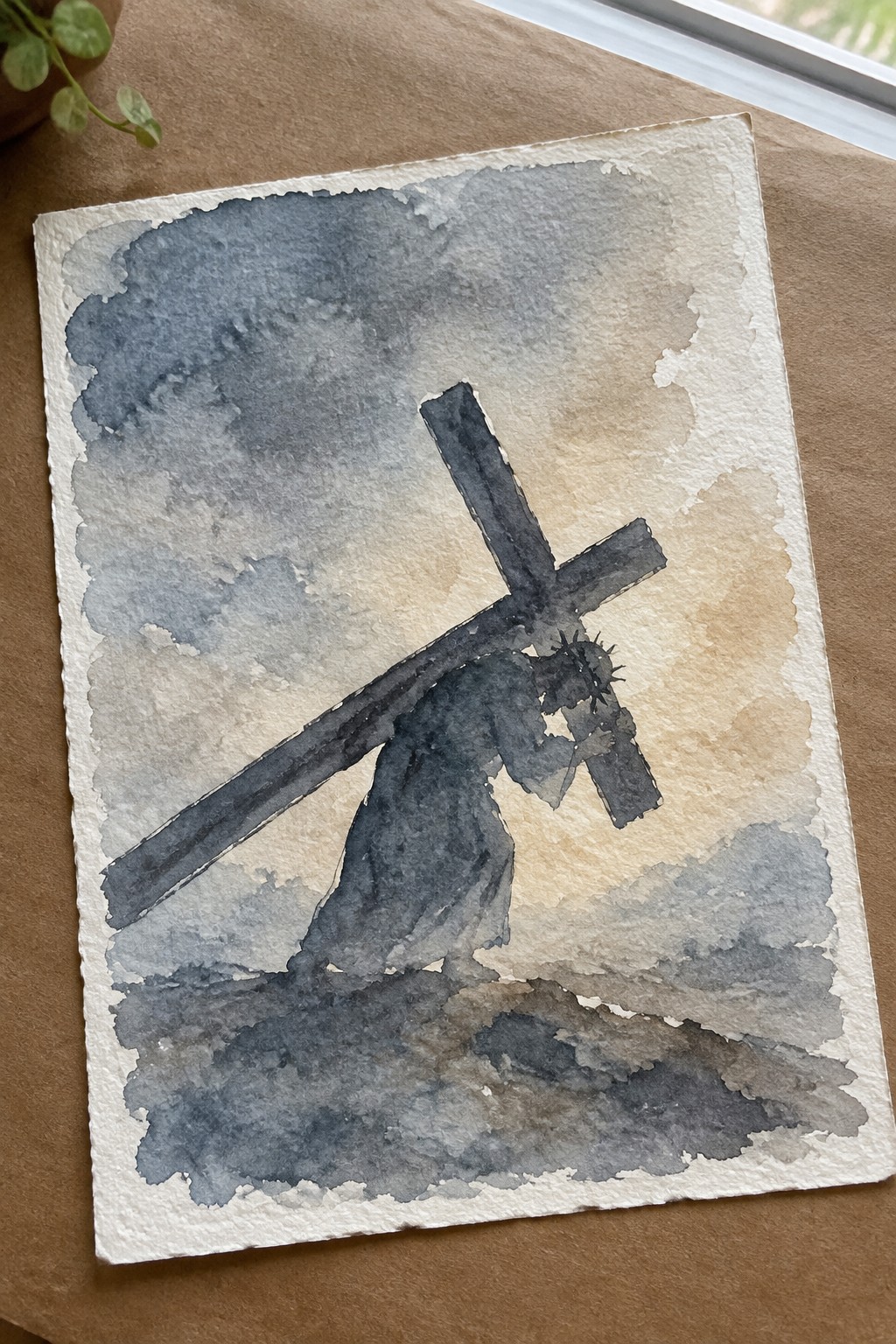
A single figure shouldering a heavy cross under a heavy sky works as a strong Stations of the Cross idea because the subject itself carries most of the narrative weight. Muted watercolor washes in cool grays and earth tones keep the focus on the tilt of the cross and the forward lean of the body rather than on fine facial details. The low horizon and diagonal line of the cross create a natural sense of movement that makes the scene feel active even with minimal drawing.
What makes this idea useful is how the limited palette and soft edges let you practice gesture and atmosphere without getting stuck on small shapes. You can reuse the same background treatment for other stations by swapping only the main pose and any simple props. The loose sky also gives beginners room to try wet-on-wet blending while still ending up with a finished piece that reads clearly from a distance.
Flat Shapes Frame the Weight of the Cross
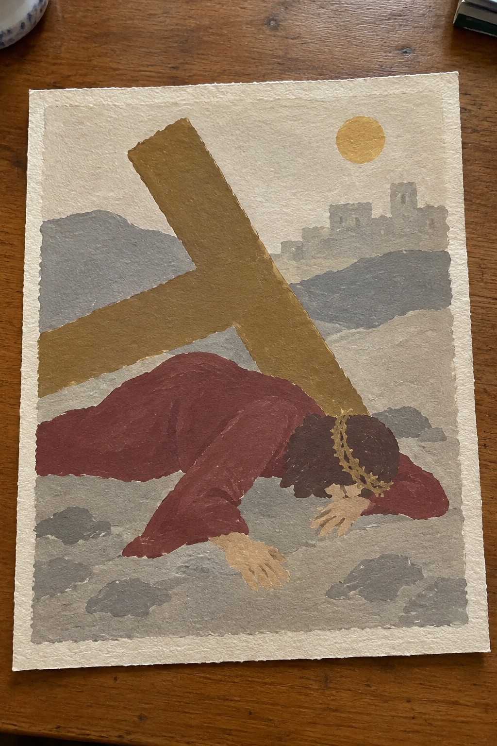
This painting idea uses large, simplified color blocks to show Jesus fallen under the cross on the way to Calvary. The composition places the heavy diagonal of the cross across the frame while the figure in deep red anchors the lower half against a muted landscape and pale sky. The approach fits a graphic, stylized category that relies on shape and limited palette rather than fine detail.
What makes this idea useful is how the flat areas of color keep the focus on the main action without requiring precise anatomy or perspective. The background hills and distant buildings can be scaled down or removed to suit smaller canvases or quicker studies. A version like this works well for seasonal church displays or printable resources because the strong silhouettes remain clear even when reduced in size.
Close Profile Portraits of Jesus and Mary
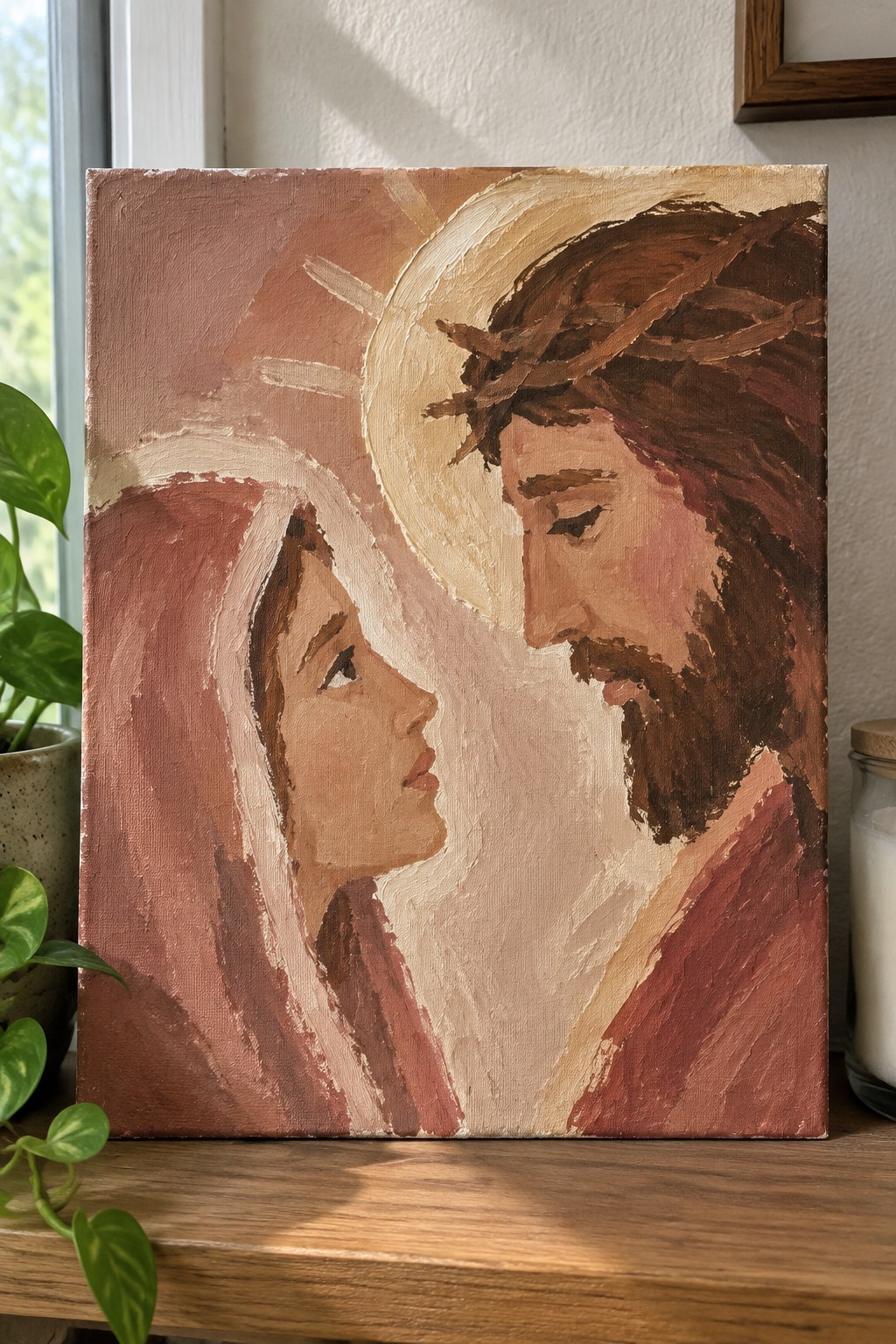
A painting idea built around two faces meeting in profile, with Jesus shown in a crown of thorns and a woman in a head covering. The idea uses a tight crop and warm earth tones to keep attention on the space between them rather than on background details. Broad strokes and a simple color range make the forms readable from a short distance.
The limited palette keeps mixing easy and lets you work on a smaller canvas without losing impact. You could shift the angle slightly or change the veil color to match a different station while keeping the same layout. This kind of centered two-face setup works well for quick studies or for pieces meant to hang in a quiet corner during Lent.
Carrying the Cross

This painting idea focuses on the moment Jesus carries the cross on the way to Calvary, with a second figure stepping forward to share the weight. The composition places the cross on a strong diagonal that connects the two figures and keeps the action moving across the canvas. A restrained palette of browns, ochres, and dull greens plus visible brush texture gives the scene weight without extra detail.
What makes this idea useful is how the two figures and the cross already tell the story, so the background can stay loose or even be left minimal. The same layout works at different sizes and can be simplified by reducing the number of folds in the robes or flattening the color areas for quicker studies. For a Stations of the Cross series, this subject stands out because the poses read clearly even from a distance.
Veronica’s Veil as a Close-Up Devotional Scene

This painting idea centers on the moment Veronica holds the cloth bearing Christ’s face after wiping it during his walk to Calvary. It works as a narrative religious piece that keeps the focus tight on two main elements: the woman’s profile and the cloth with its faint face imprint. The soft layering of washes and the way the hands and fabric overlap create a natural focal point without needing extra figures or a busy setting.
What makes this idea useful is how the profile angle and limited color range cut down on complex anatomy work. You can easily adapt the scale for a small devotional panel or stretch it into a larger piece by softening the background further. For a Stations of the Cross series, this approach stands out because it stays intimate and recognizable even when simplified to just the veil and the two faces.
Jesus Falling Under the Cross

A painting idea centered on the moment Jesus collapses under the weight of the cross during the procession to Calvary. The composition places the heavy wooden cross at a strong diagonal across the frame, with the figure positioned low against a sparse hillside and distant city. Earthy greens, browns, and muted sky tones keep the focus on the physical strain rather than dramatic lighting.
What makes this idea useful is the clear focal point created by the cross angle and the kneeling figure, which gives beginners a straightforward way to practice proportion and weight in a figure. The simple background keeps attention on the main subject, so the same scene works at a smaller scale for practice or as a full canvas with added landscape detail. You could easily shift the color palette toward cooler tones or crop tighter around the figure and cross for a more intimate study. For a Stations of the Cross series, this approach stands out because it shows the struggle without needing extra figures or elaborate architecture.
Station VIII Jesus Meets the Women of Jerusalem
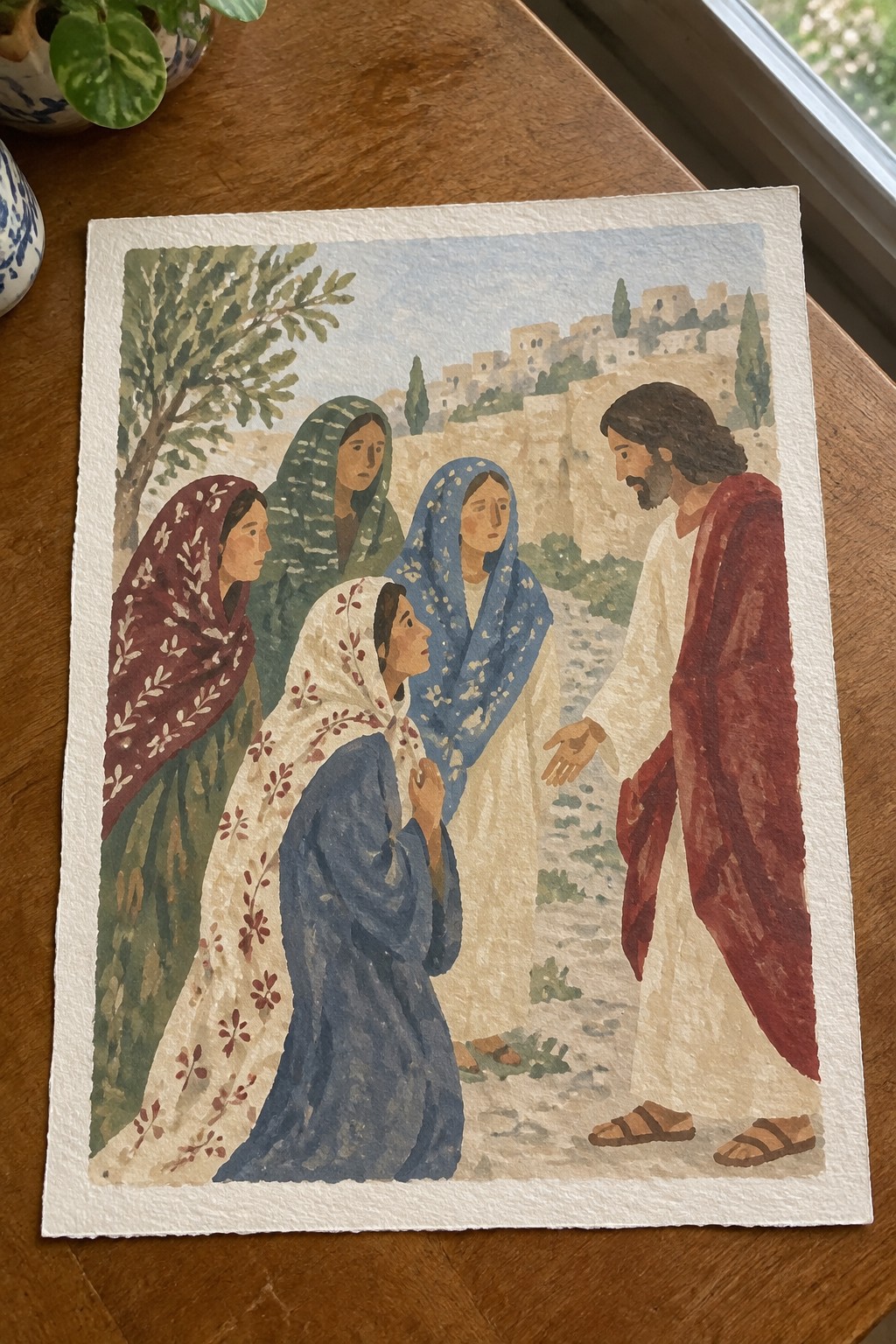
A narrative scene of Jesus stopping on a dirt path to address a small group of women works well as a Lent painting because it keeps the focus on a single moment of connection. The composition places the kneeling woman in the lower left, the standing women behind her, and Jesus on the right with his hand extended, creating a clear line of interaction across the page. Earthy greens, soft blues, and warm reds in the clothing keep the figures distinct against the pale hillside town in the background.
What makes this idea useful is the way the path and slope naturally lead the eye without needing extra details. The color choices stay simple enough to copy in watercolor or gouache while still giving each figure a clear shape. For a smaller canvas or sketchbook version, dropping two of the women still keeps the main exchange intact. This setup also translates easily to a vertical format if the goal is a series of Stations prints.
Jesus Falls Carrying the Cross
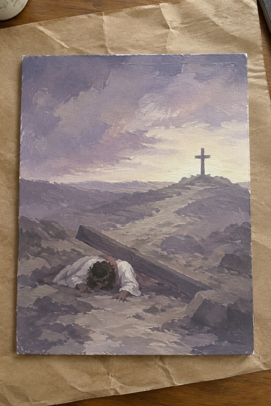
This painting idea shows a lone figure collapsed under a heavy wooden cross on rocky ground, with a second cross standing on a distant hill as the clear endpoint. The composition uses a low angle and layered hills to pull the eye forward along the path, while the broad sky and muted purple-gray palette keep the focus on the struggle rather than on fine details. It works as a landscape-driven religious scene where the environment itself carries much of the emotional weight.
The composition does a lot of the work here by using the path and distant cross to create depth with very little added detail. You could adapt the idea for a smaller canvas by keeping only the figure and one or two simple hill shapes, or shift the palette toward cooler blues if you want a different seasonal mood. For a Lent series, the limited colors and strong silhouette make this easy to repeat across multiple stations without needing advanced figure skills.
Empty Cross with Draped Linens

The painting idea uses a single wooden cross as the main subject, with white cloths draped across the crossbeam and gathered in folds at the base. The surrounding hills and sky stay low in contrast so the vertical form and fabric details stay front and center. This approach fits a quiet landscape category that still carries a clear symbolic weight through simple shapes and a restrained color range.
The composition does a lot of the work here because the cross sits slightly off center and the sky fades into the hills without competing details. You can easily adapt the idea by keeping the cross and cloths but swapping the background for a flat wash or a single horizon line if you want a faster version. For a Stations series this works especially well because the empty space around the cross leaves room for reflection without needing extra figures or symbols.
Centered Crucifixion with Sparse Background
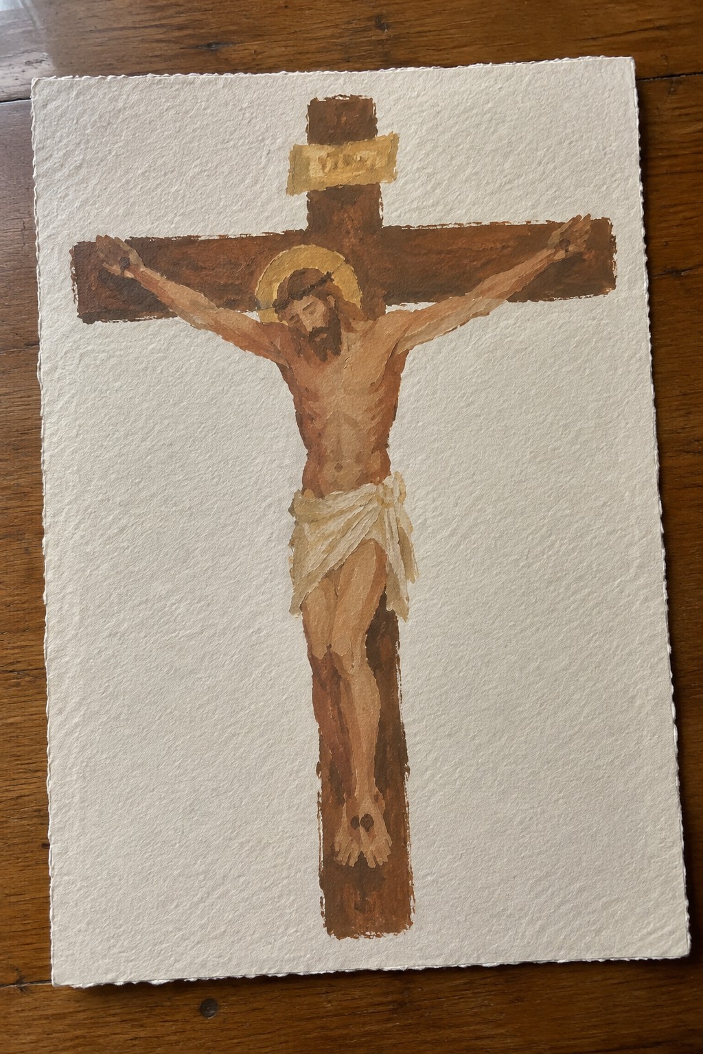
A crucifixion scene painted with a tight focus on the figure and cross works as a direct devotional piece for Lent. The vertical layout places the cross in the middle with open space on either side, which keeps attention on the main subject rather than surrounding details. This fits the category of religious or seasonal figurative painting where the composition relies on simple shapes and a narrow earth-tone palette.
What makes this idea useful is how the plain background removes the need for extra planning or layers. You can adapt it by changing the paper size or adjusting how much of the cross shows at the top and bottom. For practice or wall pieces during Lent, the limited color range and straightforward pose make it easy to repeat or scale down without losing the core subject.
Crucifixion Scene Set Against a Sunset Landscape

A crucifixion painting idea works by placing the cross slightly off center against a wide sky that fills most of the canvas. The composition uses the horizon line and the glowing sun to pull the eye upward while keeping the figures small and grouped at the base. Warm reds and oranges in the sky contrast with the dark cross and muted foreground, which helps the vertical shape of the cross stand out without extra detail.
What makes this idea useful is that the sky does most of the visual work, so you can block in large areas of color first and refine the figures later. The layout adapts easily to different canvas sizes since the distant hills and sky can be simplified or expanded depending on space. For wall pieces, the strong vertical element and warm palette make it easy to match with existing decor. You could also shift the sun lower or raise the horizon to change the mood without redrawing the whole scene.
Descent from the Cross in Earth Tones
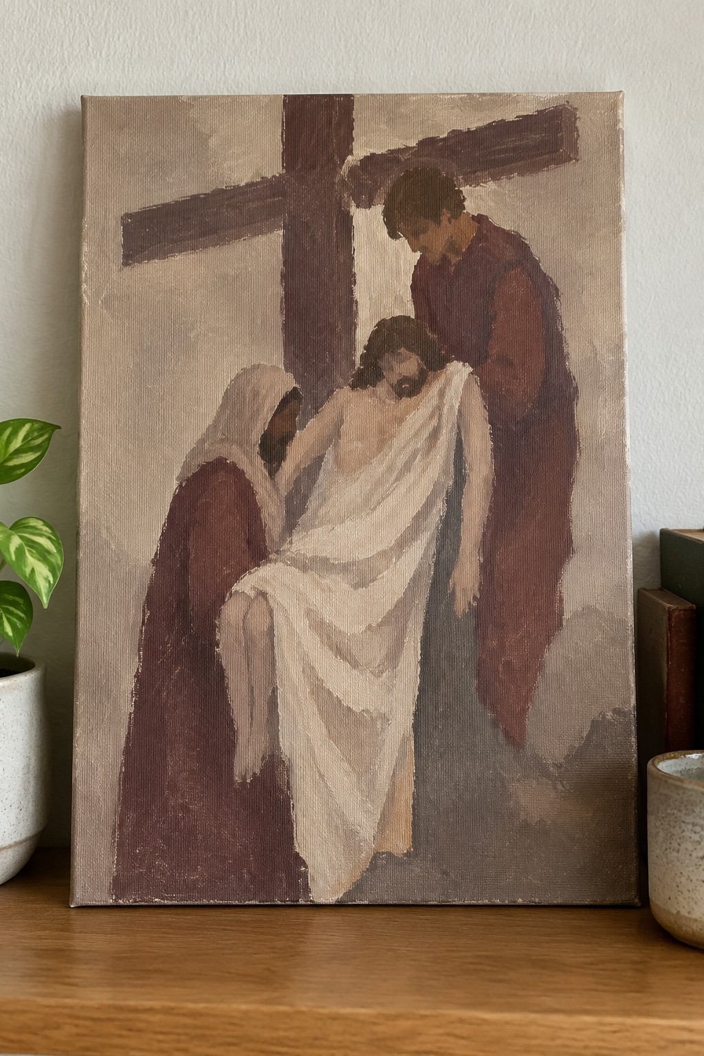
This painting idea centers on the moment Christ is taken down from the cross, shown through three figures grouped around the base of a large wooden cross. The concept works as a narrative religious piece that relies on a narrow range of browns, beiges, and creams to keep the focus on the arrangement of bodies rather than on color contrast. The vertical cross and the way the white cloth drapes across the central figure create a clear focal point without needing sharp details or complex backgrounds.
The composition does a lot of the work here by using the cross as a strong structural line that holds the scene together. A painting like this works especially well for a full Stations series because the same limited palette and loose figure style can be repeated across multiple pieces without much extra planning. The simple shapes help this feel more approachable for someone who wants to paint the subject on a larger canvas or adapt it into a smaller study.
Empty Tomb in a Stone Chamber
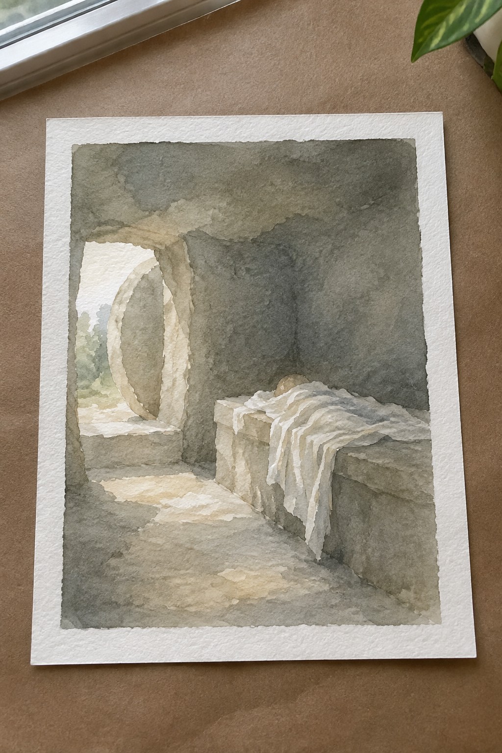
The painting idea focuses on an empty stone tomb placed inside a cave-like chamber, with light entering through a large arched opening that reveals a hint of landscape beyond. The composition works by using the contrast between the shadowed walls and the brighter floor and doorway to guide the eye toward the simple rectangular form and the cloth resting on top. This approach fits an architectural or biblical scene category, where the setting itself carries the idea without added figures or extra elements.
What makes this idea useful is the clear division between light and dark areas, which helps beginners map out values before adding color. The limited palette and strong shapes mean you can simplify the background or swap the view outside the arch to fit whatever landscape you have on hand. For seasonal Lent decor, the restrained tones and single focal point give it quiet impact on a wall without requiring fine detail work.
Cross Crown and Praying Hands Triptych
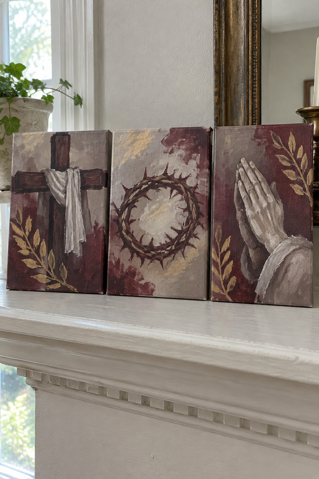
A three-panel set of small canvases offers a direct way to group key Lent symbols together. One panel shows a wooden cross with draped cloth, the next a crown of thorns, and the third a pair of praying hands, all placed on matching dark red backgrounds with gold leaf branches in the corners. The repeated background tone and gold accents tie the panels together while the centered subjects give each canvas its own clear focus.
What makes this idea useful is how the separate canvases let you hang them as a group or move them around on a shelf or mantel. The limited palette of deep reds, neutrals, and gold keeps the project simple to match or scale down to two panels if needed. For seasonal wall pieces this format works especially well because it stays compact and easy to store after Lent.
Two-Panel Idea for Comfort and Sorrow
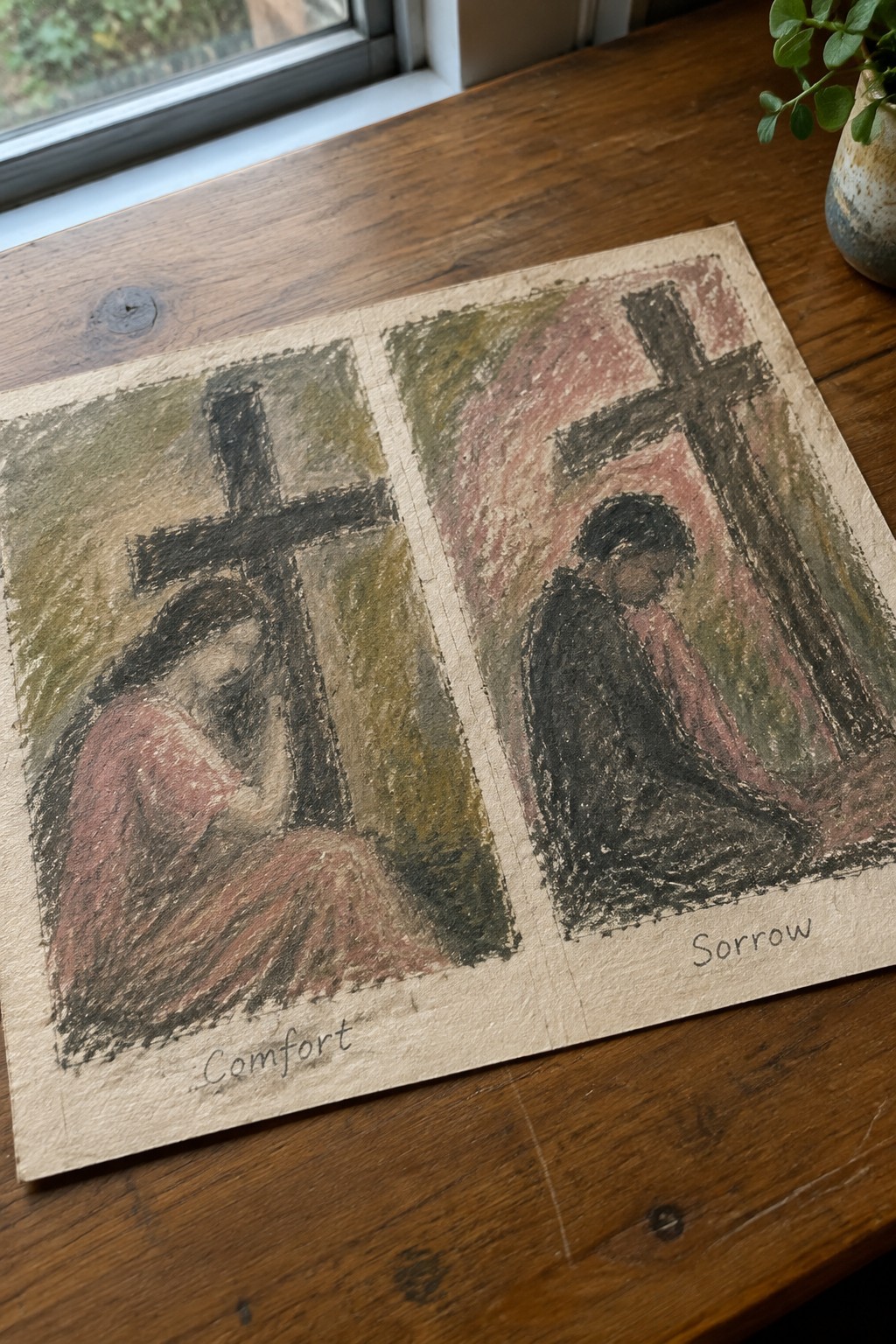
This painting idea places two similar scenes side by side so the viewer can compare a figure bowed before a cross in one muted green-brown palette and the same basic scene in a warmer red-pink palette. The large cross and seated figure stay fixed in both panels while the background colors and slight clothing shifts do the work of separating the two moods. The format fits easily into reflective or seasonal religious art where the goal is to show contrast without adding extra figures or objects.
What makes this idea useful is the repeated shape of the cross and figure, which lets you practice color mixing and mood changes instead of starting from scratch each time. You could simplify it to a single panel, swap the background tones for whatever colors you have, or enlarge just the right side for a quick standalone piece. The side-by-side layout also works well for Lent projects because it keeps the focus on the relationship between the two states without needing complex details or extra elements.
Sorrowful Madonna Portrait for Reflection
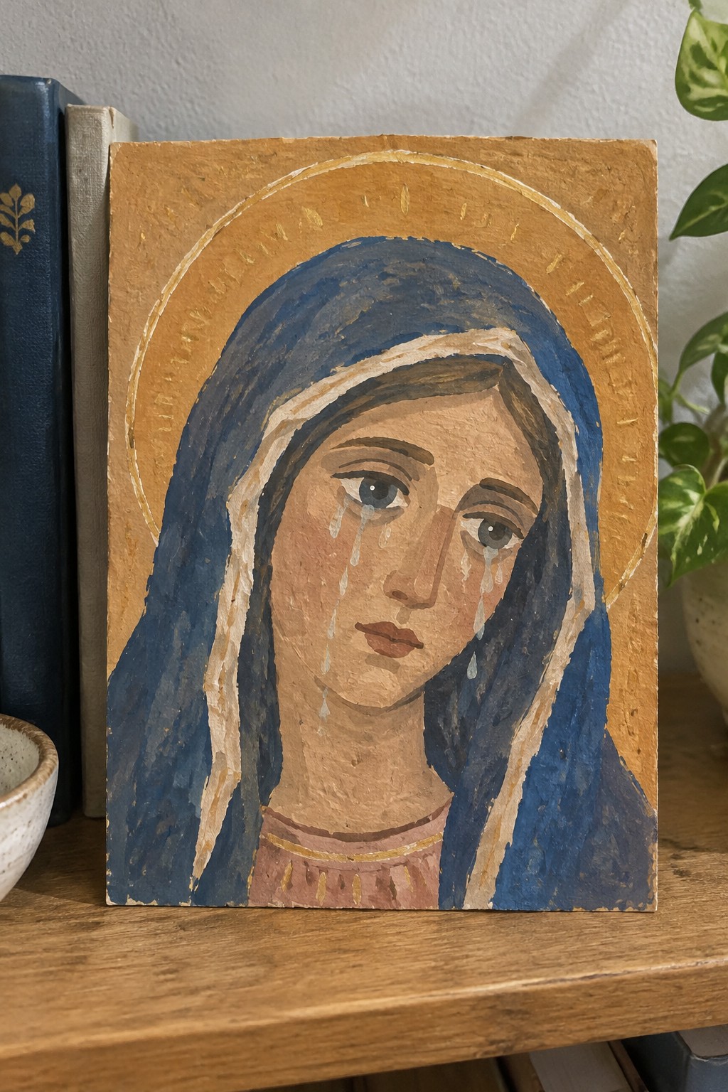
This painting idea uses a close-up portrait of the Virgin Mary to capture a moment of quiet sorrow during the Stations of the Cross. The subject features a blue veil, a simple golden halo, and visible tears that run down the face to emphasize grief without extra symbols. The limited color palette of deep blue against warm earth tones keeps the focus tightly on the face and expression.
What makes this idea useful is how the tight framing and single figure make it straightforward to paint or adapt for personal use. The composition works well on a small panel or canvas, and the basic shapes of the veil and halo can be simplified further if needed for quicker studies. For Lent decor or a personal prayer corner, the same idea can be repeated with slight changes in the blue tones or background texture to create a small series.
Cross on a Hill in Layered Cool Tones
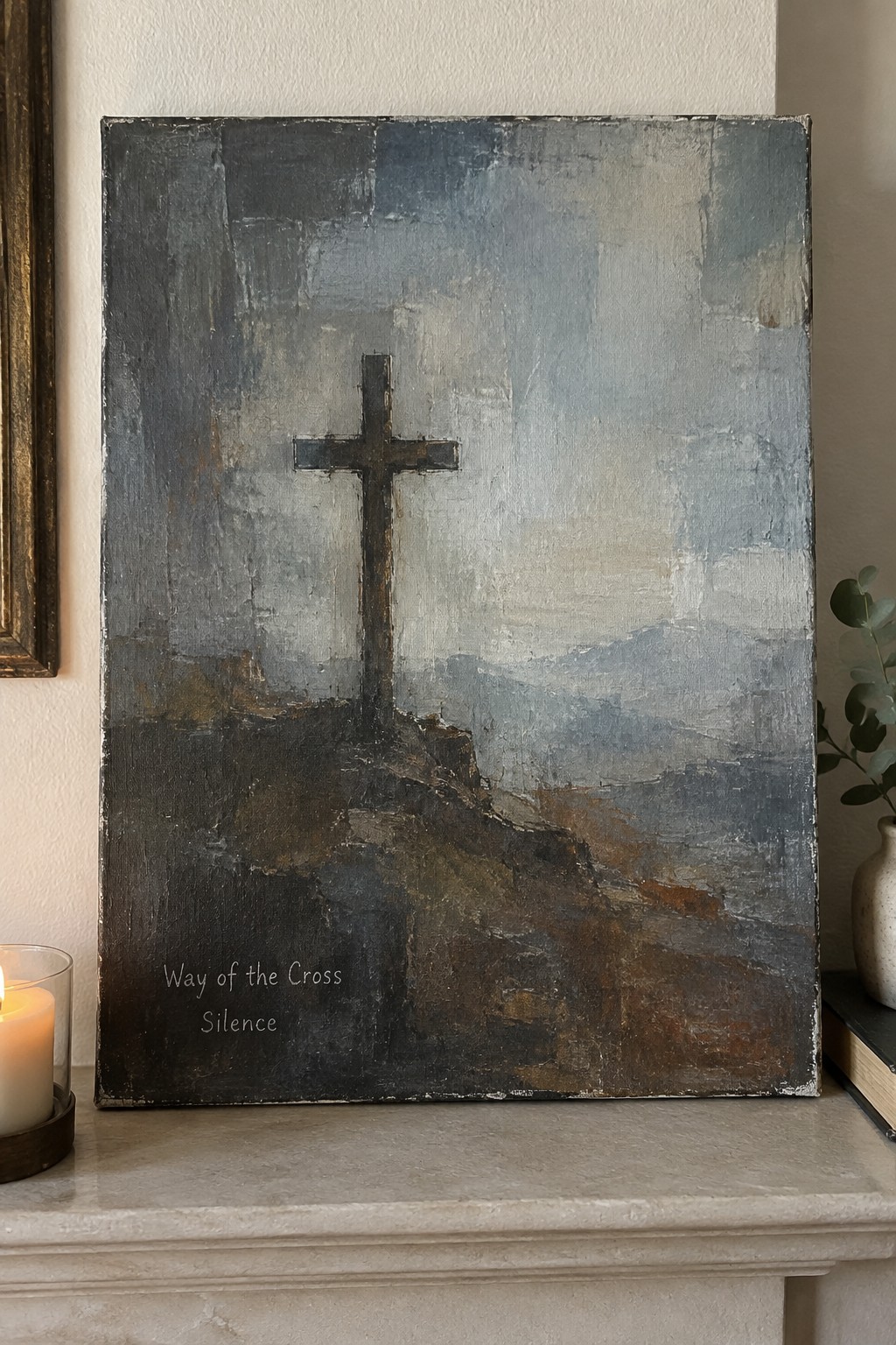
A single dark cross stands on a raised rocky area as the main element, set against a background built from broad horizontal strokes in blue-gray and muted earth tones. The painting idea relies on visible texture and overlapping layers to create depth while keeping the cross as a clear vertical shape. This fits the category of abstract landscape with a central symbol, where the limited palette and rough brushwork keep the focus on form rather than fine detail.
The composition does a lot of the work here by placing the cross slightly off center so the surrounding space still feels balanced. You can adapt the idea by changing the background colors to warmer tones or reducing the texture if you want a flatter look for smaller canvases. This approach works well for Lent-themed pieces because the simple layout leaves room to add text like the title shown without crowding the surface. For practice, the same idea could be tried with fewer layers to test how much texture is needed before the cross loses its impact.
Hands Gripping the Cross with Nails
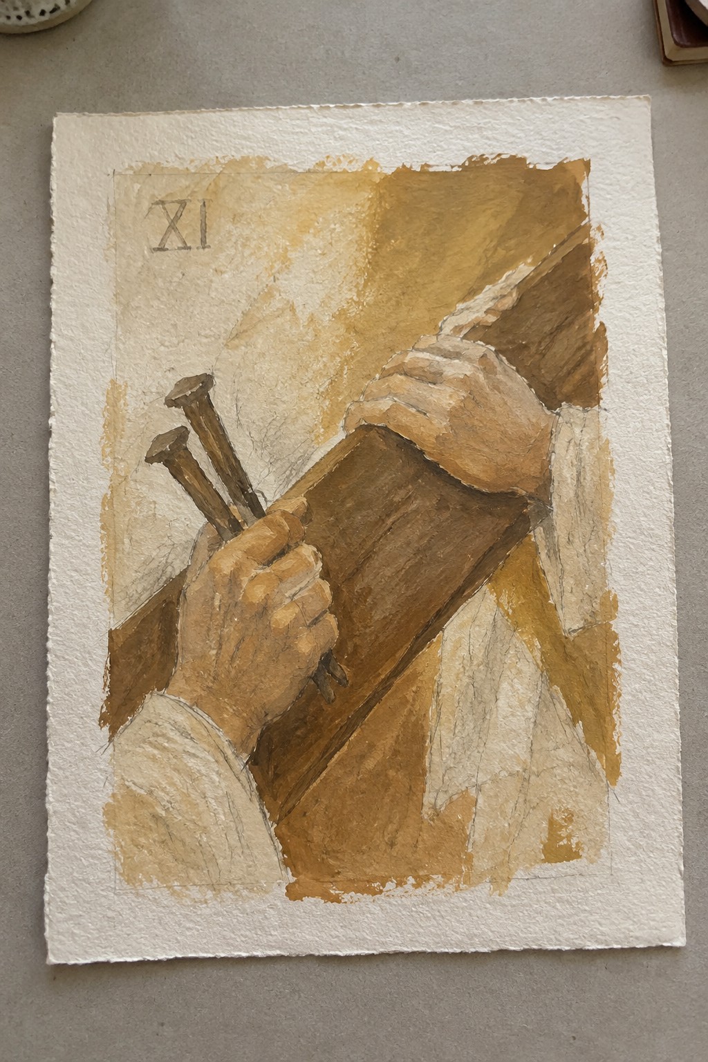
A painting idea built around hands holding a wooden beam and three large nails works as a focused devotional still life. The tight crop keeps the emphasis on the grip and the weight of the wood, while the diagonal placement of the beam adds movement without complicating the scene. A restricted brown palette and loose washes let the texture of the wood and the simple shapes of the nails carry the visual interest.
The composition does a lot of the work here by isolating just the hands and the cross, which makes it easy to paint at a smaller size or turn into a quick practice piece. You could adapt the same idea with a single nail or a different wood tone if you want to personalize it for a set of stations. This kind of direct, close-up subject tends to perform well on Pinterest because it reads clearly even as a thumbnail.
Respite at the Ninth Station
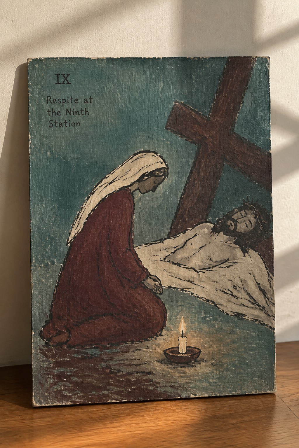
This painting idea centers on a quiet pause in the Stations of the Cross, showing a kneeling figure in a deep red robe beside the fallen form under the cross. The composition uses a teal background to separate the main elements while the lit candle in the foreground creates a clear focal point that ties the scene together. It fits the category of narrative religious art, where the limited color palette and balanced layout keep the eye moving between the two figures without extra detail.
What makes this idea useful is the way the simple background and single light source let the main shapes carry the weight of the scene. You could adapt the color choices by swapping the teal for a warmer tone or reducing the size of the candle to fit a smaller canvas. The straightforward arrangement also works for practice because the figures stay readable even if the brushwork stays loose.
Frequently Asked Questions
What are the Stations of the Cross and how do these 20 paintings connect to them? The Stations of the Cross traditionally cover 14 key events from the Passion of Jesus. These 20 reflective paintings expand on that foundation by adding meditative layers such as moments of inner struggle and communal witness, which helps viewers engage more deeply with the full emotional and spiritual journey during Lent.
How can I use these paintings in my personal Lenten prayer routine? Set aside time each day to sit quietly with one painting. Read a short Gospel passage related to the scene, then reflect on how the visual details speak to your own life. Journaling your thoughts or offering simple prayers afterward turns the artwork into a practical tool for daily spiritual growth.
Why create 20 paintings rather than sticking to the classic 14 stations? The extra paintings allow space for additional reflective pauses, such as moments before the trial or after the resurrection appearance. This structure supports a fuller 20-day Lenten practice that moves beyond the core events to include themes of preparation and renewed hope.
Are these paintings suitable for family or group settings? Yes, they work well for shared reflection. Families can discuss one image together after dinner, while parish groups might project them during weekly meetings. The accessible style encourages conversation about faith without requiring advanced art knowledge.
Where can I find these paintings for ongoing use? Search for the series on Christian art websites or the artist’s own platform, where digital downloads and prints are often available. Many creators also provide free reflection guides to accompany the images for personal or church use throughout Lent.